The same plot in 14 other libraries — Python: Altair, Bokeh, lets-plot, Matplotlib, Plotly, plotnine, Pygal, Seaborn; Julia: Makie.jl; JavaScript: Chart.js, D3.js, Apache ECharts, Highcharts, MUI X Charts. Compare all 15 side by side: Regression Diagnostic Panel (Four-Plot Display) in Python, R, Julia and JavaScript.
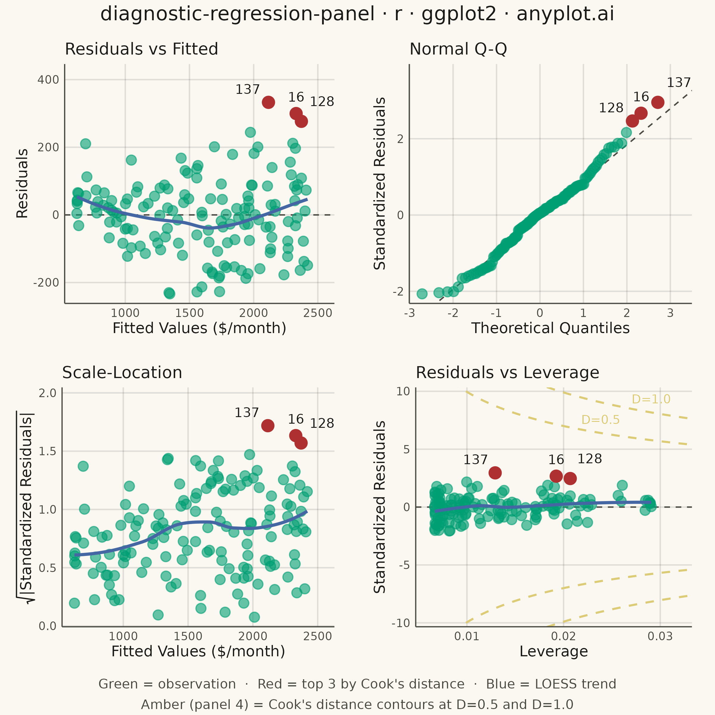
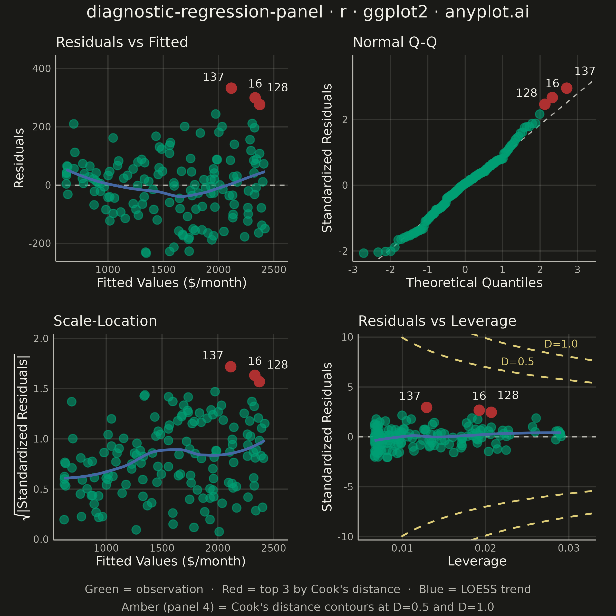
A 2x2 panel of diagnostic plots for evaluating linear regression model assumptions, replicating the classic output of R's `plot(lm)`. The four subplots are: (1) Residuals vs Fitted values to detect non-linearity and heteroscedasticity, (2) Normal Q-Q plot of standardized residuals to assess normality, (3) Scale-Location plot (square root of standardized residuals vs fitted values) to check homoscedasticity, and (4) Residuals vs Leverage with Cook's distance contours to identify influential observations. This composite display is the standard first step in regression model validation across statistics, academia, and regulated industries.
#' anyplot.ai
#' diagnostic-regression-panel: Regression Diagnostic Panel (Four-Plot Display)
#' Library: ggplot2 3.5.1 | R 4.4.1
#' Quality: 90/100 | Created: 2026-09-05

library(ggplot2)
library(scales)
library(ragg)
library(gridExtra)

grDevices::pdf(NULL)  # null device so building text grobs pre-render doesn't leave a stray Rplots.pdf
set.seed(42)

# --- Theme tokens ------------------------------------------------------
THEME    <- Sys.getenv("ANYPLOT_THEME", "light")
PAGE_BG  <- if (THEME == "light") "#FAF8F1" else "#1A1A17"
INK      <- if (THEME == "light") "#1A1A17" else "#F0EFE8"
INK_SOFT <- if (THEME == "light") "#4A4A44" else "#B8B7B0"

IMPRINT_PALETTE <- c("#009E73", "#C475FD", "#4467A3", "#BD8233",
                     "#AE3030", "#2ABCCD", "#954477", "#99B314")
ANYPLOT_AMBER <- "#DDCC77"

POINT_COLOR       <- IMPRINT_PALETTE[1]  # regular observations (brand green)
INFLUENTIAL_COLOR <- IMPRINT_PALETTE[5]  # top Cook's distance points (semantic: outlier/error -> red)
SMOOTH_COLOR      <- IMPRINT_PALETTE[3]  # LOWESS trend
CONTOUR_COLOR     <- ANYPLOT_AMBER       # Cook's distance contours (warning threshold)

# --- Data: apartment rent regressed on floor area, with a deliberately ------
# misspecified linear fit (true relation has mild curvature and the noise
# scales with size) so the diagnostics show realistic non-linearity and
# heteroscedasticity instead of a textbook-clean fit.
n_obs <- 150
floor_area_m2 <- runif(n_obs, 35, 160)
noise_sd <- 25 + 0.9 * floor_area_m2
monthly_rent <- 320 + 9.4 * floor_area_m2 + 0.028 * floor_area_m2^2 +
  rnorm(n_obs, mean = 0, sd = noise_sd)

listings <- tibble::tibble(floor_area_m2 = floor_area_m2, monthly_rent = monthly_rent)
model <- lm(monthly_rent ~ floor_area_m2, data = listings)

diagnostics <- tibble::tibble(
  obs_id        = seq_len(n_obs),
  fitted        = fitted(model),
  residuals     = resid(model),
  std_residuals = rstandard(model),
  leverage      = hatvalues(model),
  cooks_d       = cooks.distance(model)
)

n_labeled <- 3
influential_ids <- diagnostics$obs_id[order(diagnostics$cooks_d, decreasing = TRUE)][1:n_labeled]
diagnostics$is_influential <- diagnostics$obs_id %in% influential_ids
influential_points <- diagnostics[diagnostics$is_influential, ]

# Spread the 3 index labels apart along each panel's x-axis, AND stack them at
# different heights (vjust) by rank — horizontal nudging alone isn't enough
# when two influential points have close fitted/leverage values (their x-nudges
# land near each other), so the perpendicular vjust offset guarantees the
# labels never visually cluster.
label_spread <- 0.09
influential_points$nudge_fitted <-
  (rank(influential_points$fitted) - (n_labeled + 1) / 2) *
  label_spread * diff(range(diagnostics$fitted))
influential_points$nudge_leverage <-
  (rank(influential_points$leverage) - (n_labeled + 1) / 2) *
  label_spread * diff(range(diagnostics$leverage))
influential_points$vjust_fitted <-
  -0.9 - (rank(influential_points$fitted) - 1) * 0.35
influential_points$vjust_leverage <-
  -0.9 - (rank(influential_points$leverage) - 1) * 0.35

# --- Title -------------------------------------------------------------
title_text <- "diagnostic-regression-panel · r · ggplot2 · anyplot.ai"
title_fontsize <- if (nchar(title_text) > 67) round(12 * 67 / nchar(title_text)) else 12
title_fontsize <- max(title_fontsize, 8)

# --- Shared chrome -------------------------------------------------------
anyplot_theme <- theme_minimal(base_size = 7) +
  theme(
    plot.background   = element_rect(fill = PAGE_BG, color = PAGE_BG),
    panel.background  = element_rect(fill = PAGE_BG, color = NA),
    panel.grid.minor  = element_blank(),
    panel.grid.major  = element_line(color = alpha(INK, 0.12), linewidth = 0.4),
    axis.line         = element_line(color = INK_SOFT, linewidth = 0.35),
    axis.ticks        = element_blank(),
    axis.title        = element_text(color = INK, size = 9),
    axis.text         = element_text(color = INK_SOFT, size = 7),
    plot.title        = element_text(color = INK, size = 10, face = "plain"),
    plot.margin       = margin(t = 10, r = 14, b = 8, l = 10),
    legend.position   = "none"
  )

point_size  <- 2.5
point_alpha <- 0.6

# --- Panel 1: Residuals vs Fitted --------------------------------------
p_resid_fitted <- ggplot(diagnostics, aes(x = fitted, y = residuals)) +
  geom_hline(yintercept = 0, linetype = "dashed", color = INK_SOFT, linewidth = 0.4) +
  geom_point(color = POINT_COLOR, size = point_size, alpha = point_alpha) +
  geom_smooth(method = "loess", formula = y ~ x, se = FALSE,
              color = SMOOTH_COLOR, linewidth = 0.9) +
  geom_point(data = influential_points, color = INFLUENTIAL_COLOR, size = point_size + 0.6) +
  geom_text(data = influential_points,
            aes(x = fitted + nudge_fitted, label = obs_id, vjust = vjust_fitted),
            color = INK, size = 2.8, fontface = "plain") +
  scale_y_continuous(expand = expansion(mult = c(0.05, 0.20))) +
  labs(title = "Residuals vs Fitted", x = "Fitted Values ($/month)", y = "Residuals") +
  anyplot_theme

# --- Panel 2: Normal Q-Q -------------------------------------------------
qq_order <- order(diagnostics$std_residuals)
qq_data <- tibble::tibble(
  obs_id      = qq_order,
  theoretical = qnorm(ppoints(n_obs)),
  sample      = diagnostics$std_residuals[qq_order]
)
qq_influential <- qq_data[qq_data$obs_id %in% influential_ids, ]
qq_influential$nudge_theoretical <-
  (rank(qq_influential$theoretical) - (n_labeled + 1) / 2) *
  label_spread * diff(range(qq_data$theoretical))
qq_influential$vjust_theoretical <-
  -0.9 - (rank(qq_influential$theoretical) - 1) * 0.35

qq_probs      <- c(0.25, 0.75)
qq_slope      <- diff(quantile(diagnostics$std_residuals, qq_probs)) / diff(qnorm(qq_probs))
qq_intercept  <- quantile(diagnostics$std_residuals, qq_probs[1]) - qq_slope * qnorm(qq_probs[1])

p_qq <- ggplot(qq_data, aes(x = theoretical, y = sample)) +
  geom_abline(slope = qq_slope, intercept = qq_intercept,
              linetype = "dashed", color = INK_SOFT, linewidth = 0.4) +
  geom_point(color = POINT_COLOR, size = point_size, alpha = point_alpha) +
  geom_point(data = qq_influential, color = INFLUENTIAL_COLOR, size = point_size + 0.6) +
  geom_text(data = qq_influential,
            aes(x = theoretical + nudge_theoretical, label = obs_id, vjust = vjust_theoretical),
            color = INK, size = 2.8, fontface = "plain") +
  scale_y_continuous(expand = expansion(mult = c(0.05, 0.20))) +
  labs(title = "Normal Q-Q", x = "Theoretical Quantiles", y = "Standardized Residuals") +
  anyplot_theme

# --- Panel 3: Scale-Location ---------------------------------------------
diagnostics$sqrt_abs_std_resid <- sqrt(abs(diagnostics$std_residuals))
influential_points$sqrt_abs_std_resid <- sqrt(abs(influential_points$std_residuals))

p_scale_location <- ggplot(diagnostics, aes(x = fitted, y = sqrt_abs_std_resid)) +
  geom_point(color = POINT_COLOR, size = point_size, alpha = point_alpha) +
  geom_smooth(method = "loess", formula = y ~ x, se = FALSE,
              color = SMOOTH_COLOR, linewidth = 0.9) +
  geom_point(data = influential_points, color = INFLUENTIAL_COLOR, size = point_size + 0.6) +
  geom_text(data = influential_points,
            aes(x = fitted + nudge_fitted, label = obs_id, vjust = vjust_fitted),
            color = INK, size = 2.8, fontface = "plain") +
  scale_y_continuous(expand = expansion(mult = c(0.05, 0.20))) +
  labs(title = "Scale-Location", x = "Fitted Values ($/month)",
       y = expression(sqrt("|Standardized Residuals|"))) +
  anyplot_theme

# --- Panel 4: Residuals vs Leverage (with Cook's distance contours) ------
p_params <- length(coef(model))  # intercept + slope = 2
max_leverage <- max(diagnostics$leverage)
leverage_grid <- seq(max_leverage * 0.02, max_leverage * 1.15, length.out = 200)

# Both contours are decreasing functions of leverage, so their lowest values
# over the plotted range are reached at max leverage — the y-axis must extend
# at least that far or the contour is invisible. Size the axis off the
# stricter D=1.0 threshold so it's always visibly reachable (not just D=0.5),
# even though this widens the axis and shrinks the primary point cloud a bit.
cook_1_floor <- sqrt(1.0 * p_params * (1 - max_leverage) / max_leverage)
y_limit <- max(4, max(abs(diagnostics$std_residuals)) * 1.3, cook_1_floor * 1.15)

cook_contours <- tibble::tibble(
  leverage      = rep(leverage_grid, 4),
  std_residuals = c(
    sqrt(0.5 * p_params * (1 - leverage_grid) / leverage_grid),
    -sqrt(0.5 * p_params * (1 - leverage_grid) / leverage_grid),
    sqrt(1.0 * p_params * (1 - leverage_grid) / leverage_grid),
    -sqrt(1.0 * p_params * (1 - leverage_grid) / leverage_grid)
  ),
  # each sign/level combination is its own monotonic branch — sharing a group
  # between the positive and negative halves of the same level would make
  # geom_line zigzag between the two branches instead of drawing two curves
  branch = rep(c("0.5-upper", "0.5-lower", "1.0-upper", "1.0-lower"), each = length(leverage_grid))
)

# Place both labels close to max leverage (where each curve is lowest) so
# their required height stays near the axis's data-driven floor; staggering
# the leverage position also keeps "D=0.5" and "D=1.0" from colliding in x.
cook_label_leverage <- max_leverage * c(0.82, 1.00)
cook_labels <- tibble::tibble(
  leverage      = cook_label_leverage,
  std_residuals = c(
    sqrt(0.5 * p_params * (1 - cook_label_leverage[1]) / cook_label_leverage[1]),
    sqrt(1.0 * p_params * (1 - cook_label_leverage[2]) / cook_label_leverage[2])
  ),
  label = c("D=0.5", "D=1.0")
)
cook_labels <- cook_labels[cook_labels$std_residuals <= y_limit, ]

p_resid_leverage <- ggplot(diagnostics, aes(x = leverage, y = std_residuals)) +
  geom_line(data = cook_contours, aes(group = branch),
            color = CONTOUR_COLOR, linetype = "dashed", linewidth = 0.6) +
  geom_text(data = cook_labels, aes(label = label),
            color = CONTOUR_COLOR, size = 2.6, hjust = 0.5, vjust = -1.0) +
  geom_hline(yintercept = 0, linetype = "dashed", color = INK_SOFT, linewidth = 0.4) +
  geom_point(color = POINT_COLOR, size = point_size, alpha = point_alpha) +
  geom_smooth(method = "loess", formula = y ~ x, se = FALSE,
              color = SMOOTH_COLOR, linewidth = 0.9) +
  geom_point(data = influential_points, color = INFLUENTIAL_COLOR, size = point_size + 0.6) +
  geom_text(data = influential_points,
            aes(x = leverage + nudge_leverage, label = obs_id, vjust = vjust_leverage),
            color = INK, size = 2.8, fontface = "plain") +
  coord_cartesian(xlim = range(diagnostics$leverage) * c(0.9, 1.1),
                   ylim = c(-y_limit, y_limit)) +
  labs(title = "Residuals vs Leverage", x = "Leverage", y = "Standardized Residuals") +
  anyplot_theme

# --- Combine into a 2x2 grid with a shared title and legend caption ------
combined <- arrangeGrob(
  p_resid_fitted, p_qq, p_scale_location, p_resid_leverage,
  ncol = 2, nrow = 2,
  top = grid::textGrob(title_text, gp = grid::gpar(col = INK, fontsize = title_fontsize)),
  bottom = grid::textGrob(
    "Green = observation  ·  Red = top 3 by Cook's distance  ·  Blue = LOESS trend\nAmber (panel 4) = Cook's distance contours at D=0.5 and D=1.0",
    gp = grid::gpar(col = INK_SOFT, fontsize = 8, lineheight = 1.3)
  )
)

# --- Save ----------------------------------------------------------------
ggsave(
  filename = sprintf("plot-%s.png", THEME),
  plot     = combined,
  device   = ragg::agg_png,
  width    = 6,
  height   = 6,
  units    = "in",
  dpi      = 400,
  bg       = PAGE_BG
)
Runnable source as JSON, for any HTTP client: https://api.anyplot.ai/specs/diagnostic-regression-panel/ggplot2/code. Any spec id and library id listed in llms-full.txt fit the same URL shape; every URL below is complete and callable.
{
  "spec_id": "diagnostic-regression-panel",
  "language": "r",
  "library": "ggplot2",
  "page": "https://anyplot.ai/diagnostic-regression-panel/r/ggplot2",
  "hub": "https://anyplot.ai/diagnostic-regression-panel",
  "code_json": "https://api.anyplot.ai/specs/diagnostic-regression-panel/ggplot2/code",
  "spec_json": "https://api.anyplot.ai/specs/diagnostic-regression-panel",
  "render_light_png": "https://storage.googleapis.com/anyplot-images/plots/diagnostic-regression-panel/r/ggplot2/plot-light.png",
  "render_dark_png": "https://storage.googleapis.com/anyplot-images/plots/diagnostic-regression-panel/r/ggplot2/plot-dark.png",
  "quality_score": 90.0,
  "license": "MIT",
  "guide": "https://anyplot.ai/llms.txt"
}
Part of Regression Diagnostic Panel (Four-Plot Display) on anyplot.ai.