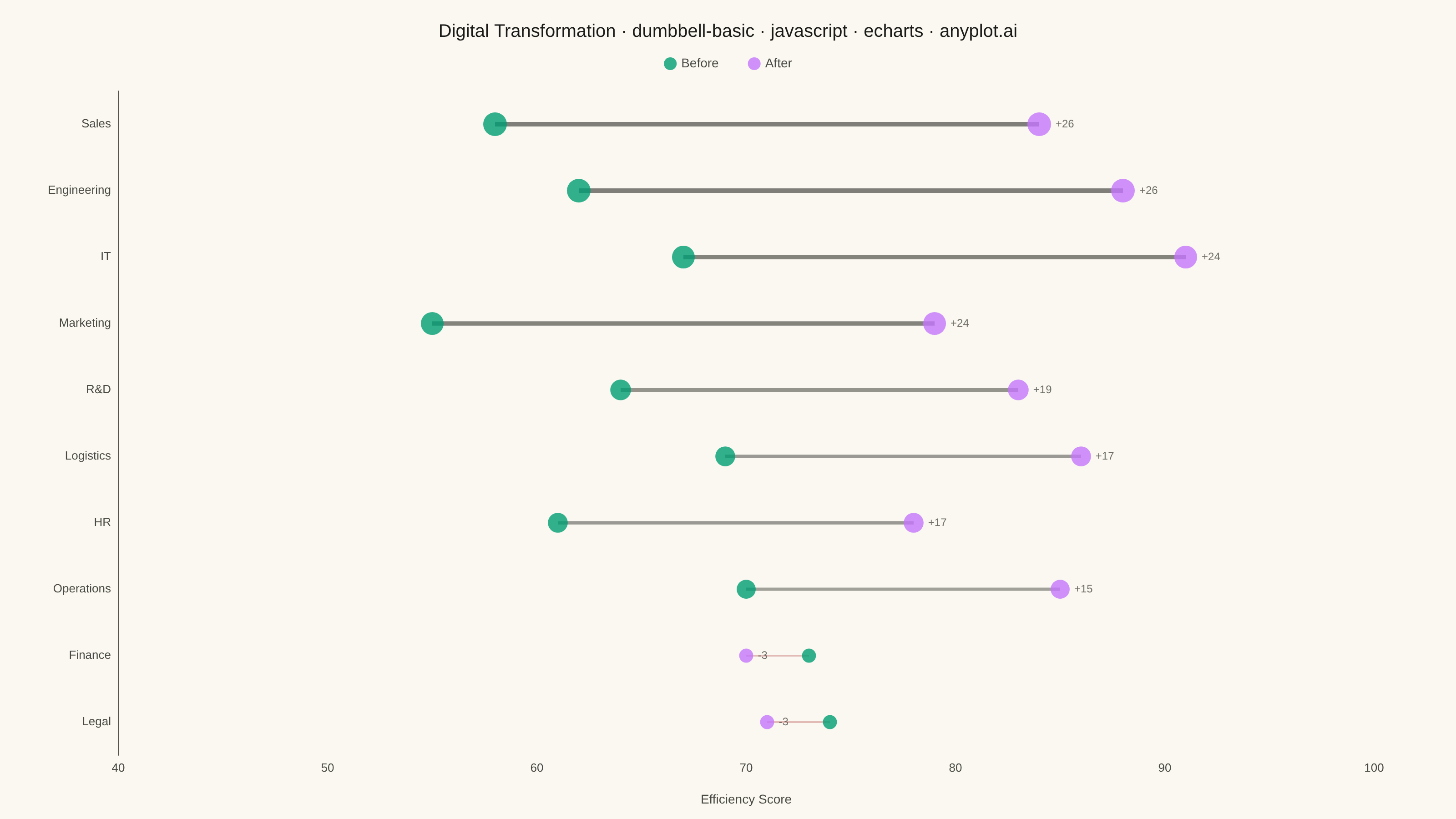
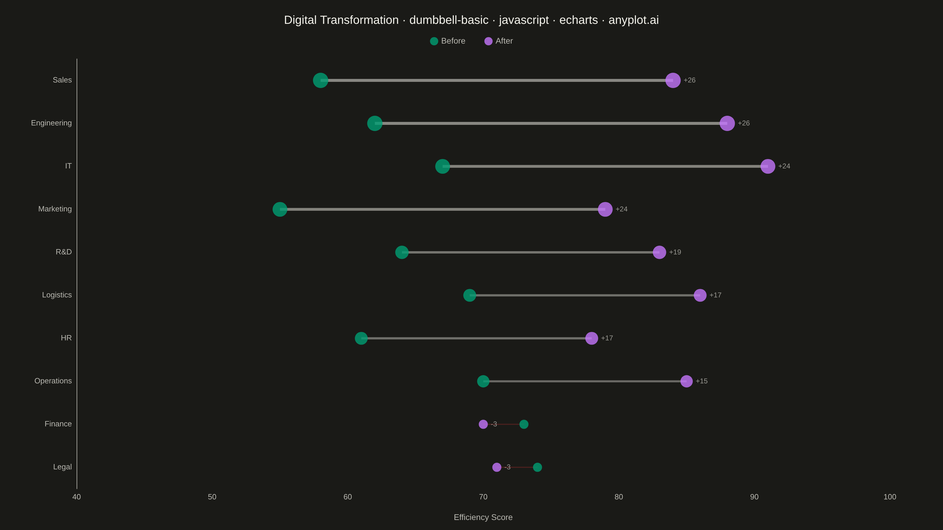
The same plot in 14 other libraries — JavaScript: Chart.js, D3.js, Highcharts, MUI X Charts; Python: Altair, Bokeh, lets-plot, Matplotlib, Plotly, plotnine, Pygal, Seaborn; R: ggplot2; Julia: Makie.jl. Compare all 15 side by side: Basic Dumbbell Chart in Python, R, Julia and JavaScript.
A dumbbell chart (also called a connected dot plot or Cleveland dot plot) compares two values for each category by displaying two dots connected by a line. It effectively visualizes differences, changes, or ranges between two data points such as before/after comparisons, gaps, or min/max values. The connected dots make it easy to see both the magnitude and direction of change.
// anyplot.ai
// dumbbell-basic: Basic Dumbbell Chart
// Library: echarts 5.5.1 | JavaScript 22.23.0
// Quality: 93/100 | Created: 2026-06-30
//# anyplot-orientation: landscape

const tokens = window.ANYPLOT_TOKENS;

// Department efficiency scores (0–100) before/after digital transformation
// Legal and Finance show slight decline; remaining departments all improved
// Sorted ascending by delta so largest gain appears at top (Y-axis bottom→top)
const departments = [
  "Legal", "Finance", "Operations", "HR",
  "Logistics", "R&D", "Marketing", "IT", "Engineering", "Sales"
];
const scoreBefore = [74, 73, 70, 61, 69, 64, 55, 67, 62, 58];
const scoreAfter  = [71, 70, 85, 78, 86, 83, 79, 91, 88, 84];

const deltas = departments.map(function(_, i) { return scoreAfter[i] - scoreBefore[i]; });
const maxAbsDelta = Math.max.apply(null, deltas.map(Math.abs));

const chart = echarts.init(document.getElementById("container"));

const titleText =
  "Digital Transformation · dumbbell-basic · javascript · echarts · anyplot.ai";
const titleFontSize = Math.round(22 * Math.min(1, 67 / titleText.length));

chart.setOption({
  animation: false,
  color: tokens.palette,
  backgroundColor: "transparent",
  title: {
    text: titleText,
    left: "center",
    top: 20,
    textStyle: { color: tokens.ink, fontSize: titleFontSize, fontWeight: "500" }
  },
  legend: {
    data: [
      { name: "Before", icon: "circle", itemStyle: { color: tokens.palette[0] } },
      { name: "After",  icon: "circle", itemStyle: { color: tokens.palette[1] } }
    ],
    top: 58,
    left: "center",
    itemGap: 32,
    itemWidth: 14,
    itemHeight: 14,
    textStyle: { color: tokens.inkSoft, fontSize: 14 }
  },
  tooltip: {
    trigger: "item",
    backgroundColor: tokens.elevatedBg,
    borderColor: tokens.grid,
    textStyle: { color: tokens.ink, fontSize: 13 },
    formatter: function(params) {
      if (params.seriesType !== "scatter") return "";
      var idx = params.dataIndex;
      var delta = deltas[idx];
      var sign = delta >= 0 ? "+" : "";
      return (
        "<b>" + departments[idx] + "</b><br/>" +
        "Before: " + scoreBefore[idx] + "<br/>" +
        "After: "  + scoreAfter[idx]  + "<br/>" +
        "Change: " + sign + delta
      );
    }
  },
  grid: { left: 130, right: 90, top: 100, bottom: 70 },
  xAxis: {
    type: "value",
    min: 40,
    max: 100,
    name: "Efficiency Score",
    nameLocation: "middle",
    nameGap: 42,
    nameTextStyle: { color: tokens.inkSoft, fontSize: 14 },
    axisLabel: { color: tokens.inkSoft, fontSize: 13 },
    axisLine: { show: false },
    axisTick: { show: false },
    splitLine: { show: false }
  },
  yAxis: {
    type: "category",
    data: departments,
    axisLabel: { color: tokens.inkSoft, fontSize: 13 },
    axisLine: { lineStyle: { color: tokens.inkSoft } },
    axisTick: { show: false },
    splitLine: { show: false }
  },
  series: [
    // Connector lines: color encodes direction (inkSoft=gain / matte-red=decline),
    // lineWidth and opacity scale with |delta| to visually rank the magnitude of change
    {
      type: "custom",
      name: "_connector",
      renderItem: function(params, api) {
        var delta = deltas[params.dataIndex];
        var frac = Math.abs(delta) / maxAbsDelta;
        var lineWidth = 1.5 + 3.5 * frac;
        var opacity   = 0.25 + 0.45 * frac;
        var color = delta >= 0 ? tokens.inkSoft : "#AE3030";
        var s = api.coord([api.value(0), params.dataIndex]);
        var e = api.coord([api.value(1), params.dataIndex]);
        return {
          type: "line",
          shape: { x1: s[0], y1: s[1], x2: e[0], y2: e[1] },
          style: { stroke: color, lineWidth: lineWidth, opacity: opacity }
        };
      },
      data: departments.map(function(_, i) { return [scoreBefore[i], scoreAfter[i]]; }),
      encode: { x: [0, 1] },
      z: 1,
      silent: true
    },
    // "Before" endpoints — Imprint palette[0] (brand green)
    // Dot size scales with |delta| to emphasize departments with larger changes
    {
      type: "scatter",
      name: "Before",
      data: departments.map(function(d, i) {
        return [scoreBefore[i], d, Math.abs(deltas[i])];
      }),
      encode: { x: 0, y: 1 },
      symbolSize: function(data) { return 14 + 12 * (data[2] / maxAbsDelta); },
      itemStyle: { color: tokens.palette[0] },
      z: 2
    },
    // "After" endpoints — Imprint palette[1] (lavender)
    // Delta labels displayed to the right of each After dot for instant readability
    {
      type: "scatter",
      name: "After",
      data: departments.map(function(d, i) {
        return [scoreAfter[i], d, Math.abs(deltas[i])];
      }),
      encode: { x: 0, y: 1 },
      symbolSize: function(data) { return 14 + 12 * (data[2] / maxAbsDelta); },
      itemStyle: { color: tokens.palette[1] },
      label: {
        show: true,
        position: "right",
        formatter: function(params) {
          var delta = deltas[params.dataIndex];
          return (delta >= 0 ? "+" : "") + delta;
        },
        color: tokens.inkSoft,
        fontSize: 12
      },
      z: 2
    }
  ]
});
Runnable source as JSON, for any HTTP client: https://api.anyplot.ai/specs/dumbbell-basic/echarts/code. Any spec id and library id listed in llms-full.txt fit the same URL shape; every URL below is complete and callable.
{
  "spec_id": "dumbbell-basic",
  "language": "javascript",
  "library": "echarts",
  "page": "https://anyplot.ai/dumbbell-basic/javascript/echarts",
  "hub": "https://anyplot.ai/dumbbell-basic",
  "code_json": "https://api.anyplot.ai/specs/dumbbell-basic/echarts/code",
  "spec_json": "https://api.anyplot.ai/specs/dumbbell-basic",
  "render_light_png": "https://storage.googleapis.com/anyplot-images/plots/dumbbell-basic/javascript/echarts/plot-light.png",
  "render_dark_png": "https://storage.googleapis.com/anyplot-images/plots/dumbbell-basic/javascript/echarts/plot-dark.png",
  "interactive_light_html": "https://storage.googleapis.com/anyplot-images/plots/dumbbell-basic/javascript/echarts/plot-light.html",
  "interactive_dark_html": "https://storage.googleapis.com/anyplot-images/plots/dumbbell-basic/javascript/echarts/plot-dark.html",
  "quality_score": 93.0,
  "license": "MIT",
  "guide": "https://anyplot.ai/llms.txt"
}
Part of Basic Dumbbell Chart on anyplot.ai.