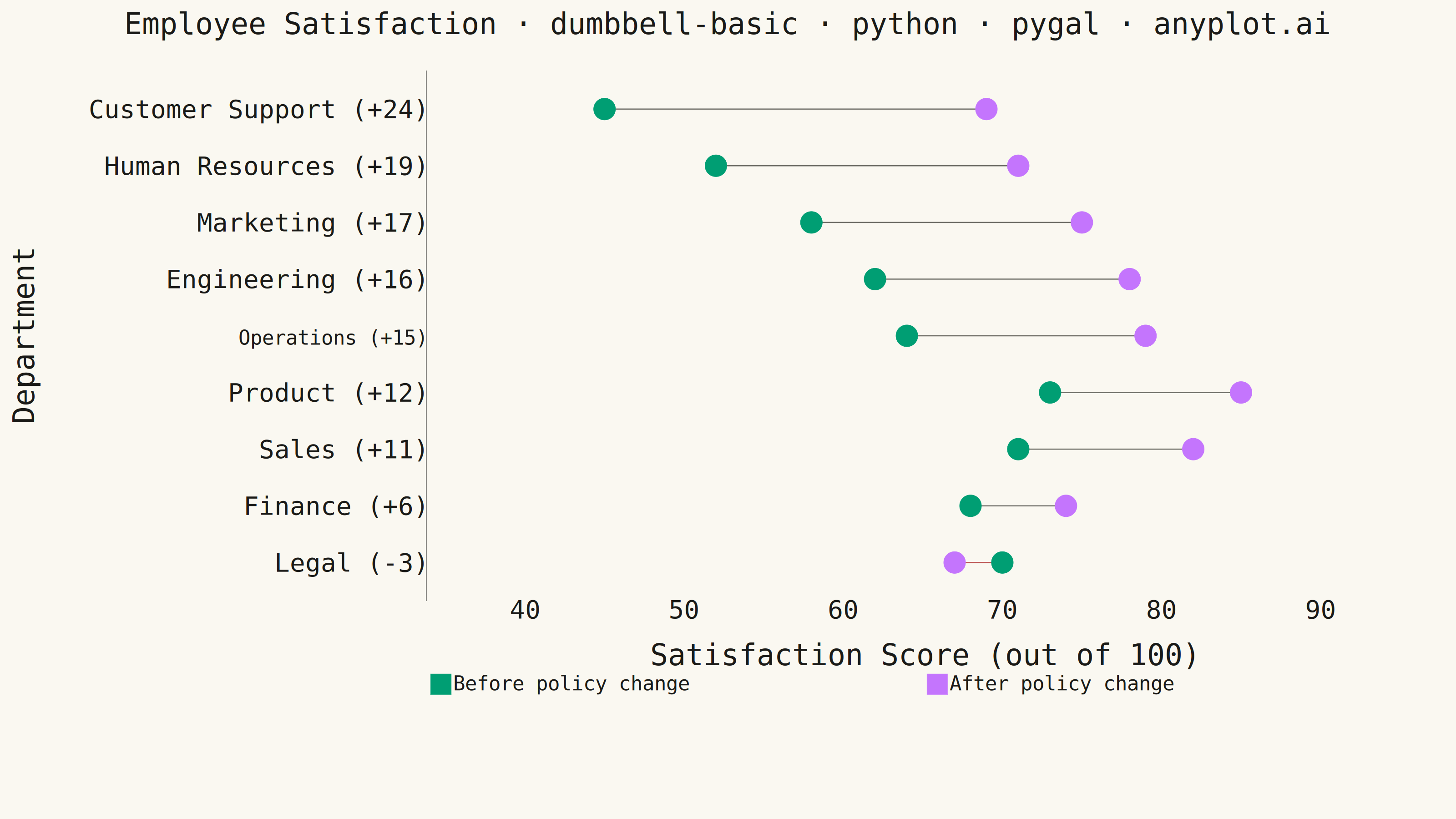
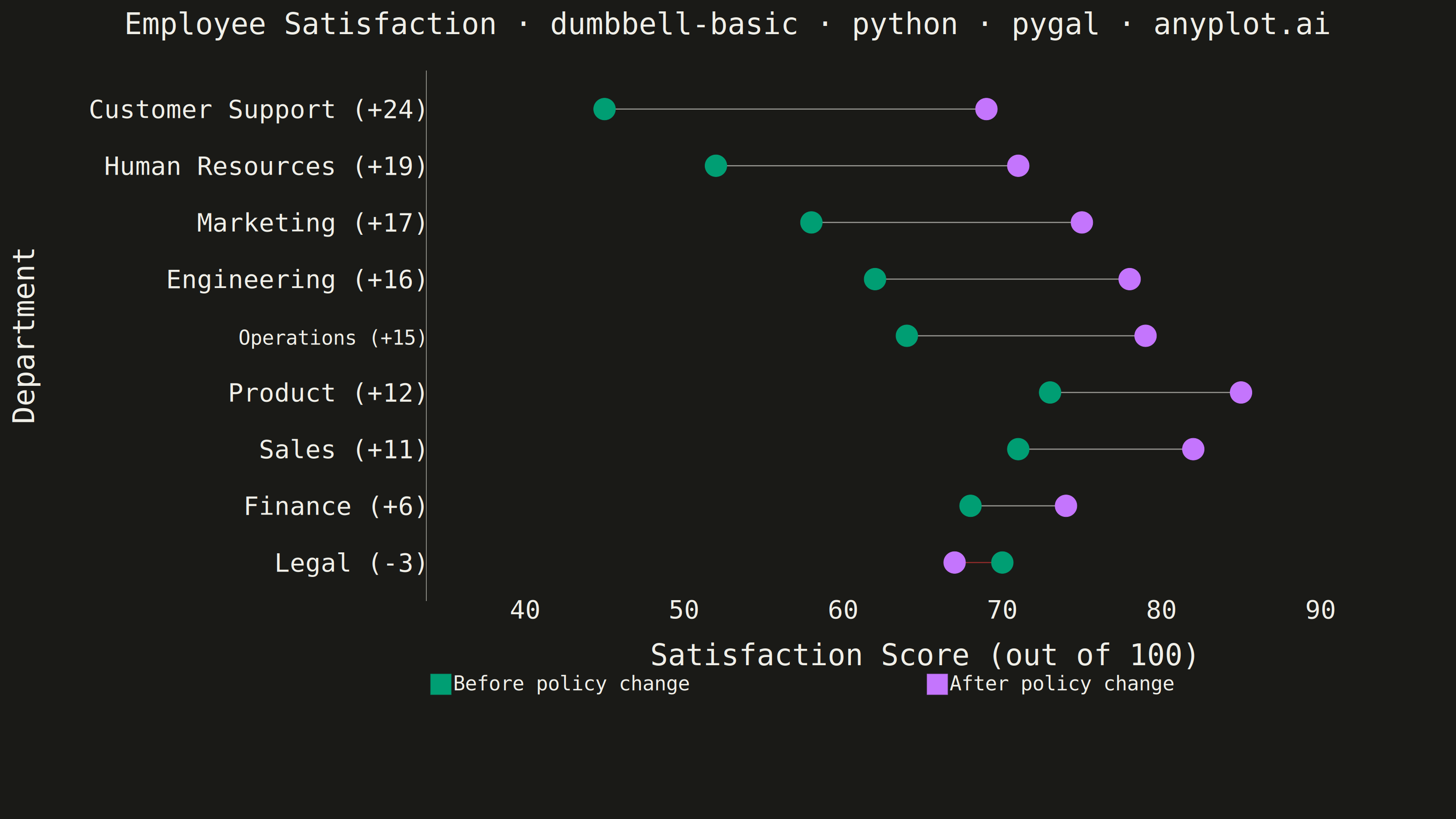
A dumbbell chart (also called a connected dot plot or Cleveland dot plot) compares two values for each category by displaying two dots connected by a line. It effectively visualizes differences, changes, or ranges between two data points such as before/after comparisons, gaps, or min/max values. The connected dots make it easy to see both the magnitude and direction of change.
""" anyplot.ai
dumbbell-basic: Basic Dumbbell Chart
Library: pygal 3.1.3 | Python 3.13.14
Quality: 88/100 | Updated: 2026-06-30
"""

import os
import sys
from pathlib import Path


# Remove script dir from sys.path to avoid name collision with the pygal package
_script_dir = str(Path(__file__).parent)
sys.path = [p for p in sys.path if p != _script_dir]

import pygal
from pygal.style import Style


# Theme tokens
THEME = os.getenv("ANYPLOT_THEME", "light")
PAGE_BG = "#FAF8F1" if THEME == "light" else "#1A1A17"
INK = "#1A1A17" if THEME == "light" else "#F0EFE8"
INK_SOFT = "#4A4A44" if THEME == "light" else "#B8B7B0"
INK_MUTED = "#6B6A63" if THEME == "light" else "#A8A79F"

# Imprint categorical palette — positions 1 and 2 for two-series dumbbell
BEFORE = "#009E73"  # Imprint position 1 — brand green, always first series
AFTER = "#C475FD"  # Imprint position 2 — lavender
CONNECTOR = INK_SOFT  # theme-adaptive neutral connector line
LOSS_COLOR = "#AE3030"  # Imprint matte red — semantic anchor for regression/bad outcomes

# Data — employee satisfaction scores before and after new workplace policy
categories = [
    "Engineering",
    "Sales",
    "Marketing",
    "Customer Support",
    "Finance",
    "Human Resources",
    "Operations",
    "Product",
    "Legal",
]
before = [62, 71, 58, 45, 68, 52, 64, 73, 70]
after = [78, 82, 75, 69, 74, 71, 79, 85, 67]

# Sort by improvement (largest gain at top; Legal regression ends up at bottom)
data = sorted(zip(categories, before, after, strict=True), key=lambda x: x[2] - x[1], reverse=True)
categories = [d[0] for d in data]
before = [d[1] for d in data]
after = [d[2] for d in data]
n = len(categories)

# Top row = biggest improvement; y=n at top, y=1 at bottom
y_positions = list(range(n, 0, -1))

# Category labels include delta for at-a-glance storytelling (e.g. "Customer Support (+24)")
y_labels = [
    {"label": f"{cat}  ({a - b:+d})", "value": pos}
    for cat, b, a, pos in zip(categories, before, after, y_positions, strict=True)
]

# Title — include language token; scale font size for title length
title = "Employee Satisfaction · dumbbell-basic · python · pygal · anyplot.ai"
n_chars = len(title)  # 70 chars
ratio = 67 / n_chars if n_chars > 67 else 1.0
title_font_size = max(44, round(66 * ratio))  # ≈ 63

# Color sequence: neutral connectors (red for negative deltas), then dot colors
connector_colors = tuple(LOSS_COLOR if a < b else CONNECTOR for b, a in zip(before, after, strict=True))
colors_tuple = connector_colors + (BEFORE, AFTER)

custom_style = Style(
    background=PAGE_BG,
    plot_background=PAGE_BG,
    foreground=INK,
    foreground_strong=INK,
    foreground_subtle=INK_MUTED,
    colors=colors_tuple,
    title_font_size=title_font_size,
    label_font_size=56,
    major_label_font_size=44,
    legend_font_size=44,
    value_font_size=36,
    stroke_width=2.5,
    opacity=1.0,
    opacity_hover=0.85,
)

chart = pygal.XY(
    width=3200,
    height=1800,
    style=custom_style,
    title=title,
    x_title="Satisfaction Score (out of 100)",
    y_title="Department",
    show_legend=True,
    legend_at_bottom=True,
    legend_at_bottom_columns=2,
    legend_box_size=44,
    margin=80,
    margin_bottom=20,
    show_x_guides=False,
    show_y_guides=False,
    xrange=(35, 95),
    range=(0.5, n + 0.5),
    y_labels=y_labels,
    truncate_legend=-1,
    truncate_label=-1,
    stroke=False,
)

# Connector lines drawn first so they sit underneath the dots
for b, a, pos in zip(before, after, y_positions, strict=True):
    chart.add(None, [(b, pos), (a, pos)], stroke=True, show_dots=False, stroke_style={"width": 5, "linecap": "round"})

# Before dots — Imprint brand green (position 1)
before_points = [
    {"value": (b, pos), "label": f"{cat}: {b}"} for cat, b, pos in zip(categories, before, y_positions, strict=True)
]
chart.add("Before policy change", before_points, stroke=False, dots_size=24)

# After dots — Imprint lavender (position 2)
after_points = [
    {"value": (a, pos), "label": f"{cat}: {a}"} for cat, a, pos in zip(categories, after, y_positions, strict=True)
]
chart.add("After policy change", after_points, stroke=False, dots_size=24)

# Save PNG and interactive HTML
chart.render_to_png(f"plot-{THEME}.png")
with open(f"plot-{THEME}.html", "wb") as f:
    f.write(chart.render())
Runnable source as JSON, for any HTTP client: https://api.anyplot.ai/specs/dumbbell-basic/pygal/code. Any spec id and library id listed in llms-full.txt fit the same URL shape; every URL below is complete and callable.
{
  "spec_id": "dumbbell-basic",
  "language": "python",
  "library": "pygal",
  "page": "https://anyplot.ai/dumbbell-basic/python/pygal",
  "hub": "https://anyplot.ai/dumbbell-basic",
  "code_json": "https://api.anyplot.ai/specs/dumbbell-basic/pygal/code",
  "spec_json": "https://api.anyplot.ai/specs/dumbbell-basic",
  "render_light_png": "https://storage.googleapis.com/anyplot-images/plots/dumbbell-basic/python/pygal/plot-light.png",
  "render_dark_png": "https://storage.googleapis.com/anyplot-images/plots/dumbbell-basic/python/pygal/plot-dark.png",
  "interactive_light_html": "https://storage.googleapis.com/anyplot-images/plots/dumbbell-basic/python/pygal/plot-light.html",
  "interactive_dark_html": "https://storage.googleapis.com/anyplot-images/plots/dumbbell-basic/python/pygal/plot-dark.html",
  "quality_score": 88.0,
  "license": "MIT",
  "guide": "https://anyplot.ai/llms.txt"
}
Part of Basic Dumbbell Chart on anyplot.ai.