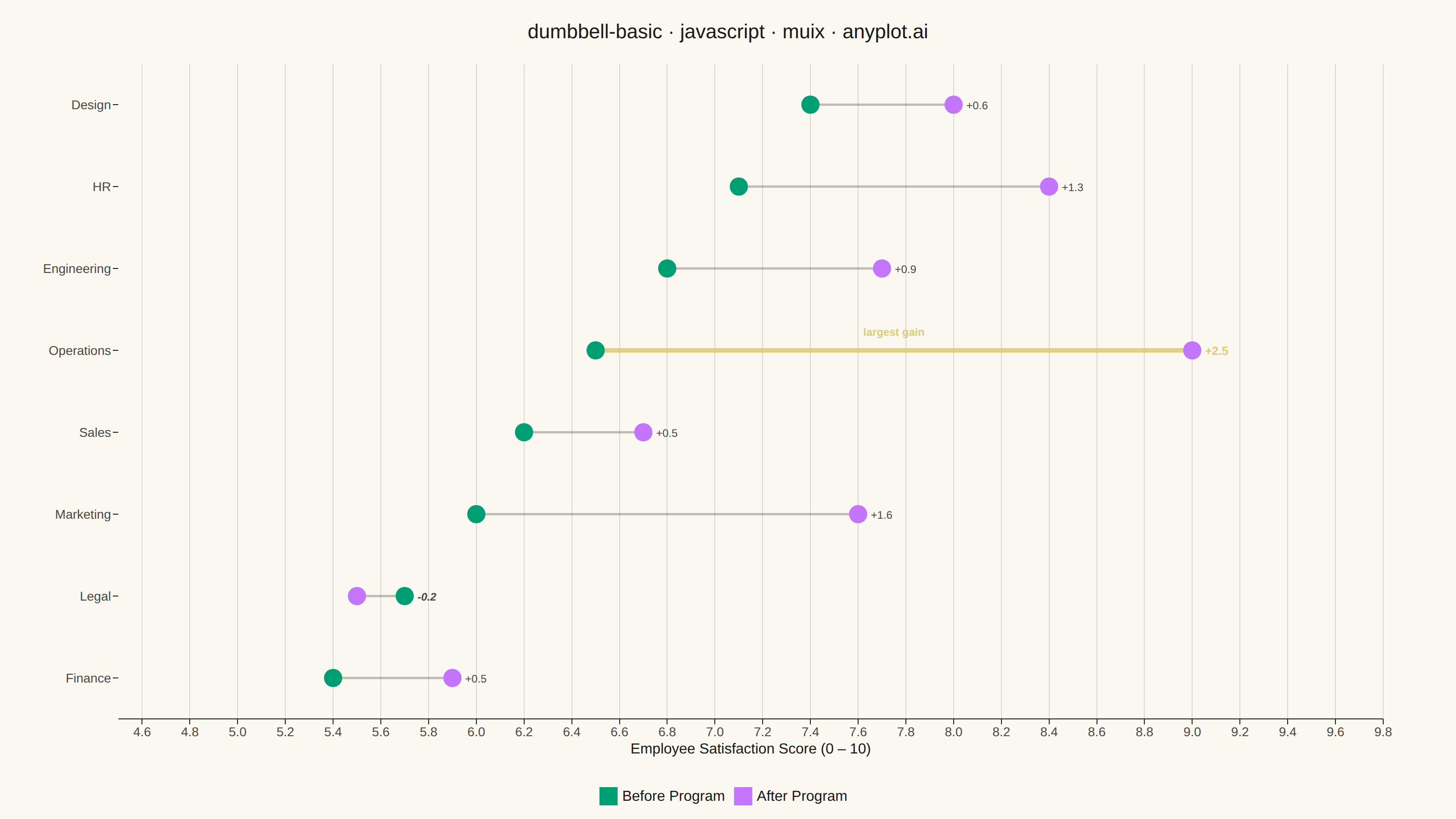
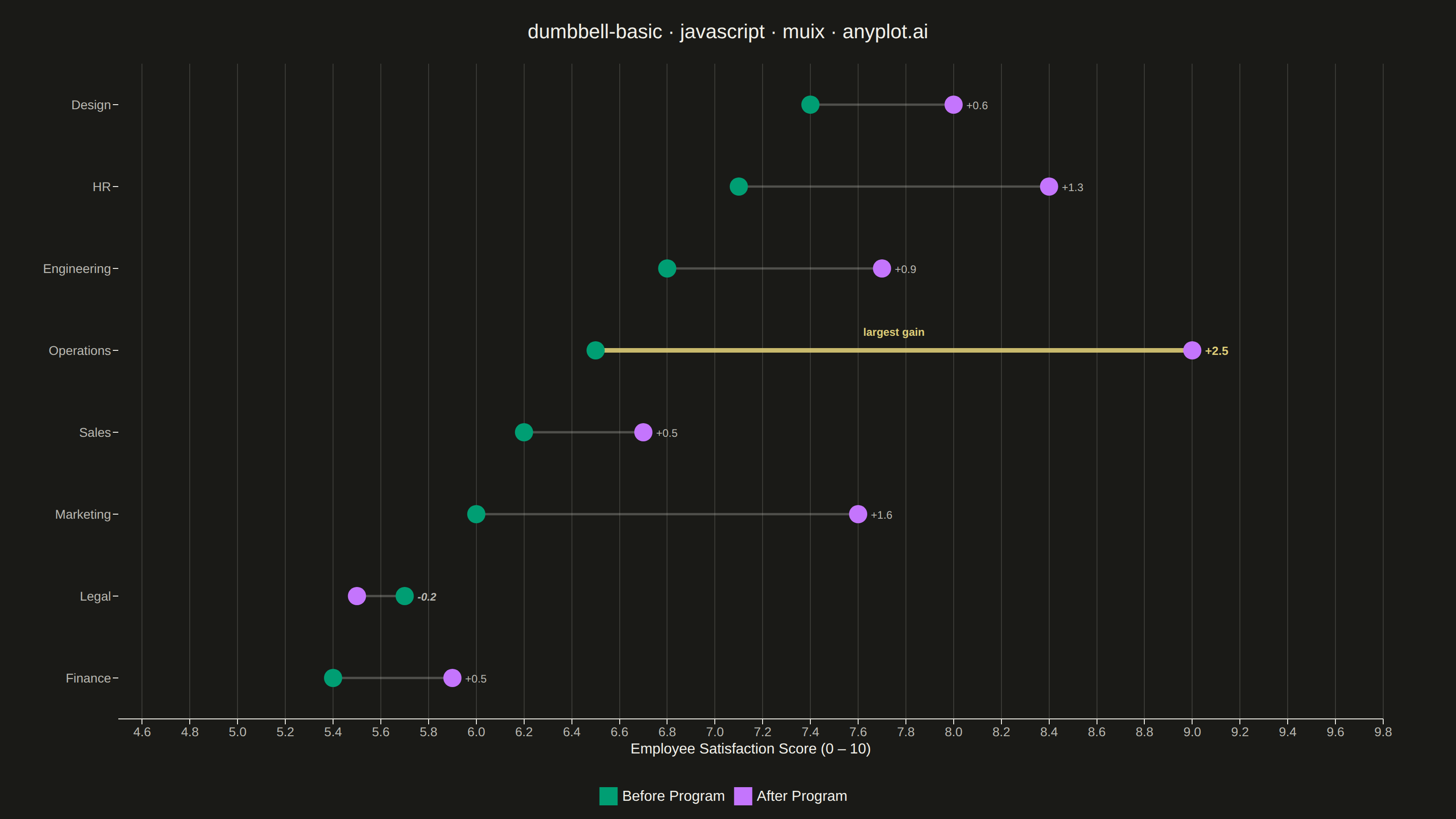
The same plot in 14 other libraries — JavaScript: Chart.js, D3.js, Apache ECharts, Highcharts; Python: Altair, Bokeh, lets-plot, Matplotlib, Plotly, plotnine, Pygal, Seaborn; R: ggplot2; Julia: Makie.jl. Compare all 15 side by side: Basic Dumbbell Chart in Python, R, Julia and JavaScript.
A dumbbell chart (also called a connected dot plot or Cleveland dot plot) compares two values for each category by displaying two dots connected by a line. It effectively visualizes differences, changes, or ranges between two data points such as before/after comparisons, gaps, or min/max values. The connected dots make it easy to see both the magnitude and direction of change.
// anyplot.ai
// dumbbell-basic: Basic Dumbbell Chart
// Library: muix 7.29.1 | JavaScript 22.23.0
// Quality: 89/100 | Created: 2026-06-30
//# anyplot-orientation: landscape
// anyplot.ai
// dumbbell-basic: Basic Dumbbell Chart
// Library: MUI X Charts | React | Node 22
// License: @mui/x-charts — MIT (community). Pro/Premium are out of scope.
// Quality: pending | Created: 2026-06-30

import { ChartContainer } from "@mui/x-charts/ChartContainer";
import { ChartsXAxis } from "@mui/x-charts/ChartsXAxis";
import { ChartsYAxis } from "@mui/x-charts/ChartsYAxis";
import { ChartsGrid } from "@mui/x-charts/ChartsGrid";
import { ChartsLegend } from "@mui/x-charts/ChartsLegend";
import { ScatterPlot } from "@mui/x-charts/ScatterChart";
import { useXScale, useYScale } from "@mui/x-charts/hooks";

const t = window.ANYPLOT_TOKENS;

// Employee satisfaction (0–10) before/after a wellness program.
// Includes a wide range of outcomes — one regression, one standout gain.
const RAW = [
  { dept: "Finance",     before: 5.4, after: 5.9 },  // +0.5 modest gain
  { dept: "Legal",       before: 5.7, after: 5.5 },  // -0.2 regression
  { dept: "Marketing",   before: 6.0, after: 7.6 },  // +1.6
  { dept: "Sales",       before: 6.2, after: 6.7 },  // +0.5
  { dept: "Operations",  before: 6.5, after: 9.0 },  // +2.5 ← largest gain
  { dept: "Engineering", before: 6.8, after: 7.7 },  // +0.9
  { dept: "HR",          before: 7.1, after: 8.4 },  // +1.3
  { dept: "Design",      before: 7.4, after: 8.0 },  // +0.6
];

// Sort ascending by before-score to reveal baseline-vs-gain pattern
const DATA = [...RAW].sort((a, b) => a.before - b.before);

const departments  = DATA.map(d => d.dept);
const beforeScores = DATA.map(d => d.before);
const afterScores  = DATA.map(d => d.after);
const gaps         = DATA.map(d => +(d.after - d.before).toFixed(1));
const N            = DATA.length;

// Index of the department with the largest gain (focal point)
const maxGapIdx = gaps.indexOf(Math.max(...gaps));

const beforeData = beforeScores.map((x, i) => ({ id: i,       x, y: i }));
const afterData  = afterScores.map( (x, i) => ({ id: i + 100, x, y: i }));

// Rendered inside ChartContainer so it can access the D3 coordinate scales.
// Placed before <ScatterPlot /> so lines sit below the dots.
function DumbbellOverlay() {
  const xScale = useXScale();
  const yScale = useYScale();

  return (
    <g>
      {/* Connecting lines — highlight the biggest-gain row with amber */}
      {DATA.map((d, i) => {
        const x1 = xScale(d.before) ?? 0;
        const x2 = xScale(d.after)  ?? 0;
        const y  = yScale(i) ?? 0;
        const isHighlight = i === maxGapIdx;
        return (
          <line
            key={i}
            x1={x1} y1={y}
            x2={x2} y2={y}
            stroke={isHighlight ? t.amber : t.inkSoft}
            strokeWidth={isHighlight ? 5 : 2.5}
            strokeOpacity={isHighlight ? 0.9 : 0.35}
          />
        );
      })}

      {/* Gap labels — showing change magnitude to the right of each dumbbell */}
      {DATA.map((d, i) => {
        const rightX = Math.max(xScale(d.before) ?? 0, xScale(d.after) ?? 0);
        const y      = yScale(i) ?? 0;
        const g      = gaps[i];
        const isHighlight  = i === maxGapIdx;
        const isRegression = g < 0;
        const label = g > 0 ? `+${g.toFixed(1)}` : g.toFixed(1);
        return (
          <text
            key={`gap-${i}`}
            x={rightX + 14}
            y={y + 5}
            fontSize={isHighlight ? 13 : 12}
            fill={isHighlight ? t.amber : t.inkSoft}
            fontFamily="sans-serif"
            fontWeight={isHighlight ? "700" : isRegression ? "600" : "400"}
            fontStyle={isRegression ? "italic" : "normal"}
          >
            {label}
          </text>
        );
      })}

      {/* Callout annotation for the focal-point row */}
      {(() => {
        const i  = maxGapIdx;
        const x1 = xScale(beforeScores[i]) ?? 0;
        const x2 = xScale(afterScores[i])  ?? 0;
        const y  = yScale(i) ?? 0;
        const xMid = (x1 + x2) / 2;
        return (
          <text
            x={xMid}
            y={y - 16}
            textAnchor="middle"
            fontSize={12}
            fill={t.amber}
            fontFamily="sans-serif"
            fontWeight="600"
          >
            largest gain
          </text>
        );
      })()}
    </g>
  );
}

const TITLE = "dumbbell-basic · javascript · muix · anyplot.ai";

export default function Chart() {
  const W = window.ANYPLOT_SIZE.width;
  const H = window.ANYPLOT_SIZE.height;

  return (
    <ChartContainer
      width={W}
      height={H}
      skipAnimation
      series={[
        {
          type: "scatter",
          id: "before",
          label: "Before Program",
          data: beforeData,
          color: t.palette[0],
          markerSize: 10,
        },
        {
          type: "scatter",
          id: "after",
          label: "After Program",
          data: afterData,
          color: t.palette[1],
          markerSize: 10,
        },
      ]}
      xAxis={[{
        id: "xAxis",
        min: 4.5,
        max: 9.8,
        label: "Employee Satisfaction Score (0 – 10)",
        tickLabelStyle: { fontSize: 14, fill: t.inkSoft },
        labelStyle: { fontSize: 16, fill: t.ink },
      }]}
      yAxis={[{
        id: "yAxis",
        min: -0.5,
        max: N - 0.5,
        tickMinStep: 1,
        valueFormatter: (v) => departments[Math.round(v)] ?? "",
        tickLabelStyle: { fontSize: 14, fill: t.inkSoft },
      }]}
      margin={{ left: 130, right: 80, top: 70, bottom: 110 }}
    >
      <ChartsGrid vertical />
      <DumbbellOverlay />
      <ScatterPlot />
      <ChartsXAxis axisId="xAxis" />
      {/* disableLine removes the left spine for a cleaner open-chart look */}
      <ChartsYAxis axisId="yAxis" disableLine />
      <ChartsLegend
        position={{ vertical: "bottom", horizontal: "middle" }}
        direction="row"
      />
      <text
        x={W / 2}
        y={42}
        textAnchor="middle"
        fontSize={22}
        fontFamily="sans-serif"
        fontWeight="500"
        fill={t.ink}
      >
        {TITLE}
      </text>
    </ChartContainer>
  );
}
Runnable source as JSON, for any HTTP client: https://api.anyplot.ai/specs/dumbbell-basic/muix/code. Any spec id and library id listed in llms-full.txt fit the same URL shape; every URL below is complete and callable.
{
  "spec_id": "dumbbell-basic",
  "language": "javascript",
  "library": "muix",
  "page": "https://anyplot.ai/dumbbell-basic/javascript/muix",
  "hub": "https://anyplot.ai/dumbbell-basic",
  "code_json": "https://api.anyplot.ai/specs/dumbbell-basic/muix/code",
  "spec_json": "https://api.anyplot.ai/specs/dumbbell-basic",
  "render_light_png": "https://storage.googleapis.com/anyplot-images/plots/dumbbell-basic/javascript/muix/plot-light.png",
  "render_dark_png": "https://storage.googleapis.com/anyplot-images/plots/dumbbell-basic/javascript/muix/plot-dark.png",
  "interactive_light_html": "https://storage.googleapis.com/anyplot-images/plots/dumbbell-basic/javascript/muix/plot-light.html",
  "interactive_dark_html": "https://storage.googleapis.com/anyplot-images/plots/dumbbell-basic/javascript/muix/plot-dark.html",
  "quality_score": 89.0,
  "license": "MIT",
  "guide": "https://anyplot.ai/llms.txt"
}
Part of Basic Dumbbell Chart on anyplot.ai.