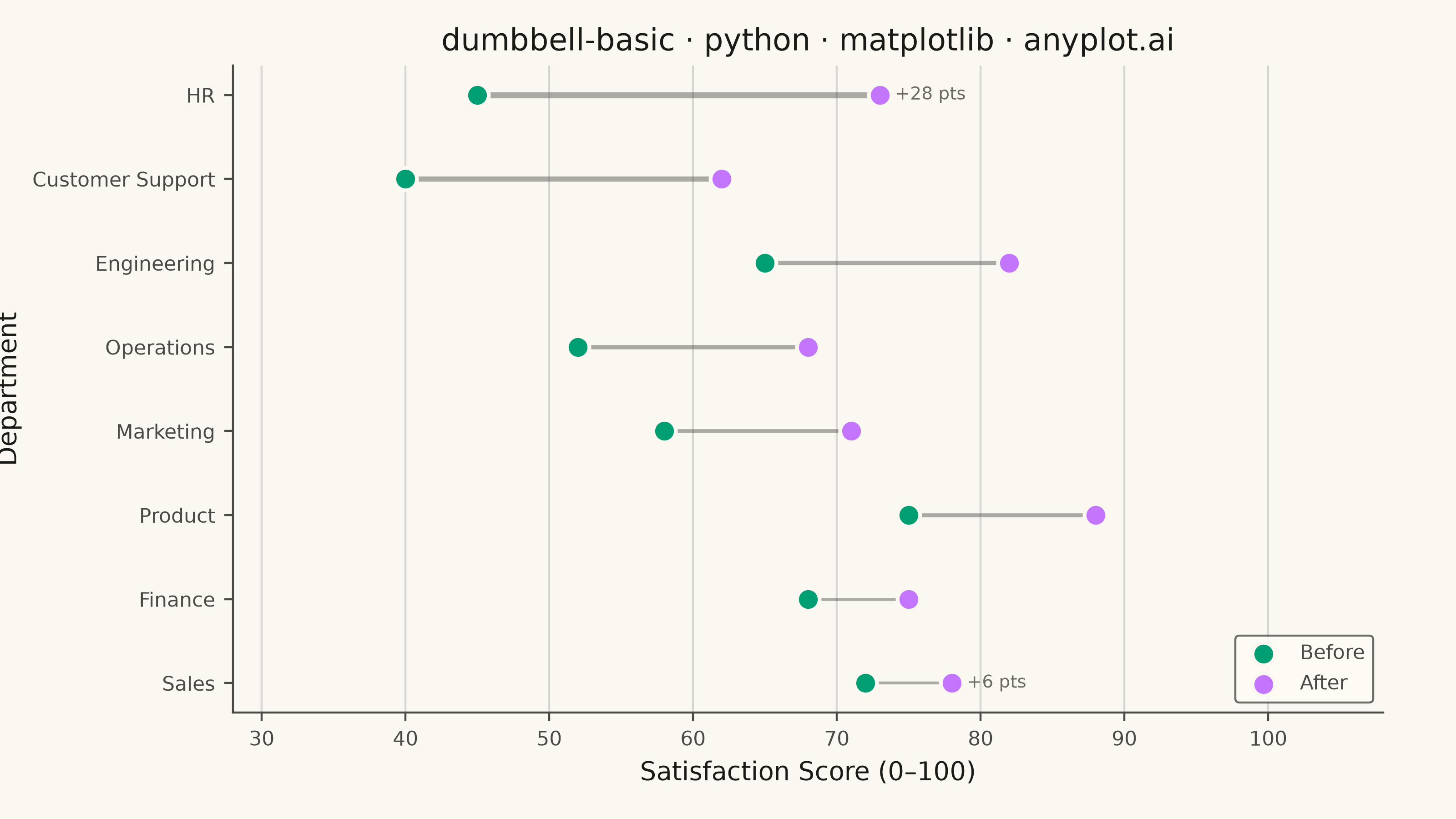
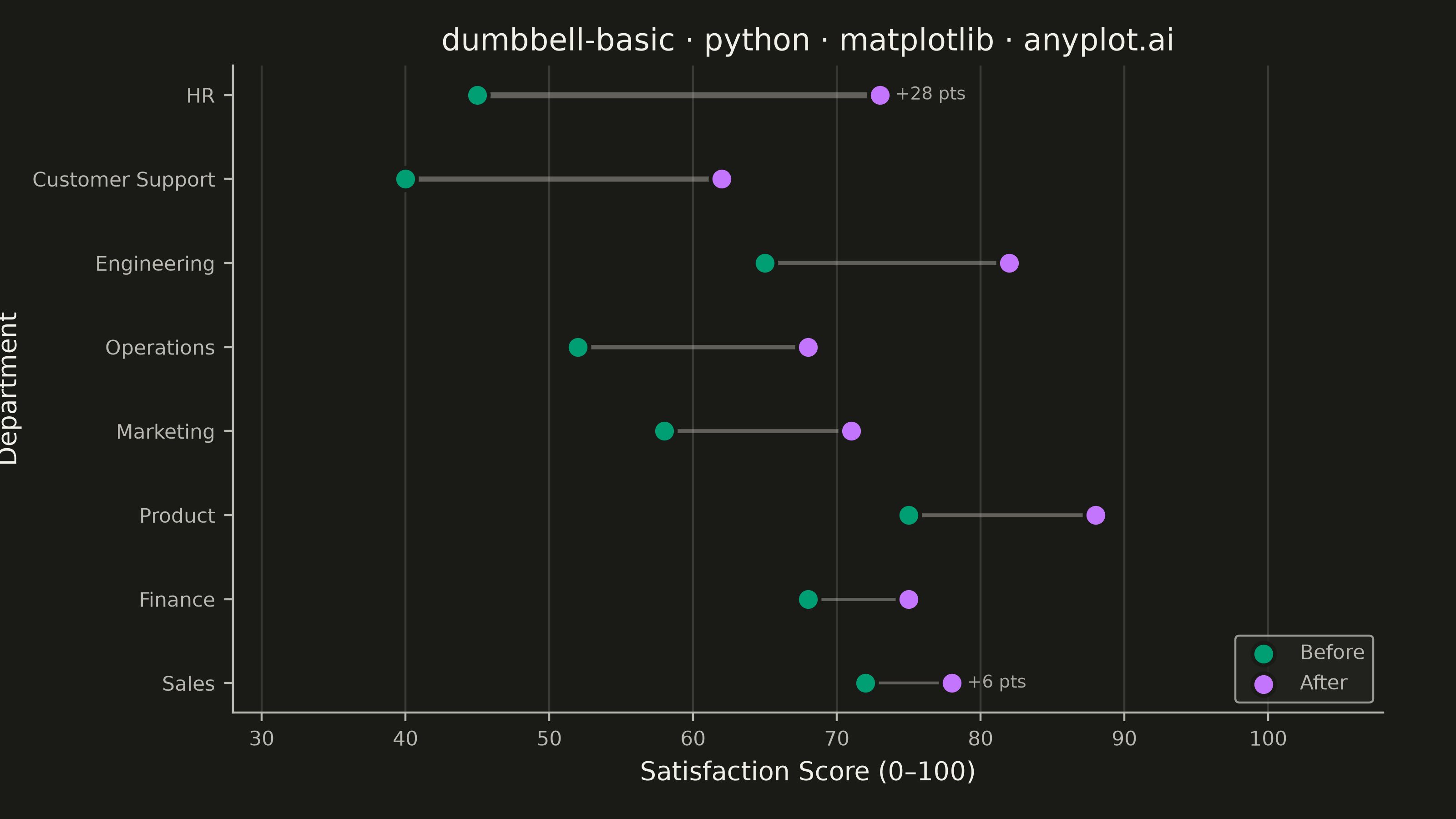
A dumbbell chart (also called a connected dot plot or Cleveland dot plot) compares two values for each category by displaying two dots connected by a line. It effectively visualizes differences, changes, or ranges between two data points such as before/after comparisons, gaps, or min/max values. The connected dots make it easy to see both the magnitude and direction of change.
""" anyplot.ai
dumbbell-basic: Basic Dumbbell Chart
Library: matplotlib 3.11.0 | Python 3.13.14
Quality: 91/100 | Created: 2026-06-30
"""

import os

import matplotlib.pyplot as plt
import numpy as np


# Theme tokens
THEME = os.getenv("ANYPLOT_THEME", "light")
PAGE_BG = "#FAF8F1" if THEME == "light" else "#1A1A17"
ELEVATED_BG = "#FFFDF6" if THEME == "light" else "#242420"
INK = "#1A1A17" if THEME == "light" else "#F0EFE8"
INK_SOFT = "#4A4A44" if THEME == "light" else "#B8B7B0"
INK_MUTED = "#6B6A63" if THEME == "light" else "#A8A79F"

# Imprint palette — positions 1 and 2
BEFORE_COLOR = "#009E73"  # Imprint position 1 — always first series
AFTER_COLOR = "#C475FD"  # Imprint position 2

# Data: Employee satisfaction scores before/after workplace policy changes
categories = ["Engineering", "Marketing", "Sales", "HR", "Finance", "Operations", "Customer Support", "Product"]
before_scores = [65, 58, 72, 45, 68, 52, 40, 75]
after_scores = [82, 71, 78, 73, 75, 68, 62, 88]

# Sort by improvement magnitude (largest at top)
diffs = [a - b for a, b in zip(after_scores, before_scores, strict=True)]
order = np.argsort(diffs)
categories = [categories[i] for i in order]
before_scores = [before_scores[i] for i in order]
after_scores = [after_scores[i] for i in order]
diffs = [diffs[i] for i in order]

# Canonical 3200 × 1800 px landscape canvas — figsize=(8,4.5), dpi=400
fig, ax = plt.subplots(figsize=(8, 4.5), dpi=400, facecolor=PAGE_BG)
ax.set_facecolor(PAGE_BG)

y = np.arange(len(categories))

# Connecting lines — width proportional to improvement magnitude for visual storytelling
max_diff = max(diffs)
for i, (b, a, d) in enumerate(zip(before_scores, after_scores, diffs, strict=True)):
    lw = 0.8 + 1.6 * d / max_diff  # scales 0.8–2.4 across the improvement range
    ax.plot([b, a], [i, i], color=INK_SOFT, linewidth=lw, alpha=0.45, zorder=1)

# Dots with Imprint palette; edgecolors=PAGE_BG for theme-adaptive halos
ax.scatter(before_scores, y, s=80, color=BEFORE_COLOR, zorder=3, edgecolors=PAGE_BG, linewidths=1.5)
ax.scatter(after_scores, y, s=80, color=AFTER_COLOR, zorder=3, edgecolors=PAGE_BG, linewidths=1.5)

# Annotate the top and bottom performers to guide the viewer
for i in (0, len(categories) - 1):
    sign = "+" if diffs[i] >= 0 else ""
    ax.annotate(
        f"{sign}{diffs[i]} pts",
        xy=(after_scores[i], i),
        xytext=(6, 0),
        textcoords="offset points",
        fontsize=7,
        color=INK_MUTED,
        va="center",
    )

# Axes
ax.set_yticks(y)
ax.set_yticklabels(categories)
ax.tick_params(axis="both", labelsize=8, colors=INK_SOFT, labelcolor=INK_SOFT)
ax.set_xlim(28, 108)

title = "dumbbell-basic · python · matplotlib · anyplot.ai"
title_fs = max(8, round(12 * 67 / len(title))) if len(title) > 67 else 12
ax.set_title(title, fontsize=title_fs, fontweight="medium", color=INK)
ax.set_xlabel("Satisfaction Score (0–100)", fontsize=10, color=INK)
ax.set_ylabel("Department", fontsize=10, color=INK)

# Spines: L-shaped (top + right removed)
ax.spines["top"].set_visible(False)
ax.spines["right"].set_visible(False)
for s in ("left", "bottom"):
    ax.spines[s].set_color(INK_SOFT)

# Subtle x-axis grid
ax.xaxis.grid(True, color=INK, alpha=0.15, linewidth=0.8)
ax.set_axisbelow(True)

# Custom legend handles via empty-data scatter — explicit matplotlib idiom
h_before = ax.scatter([], [], s=80, color=BEFORE_COLOR, edgecolors=PAGE_BG, linewidths=1.5, label="Before")
h_after = ax.scatter([], [], s=80, color=AFTER_COLOR, edgecolors=PAGE_BG, linewidths=1.5, label="After")
leg = ax.legend(handles=[h_before, h_after], fontsize=8, loc="lower right", frameon=True)
leg.get_frame().set_facecolor(ELEVATED_BG)
leg.get_frame().set_edgecolor(INK_SOFT)
leg.get_frame().set_linewidth(0.8)
plt.setp(leg.get_texts(), color=INK_SOFT)

# Explicit margins — do NOT use bbox_inches='tight' on savefig (shrinks canvas)
fig.subplots_adjust(left=0.16, right=0.95, top=0.92, bottom=0.13)
plt.savefig(f"plot-{THEME}.png", dpi=400, facecolor=PAGE_BG)
Runnable source as JSON, for any HTTP client: https://api.anyplot.ai/specs/dumbbell-basic/matplotlib/code. Any spec id and library id listed in llms-full.txt fit the same URL shape; every URL below is complete and callable.
{
  "spec_id": "dumbbell-basic",
  "language": "python",
  "library": "matplotlib",
  "page": "https://anyplot.ai/dumbbell-basic/python/matplotlib",
  "hub": "https://anyplot.ai/dumbbell-basic",
  "code_json": "https://api.anyplot.ai/specs/dumbbell-basic/matplotlib/code",
  "spec_json": "https://api.anyplot.ai/specs/dumbbell-basic",
  "render_light_png": "https://storage.googleapis.com/anyplot-images/plots/dumbbell-basic/python/matplotlib/plot-light.png",
  "render_dark_png": "https://storage.googleapis.com/anyplot-images/plots/dumbbell-basic/python/matplotlib/plot-dark.png",
  "quality_score": 91.0,
  "license": "MIT",
  "guide": "https://anyplot.ai/llms.txt"
}
Part of Basic Dumbbell Chart on anyplot.ai.