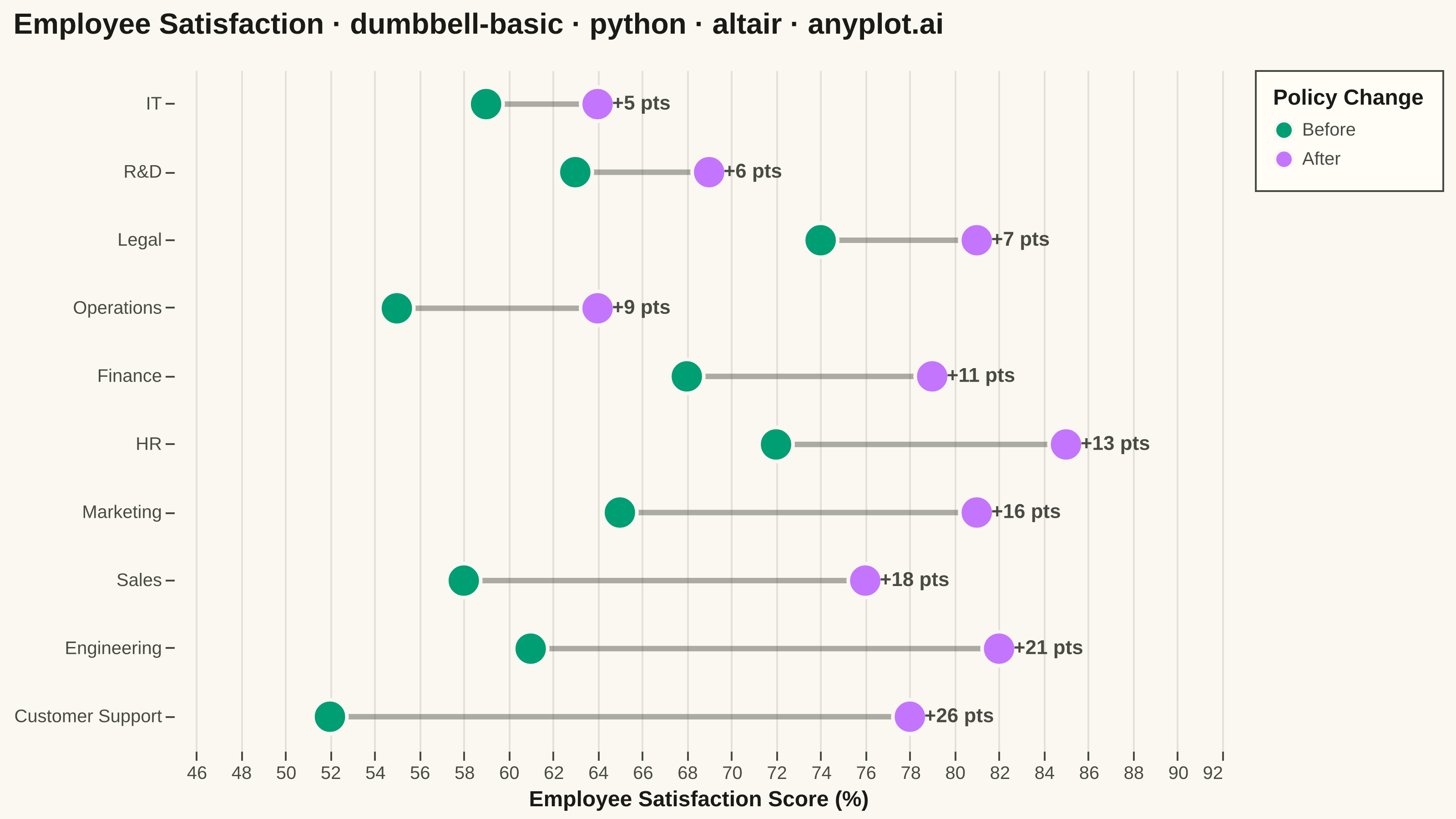
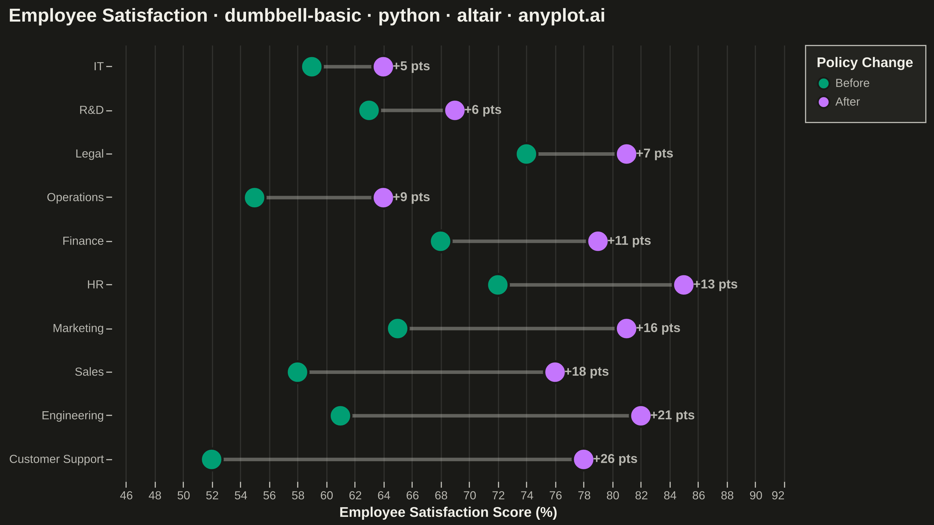
A dumbbell chart (also called a connected dot plot or Cleveland dot plot) compares two values for each category by displaying two dots connected by a line. It effectively visualizes differences, changes, or ranges between two data points such as before/after comparisons, gaps, or min/max values. The connected dots make it easy to see both the magnitude and direction of change.
""" anyplot.ai
dumbbell-basic: Basic Dumbbell Chart
Library: altair 6.2.2 | Python 3.13.14
Quality: 92/100 | Updated: 2026-06-30
"""

import os

import altair as alt
import pandas as pd
from PIL import Image


# Theme-adaptive chrome
THEME = os.getenv("ANYPLOT_THEME", "light")
PAGE_BG = "#FAF8F1" if THEME == "light" else "#1A1A17"
ELEVATED_BG = "#FFFDF6" if THEME == "light" else "#242420"
INK = "#1A1A17" if THEME == "light" else "#F0EFE8"
INK_SOFT = "#4A4A44" if THEME == "light" else "#B8B7B0"

# Imprint palette positions 1 and 2
COLOR_BEFORE = "#009E73"
COLOR_AFTER = "#C475FD"

# Data — Employee satisfaction scores before and after policy changes
data = pd.DataFrame(
    {
        "category": [
            "Customer Support",
            "Engineering",
            "Sales",
            "Marketing",
            "HR",
            "Finance",
            "Operations",
            "Legal",
            "R&D",
            "IT",
        ],
        "Before": [52, 61, 58, 65, 72, 68, 55, 74, 63, 59],
        "After": [78, 82, 76, 81, 85, 79, 64, 81, 69, 64],
    }
)
data["difference"] = data["After"] - data["Before"]
data = data.sort_values("difference", ascending=True).reset_index(drop=True)

# Long-form data for the two dot series
dots_data = pd.melt(
    data, id_vars=["category", "difference"], value_vars=["Before", "After"], var_name="period", value_name="score"
)

title = "Employee Satisfaction · dumbbell-basic · python · altair · anyplot.ai"
n = len(title)
title_fontsize = round(16 * (67 / n)) if n > 67 else 16

x_scale = alt.Scale(domain=[45, 92])
y_sort = alt.EncodingSortField(field="difference", order="ascending")

# Connecting lines (theme-adaptive subtle ink)
lines = (
    alt.Chart(data)
    .mark_rule(strokeWidth=3, color=INK_SOFT, opacity=0.45)
    .encode(y=alt.Y("category:N", sort=y_sort, title=None), x=alt.X("Before:Q", scale=x_scale), x2=alt.X2("After:Q"))
)

# Dots for Before / After values
dots = (
    alt.Chart(dots_data)
    .mark_circle(size=350, opacity=1.0, stroke=PAGE_BG, strokeWidth=2)
    .encode(
        y=alt.Y("category:N", sort=y_sort, title=None),
        x=alt.X("score:Q", scale=x_scale, title="Employee Satisfaction Score (%)"),
        color=alt.Color(
            "period:N",
            scale=alt.Scale(domain=["Before", "After"], range=[COLOR_BEFORE, COLOR_AFTER]),
            legend=alt.Legend(title="Policy Change", labelFontSize=10, titleFontSize=12),
        ),
        tooltip=["category:N", "period:N", "score:Q"],
    )
)

# Difference labels via transform_calculate — shows the gain at a glance
diff_labels = (
    alt.Chart(data)
    .transform_calculate(label="'+' + toString(datum.difference) + ' pts'")
    .mark_text(align="left", dx=8, fontSize=11, fontWeight="bold", clip=False)
    .encode(
        y=alt.Y("category:N", sort=y_sort, title=None),
        x=alt.X("After:Q", scale=x_scale),
        text=alt.Text("label:N"),
        color=alt.value(INK_SOFT),
    )
)

chart = (
    (lines + dots + diff_labels)
    .properties(
        width=576,
        height=374,
        title=alt.Title(title, fontSize=title_fontsize, color=INK, anchor="start", offset=16),
        background=PAGE_BG,
    )
    .configure_view(fill=PAGE_BG, stroke=None)
    .configure_axis(
        labelFontSize=10,
        titleFontSize=12,
        domainColor=INK_SOFT,
        domainOpacity=0,
        tickColor=INK_SOFT,
        gridColor=INK,
        gridOpacity=0.10,
        labelColor=INK_SOFT,
        titleColor=INK,
    )
    .configure_title(color=INK)
    .configure_legend(fillColor=ELEVATED_BG, strokeColor=INK_SOFT, labelColor=INK_SOFT, titleColor=INK, padding=10)
)

chart.save(f"plot-{THEME}.png", scale_factor=4.0)

# Pad to exact 3200×1800 canvas (vl-convert pads outside width/height)
TW, TH = 3200, 1800
_img = Image.open(f"plot-{THEME}.png").convert("RGB")
_w, _h = _img.size
if _w > TW or _h > TH:
    raise SystemExit(
        f"altair vl-convert produced {_w}×{_h}, exceeds target {TW}×{TH}. "
        f"Shrink chart .properties(width=, height=) values and re-render."
    )
if _w < TW or _h < TH:
    _canvas = Image.new("RGB", (TW, TH), PAGE_BG)
    _canvas.paste(_img, ((TW - _w) // 2, (TH - _h) // 2))
    _canvas.save(f"plot-{THEME}.png")

chart.save(f"plot-{THEME}.html")
Runnable source as JSON, for any HTTP client: https://api.anyplot.ai/specs/dumbbell-basic/altair/code. Any spec id and library id listed in llms-full.txt fit the same URL shape; every URL below is complete and callable.
{
  "spec_id": "dumbbell-basic",
  "language": "python",
  "library": "altair",
  "page": "https://anyplot.ai/dumbbell-basic/python/altair",
  "hub": "https://anyplot.ai/dumbbell-basic",
  "code_json": "https://api.anyplot.ai/specs/dumbbell-basic/altair/code",
  "spec_json": "https://api.anyplot.ai/specs/dumbbell-basic",
  "render_light_png": "https://storage.googleapis.com/anyplot-images/plots/dumbbell-basic/python/altair/plot-light.png",
  "render_dark_png": "https://storage.googleapis.com/anyplot-images/plots/dumbbell-basic/python/altair/plot-dark.png",
  "interactive_light_html": "https://storage.googleapis.com/anyplot-images/plots/dumbbell-basic/python/altair/plot-light.html",
  "interactive_dark_html": "https://storage.googleapis.com/anyplot-images/plots/dumbbell-basic/python/altair/plot-dark.html",
  "quality_score": 92.0,
  "license": "MIT",
  "guide": "https://anyplot.ai/llms.txt"
}
Part of Basic Dumbbell Chart on anyplot.ai.