The same plot in 14 other libraries — JavaScript: Chart.js, D3.js, Apache ECharts, MUI X Charts; Python: Altair, Bokeh, lets-plot, Matplotlib, Plotly, plotnine, Pygal, Seaborn; R: ggplot2; Julia: Makie.jl. Compare all 15 side by side: Basic Dumbbell Chart in Python, R, Julia and JavaScript.
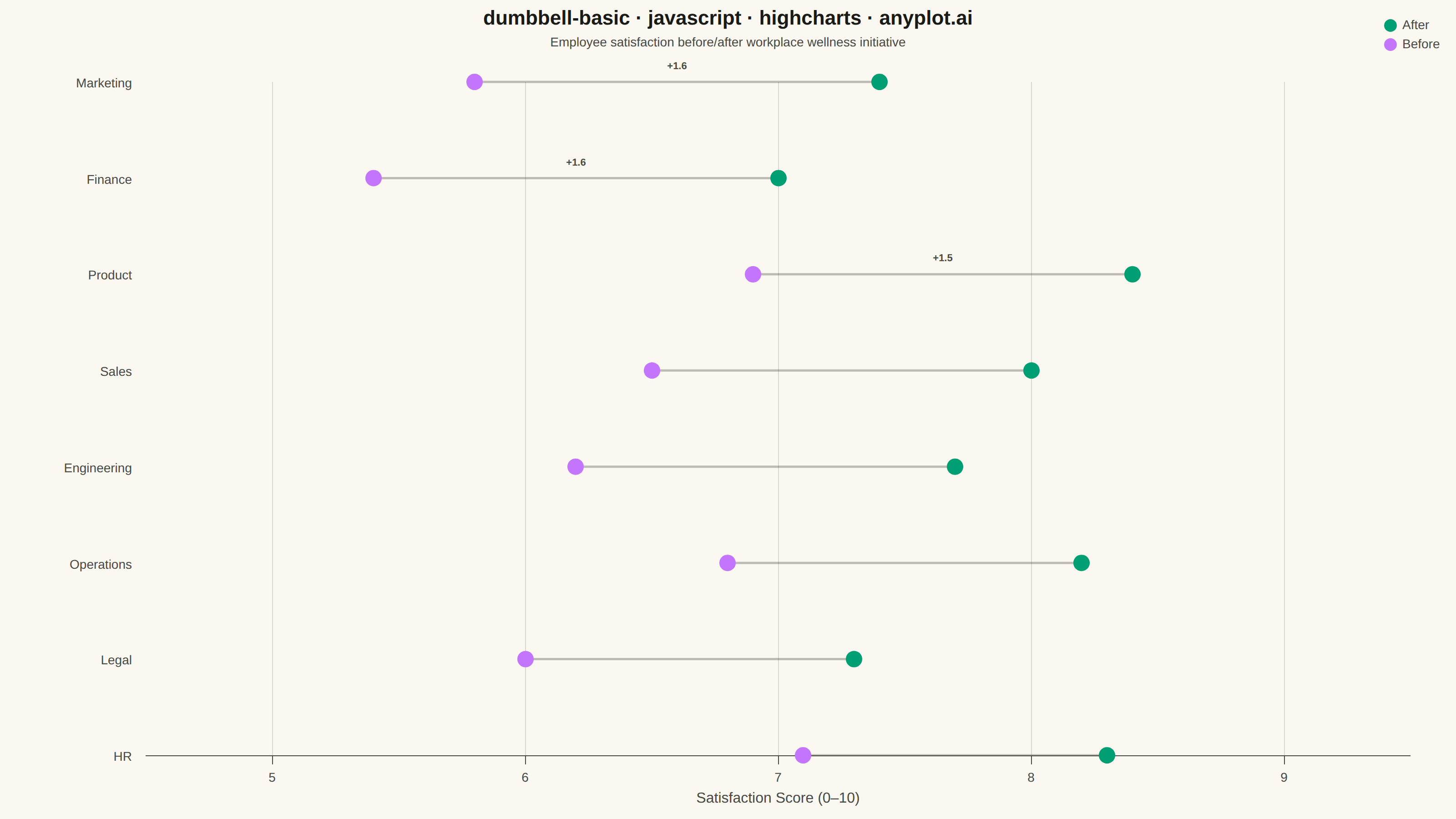
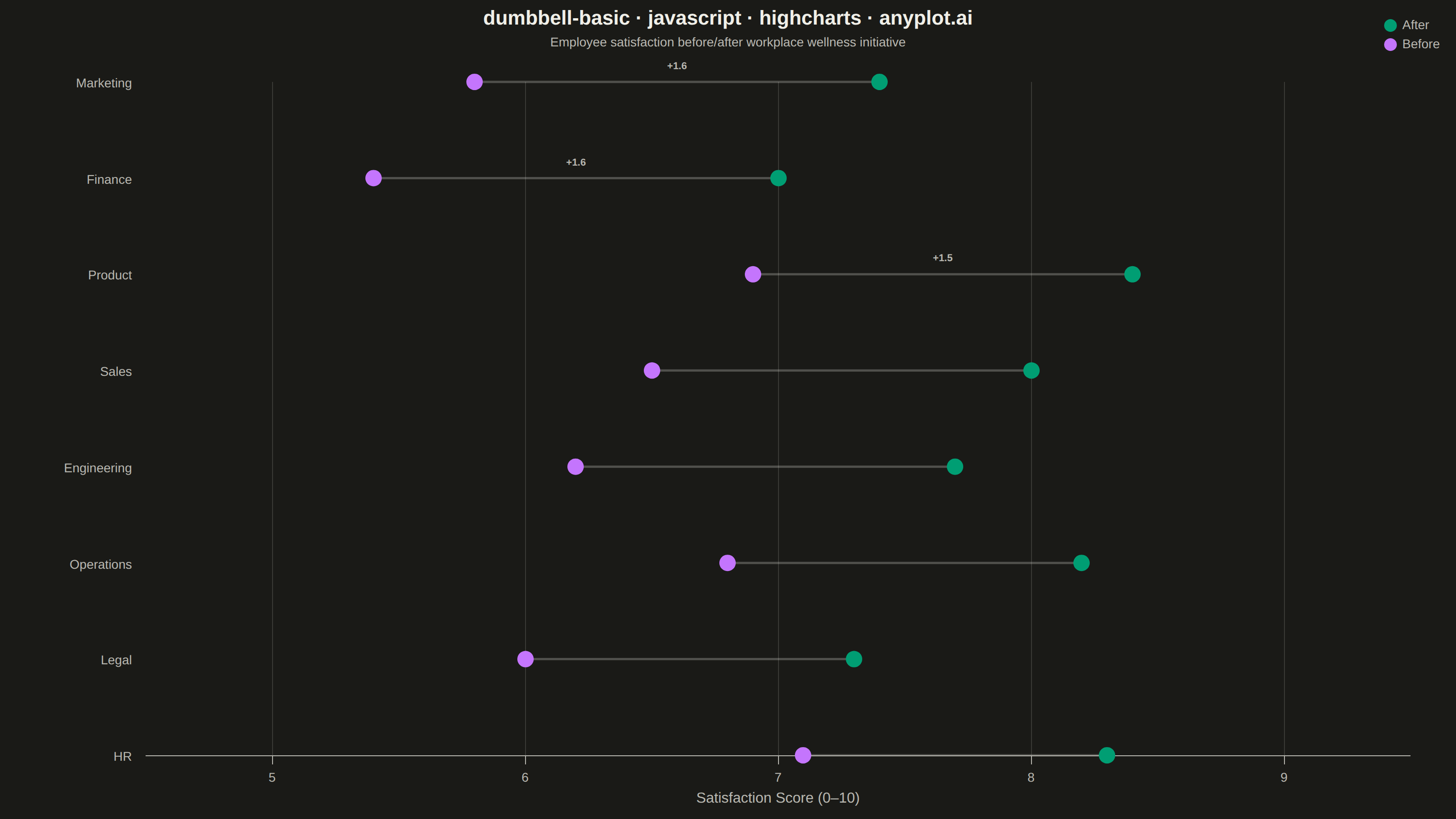
A dumbbell chart (also called a connected dot plot or Cleveland dot plot) compares two values for each category by displaying two dots connected by a line. It effectively visualizes differences, changes, or ranges between two data points such as before/after comparisons, gaps, or min/max values. The connected dots make it easy to see both the magnitude and direction of change.
// anyplot.ai
// dumbbell-basic: Basic Dumbbell Chart
// Library: highcharts 12.6.0 | JavaScript 22.23.0
// Quality: 89/100 | Created: 2026-06-30

//# anyplot-orientation: landscape

const t = window.ANYPLOT_TOKENS;

// Data — Employee satisfaction scores (0–10) before/after a workplace wellness initiative
const departments = ["Engineering", "Marketing", "Sales", "HR", "Finance", "Operations", "Legal", "Product"];
const scoreBefore = [6.2, 5.8, 6.5, 7.1, 5.4, 6.8, 6.0, 6.9];
const scoreAfter  = [7.7, 7.4, 8.0, 8.3, 7.0, 8.2, 7.3, 8.4];

// Sort ascending by improvement so the largest improvement appears at top
const sortIdx = departments.map((_, i) => i)
  .sort((a, b) => (scoreAfter[a] - scoreBefore[a]) - (scoreAfter[b] - scoreBefore[b]));
const labels  = sortIdx.map(i => departments[i]);
const vBefore = sortIdx.map(i => scoreBefore[i]);
const vAfter  = sortIdx.map(i => scoreAfter[i]);
const n       = labels.length;

// [score, categoryIndex] pairs — x = score, y = integer row index
const afterData  = vAfter.map((v,  i) => [v, i]);
const beforeData = vBefore.map((v, i) => [v, i]);

const chart = Highcharts.chart("container", {
  chart: {
    type: "scatter",
    backgroundColor: "transparent",
    animation: false,
    style: { fontFamily: "inherit" },
    marginLeft: 160,
    marginRight: 50,
    marginTop: 90,
    marginBottom: 70,
  },
  credits: { enabled: false },
  colors: t.palette,
  title: {
    text: "dumbbell-basic · javascript · highcharts · anyplot.ai",
    style: { color: t.ink, fontSize: "22px", fontWeight: "600" },
  },
  subtitle: {
    text: "Employee satisfaction before/after workplace wellness initiative",
    style: { color: t.inkSoft, fontSize: "14px" },
  },
  xAxis: {
    title: {
      text: "Satisfaction Score (0–10)",
      style: { color: t.inkSoft, fontSize: "16px" },
    },
    lineColor: t.inkSoft,
    tickColor: t.inkSoft,
    gridLineColor: t.grid,
    gridLineWidth: 1,
    min: 4.5,
    max: 9.5,
    tickInterval: 1,
    labels: { style: { color: t.inkSoft, fontSize: "14px" } },
  },
  yAxis: {
    title: { text: null },
    min: -0.5,
    max: n - 0.5,
    tickPositions: labels.map((_, i) => i),
    labels: {
      formatter() { return labels[this.value] || ""; },
      style: { color: t.inkSoft, fontSize: "14px" },
    },
    lineColor: t.inkSoft,
    tickColor: t.inkSoft,
    gridLineColor: "transparent",
  },
  legend: {
    verticalAlign: "top",
    align: "right",
    layout: "vertical",
    itemStyle: { color: t.inkSoft, fontSize: "14px" },
    itemHoverStyle: { color: t.ink },
  },
  plotOptions: {
    series: { animation: false },
    scatter: {
      marker: { radius: 9, lineWidth: 0 },
    },
  },
  series: [
    {
      name: "After",
      data: afterData,
      color: t.palette[0],
      marker: { symbol: "circle" },
      zIndex: 5,
    },
    {
      name: "Before",
      data: beforeData,
      color: t.palette[1],
      marker: { symbol: "circle" },
      zIndex: 5,
    },
  ],
});

// Draw connecting lines between Before and After dots via the SVG renderer
const renderer = chart.renderer;
const plotLeft  = chart.plotLeft;
const plotTop   = chart.plotTop;

// Build a lookup from category index → before-series point
const beforeByIdx = {};
chart.series[1].data.forEach(p => { beforeByIdx[p.y] = p; });

// Improvement per sorted row (label top 3 for focal point)
const diffs = vAfter.map((v, i) => +(v - vBefore[i]).toFixed(1));
const topN  = 3;

chart.series[0].data.forEach((afterPt) => {
  const beforePt = beforeByIdx[afterPt.y];
  if (!beforePt) return;

  renderer.path([
    "M", plotLeft + beforePt.plotX, plotTop + beforePt.plotY,
    "L", plotLeft + afterPt.plotX,  plotTop + afterPt.plotY,
  ])
    .attr({ stroke: t.inkSoft, "stroke-width": 2.5, "stroke-opacity": 0.35 })
    .add();

  // Annotate top-improvement rows with the gain value
  if (afterPt.y >= n - topN) {
    const midX = plotLeft + (beforePt.plotX + afterPt.plotX) / 2;
    const midY = plotTop + afterPt.plotY - 14;
    renderer.text(`+${diffs[afterPt.y].toFixed(1)}`, midX, midY)
      .attr({ align: "center", zIndex: 6, fill: t.inkSoft })
      .css({ fontSize: "11px", fontWeight: "700" })
      .add();
  }
});
Runnable source as JSON, for any HTTP client: https://api.anyplot.ai/specs/dumbbell-basic/highcharts/code. Any spec id and library id listed in llms-full.txt fit the same URL shape; every URL below is complete and callable.
{
  "spec_id": "dumbbell-basic",
  "language": "javascript",
  "library": "highcharts",
  "page": "https://anyplot.ai/dumbbell-basic/javascript/highcharts",
  "hub": "https://anyplot.ai/dumbbell-basic",
  "code_json": "https://api.anyplot.ai/specs/dumbbell-basic/highcharts/code",
  "spec_json": "https://api.anyplot.ai/specs/dumbbell-basic",
  "render_light_png": "https://storage.googleapis.com/anyplot-images/plots/dumbbell-basic/javascript/highcharts/plot-light.png",
  "render_dark_png": "https://storage.googleapis.com/anyplot-images/plots/dumbbell-basic/javascript/highcharts/plot-dark.png",
  "interactive_light_html": "https://storage.googleapis.com/anyplot-images/plots/dumbbell-basic/javascript/highcharts/plot-light.html",
  "interactive_dark_html": "https://storage.googleapis.com/anyplot-images/plots/dumbbell-basic/javascript/highcharts/plot-dark.html",
  "quality_score": 89.0,
  "license": "MIT",
  "guide": "https://anyplot.ai/llms.txt"
}
Part of Basic Dumbbell Chart on anyplot.ai.