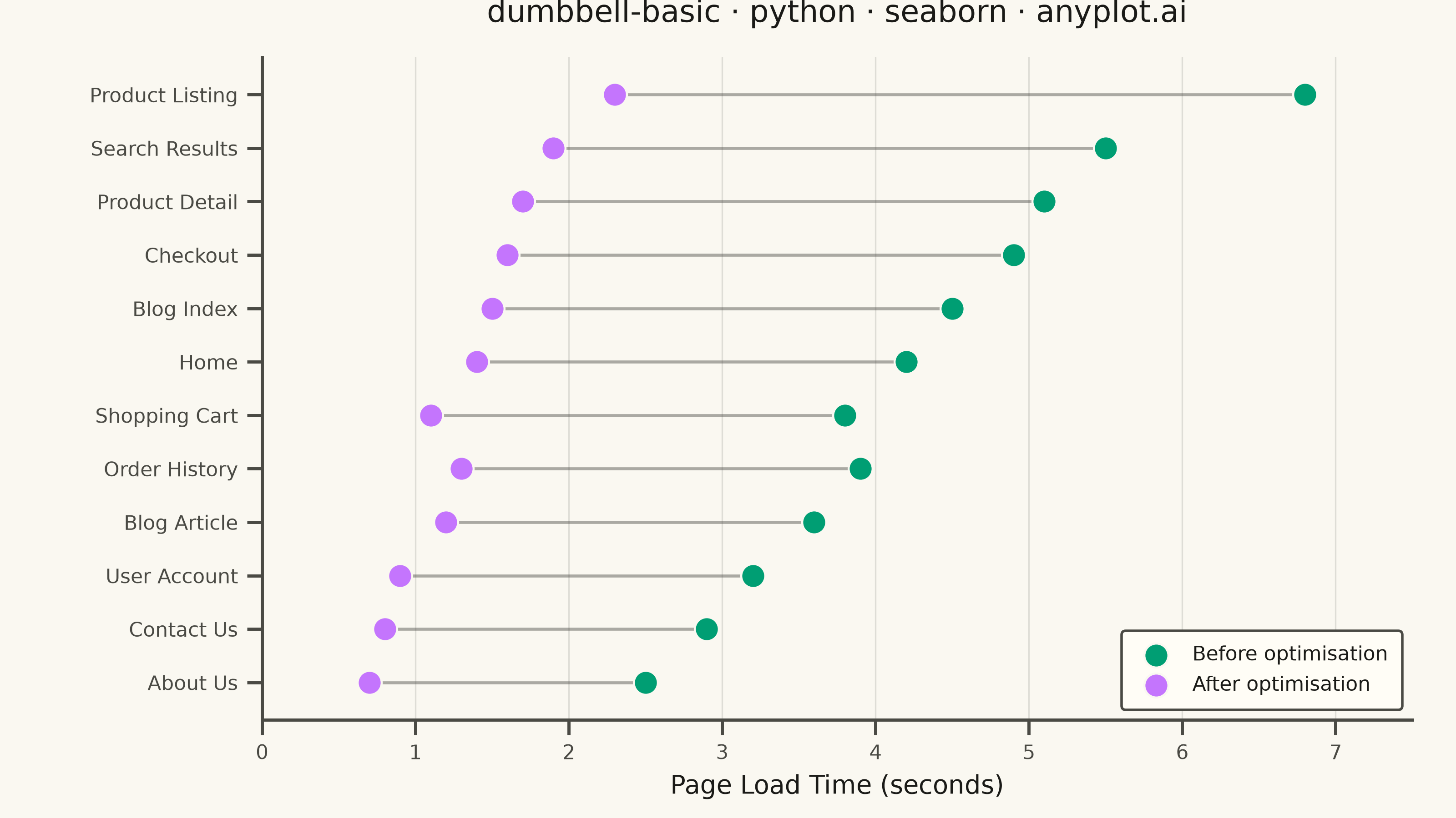
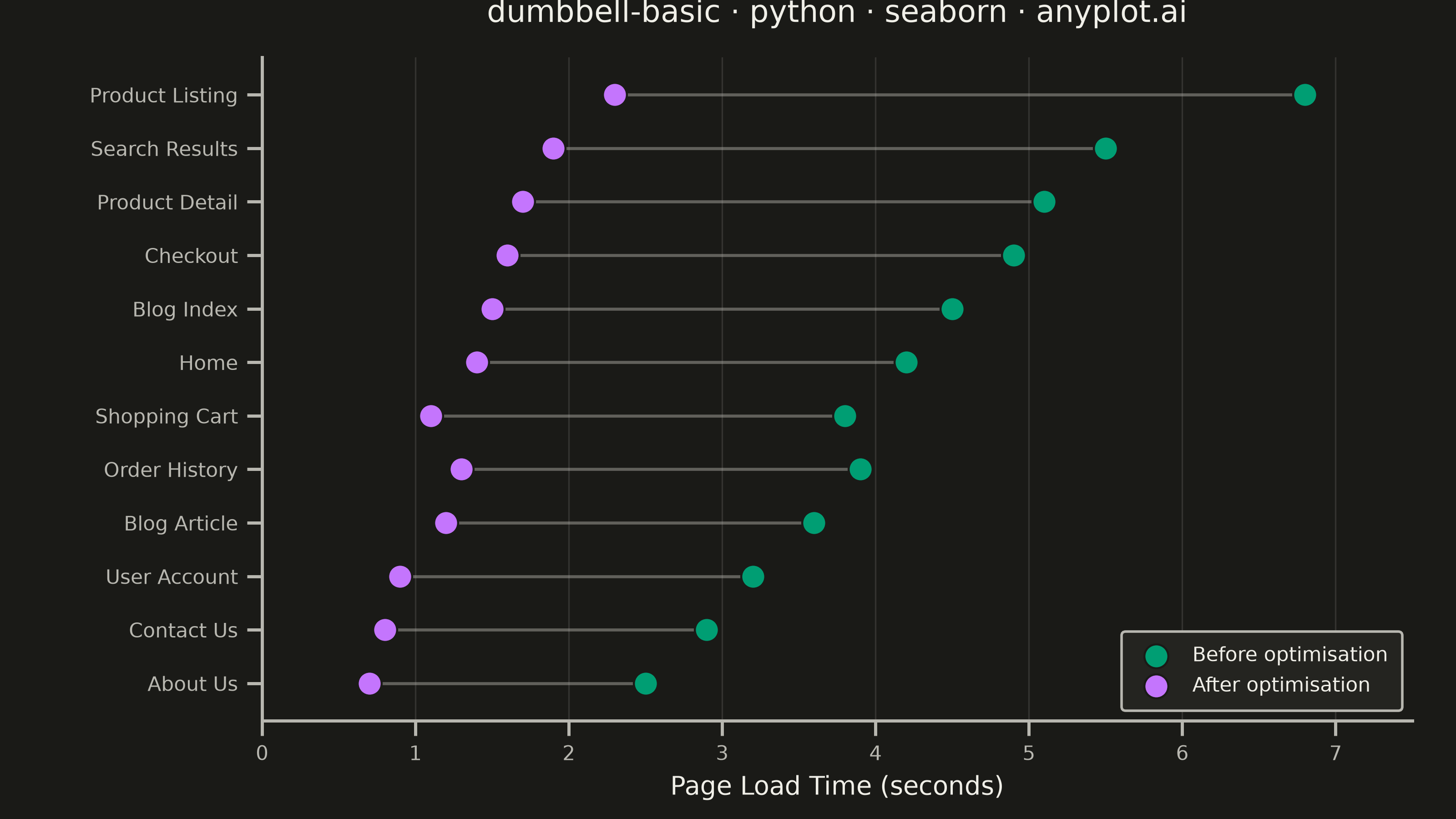
A dumbbell chart (also called a connected dot plot or Cleveland dot plot) compares two values for each category by displaying two dots connected by a line. It effectively visualizes differences, changes, or ranges between two data points such as before/after comparisons, gaps, or min/max values. The connected dots make it easy to see both the magnitude and direction of change.
""" anyplot.ai
dumbbell-basic: Basic Dumbbell Chart
Library: seaborn 0.13.2 | Python 3.13.14
Quality: 87/100 | Updated: 2026-06-30
"""

import os

import matplotlib.pyplot as plt
import pandas as pd
import seaborn as sns


# Theme tokens — Imprint palette
THEME = os.getenv("ANYPLOT_THEME", "light")
PAGE_BG = "#FAF8F1" if THEME == "light" else "#1A1A17"
ELEVATED_BG = "#FFFDF6" if THEME == "light" else "#242420"
INK = "#1A1A17" if THEME == "light" else "#F0EFE8"
INK_SOFT = "#4A4A44" if THEME == "light" else "#B8B7B0"
INK_MUTED = "#6B6A63" if THEME == "light" else "#A8A79F"

BEFORE_COLOR = "#009E73"  # Imprint position 1 — first series
AFTER_COLOR = "#C475FD"  # Imprint position 2

# Data — page load time (seconds) before and after performance optimisation
df = pd.DataFrame(
    {
        "Page": [
            "Home",
            "Product Listing",
            "Search Results",
            "Product Detail",
            "Shopping Cart",
            "Checkout",
            "User Account",
            "Blog Index",
            "Blog Article",
            "Contact Us",
            "About Us",
            "Order History",
        ],
        "Before": [4.2, 6.8, 5.5, 5.1, 3.8, 4.9, 3.2, 4.5, 3.6, 2.9, 2.5, 3.9],
        "After": [1.4, 2.3, 1.9, 1.7, 1.1, 1.6, 0.9, 1.5, 1.2, 0.8, 0.7, 1.3],
    }
)
df["Reduction"] = df["Before"] - df["After"]
df = df.sort_values("Reduction", ascending=True).reset_index(drop=True)

# Theme-adaptive seaborn styling
sns.set_theme(
    style="ticks",
    rc={
        "figure.facecolor": PAGE_BG,
        "axes.facecolor": PAGE_BG,
        "axes.edgecolor": INK_SOFT,
        "axes.labelcolor": INK,
        "text.color": INK,
        "xtick.color": INK_SOFT,
        "ytick.color": INK_SOFT,
        "grid.color": INK,
        "grid.alpha": 0.12,
        "legend.facecolor": ELEVATED_BG,
        "legend.edgecolor": INK_SOFT,
    },
)

# Canvas — landscape 3200×1800 px (8 × 4.5 in @ dpi=400)
fig, ax = plt.subplots(figsize=(8, 4.5), dpi=400, facecolor=PAGE_BG)

# Linewidth range proportional to reduction magnitude for visual hierarchy
red_min = df["Reduction"].min()
red_max = df["Reduction"].max()

# Connecting lines (drawn first, sit beneath dots) — width encodes improvement magnitude
for i, row in df.iterrows():
    lw = 0.8 + (row["Reduction"] - red_min) / (red_max - red_min) * 1.4
    ax.plot([row["Before"], row["After"]], [i, i], color=INK_SOFT, alpha=0.45, linewidth=lw, zorder=1)

# Dots — seaborn scatterplot for both ends; s=150 for adequate visual weight on 3200×1800
sns.scatterplot(
    x=df["Before"],
    y=range(len(df)),
    color=BEFORE_COLOR,
    s=150,
    label="Before optimisation",
    edgecolor=PAGE_BG,
    linewidth=0.8,
    ax=ax,
    zorder=2,
)
sns.scatterplot(
    x=df["After"],
    y=range(len(df)),
    color=AFTER_COLOR,
    s=150,
    label="After optimisation",
    edgecolor=PAGE_BG,
    linewidth=0.8,
    ax=ax,
    zorder=3,
)

# Delta annotations — reduction in seconds, positioned right of the Before dot
for i, row in df.iterrows():
    ax.text(row["Before"] + 0.18, i, f"−{row['Reduction']:.1f}s", va="center", ha="left", fontsize=7, color=INK_MUTED)

# Axes
ax.set_yticks(range(len(df)))
ax.set_yticklabels(df["Page"])
ax.set_xlabel("Page Load Time (seconds)", fontsize=10, color=INK)
ax.set_ylabel("", fontsize=10)
ax.set_title("dumbbell-basic · python · seaborn · anyplot.ai", fontsize=12, fontweight="medium", color=INK, pad=14)
ax.tick_params(axis="both", labelsize=8)
ax.set_xlim(0.0, 8.5)
ax.set_ylim(-0.7, len(df) - 0.3)

sns.despine(ax=ax, top=True, right=True)
ax.xaxis.grid(True, linewidth=0.6)
ax.yaxis.grid(False)

legend = ax.legend(fontsize=8, loc="lower right", frameon=True, framealpha=1.0, borderpad=0.7)
for text in legend.get_texts():
    text.set_color(INK)

fig.subplots_adjust(left=0.18, right=0.95, top=0.93, bottom=0.12)
plt.savefig(f"plot-{THEME}.png", dpi=400, facecolor=PAGE_BG)
plt.close()
Runnable source as JSON, for any HTTP client: https://api.anyplot.ai/specs/dumbbell-basic/seaborn/code. Any spec id and library id listed in llms-full.txt fit the same URL shape; every URL below is complete and callable.
{
  "spec_id": "dumbbell-basic",
  "language": "python",
  "library": "seaborn",
  "page": "https://anyplot.ai/dumbbell-basic/python/seaborn",
  "hub": "https://anyplot.ai/dumbbell-basic",
  "code_json": "https://api.anyplot.ai/specs/dumbbell-basic/seaborn/code",
  "spec_json": "https://api.anyplot.ai/specs/dumbbell-basic",
  "render_light_png": "https://storage.googleapis.com/anyplot-images/plots/dumbbell-basic/python/seaborn/plot-light.png",
  "render_dark_png": "https://storage.googleapis.com/anyplot-images/plots/dumbbell-basic/python/seaborn/plot-dark.png",
  "quality_score": 87.0,
  "license": "MIT",
  "guide": "https://anyplot.ai/llms.txt"
}
Part of Basic Dumbbell Chart on anyplot.ai.