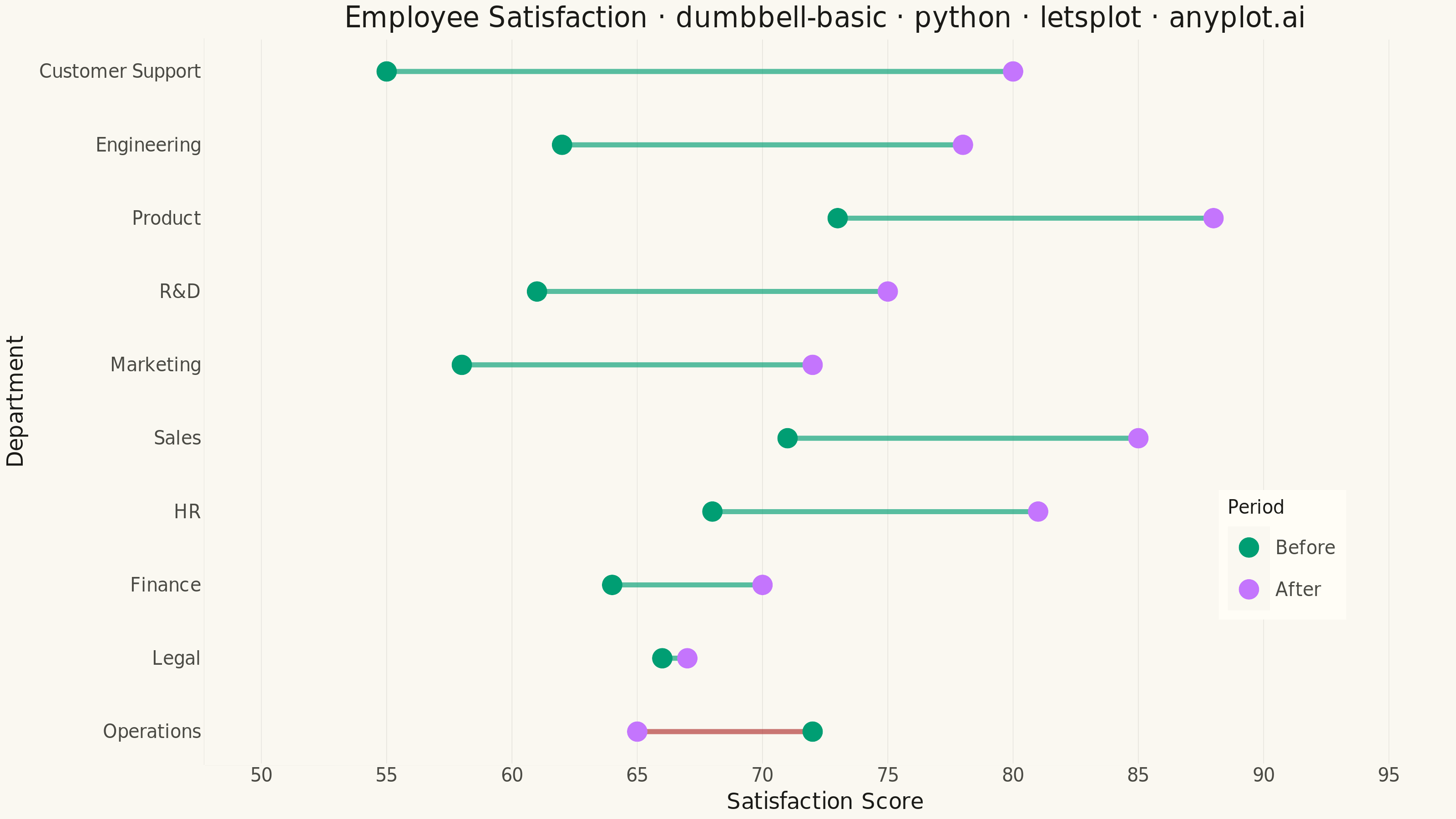
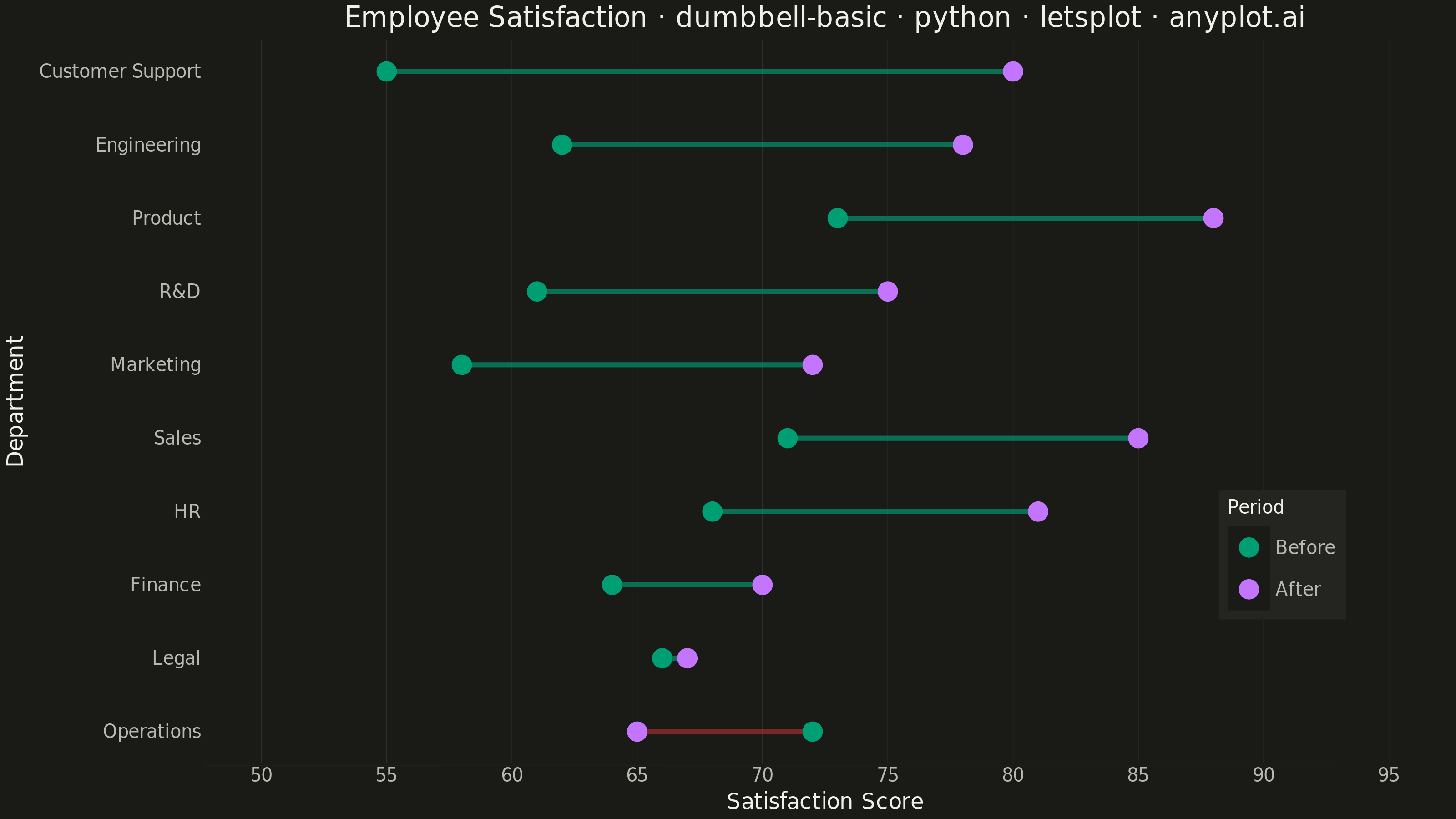
A dumbbell chart (also called a connected dot plot or Cleveland dot plot) compares two values for each category by displaying two dots connected by a line. It effectively visualizes differences, changes, or ranges between two data points such as before/after comparisons, gaps, or min/max values. The connected dots make it easy to see both the magnitude and direction of change.
""" anyplot.ai
dumbbell-basic: Basic Dumbbell Chart
Library: letsplot 4.11.0 | Python 3.13.14
Quality: 91/100 | Updated: 2026-06-30
"""

import os

import pandas as pd
from lets_plot import (
    LetsPlot,
    aes,
    element_blank,
    element_line,
    element_rect,
    element_text,
    geom_point,
    geom_segment,
    ggplot,
    ggsize,
    labs,
    layer_tooltips,
    scale_color_manual,
    scale_x_continuous,
    scale_y_continuous,
    theme,
    theme_minimal,
)
from lets_plot.export import ggsave


LetsPlot.setup_html()

# Theme tokens
THEME = os.getenv("ANYPLOT_THEME", "light")
PAGE_BG = "#FAF8F1" if THEME == "light" else "#1A1A17"
ELEVATED_BG = "#FFFDF6" if THEME == "light" else "#242420"
INK = "#1A1A17" if THEME == "light" else "#F0EFE8"
INK_SOFT = "#4A4A44" if THEME == "light" else "#B8B7B0"
RULE = "rgba(26,26,23,0.10)" if THEME == "light" else "rgba(240,239,232,0.10)"

# Imprint palette — position 1 = After (hero), position 2 = Before, position 5 = semantic decline
BRAND = "#009E73"  # position 1 — After scores / positive change direction
LAVENDER = "#C475FD"  # position 2 — Before scores
DECLINE = "#AE3030"  # position 5 — semantic red for regressions

# Data — Employee satisfaction scores before and after policy changes
categories = [
    "Engineering",
    "Marketing",
    "Sales",
    "Customer Support",
    "HR",
    "Finance",
    "Operations",
    "Product",
    "Legal",
    "R&D",
]
before_scores = [62, 58, 71, 55, 68, 64, 72, 73, 66, 61]
after_scores = [78, 72, 85, 80, 81, 70, 65, 88, 67, 75]

df = pd.DataFrame({"category": categories, "before": before_scores, "after": after_scores})
df["diff"] = df["after"] - df["before"]
df = df.sort_values("diff", ascending=True).reset_index(drop=True)
df["y_pos"] = range(len(df))

df_improved = df[df["diff"] > 0]
df_declined = df[df["diff"] <= 0]

df_points = pd.concat(
    [
        pd.DataFrame(
            {
                "y_pos": df["y_pos"],
                "value": df["before"],
                "period": "Before",
                "category": df["category"].values,
                "diff": df["diff"].values,
            }
        ),
        pd.DataFrame(
            {
                "y_pos": df["y_pos"],
                "value": df["after"],
                "period": "After",
                "category": df["category"].values,
                "diff": df["diff"].values,
            }
        ),
    ]
)

# Scale title fontsize for longer-than-baseline title (floor: 11px)
title = "Employee Satisfaction · dumbbell-basic · python · letsplot · anyplot.ai"
n = len(title)
title_size = max(11, round(16 * 67 / n)) if n > 67 else 16

# Plot — horizontal dumbbell; segments color-coded by change direction
plot = (
    ggplot()
    + geom_segment(
        data=df_improved,
        mapping=aes(x="before", xend="after", y="y_pos", yend="y_pos"),
        color=BRAND,
        size=1.2,
        alpha=0.65,
    )
    + geom_segment(
        data=df_declined,
        mapping=aes(x="before", xend="after", y="y_pos", yend="y_pos"),
        color=DECLINE,
        size=1.2,
        alpha=0.65,
    )
    + geom_point(
        data=df_points,
        mapping=aes(x="value", y="y_pos", color="period"),
        size=5,
        tooltips=layer_tooltips().line("@category").line("@period: @value").line("Change: @diff"),
    )
    + scale_color_manual(values=[BRAND, LAVENDER], name="Period")
    + scale_x_continuous(limits=[50, 95])
    + scale_y_continuous(breaks=list(range(len(df))), labels=df["category"].tolist())
    + labs(x="Satisfaction Score", y="Department", title=title)
    + ggsize(800, 450)
    + theme_minimal()
    + theme(
        plot_background=element_rect(fill=PAGE_BG, color=PAGE_BG),
        panel_background=element_rect(fill=PAGE_BG, color=PAGE_BG),
        legend_background=element_rect(fill=ELEVATED_BG, color="transparent"),
        panel_grid_major_x=element_line(color=RULE, size=0.3),
        panel_grid_minor_x=element_blank(),
        panel_grid_major_y=element_blank(),
        panel_grid_minor_y=element_blank(),
        axis_line=element_line(color=INK_SOFT),
        axis_ticks=element_blank(),
        axis_title=element_text(size=12, color=INK),
        axis_text=element_text(size=10, color=INK_SOFT),
        plot_title=element_text(size=title_size, color=INK, hjust=0.5),
        legend_title=element_text(size=10, color=INK),
        legend_text=element_text(size=10, color=INK_SOFT),
        legend_position=[0.92, 0.2],
        legend_justification=[1, 0],
    )
)

# Save
ggsave(plot, filename=f"plot-{THEME}.png", path=".", scale=4)
ggsave(plot, filename=f"plot-{THEME}.html", path=".")
Runnable source as JSON, for any HTTP client: https://api.anyplot.ai/specs/dumbbell-basic/letsplot/code. Any spec id and library id listed in llms-full.txt fit the same URL shape; every URL below is complete and callable.
{
  "spec_id": "dumbbell-basic",
  "language": "python",
  "library": "letsplot",
  "page": "https://anyplot.ai/dumbbell-basic/python/letsplot",
  "hub": "https://anyplot.ai/dumbbell-basic",
  "code_json": "https://api.anyplot.ai/specs/dumbbell-basic/letsplot/code",
  "spec_json": "https://api.anyplot.ai/specs/dumbbell-basic",
  "render_light_png": "https://storage.googleapis.com/anyplot-images/plots/dumbbell-basic/python/letsplot/plot-light.png",
  "render_dark_png": "https://storage.googleapis.com/anyplot-images/plots/dumbbell-basic/python/letsplot/plot-dark.png",
  "interactive_light_html": "https://storage.googleapis.com/anyplot-images/plots/dumbbell-basic/python/letsplot/plot-light.html",
  "interactive_dark_html": "https://storage.googleapis.com/anyplot-images/plots/dumbbell-basic/python/letsplot/plot-dark.html",
  "quality_score": 91.0,
  "license": "MIT",
  "guide": "https://anyplot.ai/llms.txt"
}
Part of Basic Dumbbell Chart on anyplot.ai.