The same plot in 14 other libraries — JavaScript: Chart.js, Apache ECharts, Highcharts, MUI X Charts; Python: Altair, Bokeh, lets-plot, Matplotlib, Plotly, plotnine, Pygal, Seaborn; R: ggplot2; Julia: Makie.jl. Compare all 15 side by side: Basic Error Bar Plot in Python, R, Julia and JavaScript.
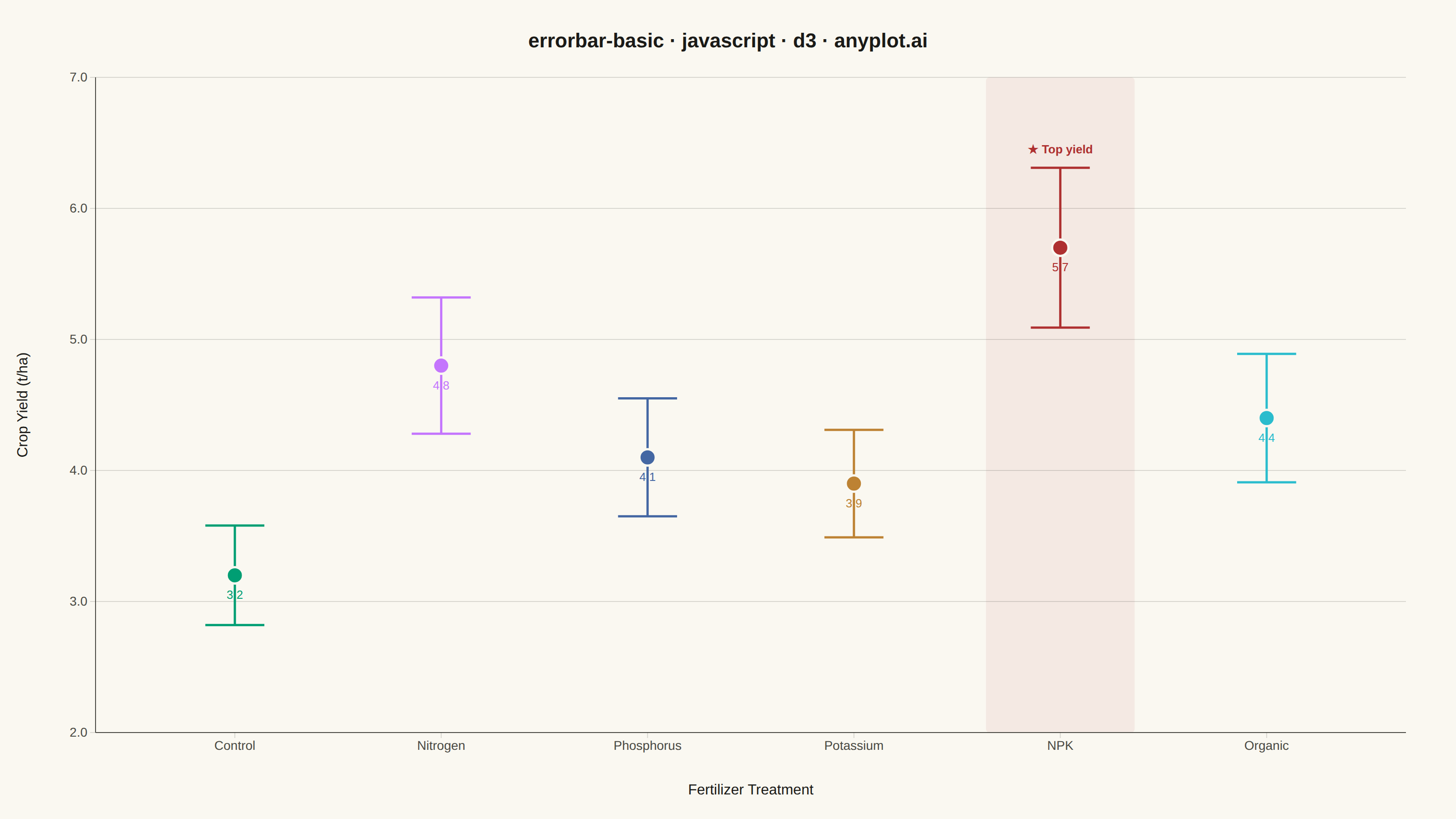
An error bar plot displays data points with associated uncertainty or variability represented by bars extending above and below (or left and right of) each point. Error bars commonly represent standard deviation, standard error, confidence intervals, or min/max ranges. This visualization is essential for communicating the reliability and precision of measurements or statistical estimates.
// anyplot.ai
// errorbar-basic: Basic Error Bar Plot
// Library: d3 7.9.0 | JavaScript 22.23.1
// Quality: 86/100 | Created: 2026-06-30

//# anyplot-orientation: landscape

const t = window.ANYPLOT_TOKENS;
const { width, height } = window.ANYPLOT_SIZE;

const margin = { top: 85, right: 55, bottom: 95, left: 105 };
const iw = width - margin.left - margin.right;
const ih = height - margin.top - margin.bottom;

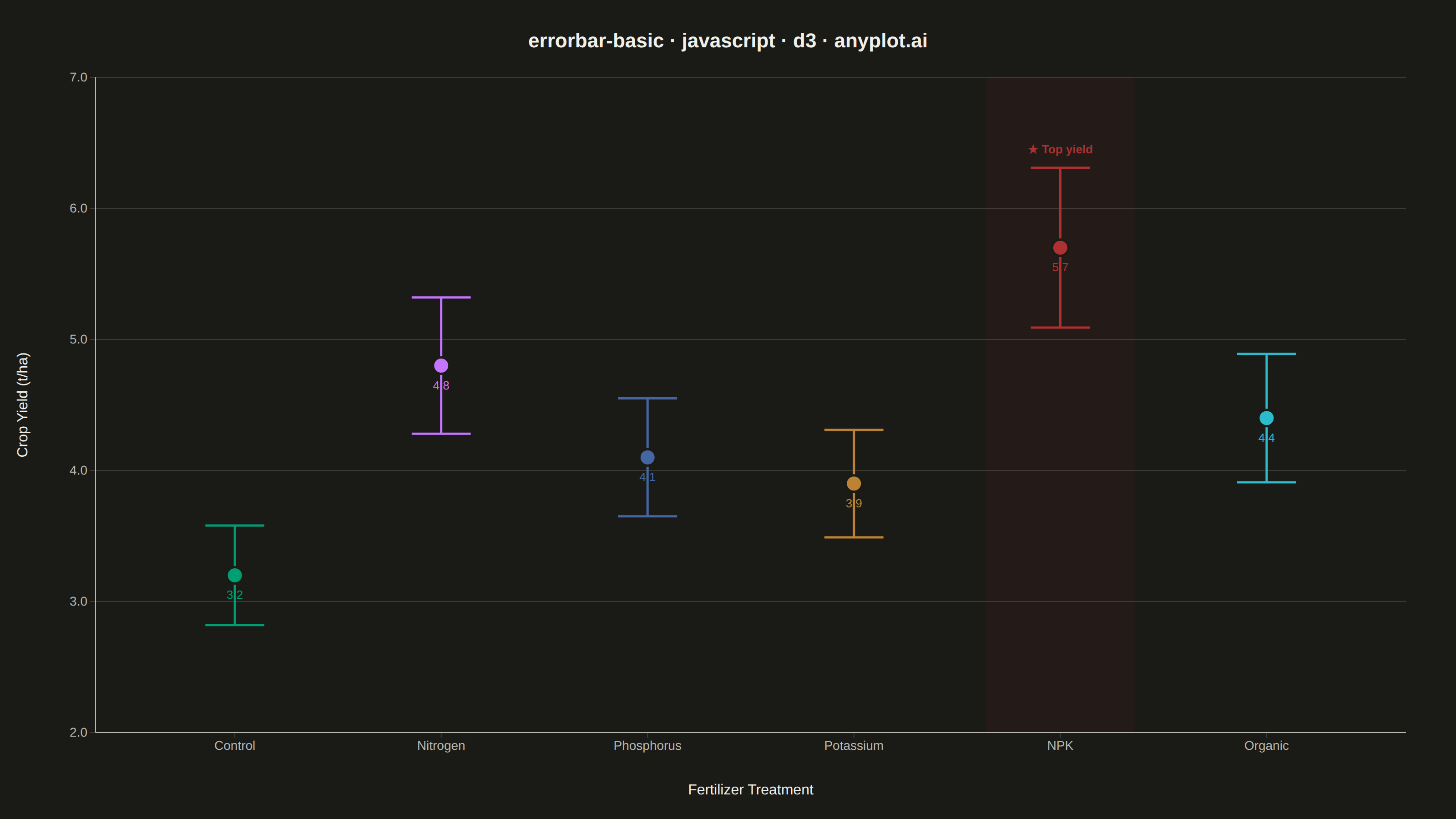
// Crop yield (t/ha) by fertilizer treatment — field trial, n=20 plots per group
const data = [
  { treatment: "Control",    mean: 3.2, sd: 0.38 },
  { treatment: "Nitrogen",   mean: 4.8, sd: 0.52 },
  { treatment: "Phosphorus", mean: 4.1, sd: 0.45 },
  { treatment: "Potassium",  mean: 3.9, sd: 0.41 },
  { treatment: "NPK",        mean: 5.7, sd: 0.61 },
  { treatment: "Organic",    mean: 4.4, sd: 0.49 },
];

// SVG mount
const svg = d3.select("#container")
  .append("svg")
  .attr("width", width)
  .attr("height", height);
const g = svg.append("g").attr("transform", `translate(${margin.left},${margin.top})`);

// Ordinal color scale — each treatment gets a distinct Imprint palette color
const color = d3.scaleOrdinal()
  .domain(data.map((d) => d.treatment))
  .range(t.palette);

// Scales
const x = d3.scaleBand()
  .domain(data.map((d) => d.treatment))
  .range([0, iw])
  .padding(0.35);

const yMin = d3.min(data, (d) => d.mean - d.sd) - 0.5;
const y = d3.scaleLinear()
  .domain([yMin, d3.max(data, (d) => d.mean + d.sd) + 0.4])
  .nice()
  .range([ih, 0]);

// Helper: horizontal center of each band
const cx = (d) => x(d.treatment) + x.bandwidth() / 2;
const capHalf = x.bandwidth() * 0.22;

// Subtle column highlight behind the top-performing NPK treatment
const npk = data.find((d) => d.treatment === "NPK");
g.append("rect")
  .attr("x", x("NPK") - 8)
  .attr("y", 0)
  .attr("width", x.bandwidth() + 16)
  .attr("height", ih)
  .attr("fill", color("NPK"))
  .attr("opacity", 0.07)
  .attr("rx", 4);

// Horizontal gridlines (y-axis only)
const gridG = g.append("g").attr("class", "grid");
gridG.call(d3.axisLeft(y).tickSize(-iw).tickFormat("").ticks(7));
gridG.selectAll("line").attr("stroke", t.grid).attr("stroke-width", 1);
gridG.select(".domain").remove();

// Axes
const xAxis = g.append("g")
  .attr("transform", `translate(0,${ih})`)
  .call(d3.axisBottom(x).tickSizeOuter(0));

const yAxis = g.append("g")
  .call(d3.axisLeft(y).ticks(7).tickFormat((d) => d.toFixed(1)).tickSizeOuter(0));

for (const ax of [xAxis, yAxis]) {
  ax.selectAll("text").attr("fill", t.inkSoft).style("font-size", "14px");
  ax.selectAll("line").attr("stroke", t.grid);
  ax.select(".domain").attr("stroke", t.inkSoft);
}

// Vertical error bar stems
g.selectAll(".errbar").data(data).join("line")
  .attr("class", "errbar")
  .attr("x1", cx).attr("x2", cx)
  .attr("y1", (d) => y(d.mean - d.sd))
  .attr("y2", (d) => y(d.mean + d.sd))
  .attr("stroke", (d) => color(d.treatment))
  .attr("stroke-width", 2.5);

// Upper caps
g.selectAll(".cap-top").data(data).join("line")
  .attr("class", "cap-top")
  .attr("x1", (d) => cx(d) - capHalf).attr("x2", (d) => cx(d) + capHalf)
  .attr("y1", (d) => y(d.mean + d.sd)).attr("y2", (d) => y(d.mean + d.sd))
  .attr("stroke", (d) => color(d.treatment)).attr("stroke-width", 2.5);

// Lower caps
g.selectAll(".cap-bot").data(data).join("line")
  .attr("class", "cap-bot")
  .attr("x1", (d) => cx(d) - capHalf).attr("x2", (d) => cx(d) + capHalf)
  .attr("y1", (d) => y(d.mean - d.sd)).attr("y2", (d) => y(d.mean - d.sd))
  .attr("stroke", (d) => color(d.treatment)).attr("stroke-width", 2.5);

// Mean value circles
g.selectAll("circle").data(data).join("circle")
  .attr("cx", cx)
  .attr("cy", (d) => y(d.mean))
  .attr("r", 9)
  .attr("fill", (d) => color(d.treatment))
  .attr("stroke", t.pageBg)
  .attr("stroke-width", 2.5);

// Mean value labels — shown below each circle for quick reading
g.selectAll(".mean-val").data(data).join("text")
  .attr("class", "mean-val")
  .attr("x", cx)
  .attr("y", (d) => y(d.mean) + 26)
  .attr("text-anchor", "middle")
  .attr("fill", (d) => color(d.treatment))
  .style("font-size", "13px")
  .style("font-weight", "500")
  .text((d) => d.mean.toFixed(1));

// NPK best-performer annotation
g.append("text")
  .attr("x", cx(npk))
  .attr("y", y(npk.mean + npk.sd) - 16)
  .attr("text-anchor", "middle")
  .attr("fill", color("NPK"))
  .style("font-size", "13px")
  .style("font-weight", "700")
  .text("★ Top yield");

// Axis labels
g.append("text")
  .attr("x", iw / 2)
  .attr("y", ih + 68)
  .attr("text-anchor", "middle")
  .attr("fill", t.ink)
  .style("font-size", "16px")
  .text("Fertilizer Treatment");

g.append("text")
  .attr("transform", "rotate(-90)")
  .attr("x", -ih / 2)
  .attr("y", -75)
  .attr("text-anchor", "middle")
  .attr("fill", t.ink)
  .style("font-size", "16px")
  .text("Crop Yield (t/ha)");

// Title
svg.append("text")
  .attr("x", width / 2)
  .attr("y", 52)
  .attr("text-anchor", "middle")
  .attr("fill", t.ink)
  .style("font-size", "22px")
  .style("font-weight", "600")
  .text("errorbar-basic · javascript · d3 · anyplot.ai");
Runnable source as JSON, for any HTTP client: https://api.anyplot.ai/specs/errorbar-basic/d3/code. Any spec id and library id listed in llms-full.txt fit the same URL shape; every URL below is complete and callable.
{
  "spec_id": "errorbar-basic",
  "language": "javascript",
  "library": "d3",
  "page": "https://anyplot.ai/errorbar-basic/javascript/d3",
  "hub": "https://anyplot.ai/errorbar-basic",
  "code_json": "https://api.anyplot.ai/specs/errorbar-basic/d3/code",
  "spec_json": "https://api.anyplot.ai/specs/errorbar-basic",
  "render_light_png": "https://storage.googleapis.com/anyplot-images/plots/errorbar-basic/javascript/d3/plot-light.png",
  "render_dark_png": "https://storage.googleapis.com/anyplot-images/plots/errorbar-basic/javascript/d3/plot-dark.png",
  "interactive_light_html": "https://storage.googleapis.com/anyplot-images/plots/errorbar-basic/javascript/d3/plot-light.html",
  "interactive_dark_html": "https://storage.googleapis.com/anyplot-images/plots/errorbar-basic/javascript/d3/plot-dark.html",
  "quality_score": 86.0,
  "license": "MIT",
  "guide": "https://anyplot.ai/llms.txt"
}
Part of Basic Error Bar Plot on anyplot.ai.