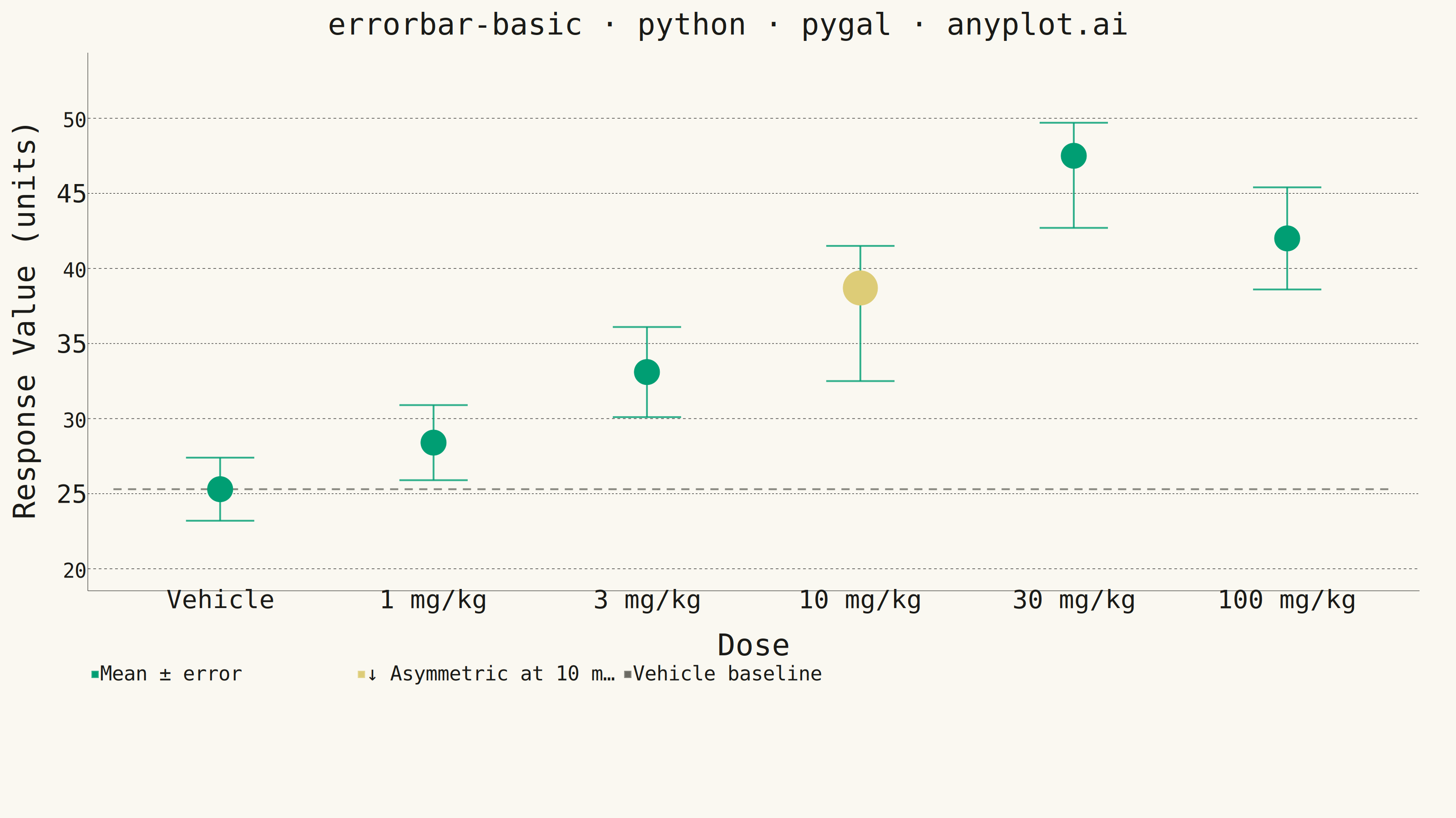
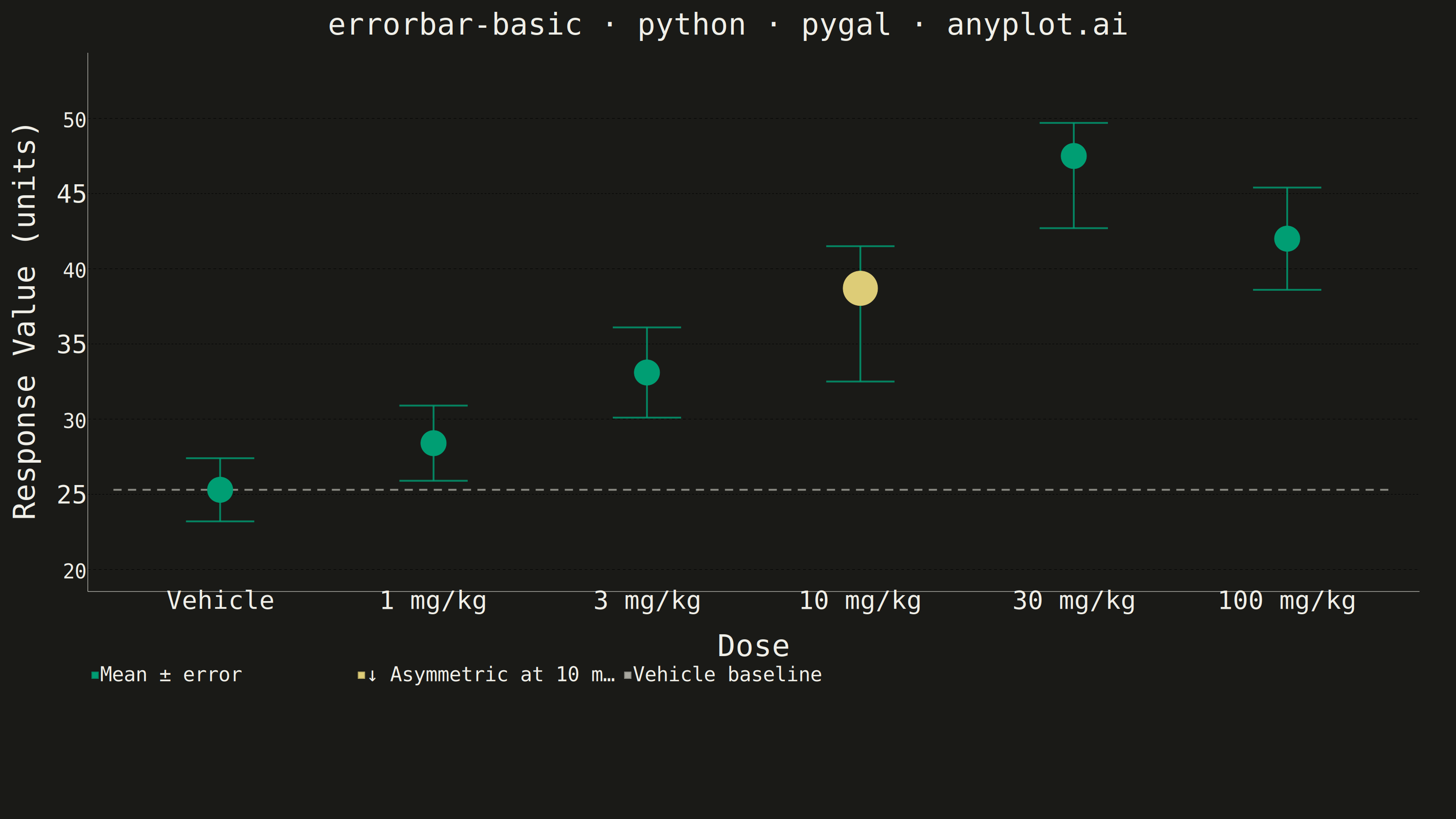
An error bar plot displays data points with associated uncertainty or variability represented by bars extending above and below (or left and right of) each point. Error bars commonly represent standard deviation, standard error, confidence intervals, or min/max ranges. This visualization is essential for communicating the reliability and precision of measurements or statistical estimates.
""" anyplot.ai
errorbar-basic: Basic Error Bar Plot
Library: pygal 3.1.3 | Python 3.13.14
Quality: 84/100 | Updated: 2026-06-30
"""

import os
import sys


# Remove script's own directory from sys.path so 'import pygal' resolves the
# installed package rather than this file.
sys.path[:] = [p for p in sys.path if os.path.abspath(p or ".") != os.path.dirname(os.path.abspath(__file__))]

import pygal
from pygal.style import Style


# Theme tokens (see prompts/default-style-guide.md)
THEME = os.getenv("ANYPLOT_THEME", "light")
PAGE_BG = "#FAF8F1" if THEME == "light" else "#1A1A17"
INK = "#1A1A17" if THEME == "light" else "#F0EFE8"
INK_MUTED = "#6B6A63" if THEME == "light" else "#A8A79F"

IMPRINT_PALETTE = ("#009E73", "#C475FD", "#4467A3", "#BD8233", "#AE3030", "#2ABCCD", "#954477", "#99B314")
BRAND = IMPRINT_PALETTE[0]  # #009E73 — Imprint palette position 1, always first series
ANYPLOT_AMBER = "#DDCC77"  # warning / caution annotation (outside categorical pool, per pygal.md)

# Data — dose-response study: vehicle control + escalating doses (mg/kg)
categories = ["Vehicle", "1 mg/kg", "3 mg/kg", "10 mg/kg", "30 mg/kg", "100 mg/kg"]
means = [25.3, 28.4, 33.1, 38.7, 47.5, 42.0]
# Asymmetric errors: 10 mg/kg shows notable lower-tail variability
err_lower = [2.1, 2.5, 3.0, 6.2, 4.8, 3.4]
err_upper = [2.1, 2.5, 3.0, 2.8, 2.2, 3.4]

n = len(categories)
baseline = means[0]  # Vehicle/control mean — visual reference for treatment effects

# Colors: series ordering determines color assignment
# 1: Mean ± error → BRAND; 2: asymmetry callout → ANYPLOT_AMBER; 3: baseline → INK_MUTED; 4+: error bars → BRAND
colors_tuple = (BRAND, ANYPLOT_AMBER, INK_MUTED) + (BRAND,) * 62

custom_style = Style(
    background=PAGE_BG,
    plot_background=PAGE_BG,
    foreground=INK,
    foreground_strong=INK,
    foreground_subtle=INK_MUTED,
    colors=colors_tuple,
    title_font_size=66,
    label_font_size=56,
    major_label_font_size=44,
    legend_font_size=44,
    value_font_size=36,
    tooltip_font_size=36,
    stroke_width=4,
    opacity=1.0,
    opacity_hover=0.85,
)

# Y-axis range with breathing room
data_min = min(m - e for m, e in zip(means, err_lower, strict=True))
data_max = max(m + e for m, e in zip(means, err_upper, strict=True))
pad = (data_max - data_min) * 0.15
y_min = max(0.0, data_min - pad)
y_max = data_max + pad

chart = pygal.XY(
    style=custom_style,
    width=3200,
    height=1800,
    dots_size=24,
    title="errorbar-basic · python · pygal · anyplot.ai",
    x_title="Dose",
    y_title="Response Value (units)",
    show_legend=True,
    legend_at_bottom=True,
    range=(y_min, y_max),
    xrange=(0.5, n + 0.5),
    show_x_guides=False,
    show_y_guides=True,
    truncate_label=-1,
    margin=40,
    margin_right=80,
)

chart.x_labels = [{"label": categories[i], "value": i + 1} for i in range(n)]
chart.x_labels_major = [{"label": categories[i], "value": i + 1} for i in range(n)]
chart.y_labels = [20, 25, 30, 35, 40, 45, 50]

# Mean points — first series (BRAND #009E73) so brand green is assigned as palette position 1
mean_points = [
    {"value": (i + 1, means[i]), "label": f"{categories[i]}: {means[i]:.1f} (−{err_lower[i]:.1f}/+{err_upper[i]:.1f})"}
    for i in range(n)
]
chart.add("Mean ± error", mean_points, stroke=False, dots_size=28)

# Asymmetric variability callout — second series (ANYPLOT_AMBER warning color)
# Amber marker overlaid at 10 mg/kg creates a visual focal point for the chart's key insight:
# lower-tail variability (6.2) substantially exceeds upper (2.8), indicating non-Gaussian spread
asym_idx = 3  # 10 mg/kg
chart.add(
    "↓ Asymmetric at 10 mg/kg (−6.2 / +2.8)",
    [
        {
            "value": (asym_idx + 1, means[asym_idx]),
            "label": "10 mg/kg: lower-tail variability (6.2) ≫ upper (2.8) — floor-effect compression near peak response",
        }
    ],
    stroke=False,
    dots_size=38,
)

# Vehicle baseline reference line — third series (INK_MUTED) for control comparison
chart.add(
    "Vehicle baseline",
    [(0.5, baseline), (n + 0.5, baseline)],
    stroke=True,
    show_dots=False,
    stroke_style={"width": 3, "dasharray": "18, 14"},
)

# Error bars: vertical stem + upper and lower caps per data point
cap_width = 0.16
for i in range(n):
    x = i + 1
    low = means[i] - err_lower[i]
    high = means[i] + err_upper[i]
    chart.add(None, [(x, low), (x, high)], stroke=True, show_dots=False)
    chart.add(None, [(x - cap_width, low), (x + cap_width, low)], stroke=True, show_dots=False)
    chart.add(None, [(x - cap_width, high), (x + cap_width, high)], stroke=True, show_dots=False)

# Save
chart.render_to_png(f"plot-{THEME}.png")
with open(f"plot-{THEME}.html", "wb") as f:
    f.write(chart.render())
Runnable source as JSON, for any HTTP client: https://api.anyplot.ai/specs/errorbar-basic/pygal/code. Any spec id and library id listed in llms-full.txt fit the same URL shape; every URL below is complete and callable.
{
  "spec_id": "errorbar-basic",
  "language": "python",
  "library": "pygal",
  "page": "https://anyplot.ai/errorbar-basic/python/pygal",
  "hub": "https://anyplot.ai/errorbar-basic",
  "code_json": "https://api.anyplot.ai/specs/errorbar-basic/pygal/code",
  "spec_json": "https://api.anyplot.ai/specs/errorbar-basic",
  "render_light_png": "https://storage.googleapis.com/anyplot-images/plots/errorbar-basic/python/pygal/plot-light.png",
  "render_dark_png": "https://storage.googleapis.com/anyplot-images/plots/errorbar-basic/python/pygal/plot-dark.png",
  "interactive_light_html": "https://storage.googleapis.com/anyplot-images/plots/errorbar-basic/python/pygal/plot-light.html",
  "interactive_dark_html": "https://storage.googleapis.com/anyplot-images/plots/errorbar-basic/python/pygal/plot-dark.html",
  "quality_score": 84.0,
  "license": "MIT",
  "guide": "https://anyplot.ai/llms.txt"
}
Part of Basic Error Bar Plot on anyplot.ai.