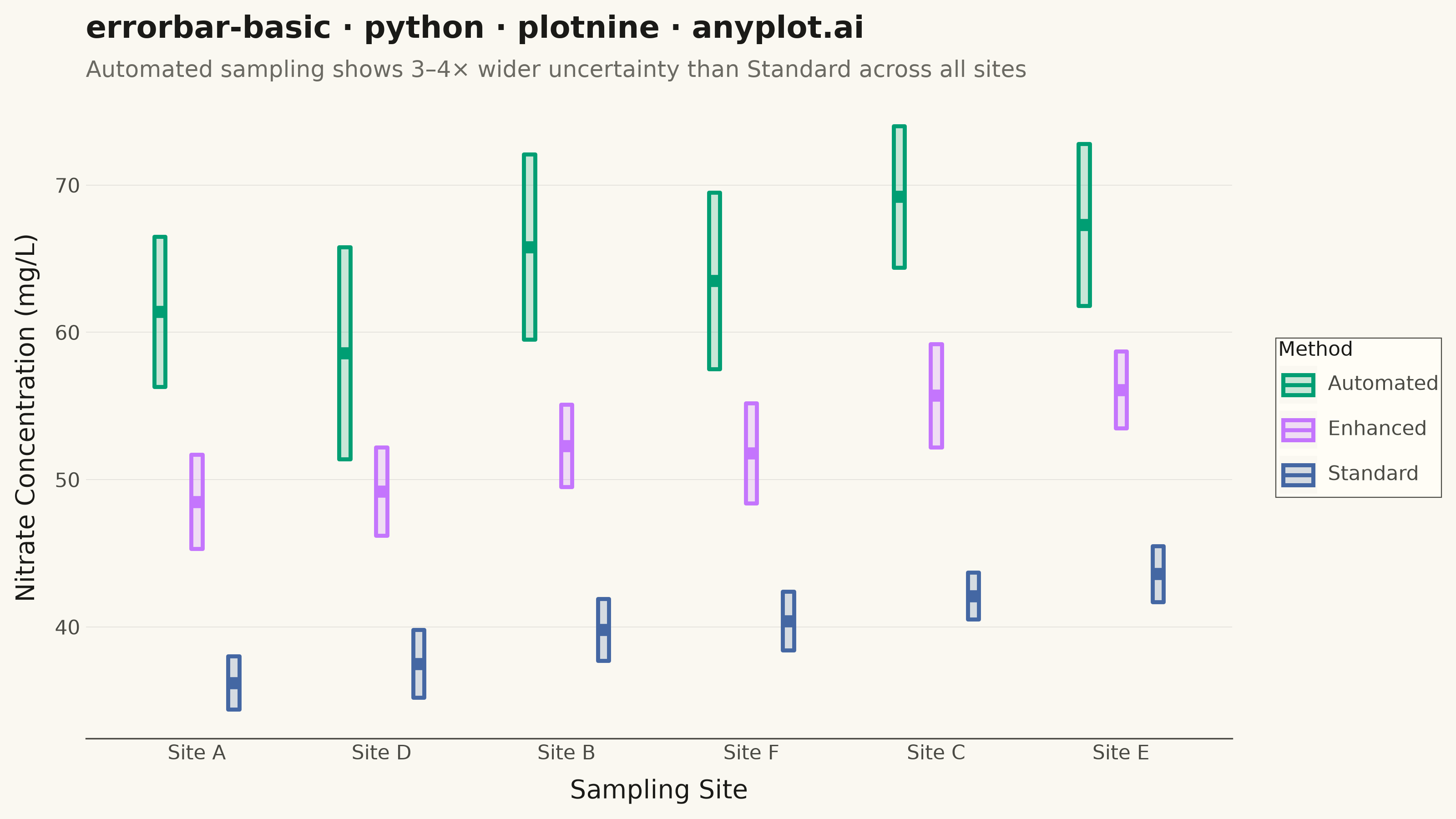
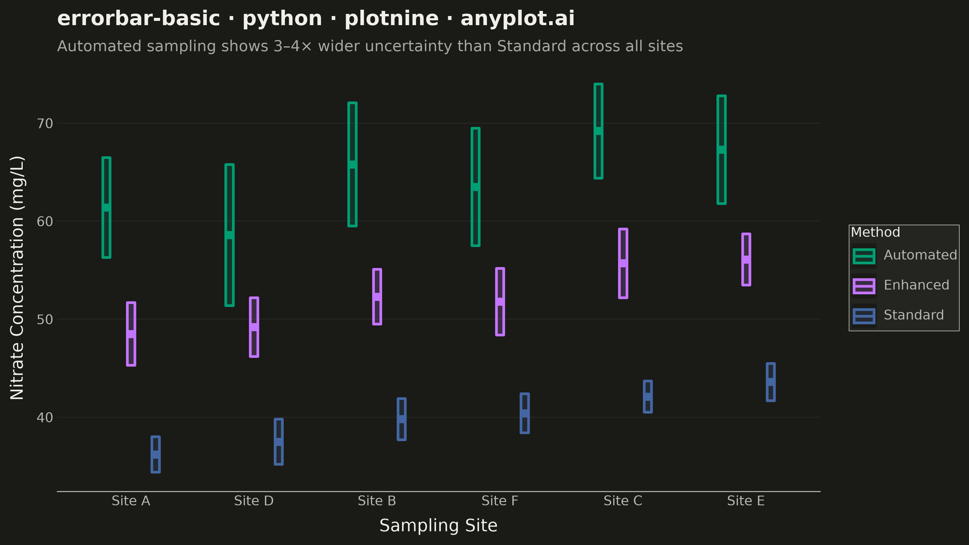
An error bar plot displays data points with associated uncertainty or variability represented by bars extending above and below (or left and right of) each point. Error bars commonly represent standard deviation, standard error, confidence intervals, or min/max ranges. This visualization is essential for communicating the reliability and precision of measurements or statistical estimates.
""" anyplot.ai
errorbar-basic: Basic Error Bar Plot
Library: plotnine 0.15.7 | Python 3.13.14
Quality: 84/100 | Updated: 2026-06-30
"""

import os

import pandas as pd
from plotnine import (
    aes,
    element_blank,
    element_line,
    element_rect,
    element_text,
    geom_crossbar,
    ggplot,
    labs,
    position_dodge,
    scale_color_manual,
    scale_fill_manual,
    scale_x_discrete,
    theme,
    theme_minimal,
)


THEME = os.getenv("ANYPLOT_THEME", "light")
PAGE_BG = "#FAF8F1" if THEME == "light" else "#1A1A17"
ELEVATED_BG = "#FFFDF6" if THEME == "light" else "#242420"
INK = "#1A1A17" if THEME == "light" else "#F0EFE8"
INK_SOFT = "#4A4A44" if THEME == "light" else "#B8B7B0"
INK_MUTED = "#6B6A63" if THEME == "light" else "#A8A79F"

IMPRINT = ["#009E73", "#C475FD", "#4467A3"]

# Data — three analytical methods measuring nitrate concentration across six sampling sites
data = pd.DataFrame(
    {
        "site": ["Site A", "Site B", "Site C", "Site D", "Site E", "Site F"] * 3,
        "method": ["Standard"] * 6 + ["Enhanced"] * 6 + ["Automated"] * 6,
        "concentration": [
            # Standard: baseline sensitivity, tight precision
            36.2,
            39.8,
            42.1,
            37.5,
            43.6,
            40.4,
            # Enhanced: ~35% higher detection
            48.5,
            52.3,
            55.7,
            49.2,
            56.1,
            51.8,
            # Automated: highest values, greatest variability
            61.4,
            65.8,
            69.2,
            58.6,
            67.3,
            63.5,
        ],
        "se": [
            1.8,
            2.1,
            1.6,
            2.3,
            1.9,
            2.0,  # Standard: SE ±1.6–2.3
            3.2,
            2.8,
            3.5,
            3.0,
            2.6,
            3.4,  # Enhanced: SE ±2.6–3.5
            5.1,
            6.3,
            4.8,
            7.2,
            5.5,
            6.0,  # Automated: SE ±4.8–7.2
        ],
    }
)

data["ymin"] = data["concentration"] - data["se"]
data["ymax"] = data["concentration"] + data["se"]

# Sort sites by Standard-method concentration so all three methods trend upward left→right
site_order = data[data["method"] == "Standard"].set_index("site")["concentration"].sort_values().index.tolist()

dodge = position_dodge(width=0.6)

title = "errorbar-basic · python · plotnine · anyplot.ai"
subtitle = "Automated sampling shows 3–4× wider uncertainty than Standard across all sites"

plot = (
    ggplot(data, aes(x="site", y="concentration", color="method", fill="method", group="method"))
    + geom_crossbar(aes(ymin="ymin", ymax="ymax"), width=0.18, fatten=3, size=0.9, alpha=0.2, position=dodge)
    + scale_color_manual(values=IMPRINT, name="Method")
    + scale_fill_manual(values=IMPRINT, name="Method")
    + scale_x_discrete(limits=site_order)
    + labs(x="Sampling Site", y="Nitrate Concentration (mg/L)", title=title, subtitle=subtitle)
    + theme_minimal()
    + theme(
        figure_size=(8, 4.5),
        text=element_text(size=7, color=INK_SOFT),
        plot_background=element_rect(fill=PAGE_BG, color=PAGE_BG),
        panel_background=element_rect(fill=PAGE_BG, color=PAGE_BG),
        panel_border=element_blank(),
        panel_grid_major_x=element_blank(),
        panel_grid_minor=element_blank(),
        panel_grid_major_y=element_line(color=INK, size=0.3, alpha=0.10),
        axis_line_x=element_line(color=INK_SOFT, size=0.6),
        axis_line_y=element_blank(),
        axis_ticks=element_blank(),
        axis_title=element_text(size=10, color=INK),
        axis_text=element_text(size=8, color=INK_SOFT),
        plot_title=element_text(size=12, color=INK, weight="bold"),
        plot_subtitle=element_text(size=9, color=INK_MUTED),
        legend_background=element_rect(fill=ELEVATED_BG, color=INK_SOFT, size=0.4),
        legend_key=element_rect(fill=PAGE_BG, color=PAGE_BG),
        legend_text=element_text(size=8, color=INK_SOFT),
        legend_title=element_text(size=8, color=INK),
        legend_position="right",
    )
)

plot.save(f"plot-{THEME}.png", dpi=400, width=8, height=4.5, units="in", verbose=False)
Runnable source as JSON, for any HTTP client: https://api.anyplot.ai/specs/errorbar-basic/plotnine/code. Any spec id and library id listed in llms-full.txt fit the same URL shape; every URL below is complete and callable.
{
  "spec_id": "errorbar-basic",
  "language": "python",
  "library": "plotnine",
  "page": "https://anyplot.ai/errorbar-basic/python/plotnine",
  "hub": "https://anyplot.ai/errorbar-basic",
  "code_json": "https://api.anyplot.ai/specs/errorbar-basic/plotnine/code",
  "spec_json": "https://api.anyplot.ai/specs/errorbar-basic",
  "render_light_png": "https://storage.googleapis.com/anyplot-images/plots/errorbar-basic/python/plotnine/plot-light.png",
  "render_dark_png": "https://storage.googleapis.com/anyplot-images/plots/errorbar-basic/python/plotnine/plot-dark.png",
  "quality_score": 84.0,
  "license": "MIT",
  "guide": "https://anyplot.ai/llms.txt"
}
Part of Basic Error Bar Plot on anyplot.ai.