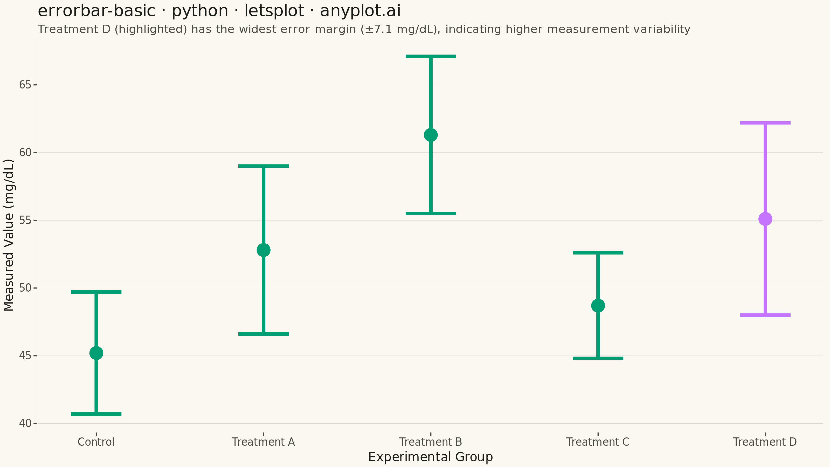
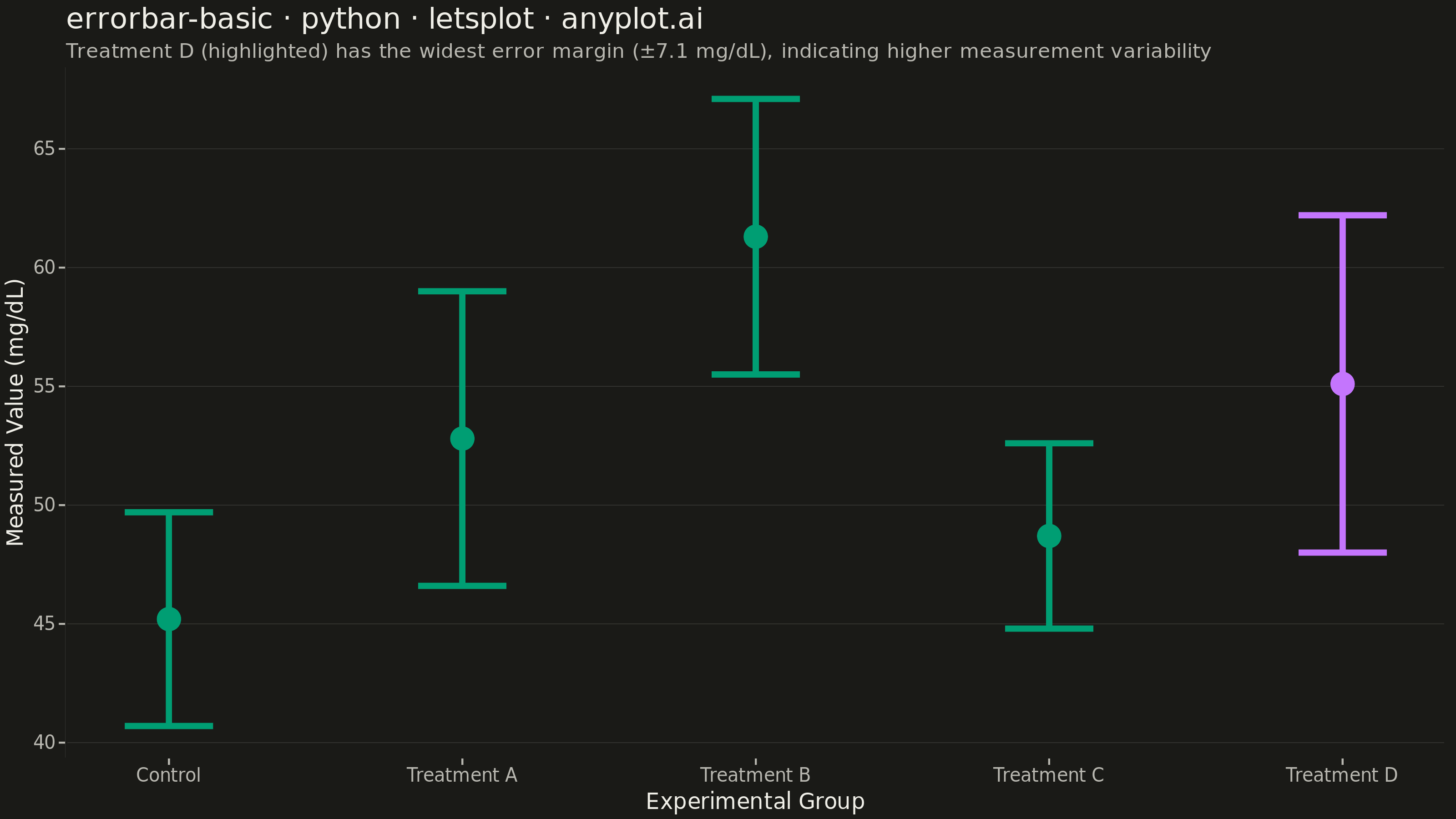
An error bar plot displays data points with associated uncertainty or variability represented by bars extending above and below (or left and right of) each point. Error bars commonly represent standard deviation, standard error, confidence intervals, or min/max ranges. This visualization is essential for communicating the reliability and precision of measurements or statistical estimates.
""" anyplot.ai
errorbar-basic: Basic Error Bar Plot
Library: letsplot 4.11.0 | Python 3.13.14
Quality: 89/100 | Updated: 2026-06-30
"""

import os

import pandas as pd
from lets_plot import (
    LetsPlot,
    aes,
    element_blank,
    element_line,
    element_rect,
    element_text,
    geom_errorbar,
    geom_point,
    ggplot,
    ggsave,
    ggsize,
    labs,
    scale_color_manual,
    theme,
    theme_minimal,
)


LetsPlot.setup_html()

THEME = os.getenv("ANYPLOT_THEME", "light")
PAGE_BG = "#FAF8F1" if THEME == "light" else "#1A1A17"
INK = "#1A1A17" if THEME == "light" else "#F0EFE8"
INK_SOFT = "#4A4A44" if THEME == "light" else "#B8B7B0"
ELEVATED_BG = "#FFFDF6" if THEME == "light" else "#242420"
RULE = "#1A1A1726" if THEME == "light" else "#F0EFE826"  # 15% opacity — subtle grid

BRAND = "#009E73"  # Imprint palette position 1
FOCAL = "#C475FD"  # Imprint palette position 2 — highlights group with largest spread

# Data — clinical measurements comparing control vs treatment groups
data = pd.DataFrame(
    {
        "experiment": ["Control", "Treatment A", "Treatment B", "Treatment C", "Treatment D"],
        "mean_value": [45.2, 52.8, 61.3, 48.7, 55.1],
        "error": [4.5, 6.2, 5.8, 3.9, 7.1],
    }
)
data["ymin"] = data["mean_value"] - data["error"]
data["ymax"] = data["mean_value"] + data["error"]

focal_idx = data["error"].idxmax()
data["highlight"] = ["focal" if i == focal_idx else "base" for i in data.index]

color_map = {"base": BRAND, "focal": FOCAL}

title = "errorbar-basic · python · letsplot · anyplot.ai"
subtitle = (
    "Treatment D (highlighted) has the widest error margin (±7.1 mg/dL), indicating higher measurement variability"
)

anyplot_theme = theme(
    plot_background=element_rect(fill=PAGE_BG, color=PAGE_BG),
    panel_background=element_rect(fill=PAGE_BG, color=PAGE_BG),
    panel_border=element_blank(),
    panel_grid_major_x=element_blank(),
    panel_grid_minor=element_blank(),
    panel_grid_major_y=element_line(color=RULE, size=0.3),
    axis_line=element_line(color=INK_SOFT),
    axis_ticks=element_line(color=INK_SOFT),
    axis_title=element_text(color=INK, size=12),
    axis_text=element_text(color=INK_SOFT, size=10),
    plot_title=element_text(color=INK, size=16),
    plot_subtitle=element_text(color=INK_SOFT, size=11),
    legend_position="none",
)

plot = (
    ggplot(data, aes(x="experiment", y="mean_value", color="highlight"))
    + geom_errorbar(aes(ymin="ymin", ymax="ymax"), width=0.3, size=1.5)
    + geom_point(size=6)
    + scale_color_manual(values=color_map)
    + labs(x="Experimental Group", y="Measured Value (mg/dL)", title=title, subtitle=subtitle)
    + theme_minimal()
    + anyplot_theme
    + ggsize(800, 450)
)

# PNG (scale=4 → 3200 × 1800 px)
ggsave(plot, f"plot-{THEME}.png", scale=4, path=".")

# HTML (interactive)
ggsave(plot, f"plot-{THEME}.html", path=".")
Runnable source as JSON, for any HTTP client: https://api.anyplot.ai/specs/errorbar-basic/letsplot/code. Any spec id and library id listed in llms-full.txt fit the same URL shape; every URL below is complete and callable.
{
  "spec_id": "errorbar-basic",
  "language": "python",
  "library": "letsplot",
  "page": "https://anyplot.ai/errorbar-basic/python/letsplot",
  "hub": "https://anyplot.ai/errorbar-basic",
  "code_json": "https://api.anyplot.ai/specs/errorbar-basic/letsplot/code",
  "spec_json": "https://api.anyplot.ai/specs/errorbar-basic",
  "render_light_png": "https://storage.googleapis.com/anyplot-images/plots/errorbar-basic/python/letsplot/plot-light.png",
  "render_dark_png": "https://storage.googleapis.com/anyplot-images/plots/errorbar-basic/python/letsplot/plot-dark.png",
  "interactive_light_html": "https://storage.googleapis.com/anyplot-images/plots/errorbar-basic/python/letsplot/plot-light.html",
  "interactive_dark_html": "https://storage.googleapis.com/anyplot-images/plots/errorbar-basic/python/letsplot/plot-dark.html",
  "quality_score": 89.0,
  "license": "MIT",
  "guide": "https://anyplot.ai/llms.txt"
}
Part of Basic Error Bar Plot on anyplot.ai.