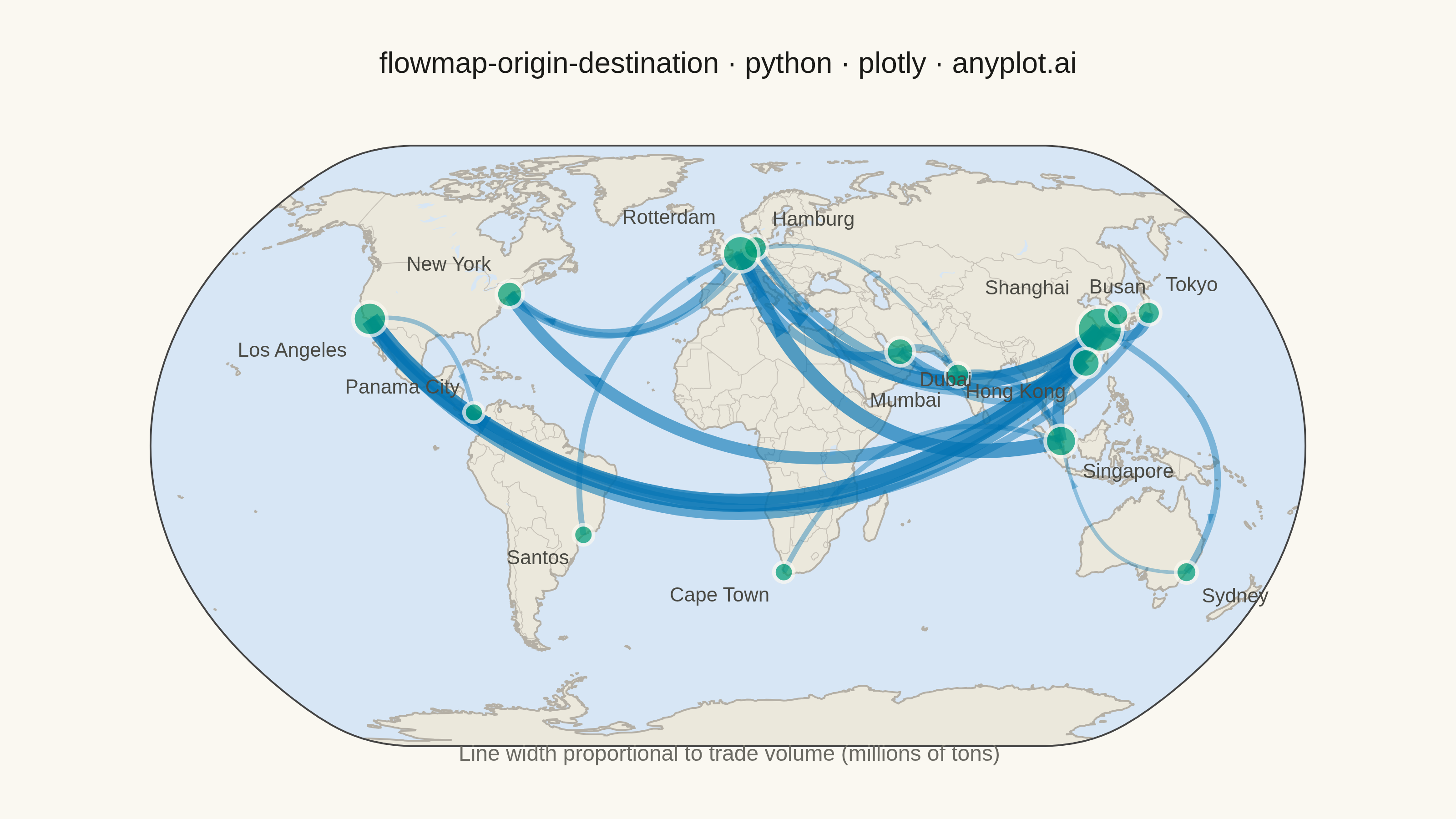
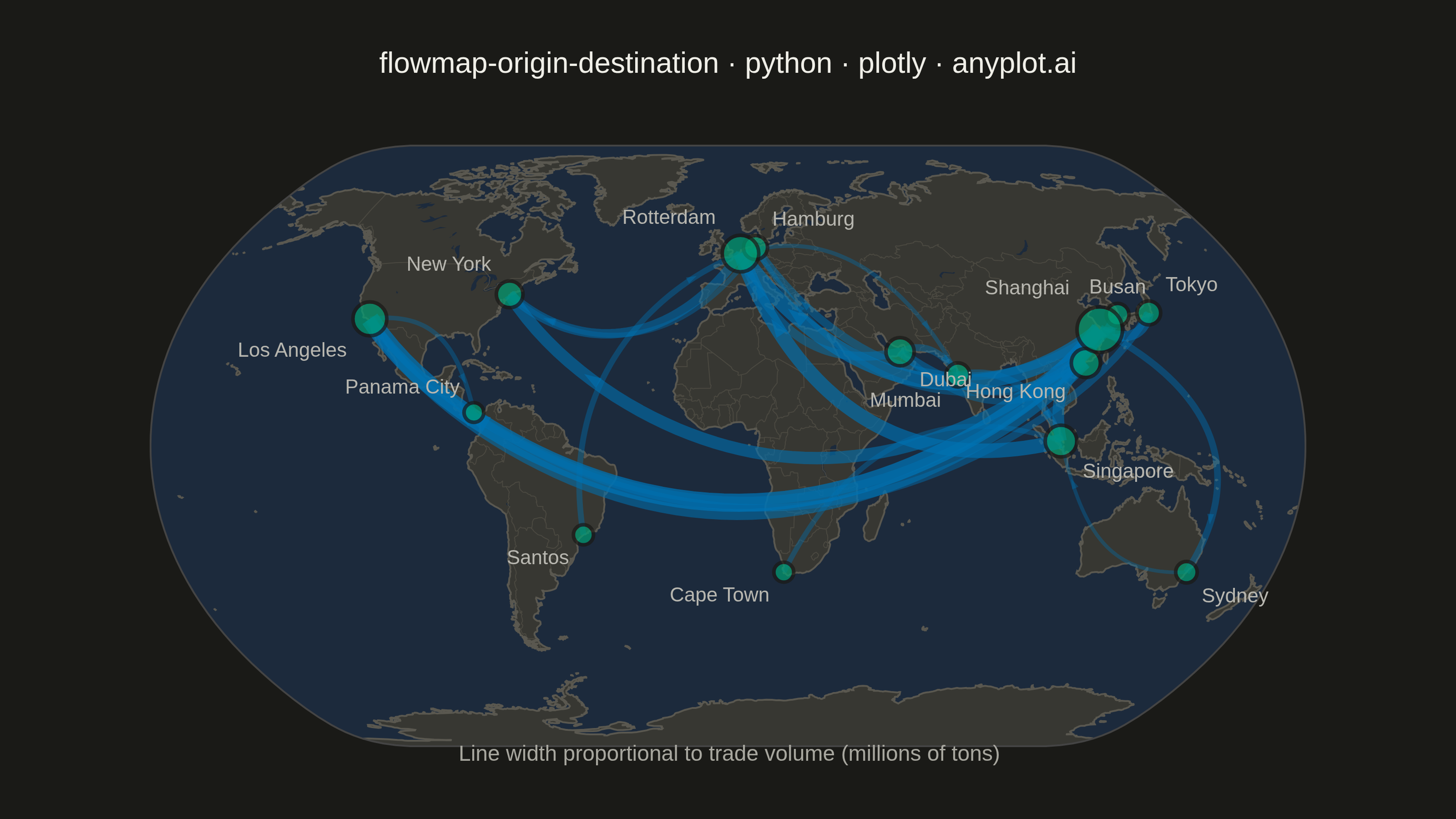
An origin-destination flow map visualizes movement or transfer between geographic locations using curved arcs overlaid on a map. Each arc connects an origin point to a destination point, with line thickness proportional to the flow magnitude. This visualization excels at revealing spatial patterns in migration, trade, or travel data, making it easy to identify major corridors, hub locations, and directional imbalances in movement between places.
""" anyplot.ai
flowmap-origin-destination: Origin-Destination Flow Map
Library: plotly 6.7.0 | Python 3.13.13
Quality: 84/100 | Updated: 2026-05-20
"""

import math
import os

import numpy as np
import plotly.graph_objects as go


# Theme tokens
THEME = os.getenv("ANYPLOT_THEME", "light")
PAGE_BG = "#FAF8F1" if THEME == "light" else "#1A1A17"
INK = "#1A1A17" if THEME == "light" else "#F0EFE8"
INK_SOFT = "#4A4A44" if THEME == "light" else "#B8B7B0"
INK_MUTED = "#6B6A63" if THEME == "light" else "#A8A79F"

# Basemap colors (theme-adaptive)
if THEME == "light":
    LAND_COLOR = "rgb(235, 232, 220)"
    OCEAN_COLOR = "rgb(215, 230, 245)"
    COAST_COLOR = "rgb(180, 175, 165)"
    COUNTRY_COLOR = "rgb(200, 195, 185)"
else:
    LAND_COLOR = "rgb(55, 55, 50)"
    OCEAN_COLOR = "rgb(28, 42, 60)"
    COAST_COLOR = "rgb(90, 88, 80)"
    COUNTRY_COLOR = "rgb(75, 73, 65)"

# Okabe-Ito blue (position 3) for arcs; green (position 1) for city nodes
ARC_RGB = "0, 114, 178"
CITY_COLOR = "#009E73"

# Data: Major international trade flows between world ports
np.random.seed(42)

cities = {
    "Shanghai": (31.2, 121.5),
    "Los Angeles": (34.1, -118.2),
    "Rotterdam": (51.9, 4.5),
    "Singapore": (1.3, 103.8),
    "Dubai": (25.3, 55.3),
    "New York": (40.7, -74.0),
    "Tokyo": (35.7, 139.7),
    "Hamburg": (53.6, 10.0),
    "Busan": (35.2, 129.1),
    "Hong Kong": (22.3, 114.2),
    "Santos": (-23.9, -46.3),
    "Mumbai": (19.1, 72.9),
    "Sydney": (-33.9, 151.2),
    "Cape Town": (-33.9, 18.4),
    "Panama City": (9.0, -79.5),
}

# Per-city label positions — East Asian cluster spread aggressively to avoid overlap
label_positions = {
    "Shanghai": "top left",
    "Tokyo": "top right",
    "Busan": "top center",
    "Hong Kong": "bottom left",
    "Singapore": "bottom right",
    "Rotterdam": "top left",
    "Hamburg": "top right",
    "New York": "top left",
    "Los Angeles": "bottom left",
    "Dubai": "bottom right",
    "Mumbai": "bottom left",
    "Santos": "bottom left",
    "Cape Town": "bottom left",
    "Sydney": "bottom right",
    "Panama City": "top left",
}

flows_data = [
    ("Shanghai", "Los Angeles", 85),
    ("Shanghai", "Rotterdam", 72),
    ("Singapore", "Rotterdam", 68),
    ("Shanghai", "New York", 58),
    ("Hong Kong", "Los Angeles", 52),
    ("Tokyo", "Shanghai", 48),
    ("Rotterdam", "New York", 45),
    ("Dubai", "Rotterdam", 42),
    ("Busan", "Los Angeles", 40),
    ("Shanghai", "Hamburg", 38),
    ("Mumbai", "Singapore", 35),
    ("Shanghai", "Sydney", 32),
    ("Hong Kong", "Dubai", 30),
    ("Santos", "Rotterdam", 28),
    ("Cape Town", "Singapore", 25),
    ("Shanghai", "Dubai", 45),
    ("Singapore", "Hong Kong", 55),
    ("Los Angeles", "Panama City", 22),
    ("Rotterdam", "Mumbai", 20),
    ("Tokyo", "Los Angeles", 36),
    ("Sydney", "Singapore", 18),
    ("Hamburg", "New York", 24),
    ("Dubai", "Mumbai", 33),
    ("Busan", "Shanghai", 29),
    ("Hong Kong", "Hamburg", 26),
]

flow_values = [f[2] for f in flows_data]
max_flow = max(flow_values)
min_flow = min(flow_values)
line_widths = [2 + 8 * (v - min_flow) / (max_flow - min_flow) for v in flow_values]

# Plot
fig = go.Figure()

# Add flow arcs using quadratic Bezier curves
for i, (origin, dest, volume) in enumerate(flows_data):
    o_lat, o_lon = cities[origin]
    d_lat, d_lon = cities[dest]

    t = np.linspace(0, 1, 50)
    mid_lat = (o_lat + d_lat) / 2
    mid_lon = (o_lon + d_lon) / 2

    dist = np.sqrt((d_lat - o_lat) ** 2 + (d_lon - o_lon) ** 2)
    arc_height = dist * 0.2
    dx = d_lon - o_lon
    dy = d_lat - o_lat
    perp_x = -dy / (dist + 0.001) * arc_height * 2
    perp_y = dx / (dist + 0.001) * arc_height * 2
    ctrl_lat = mid_lat + perp_y
    ctrl_lon = mid_lon + perp_x

    arc_lats = (1 - t) ** 2 * o_lat + 2 * (1 - t) * t * ctrl_lat + t**2 * d_lat
    arc_lons = (1 - t) ** 2 * o_lon + 2 * (1 - t) * t * ctrl_lon + t**2 * d_lon

    intensity = (volume - min_flow) / (max_flow - min_flow)
    opacity = 0.35 + 0.40 * intensity

    fig.add_trace(
        go.Scattergeo(
            lon=arc_lons,
            lat=arc_lats,
            mode="lines",
            line={"width": line_widths[i], "color": f"rgba({ARC_RGB}, {opacity:.2f})"},
            hoverinfo="text",
            hovertext=f"{origin} → {dest}<br>Volume: {volume}M tons",
            showlegend=False,
        )
    )

    # Directional arrow at ~85% along arc, rotated to match the bezier tangent
    t_a = 0.85
    a_lat = (1 - t_a) ** 2 * o_lat + 2 * (1 - t_a) * t_a * ctrl_lat + t_a**2 * d_lat
    a_lon = (1 - t_a) ** 2 * o_lon + 2 * (1 - t_a) * t_a * ctrl_lon + t_a**2 * d_lon
    dir_lat = 2 * (1 - t_a) * (ctrl_lat - o_lat) + 2 * t_a * (d_lat - ctrl_lat)
    dir_lon = 2 * (1 - t_a) * (ctrl_lon - o_lon) + 2 * t_a * (d_lon - ctrl_lon)
    arrow_angle = 90 - math.degrees(math.atan2(dir_lat, dir_lon))
    fig.add_trace(
        go.Scattergeo(
            lon=[a_lon],
            lat=[a_lat],
            mode="markers",
            marker={
                "symbol": "arrow",
                "size": max(6, int(line_widths[i] * 1.5)),
                "color": f"rgba({ARC_RGB}, {opacity:.2f})",
                "angle": arrow_angle,
            },
            hoverinfo="skip",
            showlegend=False,
        )
    )

# City markers and labels
all_cities = {o for o, _, _ in flows_data} | {d for _, d, _ in flows_data}
city_names = list(all_cities)
city_lats = [cities[c][0] for c in city_names]
city_lons = [cities[c][1] for c in city_names]

city_totals = {}
for o, d, v in flows_data:
    city_totals[o] = city_totals.get(o, 0) + v
    city_totals[d] = city_totals.get(d, 0) + v

max_total = max(city_totals.values())
marker_sizes = [10 + 15 * city_totals[c] / max_total for c in city_names]
text_pos = [label_positions.get(c, "top center") for c in city_names]

fig.add_trace(
    go.Scattergeo(
        lon=city_lons,
        lat=city_lats,
        mode="markers+text",
        marker={"size": marker_sizes, "color": CITY_COLOR, "line": {"width": 2, "color": PAGE_BG}},
        text=city_names,
        textposition=text_pos,
        textfont={"size": 11, "color": INK_SOFT},
        hoverinfo="text",
        hovertext=[f"{c}<br>Total: {city_totals[c]}M tons" for c in city_names],
        showlegend=False,
    )
)

# Style
fig.update_layout(
    title={
        "text": "flowmap-origin-destination · python · plotly · anyplot.ai",
        "font": {"size": 16, "color": INK},
        "x": 0.5,
        "xanchor": "center",
    },
    geo={
        "projection_type": "natural earth",
        "showland": True,
        "landcolor": LAND_COLOR,
        "showocean": True,
        "oceancolor": OCEAN_COLOR,
        "showcoastlines": True,
        "coastlinecolor": COAST_COLOR,
        "coastlinewidth": 1,
        "showlakes": True,
        "lakecolor": OCEAN_COLOR,
        "showcountries": True,
        "countrycolor": COUNTRY_COLOR,
        "countrywidth": 0.5,
        "bgcolor": "rgba(0,0,0,0)",
    },
    paper_bgcolor=PAGE_BG,
    margin={"l": 20, "r": 20, "t": 80, "b": 40},
    annotations=[
        {
            "text": "Line width proportional to trade volume (millions of tons)",
            "x": 0.5,
            "y": -0.04,
            "xref": "paper",
            "yref": "paper",
            "showarrow": False,
            "font": {"size": 12, "color": INK_MUTED},
        }
    ],
)

# Save
fig.write_image(f"plot-{THEME}.png", width=800, height=450, scale=4)
fig.write_html(f"plot-{THEME}.html", include_plotlyjs="cdn")
Runnable source as JSON, for any HTTP client: https://api.anyplot.ai/specs/flowmap-origin-destination/plotly/code. Any spec id and library id listed in llms-full.txt fit the same URL shape; every URL below is complete and callable.
{
  "spec_id": "flowmap-origin-destination",
  "language": "python",
  "library": "plotly",
  "page": "https://anyplot.ai/flowmap-origin-destination/python/plotly",
  "hub": "https://anyplot.ai/flowmap-origin-destination",
  "code_json": "https://api.anyplot.ai/specs/flowmap-origin-destination/plotly/code",
  "spec_json": "https://api.anyplot.ai/specs/flowmap-origin-destination",
  "render_light_png": "https://storage.googleapis.com/anyplot-images/plots/flowmap-origin-destination/python/plotly/plot-light.png",
  "render_dark_png": "https://storage.googleapis.com/anyplot-images/plots/flowmap-origin-destination/python/plotly/plot-dark.png",
  "interactive_light_html": "https://storage.googleapis.com/anyplot-images/plots/flowmap-origin-destination/python/plotly/plot-light.html",
  "interactive_dark_html": "https://storage.googleapis.com/anyplot-images/plots/flowmap-origin-destination/python/plotly/plot-dark.html",
  "quality_score": 84.0,
  "license": "MIT",
  "guide": "https://anyplot.ai/llms.txt"
}
Part of Origin-Destination Flow Map on anyplot.ai.