The same plot in 14 other libraries — Python: Altair, Bokeh, lets-plot, Matplotlib, Plotly, plotnine, Pygal, Seaborn; Julia: Makie.jl; JavaScript: Chart.js, D3.js, Apache ECharts, Highcharts, MUI X Charts. Compare all 15 side by side: Origin-Destination Flow Map in Python, R, Julia and JavaScript.
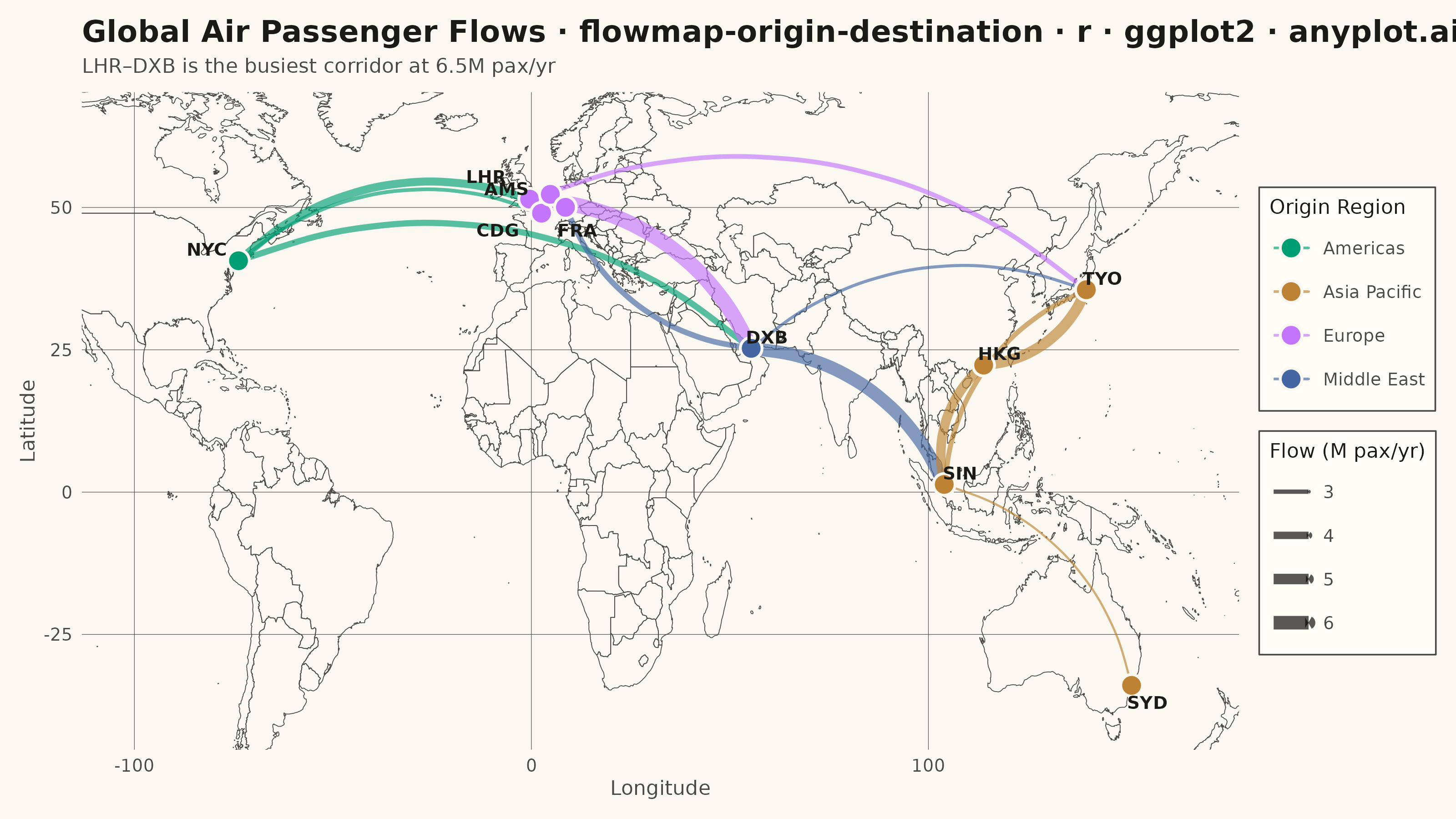
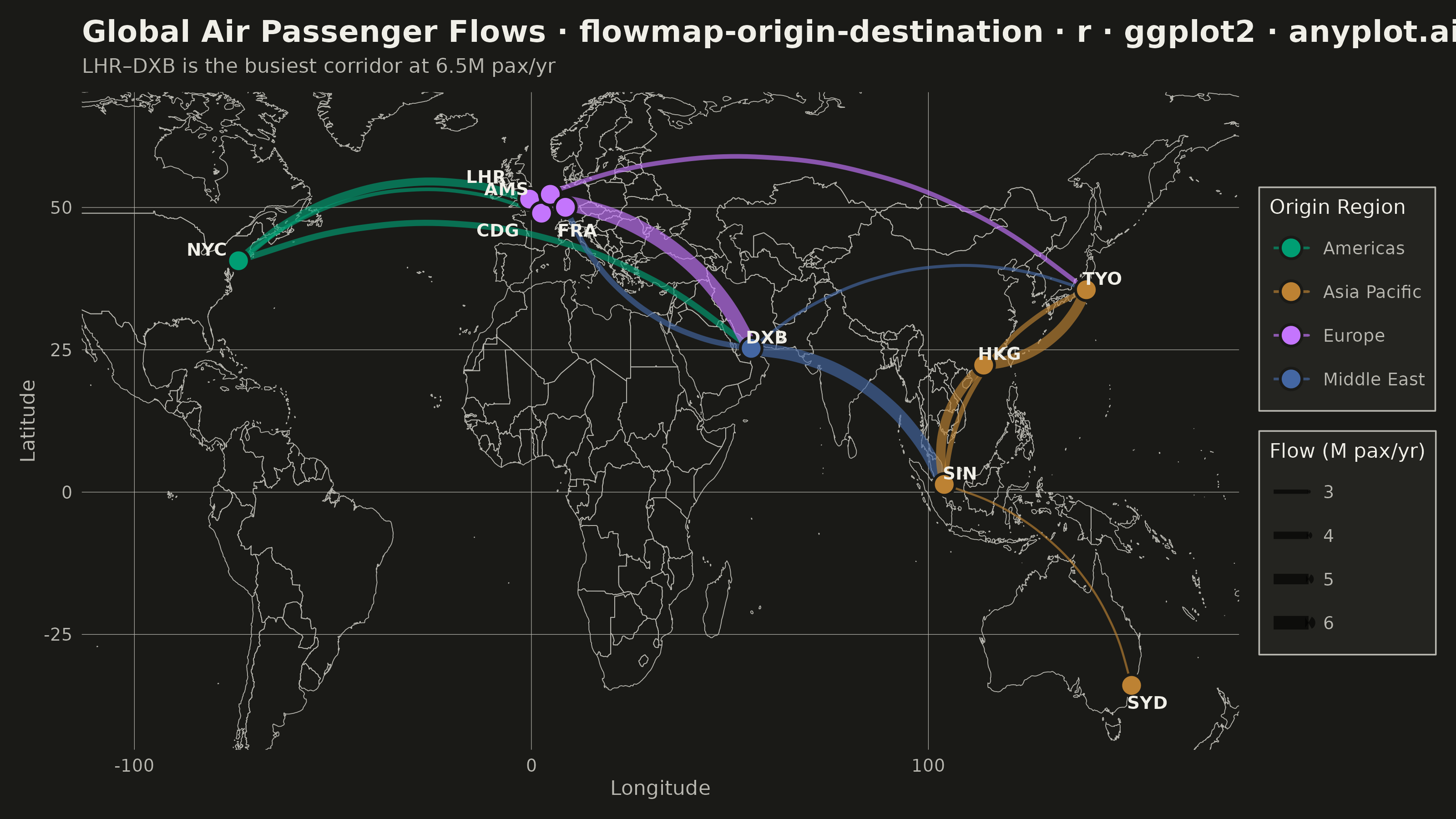
An origin-destination flow map visualizes movement or transfer between geographic locations using curved arcs overlaid on a map. Each arc connects an origin point to a destination point, with line thickness proportional to the flow magnitude. This visualization excels at revealing spatial patterns in migration, trade, or travel data, making it easy to identify major corridors, hub locations, and directional imbalances in movement between places.
#' anyplot.ai
#' flowmap-origin-destination: Origin-Destination Flow Map
#' Library: ggplot2 3.5.1 | R 4.4.1
#' Quality: 81/100 | Created: 2026-05-20

library(ggplot2)
library(dplyr)
library(maps)
library(ragg)

set.seed(42)

# Theme tokens
THEME       <- Sys.getenv("ANYPLOT_THEME", "light")
PAGE_BG     <- if (THEME == "light") "#FAF8F1" else "#1A1A17"
ELEVATED_BG <- if (THEME == "light") "#FFFDF6" else "#242420"
INK         <- if (THEME == "light") "#1A1A17" else "#F0EFE8"
INK_SOFT    <- if (THEME == "light") "#4A4A44" else "#B8B7B0"
IMPRINT   <- c("#009E73", "#C475FD", "#4467A3", "#BD8233",
                 "#AE3030", "#2ABCCD", "#954477")

# World basemap polygons for geographic context
world <- map_data("world")

# Major global air hub coordinates and IATA codes
airports <- data.frame(
  name   = c("New York", "London", "Paris", "Dubai", "Tokyo",
             "Singapore", "Sydney", "Hong Kong", "Amsterdam", "Frankfurt"),
  code   = c("NYC", "LHR", "CDG", "DXB", "TYO",
             "SIN", "SYD", "HKG", "AMS", "FRA"),
  lat    = c(40.64, 51.47, 49.00, 25.25, 35.55,
             1.35, -33.95, 22.31, 52.31, 50.03),
  lon    = c(-73.78, -0.45, 2.55, 55.36, 139.78,
             103.99, 151.18, 113.92, 4.76, 8.57),
  region = c("Americas", "Europe", "Europe", "Middle East", "Asia Pacific",
             "Asia Pacific", "Asia Pacific", "Asia Pacific", "Europe", "Europe"),
  stringsAsFactors = FALSE
)

# Synthetic international air passenger flows (millions per year)
flows_raw <- data.frame(
  origin = c("New York", "New York", "New York", "London", "London",
             "London", "Dubai", "Dubai", "Dubai", "Singapore",
             "Singapore", "Singapore", "Tokyo", "Frankfurt", "Amsterdam"),
  dest   = c("London", "Paris", "Dubai", "Dubai", "Tokyo",
             "Amsterdam", "Singapore", "Frankfurt", "Tokyo", "Hong Kong",
             "Sydney", "Tokyo", "Hong Kong", "Amsterdam", "Paris"),
  flow   = c(4.2, 2.8, 3.6, 6.5, 3.1, 2.5, 5.8, 3.4, 2.6, 4.7,
             2.3, 3.2, 5.1, 3.8, 2.9),
  stringsAsFactors = FALSE
)

# Join origin and destination coordinates
flows <- flows_raw |>
  left_join(airports[, c("name", "lat", "lon", "region")],
            by = c("origin" = "name")) |>
  rename(origin_lat = lat, origin_lon = lon, origin_region = region) |>
  left_join(airports[, c("name", "lat", "lon")],
            by = c("dest" = "name")) |>
  rename(dest_lat = lat, dest_lon = lon)

region_colors <- c(
  "Americas"     = IMPRINT[1],
  "Europe"       = IMPRINT[2],
  "Middle East"  = IMPRINT[3],
  "Asia Pacific" = IMPRINT[4]
)

# Manual label nudges to spread the dense European cluster
airports$nudge_x <- c(-8, -11, -11,  4,  4,  4,  4,  4, -11,  3)
airports$nudge_y <- c( 2,   4,  -3,  2,  2,  2, -3,  2,   1, -4)

p <- ggplot() +
  geom_polygon(
    data = world,
    aes(x = long, y = lat, group = group),
    fill      = NA,
    color     = INK_SOFT,
    linewidth = 0.15
  ) +
  geom_curve(
    data = flows,
    aes(
      x         = origin_lon, y         = origin_lat,
      xend      = dest_lon,   yend      = dest_lat,
      color     = origin_region,
      linewidth = flow
    ),
    curvature = -0.3,
    alpha     = 0.65,
    arrow     = arrow(length = unit(0.006, "npc"), type = "open")
  ) +
  geom_point(
    data = airports,
    aes(x = lon, y = lat, fill = region),
    shape  = 21,
    color  = PAGE_BG,
    size   = 3.5,
    stroke = 0.8
  ) +
  geom_text(
    data = airports,
    aes(x = lon + nudge_x, y = lat + nudge_y, label = code),
    color    = INK,
    size     = 2.5,
    fontface = "bold"
  ) +
  scale_color_manual(values = region_colors, name = "Origin Region") +
  scale_fill_manual(values = region_colors, name = "Origin Region") +
  scale_linewidth_continuous(range = c(0.4, 2.8), name = "Flow (M pax/yr)") +
  coord_cartesian(xlim = c(-100, 165), ylim = c(-40, 65)) +
  labs(
    title    = "Global Air Passenger Flows · flowmap-origin-destination · r · ggplot2 · anyplot.ai",
    subtitle = "LHR–DXB is the busiest corridor at 6.5M pax/yr",
    x = "Longitude", y = "Latitude"
  ) +
  theme_minimal(base_size = 8) +
  theme(
    plot.background   = element_rect(fill = PAGE_BG, color = PAGE_BG),
    panel.background  = element_rect(fill = PAGE_BG, color = NA),
    panel.grid.major  = element_line(color = INK_SOFT, linewidth = 0.1),
    panel.grid.minor  = element_blank(),
    axis.text         = element_text(color = INK_SOFT, size = 7),
    axis.title        = element_text(color = INK_SOFT, size = 8),
    axis.ticks        = element_blank(),
    plot.title        = element_text(color = INK, size = 12, face = "bold",
                                     margin = margin(b = 4)),
    plot.subtitle     = element_text(color = INK_SOFT, size = 8,
                                     margin = margin(b = 6)),
    legend.background = element_rect(fill = ELEVATED_BG, color = INK_SOFT,
                                     linewidth = 0.3),
    legend.text       = element_text(color = INK_SOFT, size = 7),
    legend.title      = element_text(color = INK, size = 8),
    legend.key        = element_rect(fill = NA, color = NA),
    legend.position   = "right",
    plot.margin       = margin(t = 8, r = 8, b = 8, l = 8)
  ) +
  guides(
    fill  = guide_legend(order = 1),
    color = guide_legend(order = 1),
    linewidth = guide_legend(order = 2)
  )

ggsave(
  filename = sprintf("plot-%s.png", THEME),
  plot     = p,
  device   = ragg::agg_png,
  width    = 8,
  height   = 4.5,
  units    = "in",
  dpi      = 400
)
Runnable source as JSON, for any HTTP client: https://api.anyplot.ai/specs/flowmap-origin-destination/ggplot2/code. Any spec id and library id listed in llms-full.txt fit the same URL shape; every URL below is complete and callable.
{
  "spec_id": "flowmap-origin-destination",
  "language": "r",
  "library": "ggplot2",
  "page": "https://anyplot.ai/flowmap-origin-destination/r/ggplot2",
  "hub": "https://anyplot.ai/flowmap-origin-destination",
  "code_json": "https://api.anyplot.ai/specs/flowmap-origin-destination/ggplot2/code",
  "spec_json": "https://api.anyplot.ai/specs/flowmap-origin-destination",
  "render_light_png": "https://storage.googleapis.com/anyplot-images/plots/flowmap-origin-destination/r/ggplot2/plot-light.png",
  "render_dark_png": "https://storage.googleapis.com/anyplot-images/plots/flowmap-origin-destination/r/ggplot2/plot-dark.png",
  "quality_score": 81.0,
  "license": "MIT",
  "guide": "https://anyplot.ai/llms.txt"
}
Part of Origin-Destination Flow Map on anyplot.ai.