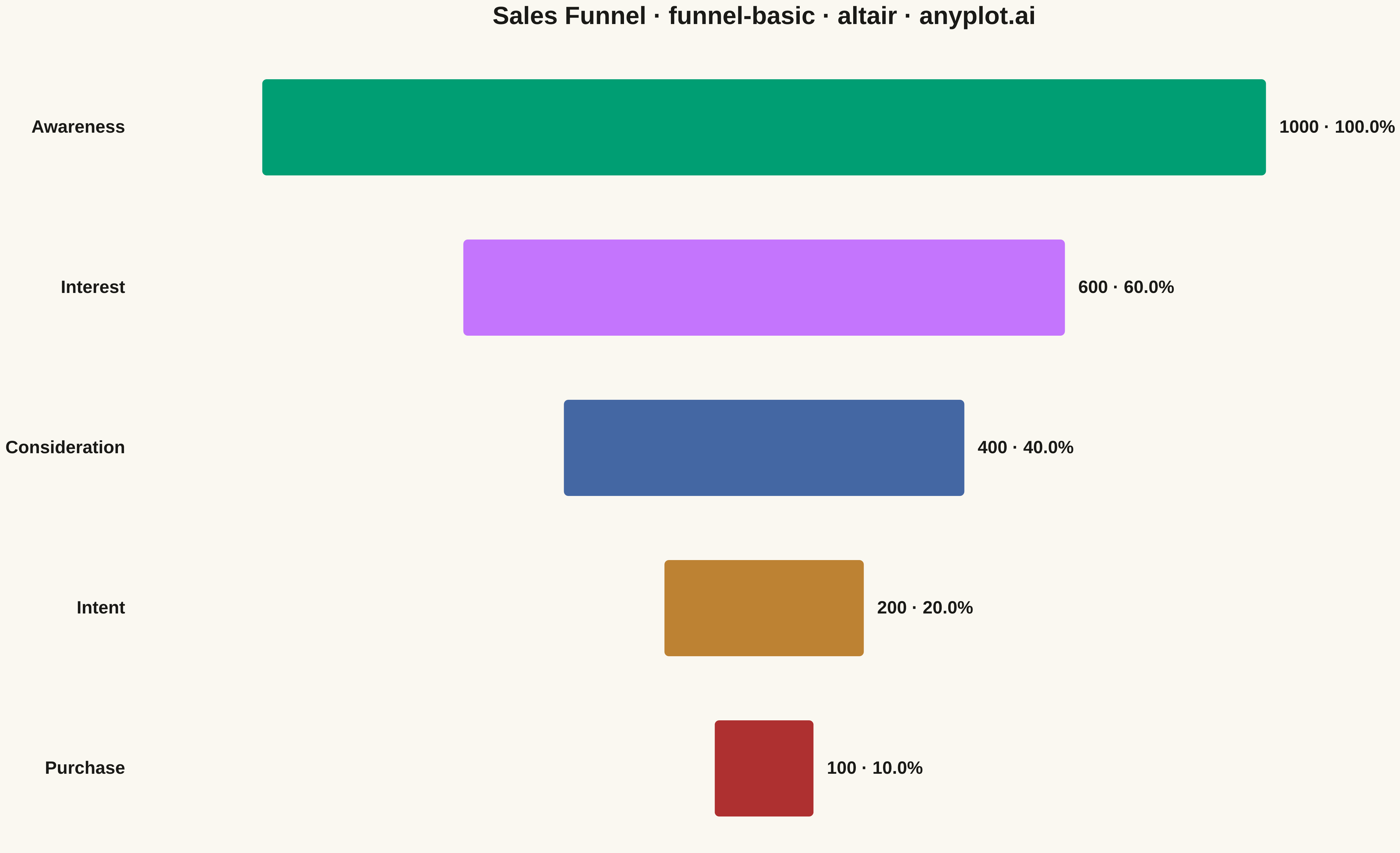
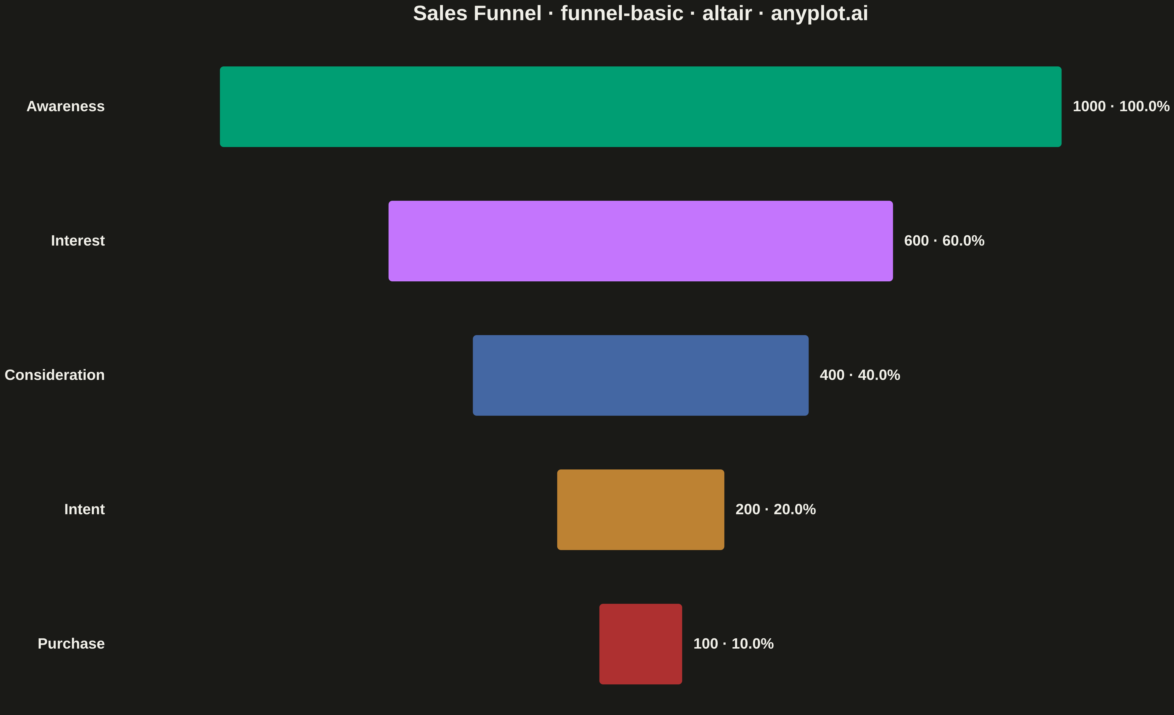
A funnel chart visualizes sequential stages of a process where values progressively decrease from one stage to the next. Each stage is represented as a trapezoidal segment that narrows from top to bottom, making it easy to identify drop-offs between stages. This chart is ideal for tracking conversion rates, sales pipelines, and multi-step processes where understanding stage-to-stage transitions is critical.
""" anyplot.ai
funnel-basic: Basic Funnel Chart
Library: altair 6.1.0 | Python 3.14.4
Quality: 87/100 | Updated: 2026-04-26
"""

import os

import altair as alt
import pandas as pd


# Theme-adaptive chrome
THEME = os.getenv("ANYPLOT_THEME", "light")
PAGE_BG = "#FAF8F1" if THEME == "light" else "#1A1A17"
ELEVATED_BG = "#FFFDF6" if THEME == "light" else "#242420"
INK = "#1A1A17" if THEME == "light" else "#F0EFE8"
INK_SOFT = "#4A4A44" if THEME == "light" else "#B8B7B0"

# Okabe-Ito categorical palette — first stage is brand green (#009E73)
IMPRINT = ["#009E73", "#C475FD", "#4467A3", "#BD8233", "#AE3030"]

# Data — sales funnel example from the specification
stages = ["Awareness", "Interest", "Consideration", "Intent", "Purchase"]
values = [1000, 600, 400, 200, 100]

df = pd.DataFrame({"stage": stages, "value": values})
df["percentage"] = (df["value"] / df["value"].iloc[0] * 100).round(1)
df["label"] = df["value"].astype(str) + "  ·  " + df["percentage"].astype(str) + "%"

# Centered funnel: bars span [-value/2, +value/2]; mid is always 0
df["x_start"] = -df["value"] / 2
df["x_end"] = df["value"] / 2
df["x_mid"] = 0

x_scale = alt.Scale(domain=[-620, 620])

# Funnel bars (centered, narrowing)
bars = (
    alt.Chart(df)
    .mark_bar(cornerRadius=6, height=110, stroke=PAGE_BG, strokeWidth=2)
    .encode(
        x=alt.X("x_start:Q", axis=None, scale=x_scale),
        x2="x_end:Q",
        y=alt.Y("stage:N", sort=stages, axis=alt.Axis(title=None, labelPadding=18, ticks=False, domain=False)),
        color=alt.Color("stage:N", scale=alt.Scale(domain=stages, range=IMPRINT), legend=None),
        tooltip=[
            alt.Tooltip("stage:N", title="Stage"),
            alt.Tooltip("value:Q", title="Count", format=","),
            alt.Tooltip("percentage:Q", title="% of top", format=".1f"),
        ],
    )
)

# Value + percentage labels positioned to the right of each bar
labels = (
    alt.Chart(df)
    .mark_text(align="left", baseline="middle", dx=14, fontSize=20, fontWeight="bold", color=INK)
    .encode(x=alt.X("x_end:Q", scale=x_scale, axis=None), y=alt.Y("stage:N", sort=stages), text="label:N")
)

chart = (
    (bars + labels)
    .properties(
        width=1400,
        height=900,
        background=PAGE_BG,
        title=alt.Title(
            "Sales Funnel · funnel-basic · altair · anyplot.ai", fontSize=28, color=INK, anchor="middle", offset=20
        ),
    )
    .configure_view(fill=PAGE_BG, stroke=None)
    .configure_axis(
        labelFontSize=20,
        labelFontWeight="bold",
        labelColor=INK,
        titleColor=INK,
        domainColor=INK_SOFT,
        tickColor=INK_SOFT,
        grid=False,
    )
    .configure_title(color=INK)
    .configure_legend(fillColor=ELEVATED_BG, strokeColor=INK_SOFT, labelColor=INK_SOFT, titleColor=INK)
)

chart.save(f"plot-{THEME}.png", scale_factor=3.0)
chart.save(f"plot-{THEME}.html")
Runnable source as JSON, for any HTTP client: https://api.anyplot.ai/specs/funnel-basic/altair/code. Any spec id and library id listed in llms-full.txt fit the same URL shape; every URL below is complete and callable.
{
  "spec_id": "funnel-basic",
  "language": "python",
  "library": "altair",
  "page": "https://anyplot.ai/funnel-basic/python/altair",
  "hub": "https://anyplot.ai/funnel-basic",
  "code_json": "https://api.anyplot.ai/specs/funnel-basic/altair/code",
  "spec_json": "https://api.anyplot.ai/specs/funnel-basic",
  "render_light_png": "https://storage.googleapis.com/anyplot-images/plots/funnel-basic/python/altair/plot-light.png",
  "render_dark_png": "https://storage.googleapis.com/anyplot-images/plots/funnel-basic/python/altair/plot-dark.png",
  "interactive_light_html": "https://storage.googleapis.com/anyplot-images/plots/funnel-basic/python/altair/plot-light.html",
  "interactive_dark_html": "https://storage.googleapis.com/anyplot-images/plots/funnel-basic/python/altair/plot-dark.html",
  "quality_score": 87.0,
  "license": "MIT",
  "guide": "https://anyplot.ai/llms.txt"
}
Part of Basic Funnel Chart on anyplot.ai.