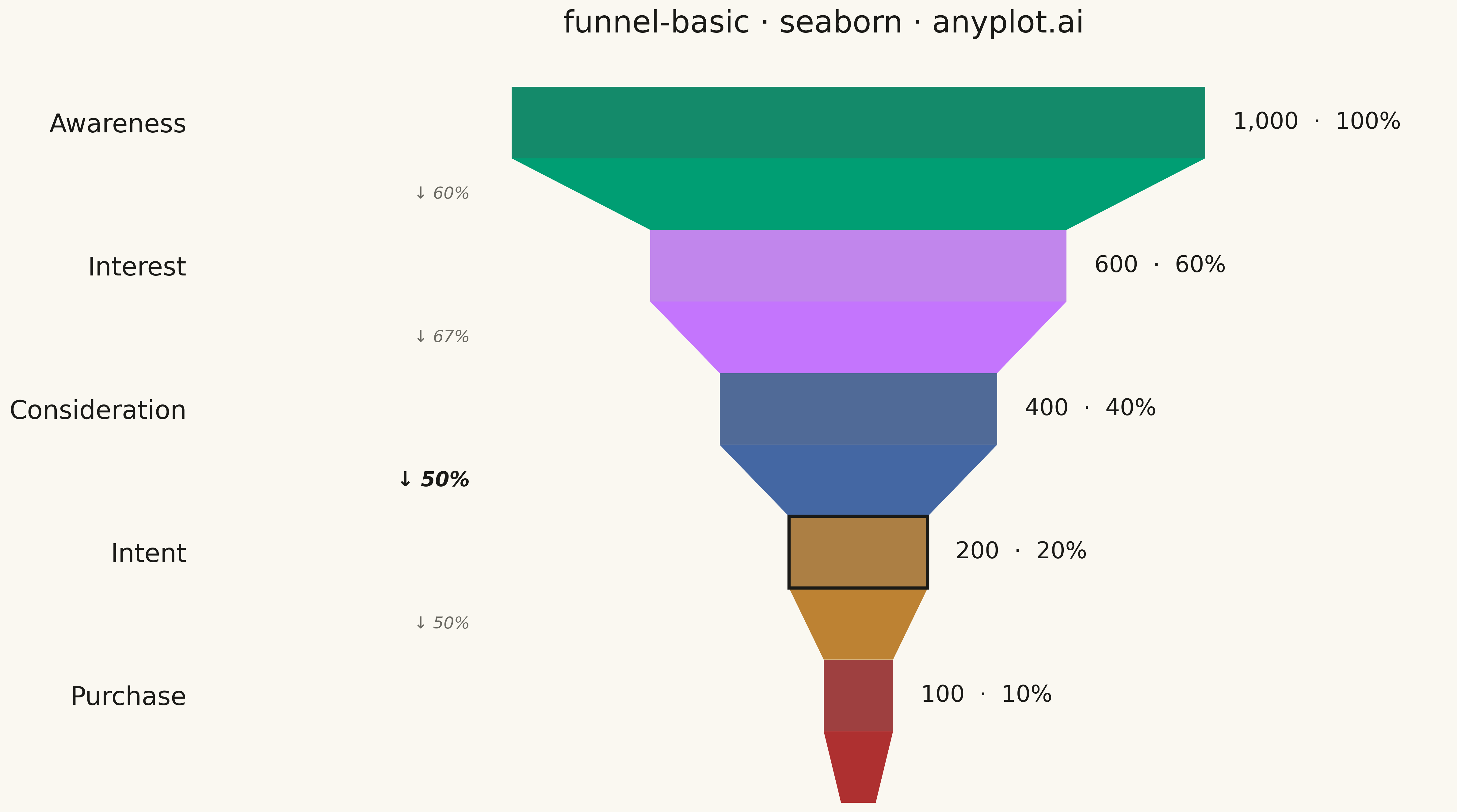
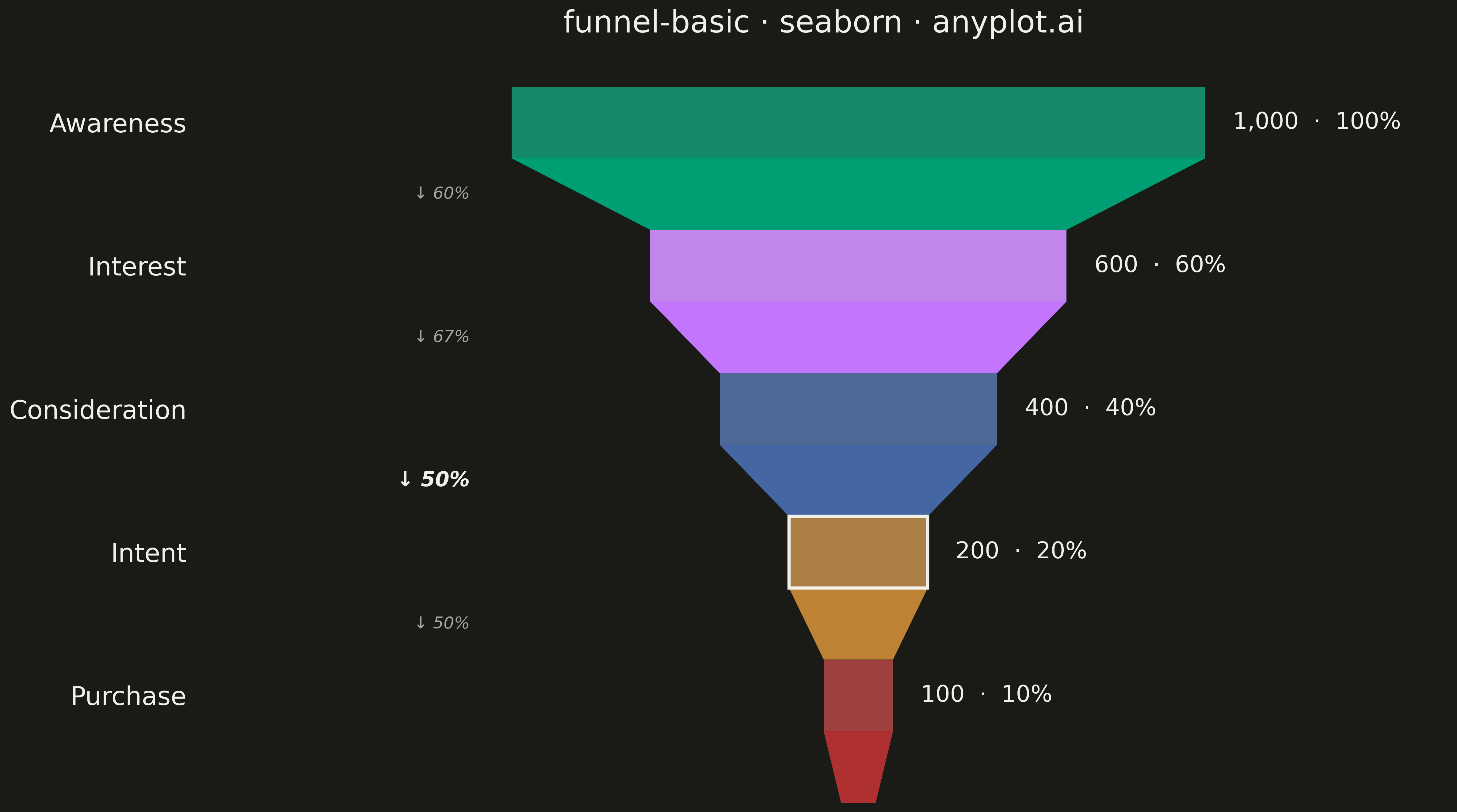
A funnel chart visualizes sequential stages of a process where values progressively decrease from one stage to the next. Each stage is represented as a trapezoidal segment that narrows from top to bottom, making it easy to identify drop-offs between stages. This chart is ideal for tracking conversion rates, sales pipelines, and multi-step processes where understanding stage-to-stage transitions is critical.
""" anyplot.ai
funnel-basic: Basic Funnel Chart
Library: seaborn 0.13.2 | Python 3.14.4
Quality: 90/100 | Updated: 2026-04-26
"""

import os

import matplotlib.pyplot as plt
import seaborn as sns
from matplotlib.patches import Polygon


# Theme tokens
THEME = os.getenv("ANYPLOT_THEME", "light")
PAGE_BG = "#FAF8F1" if THEME == "light" else "#1A1A17"
INK = "#1A1A17" if THEME == "light" else "#F0EFE8"
INK_SOFT = "#4A4A44" if THEME == "light" else "#B8B7B0"
INK_MUTED = "#6B6A63" if THEME == "light" else "#A8A79F"

# Okabe-Ito palette — first series always #009E73
IMPRINT = ["#009E73", "#C475FD", "#4467A3", "#BD8233", "#AE3030"]

# Sales funnel data
stages = ["Awareness", "Interest", "Consideration", "Intent", "Purchase"]
values = [1000, 600, 400, 200, 100]
max_value = values[0]
percentages = [v / max_value * 100 for v in values]
conversions = [values[i + 1] / values[i] * 100 for i in range(len(values) - 1)]
# Stage transition with the largest drop-off (lowest retention)
worst_idx = min(range(len(conversions)), key=conversions.__getitem__)

sns.set_theme(
    style="white",
    rc={
        "figure.facecolor": PAGE_BG,
        "axes.facecolor": PAGE_BG,
        "text.color": INK,
        "axes.labelcolor": INK,
        "ytick.color": INK,
        "xtick.color": INK_SOFT,
    },
)

fig, ax = plt.subplots(figsize=(16, 9), facecolor=PAGE_BG)
ax.set_facecolor(PAGE_BG)

# Seaborn draws the rectangular core of each stage; trapezoidal panels added
# below tie the cores into a continuous funnel silhouette in stage colors.
sns.barplot(
    x=values,
    y=stages,
    hue=stages,
    order=stages,
    palette=IMPRINT[: len(stages)],
    ax=ax,
    legend=False,
    width=0.50,
    edgecolor="none",
)

# Center each bar on x=0 so the silhouette narrows symmetrically
bars = list(ax.patches)[: len(stages)]
for patch in bars:
    patch.set_x(-patch.get_width() / 2)

# Trapezoidal panels between stages — each panel inherits the upper stage color
# so visually each stage = rectangle + tapering trapezoid below it.
for i in range(len(bars) - 1):
    p_top, p_bot = bars[i], bars[i + 1]
    top_y = p_top.get_y() + p_top.get_height()
    bot_y = p_bot.get_y()
    ax.add_patch(
        Polygon(
            [
                (p_top.get_x(), top_y),
                (p_top.get_x() + p_top.get_width(), top_y),
                (p_bot.get_x() + p_bot.get_width(), bot_y),
                (p_bot.get_x(), bot_y),
            ],
            facecolor=IMPRINT[i],
            edgecolor="none",
            zorder=1,
        )
    )

# Closing tail below the last stage so the funnel ends with a proper taper
last_bar = bars[-1]
last_top_y = last_bar.get_y() + last_bar.get_height()
tail_height = 0.50
tail_bot_w = last_bar.get_width() * 0.5
ax.add_patch(
    Polygon(
        [
            (last_bar.get_x(), last_top_y),
            (last_bar.get_x() + last_bar.get_width(), last_top_y),
            (tail_bot_w / 2, last_top_y + tail_height),
            (-tail_bot_w / 2, last_top_y + tail_height),
        ],
        facecolor=IMPRINT[-1],
        edgecolor="none",
        zorder=1,
    )
)

# Emphasise the bar after the worst drop-off with a thicker outline accent
worst_bar = bars[worst_idx + 1]
worst_bar.set_edgecolor(INK)
worst_bar.set_linewidth(2.5)
worst_bar.set_zorder(3)

# Value + percentage labels are placed OUTSIDE bars (right) so narrow stages
# never overflow onto the page background.
right_offset = max_value * 0.04
for i, patch in enumerate(bars):
    cy = patch.get_y() + patch.get_height() / 2
    x_right = patch.get_x() + patch.get_width()
    ax.text(
        x_right + right_offset,
        cy,
        f"{values[i]:,}  ·  {percentages[i]:.0f}%",
        ha="left",
        va="center",
        fontsize=18,
        fontweight="medium",
        color=INK,
    )

# Conversion-rate annotations on the LEFT, with the largest drop-off
# rendered bolder and in full-strength ink for visual emphasis.
left_anchor = -max_value / 2 - max_value * 0.06
for i in range(len(conversions)):
    p_top, p_bot = bars[i], bars[i + 1]
    y_mid = (p_top.get_y() + p_top.get_height() + p_bot.get_y()) / 2
    is_worst = i == worst_idx
    ax.text(
        left_anchor,
        y_mid,
        f"↓ {conversions[i]:.0f}%",
        ha="right",
        va="center",
        fontsize=16 if is_worst else 13,
        fontweight="bold" if is_worst else "normal",
        style="italic",
        color=INK if is_worst else INK_MUTED,
    )

# Awareness on top — matplotlib's default places the first category at the bottom
ax.invert_yaxis()
ax.set_ylim(len(stages) - 1 + tail_height + 0.25, -0.45)

sns.despine(ax=ax, left=True, bottom=True)
ax.set_xticks([])
ax.set_xlabel("")
ax.set_ylabel("")
ax.tick_params(axis="y", labelsize=20, length=0, pad=10)

ax.set_xlim(-max_value * 0.95, max_value * 0.85)

ax.set_title("funnel-basic · seaborn · anyplot.ai", fontsize=24, fontweight="medium", color=INK, pad=20)

plt.tight_layout()
plt.savefig(f"plot-{THEME}.png", dpi=300, bbox_inches="tight", facecolor=PAGE_BG)
Runnable source as JSON, for any HTTP client: https://api.anyplot.ai/specs/funnel-basic/seaborn/code. Any spec id and library id listed in llms-full.txt fit the same URL shape; every URL below is complete and callable.
{
  "spec_id": "funnel-basic",
  "language": "python",
  "library": "seaborn",
  "page": "https://anyplot.ai/funnel-basic/python/seaborn",
  "hub": "https://anyplot.ai/funnel-basic",
  "code_json": "https://api.anyplot.ai/specs/funnel-basic/seaborn/code",
  "spec_json": "https://api.anyplot.ai/specs/funnel-basic",
  "render_light_png": "https://storage.googleapis.com/anyplot-images/plots/funnel-basic/python/seaborn/plot-light.png",
  "render_dark_png": "https://storage.googleapis.com/anyplot-images/plots/funnel-basic/python/seaborn/plot-dark.png",
  "quality_score": 90.0,
  "license": "MIT",
  "guide": "https://anyplot.ai/llms.txt"
}
Part of Basic Funnel Chart on anyplot.ai.