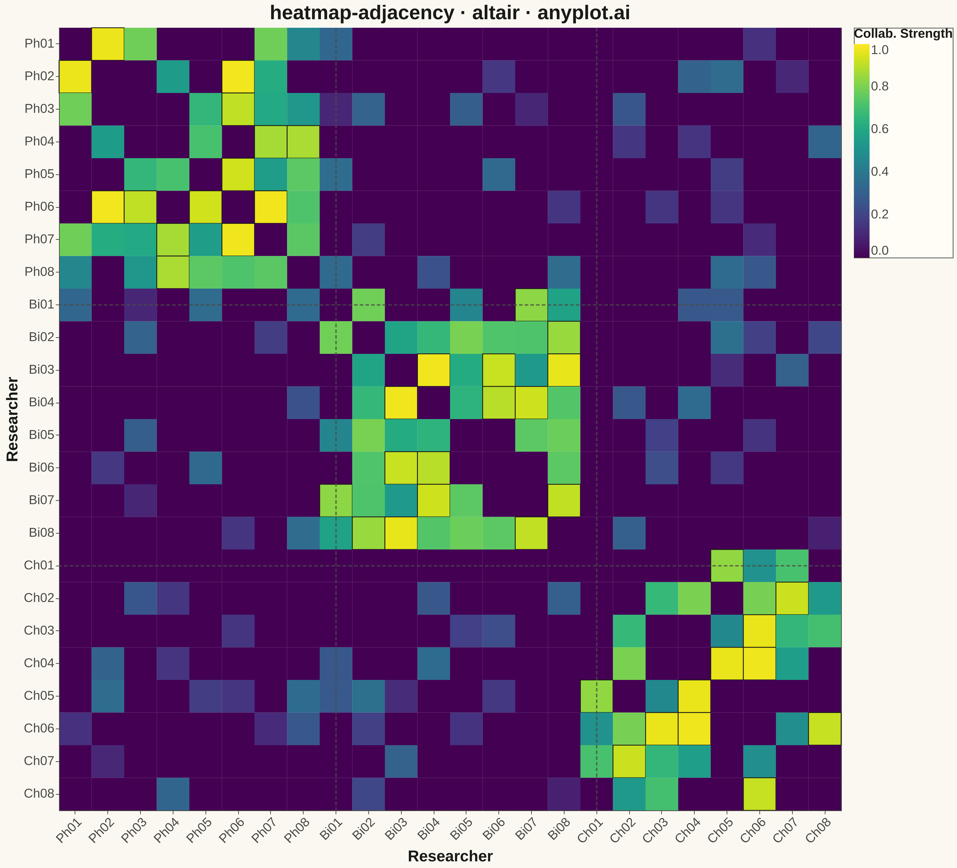
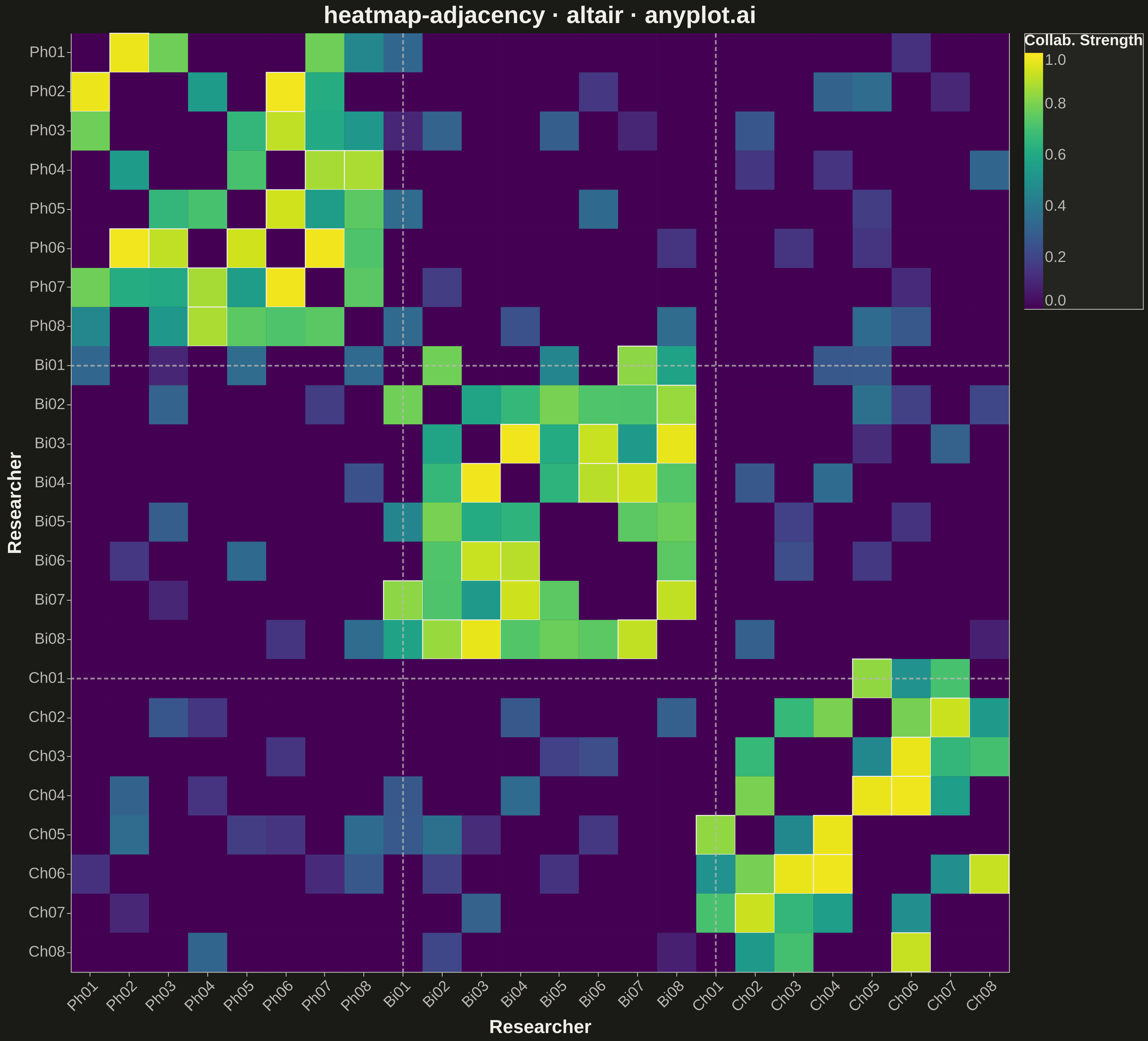
The same plot in 14 other libraries — Python: Bokeh, lets-plot, Matplotlib, Plotly, plotnine, Pygal, Seaborn; R: ggplot2; Julia: Makie.jl; JavaScript: Chart.js, D3.js, Apache ECharts, Highcharts, MUI X Charts. Compare all 15 side by side: Network Adjacency Matrix Heatmap in Python, R, Julia and JavaScript.
A matrix-based representation of a network or graph where rows and columns represent nodes and cell color indicates the presence or weight of edges between them. This visualization complements node-link diagrams by excelling at revealing clusters, structural patterns, and density in large or dense networks where node-link layouts become cluttered. Reordering nodes by cluster, degree, or community membership exposes block-diagonal structure and makes group boundaries immediately visible.
""" anyplot.ai
heatmap-adjacency: Network Adjacency Matrix Heatmap
Library: altair 6.1.0 | Python 3.13.13
Quality: 85/100 | Created: 2026-05-08
"""

import os

import altair as alt
import numpy as np
import pandas as pd


# Theme tokens
THEME = os.getenv("ANYPLOT_THEME", "light")
PAGE_BG = "#FAF8F1" if THEME == "light" else "#1A1A17"
ELEVATED_BG = "#FFFDF6" if THEME == "light" else "#242420"
INK = "#1A1A17" if THEME == "light" else "#F0EFE8"
INK_SOFT = "#4A4A44" if THEME == "light" else "#B8B7B0"

# Data: academic co-authorship network — 3 research departments, 8 members each
np.random.seed(42)
n_per_dept = 8
node_names = (
    [f"Ph{i + 1:02d}" for i in range(8)] + [f"Bi{i + 1:02d}" for i in range(8)] + [f"Ch{i + 1:02d}" for i in range(8)]
)
n_nodes = len(node_names)

# Symmetric adjacency matrix with strong within-dept and sparse cross-dept ties
adj = np.zeros((n_nodes, n_nodes))
for i in range(n_nodes):
    for j in range(i + 1, n_nodes):
        same_dept = (i // n_per_dept) == (j // n_per_dept)
        if same_dept:
            weight = np.random.uniform(0.45, 1.0) if np.random.random() > 0.18 else 0.0
        else:
            weight = np.random.uniform(0.08, 0.38) if np.random.random() > 0.74 else 0.0
        adj[i, j] = weight
        adj[j, i] = weight  # undirected: fill both triangles

# Long-format dataframe for Altair
records = [
    {"from": node_names[i], "to": node_names[j], "weight": adj[i, j]} for i in range(n_nodes) for j in range(n_nodes)
]
df = pd.DataFrame(records)

# Plot
TITLE = "heatmap-adjacency · altair · anyplot.ai"

chart = (
    alt.Chart(df)
    .mark_rect()
    .encode(
        x=alt.X("from:O", sort=node_names, axis=alt.Axis(title="Researcher")),
        y=alt.Y("to:O", sort=node_names, axis=alt.Axis(title="Researcher")),
        color=alt.Color(
            "weight:Q",
            scale=alt.Scale(scheme="viridis", domain=[0, 1]),
            legend=alt.Legend(title="Collab. Strength", gradientLength=300, gradientThickness=22),
        ),
        tooltip=[
            alt.Tooltip("from:O", title="From"),
            alt.Tooltip("to:O", title="To"),
            alt.Tooltip("weight:Q", title="Strength", format=".2f"),
        ],
    )
    .properties(width=1100, height=1100, title=TITLE, background=PAGE_BG)
    .configure_title(fontSize=28, color=INK)
    .configure_axis(
        domainColor=INK_SOFT,
        tickColor=INK_SOFT,
        gridOpacity=0.0,
        labelColor=INK_SOFT,
        titleColor=INK,
        labelFontSize=16,
        titleFontSize=22,
    )
    .configure_axisX(labelAngle=-45)
    .configure_view(fill=PAGE_BG, stroke=INK_SOFT)
    .configure_legend(
        fillColor=ELEVATED_BG,
        strokeColor=INK_SOFT,
        labelColor=INK_SOFT,
        titleColor=INK,
        titleFontSize=18,
        labelFontSize=16,
    )
)

# Save
chart.save(f"plot-{THEME}.png", scale_factor=3.0)
chart.save(f"plot-{THEME}.html")
Runnable source as JSON, for any HTTP client: https://api.anyplot.ai/specs/heatmap-adjacency/altair/code. Any spec id and library id listed in llms-full.txt fit the same URL shape; every URL below is complete and callable.
{
  "spec_id": "heatmap-adjacency",
  "language": "python",
  "library": "altair",
  "page": "https://anyplot.ai/heatmap-adjacency/python/altair",
  "hub": "https://anyplot.ai/heatmap-adjacency",
  "code_json": "https://api.anyplot.ai/specs/heatmap-adjacency/altair/code",
  "spec_json": "https://api.anyplot.ai/specs/heatmap-adjacency",
  "render_light_png": "https://storage.googleapis.com/anyplot-images/plots/heatmap-adjacency/python/altair/plot-light.png",
  "render_dark_png": "https://storage.googleapis.com/anyplot-images/plots/heatmap-adjacency/python/altair/plot-dark.png",
  "interactive_light_html": "https://storage.googleapis.com/anyplot-images/plots/heatmap-adjacency/python/altair/plot-light.html",
  "interactive_dark_html": "https://storage.googleapis.com/anyplot-images/plots/heatmap-adjacency/python/altair/plot-dark.html",
  "quality_score": 85.0,
  "license": "MIT",
  "guide": "https://anyplot.ai/llms.txt"
}
Part of Network Adjacency Matrix Heatmap on anyplot.ai.