The same plot in 14 other libraries — Python: Altair, Bokeh, lets-plot, Matplotlib, plotnine, Pygal, Seaborn; R: ggplot2; Julia: Makie.jl; JavaScript: Chart.js, D3.js, Apache ECharts, Highcharts, MUI X Charts. Compare all 15 side by side: Network Adjacency Matrix Heatmap in Python, R, Julia and JavaScript.
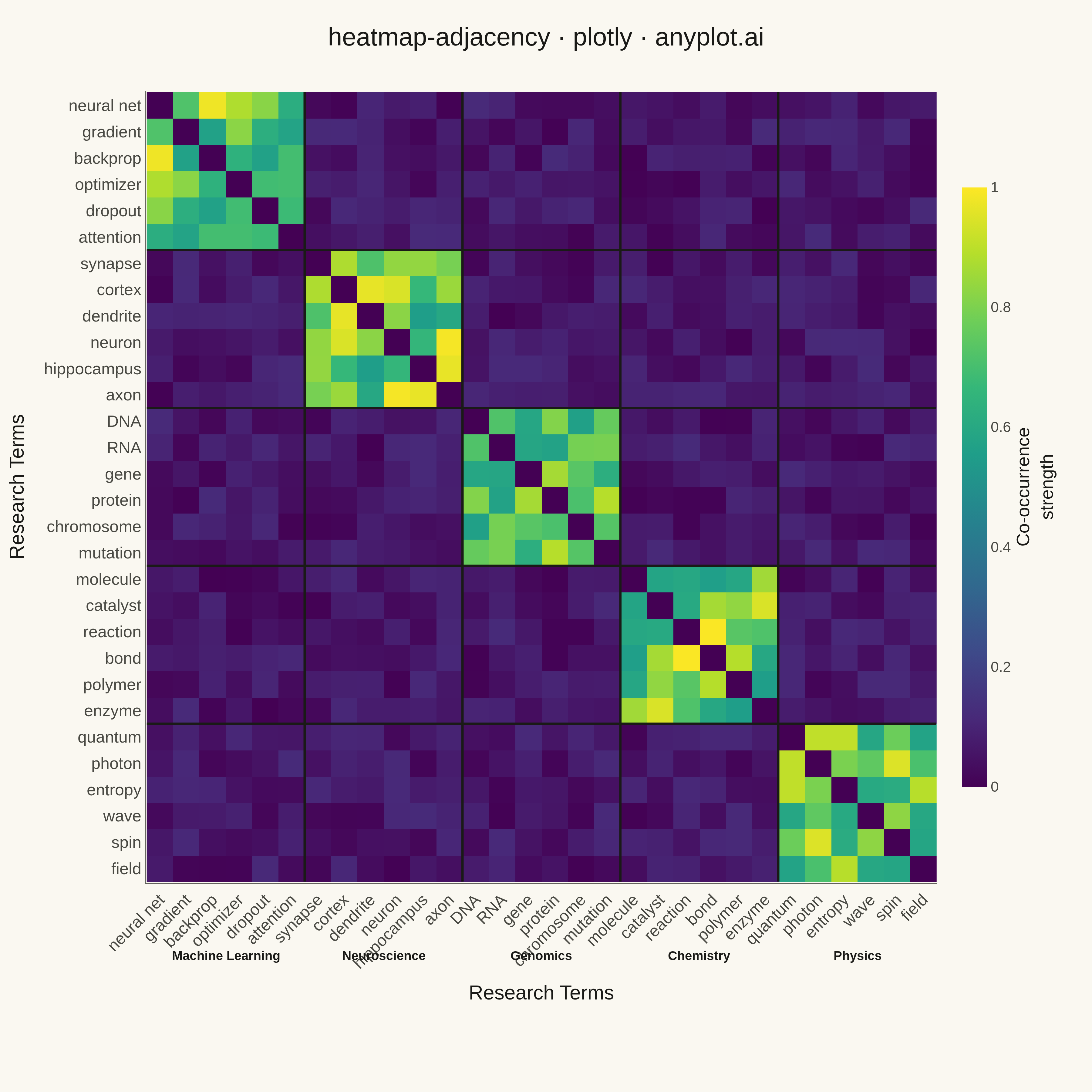
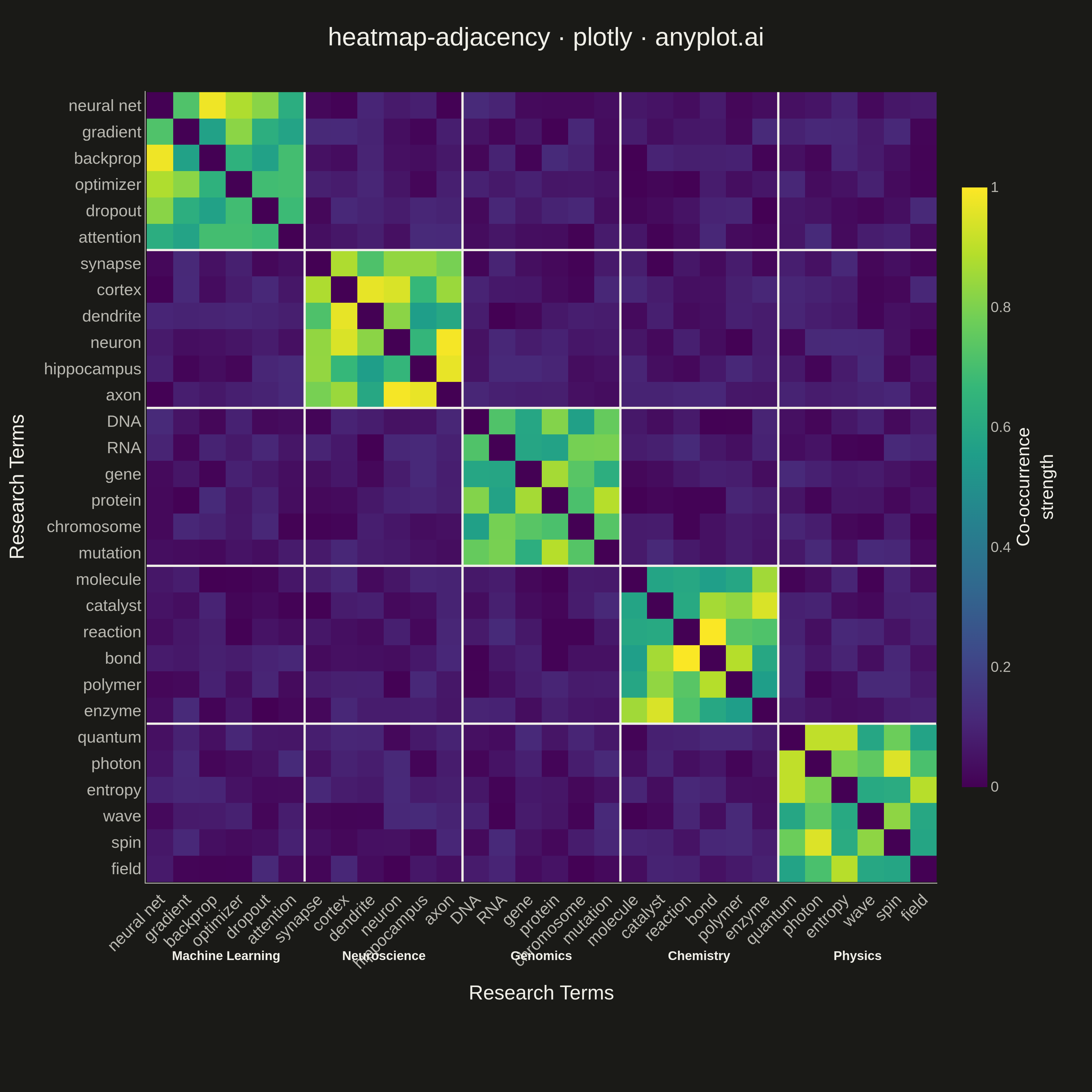
A matrix-based representation of a network or graph where rows and columns represent nodes and cell color indicates the presence or weight of edges between them. This visualization complements node-link diagrams by excelling at revealing clusters, structural patterns, and density in large or dense networks where node-link layouts become cluttered. Reordering nodes by cluster, degree, or community membership exposes block-diagonal structure and makes group boundaries immediately visible.
""" anyplot.ai
heatmap-adjacency: Network Adjacency Matrix Heatmap
Library: plotly 6.7.0 | Python 3.13.13
Quality: 81/100 | Created: 2026-05-08
"""

import os
import sys


# Prevent this file from shadowing the installed plotly package
_here = os.path.dirname(os.path.abspath(__file__))
sys.path = [p for p in sys.path if os.path.abspath(p) != _here]
del _here

import numpy as np
import plotly.graph_objects as go


# Theme tokens
THEME = os.getenv("ANYPLOT_THEME", "light")
PAGE_BG = "#FAF8F1" if THEME == "light" else "#1A1A17"
INK = "#1A1A17" if THEME == "light" else "#F0EFE8"
INK_SOFT = "#4A4A44" if THEME == "light" else "#B8B7B0"

# Data — 5 research domains, 6 terms each = 30 nodes
np.random.seed(42)

domains = {
    "Machine Learning": ["neural net", "gradient", "backprop", "optimizer", "dropout", "attention"],
    "Neuroscience": ["synapse", "cortex", "dendrite", "neuron", "hippocampus", "axon"],
    "Genomics": ["DNA", "RNA", "gene", "protein", "chromosome", "mutation"],
    "Chemistry": ["molecule", "catalyst", "reaction", "bond", "polymer", "enzyme"],
    "Physics": ["quantum", "photon", "entropy", "wave", "spin", "field"],
}

nodes = []
node_domain_idx = []
for di, (_, terms) in enumerate(domains.items()):
    nodes.extend(terms)
    node_domain_idx.extend([di] * len(terms))

n = len(nodes)

# Symmetric co-occurrence matrix with block-diagonal cluster structure
matrix = np.zeros((n, n))
for i in range(n):
    for j in range(i + 1, n):
        if node_domain_idx[i] == node_domain_idx[j]:
            val = np.random.uniform(0.55, 1.0)
        else:
            val = np.random.uniform(0.0, 0.12)
        matrix[i, j] = val
        matrix[j, i] = val

# Cluster boundary positions (between consecutive domain groups)
domain_size = 6
boundaries = [domain_size * k for k in range(1, len(domains))]

# Plot
fig = go.Figure(
    go.Heatmap(
        z=matrix,
        x=nodes,
        y=nodes,
        colorscale="viridis",
        zmin=0,
        zmax=1,
        colorbar={
            "title": {"text": "Co-occurrence<br>strength", "font": {"size": 20, "color": INK}, "side": "right"},
            "tickfont": {"size": 16, "color": INK_SOFT},
            "thickness": 28,
            "len": 0.78,
        },
        hovertemplate="%{y} ↔ %{x}<br>Strength: %{z:.2f}<extra></extra>",
    )
)

# Cluster boundary lines separating research domains
for b in boundaries:
    fig.add_shape(
        type="line", x0=b - 0.5, x1=b - 0.5, y0=-0.5, y1=n - 0.5, line={"color": INK, "width": 2.5}, xref="x", yref="y"
    )
    fig.add_shape(
        type="line", x0=-0.5, x1=n - 0.5, y0=b - 0.5, y1=b - 0.5, line={"color": INK, "width": 2.5}, xref="x", yref="y"
    )

fig.update_layout(
    title={
        "text": "Research Domain Co-occurrence · heatmap-adjacency · plotly · anyplot.ai",
        "font": {"size": 24, "color": INK},
        "x": 0.5,
        "xanchor": "center",
    },
    paper_bgcolor=PAGE_BG,
    plot_bgcolor=PAGE_BG,
    xaxis={
        "tickfont": {"size": 13, "color": INK_SOFT}, "tickangle": -45, "showgrid": False, "linecolor": INK_SOFT, "zeroline": False
    },
    yaxis={
        "tickfont": {"size": 13, "color": INK_SOFT}, "showgrid": False, "linecolor": INK_SOFT, "zeroline": False, "autorange": "reversed"
    },
    margin={"l": 130, "r": 150, "t": 80, "b": 170},
)

# Save
fig.write_image(f"plot-{THEME}.png", width=1200, height=1200, scale=3)
fig.write_html(f"plot-{THEME}.html", include_plotlyjs="cdn")
Runnable source as JSON, for any HTTP client: https://api.anyplot.ai/specs/heatmap-adjacency/plotly/code. Any spec id and library id listed in llms-full.txt fit the same URL shape; every URL below is complete and callable.
{
  "spec_id": "heatmap-adjacency",
  "language": "python",
  "library": "plotly",
  "page": "https://anyplot.ai/heatmap-adjacency/python/plotly",
  "hub": "https://anyplot.ai/heatmap-adjacency",
  "code_json": "https://api.anyplot.ai/specs/heatmap-adjacency/plotly/code",
  "spec_json": "https://api.anyplot.ai/specs/heatmap-adjacency",
  "render_light_png": "https://storage.googleapis.com/anyplot-images/plots/heatmap-adjacency/python/plotly/plot-light.png",
  "render_dark_png": "https://storage.googleapis.com/anyplot-images/plots/heatmap-adjacency/python/plotly/plot-dark.png",
  "interactive_light_html": "https://storage.googleapis.com/anyplot-images/plots/heatmap-adjacency/python/plotly/plot-light.html",
  "interactive_dark_html": "https://storage.googleapis.com/anyplot-images/plots/heatmap-adjacency/python/plotly/plot-dark.html",
  "quality_score": 81.0,
  "license": "MIT",
  "guide": "https://anyplot.ai/llms.txt"
}
Part of Network Adjacency Matrix Heatmap on anyplot.ai.