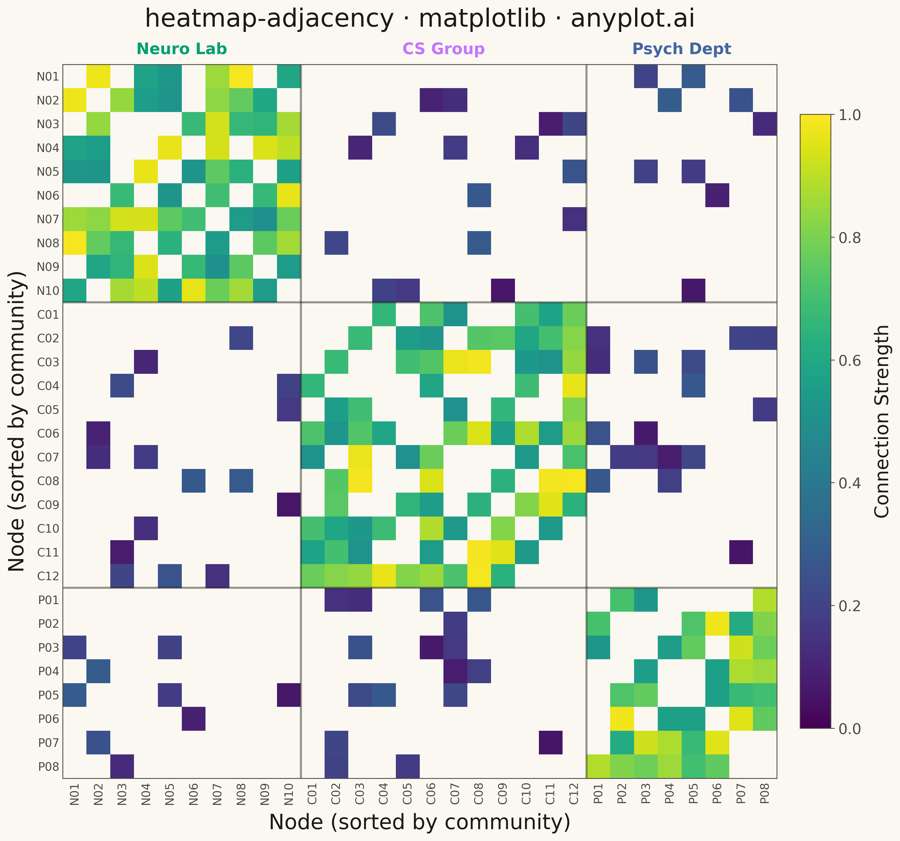
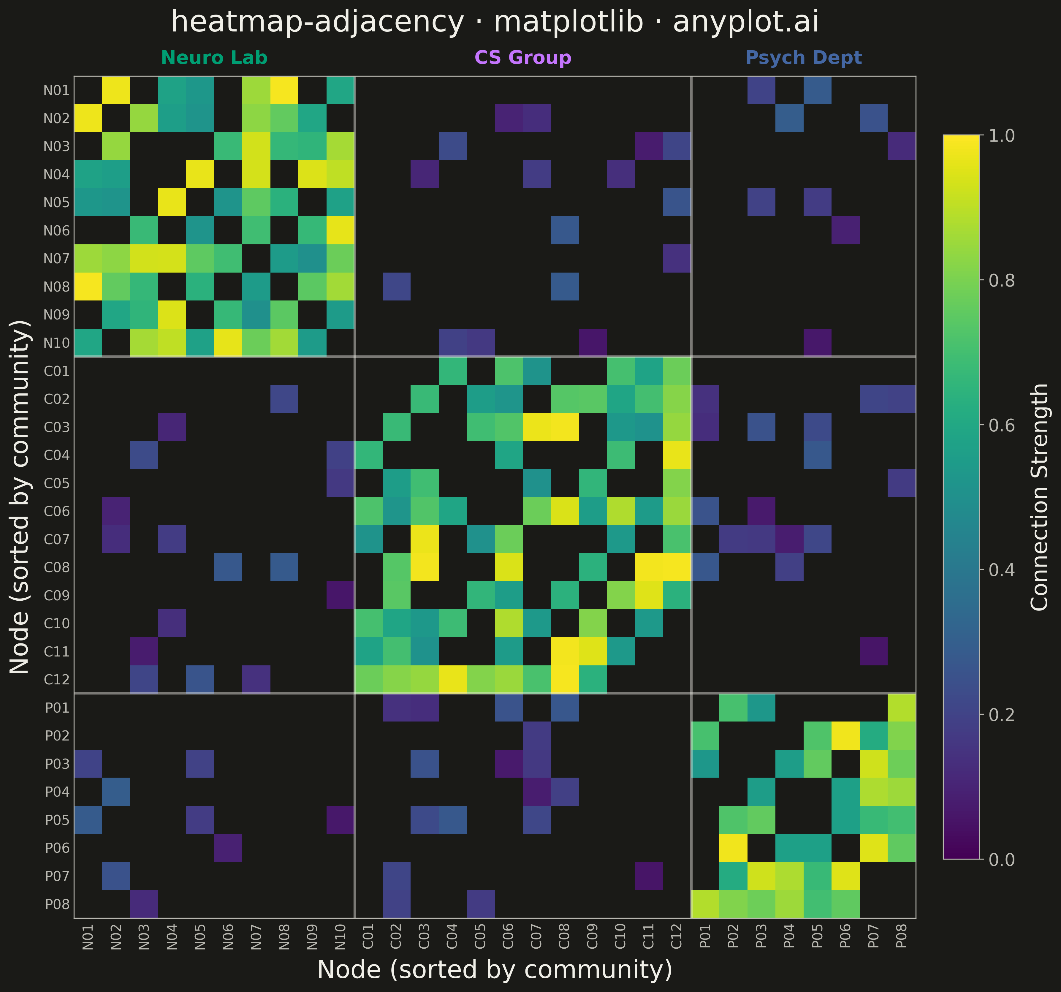
The same plot in 14 other libraries — Python: Altair, Bokeh, lets-plot, Plotly, plotnine, Pygal, Seaborn; R: ggplot2; Julia: Makie.jl; JavaScript: Chart.js, D3.js, Apache ECharts, Highcharts, MUI X Charts. Compare all 15 side by side: Network Adjacency Matrix Heatmap in Python, R, Julia and JavaScript.
A matrix-based representation of a network or graph where rows and columns represent nodes and cell color indicates the presence or weight of edges between them. This visualization complements node-link diagrams by excelling at revealing clusters, structural patterns, and density in large or dense networks where node-link layouts become cluttered. Reordering nodes by cluster, degree, or community membership exposes block-diagonal structure and makes group boundaries immediately visible.
""" anyplot.ai
heatmap-adjacency: Network Adjacency Matrix Heatmap
Library: matplotlib 3.10.9 | Python 3.13.13
Quality: 90/100 | Created: 2026-05-08
"""

import os

import matplotlib.pyplot as plt
import numpy as np
from matplotlib.transforms import blended_transform_factory


THEME = os.getenv("ANYPLOT_THEME", "light")
PAGE_BG = "#FAF8F1" if THEME == "light" else "#1A1A17"
ELEVATED_BG = "#FFFDF6" if THEME == "light" else "#242420"
INK = "#1A1A17" if THEME == "light" else "#F0EFE8"
INK_SOFT = "#4A4A44" if THEME == "light" else "#B8B7B0"
INK_MUTED = "#6B6A63" if THEME == "light" else "#A8A79F"

COMM_COLORS = ["#009E73", "#C475FD", "#4467A3"]  # Okabe-Ito positions 1–3

# Data: research collaboration network with 3 communities
np.random.seed(42)

community_sizes = [10, 12, 8]
community_names = ["Neuro Lab", "CS Group", "Psych Dept"]
n_nodes = sum(community_sizes)

communities = []
for idx, size in enumerate(community_sizes):
    communities.extend([idx] * size)
communities = np.array(communities)

prefixes = ["N", "C", "P"]
node_labels = []
counts_per_comm = [0, 0, 0]
for c in communities:
    counts_per_comm[c] += 1
    node_labels.append(f"{prefixes[c]}{counts_per_comm[c]:02d}")

# Weighted adjacency matrix with block-diagonal community structure
adj = np.zeros((n_nodes, n_nodes))
for i in range(n_nodes):
    for j in range(i + 1, n_nodes):
        same = communities[i] == communities[j]
        if np.random.random() < (0.72 if same else 0.12):
            w = np.random.uniform(0.5, 1.0) if same else np.random.uniform(0.05, 0.3)
            adj[i, j] = adj[j, i] = w

# Absent edges become NaN so they render as page background
adj_masked = np.where(adj == 0, np.nan, adj)

# Plot
fig, ax = plt.subplots(figsize=(12, 12), facecolor=PAGE_BG)
ax.set_facecolor(PAGE_BG)

cmap = plt.cm.viridis.copy()
cmap.set_bad(color=PAGE_BG)

im = ax.imshow(adj_masked, cmap=cmap, vmin=0, vmax=1.0, aspect="equal", interpolation="nearest")

# Axis ticks
ax.set_xticks(range(n_nodes))
ax.set_yticks(range(n_nodes))
ax.set_xticklabels(node_labels, fontsize=11, color=INK_SOFT, rotation=90)
ax.set_yticklabels(node_labels, fontsize=11, color=INK_SOFT)
ax.tick_params(axis="both", length=0, pad=3)

# Community boundary lines
cum = np.cumsum(community_sizes[:-1])
for b in cum:
    ax.axhline(b - 0.5, color=INK, linewidth=2.0, alpha=0.45)
    ax.axvline(b - 0.5, color=INK, linewidth=2.0, alpha=0.45)

# Community group labels above the x-axis using a blended transform
trans_x = blended_transform_factory(ax.transData, ax.transAxes)
boundaries = [0] + list(cum) + [n_nodes]
for i, (name, color) in enumerate(zip(community_names, COMM_COLORS, strict=True)):
    mid = (boundaries[i] + boundaries[i + 1] - 1) / 2
    ax.text(
        mid,
        1.01,
        name,
        transform=trans_x,
        ha="center",
        va="bottom",
        fontsize=15,
        fontweight="bold",
        color=color,
        clip_on=False,
    )

# Spines
for spine in ax.spines.values():
    spine.set_edgecolor(INK_SOFT)
    spine.set_linewidth(0.8)

# Axis labels
ax.set_xlabel("Node (sorted by community)", fontsize=20, color=INK, labelpad=8)
ax.set_ylabel("Node (sorted by community)", fontsize=20, color=INK, labelpad=8)

# Colorbar
cbar = fig.colorbar(im, ax=ax, fraction=0.045, pad=0.03, shrink=0.75)
cbar.set_label("Connection Strength", fontsize=18, color=INK, labelpad=12)
cbar.ax.tick_params(labelsize=14, labelcolor=INK_SOFT, color=INK_SOFT)
cbar.outline.set_edgecolor(INK_SOFT)

# Title
ax.set_title("heatmap-adjacency · matplotlib · anyplot.ai", fontsize=24, fontweight="medium", color=INK, pad=36)

plt.tight_layout()
plt.savefig(f"plot-{THEME}.png", dpi=300, bbox_inches="tight", facecolor=PAGE_BG)
Runnable source as JSON, for any HTTP client: https://api.anyplot.ai/specs/heatmap-adjacency/matplotlib/code. Any spec id and library id listed in llms-full.txt fit the same URL shape; every URL below is complete and callable.
{
  "spec_id": "heatmap-adjacency",
  "language": "python",
  "library": "matplotlib",
  "page": "https://anyplot.ai/heatmap-adjacency/python/matplotlib",
  "hub": "https://anyplot.ai/heatmap-adjacency",
  "code_json": "https://api.anyplot.ai/specs/heatmap-adjacency/matplotlib/code",
  "spec_json": "https://api.anyplot.ai/specs/heatmap-adjacency",
  "render_light_png": "https://storage.googleapis.com/anyplot-images/plots/heatmap-adjacency/python/matplotlib/plot-light.png",
  "render_dark_png": "https://storage.googleapis.com/anyplot-images/plots/heatmap-adjacency/python/matplotlib/plot-dark.png",
  "quality_score": 90.0,
  "license": "MIT",
  "guide": "https://anyplot.ai/llms.txt"
}
Part of Network Adjacency Matrix Heatmap on anyplot.ai.