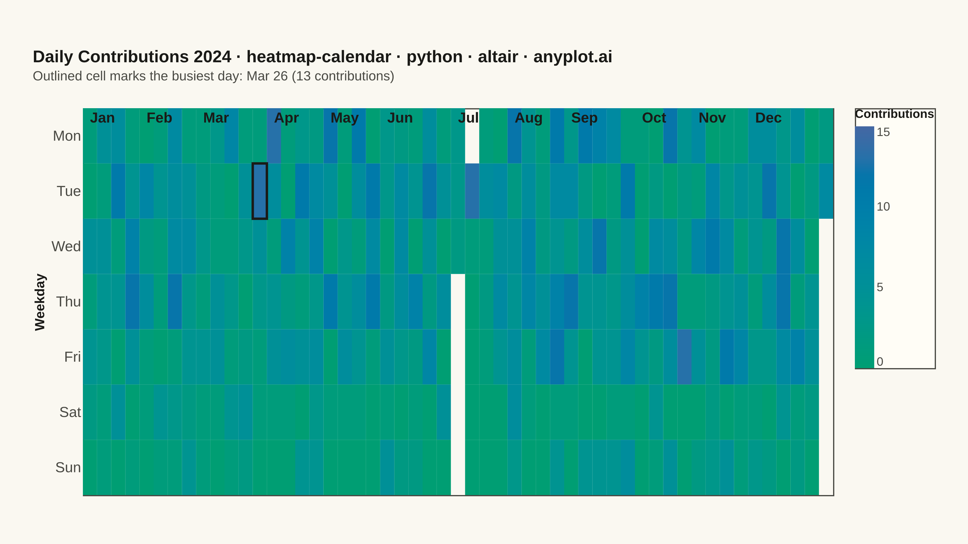
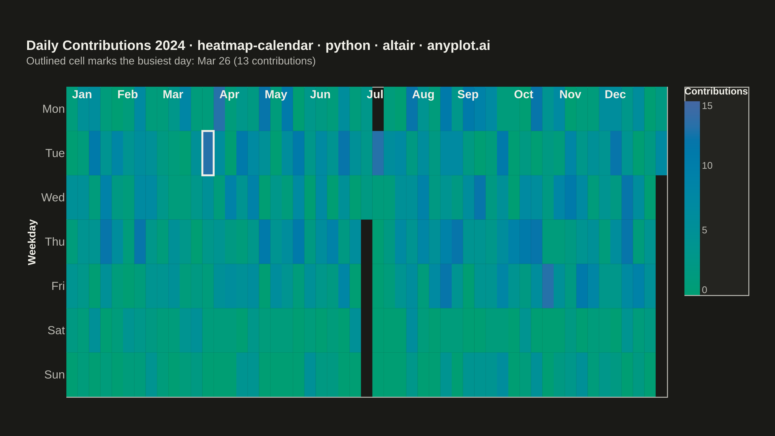
A calendar heatmap visualizes time-series data on a calendar grid, where each day is represented as a cell and color intensity indicates the value magnitude. The layout follows a calendar structure with days as cells, weeks as rows, and months as columns or sections. This visualization excels at revealing daily patterns, seasonal trends, and temporal anomalies over extended time periods.
""" anyplot.ai
heatmap-calendar: Basic Calendar Heatmap
Library: altair 6.2.2 | Python 3.13.14
Quality: 94/100 | Updated: 2026-07-23
"""

import os
import sys


# The file is named altair.py; remove its own directory from sys.path so
# `import altair` resolves to the library, not this script.
_HERE = os.path.dirname(os.path.abspath(__file__))
sys.path = [p for p in sys.path if not p or os.path.abspath(p) != _HERE]
os.chdir(_HERE)  # saves (plot-*.png, plot-*.html) land in the implementations dir

import altair as alt
import numpy as np
import pandas as pd
from PIL import Image


# Theme-adaptive chrome tokens (Imprint palette)
THEME = os.getenv("ANYPLOT_THEME", "light")
PAGE_BG = "#FAF8F1" if THEME == "light" else "#1A1A17"
ELEVATED_BG = "#FFFDF6" if THEME == "light" else "#242420"
INK = "#1A1A17" if THEME == "light" else "#F0EFE8"
INK_SOFT = "#4A4A44" if THEME == "light" else "#B8B7B0"

# Data - create one year of daily activity data (GitHub-style contribution graph)
np.random.seed(42)

# Generate dates for one year, dropping a short break to exercise the
# spec's "handle missing dates gracefully" requirement (those days simply
# have no row, so mark_rect leaves the cell blank/neutral).
start_date = pd.Timestamp("2024-01-01")
end_date = pd.Timestamp("2024-12-31")
missing_dates = pd.date_range("2024-07-04", "2024-07-08", freq="D")
dates = pd.date_range(start=start_date, end=end_date, freq="D").difference(missing_dates)

# Generate realistic activity values (commits/contributions)
# More activity on weekdays, less on weekends, with some variation
values = []
for date in dates:
    weekday = date.weekday()
    # Base activity: higher on weekdays
    if weekday < 5:  # Weekday
        base = np.random.choice([0, 2, 5, 8, 12], p=[0.2, 0.25, 0.3, 0.15, 0.1])
    else:  # Weekend
        base = np.random.choice([0, 1, 3, 5], p=[0.5, 0.25, 0.15, 0.1])
    # Add some noise
    value = max(0, base + np.random.randint(-1, 2))
    values.append(value)

# Create DataFrame
df = pd.DataFrame({"date": dates, "value": values})

# Extract calendar components
df["weekday"] = df["date"].dt.weekday  # 0=Monday, 6=Sunday
df["month"] = df["date"].dt.month
df["month_name"] = df["date"].dt.strftime("%b")

# Create week number that's continuous across the year
df["week_of_year"] = (df["date"] - start_date).dt.days // 7

# Map weekday numbers to names (for y-axis)
weekday_names = ["Mon", "Tue", "Wed", "Thu", "Fri", "Sat", "Sun"]
df["weekday_name"] = df["weekday"].map(lambda x: weekday_names[x])

# Create month labels for x-axis (first week of each month)
month_labels = df.groupby("month").agg({"week_of_year": "min", "month_name": "first"}).reset_index()
# Assign to top row (Monday) for positioning
month_labels["weekday_name"] = "Mon"

# Call out the single busiest day of the year (design storytelling: focal point)
peak_day = df.loc[[df["value"].idxmax()]]
peak_date_str = peak_day["date"].dt.strftime("%b %-d").iloc[0]
peak_value = int(peak_day["value"].iloc[0])

# Plot - calendar heatmap. Sequential imprint_seq (brand green -> blue) for
# the single-polarity contribution counts.
heatmap = (
    alt.Chart(df)
    .mark_rect()
    .encode(
        x=alt.X("week_of_year:O", title="", axis=alt.Axis(labels=False, ticks=False, domain=False)),
        y=alt.Y(
            "weekday_name:O",
            title="Weekday",
            sort=weekday_names,
            axis=alt.Axis(labelFontSize=12, titleFontSize=11, domain=False, ticks=False),
        ),
        color=alt.Color(
            "value:Q",
            scale=alt.Scale(range=["#009E73", "#4467A3"], domain=[0, 15]),
            legend=alt.Legend(title="Contributions", titleFontSize=10, labelFontSize=10, values=[0, 5, 10, 15]),
        ),
        tooltip=[
            alt.Tooltip("date:T", title="Date", format="%Y-%m-%d"),
            alt.Tooltip("value:Q", title="Contributions"),
            alt.Tooltip("weekday_name:N", title="Day"),
        ],
    )
)

# Month labels as a text layer at the top
month_text = (
    alt.Chart(month_labels)
    .mark_text(fontSize=12, align="left", baseline="bottom", dy=-8, fontWeight="bold", color=INK)
    .encode(x=alt.X("week_of_year:O"), y=alt.Y("weekday_name:O", sort=weekday_names), text="month_name:N")
)

# Highlight ring around the year's busiest day - draws the eye to a focal point
peak_highlight = (
    alt.Chart(peak_day)
    .mark_rect(filled=False, stroke=INK, strokeWidth=2)
    .encode(x=alt.X("week_of_year:O"), y=alt.Y("weekday_name:O", sort=weekday_names))
)

# Combine heatmap, month labels, and peak-day highlight
# Title fontsize scaled from the 16px default: round(16 * 67/74) = 14
title_text = "Daily Contributions 2024 · heatmap-calendar · python · altair · anyplot.ai"
chart = (
    alt.layer(heatmap, month_text, peak_highlight)
    .properties(
        width=620,
        height=320,
        background=PAGE_BG,
        title=alt.Title(
            title_text,
            fontSize=14,
            anchor="start",
            offset=20,
            subtitle=f"Outlined cell marks the busiest day: {peak_date_str} ({peak_value} contributions)",
            subtitleFontSize=11,
            subtitleColor=INK_SOFT,
        ),
    )
    .configure_view(fill=PAGE_BG, stroke=INK_SOFT)
    .configure_axis(domainColor=INK_SOFT, tickColor=INK_SOFT, grid=False, labelColor=INK_SOFT, titleColor=INK)
    .configure_title(color=INK)
    .configure_legend(fillColor=ELEVATED_BG, strokeColor=INK_SOFT, labelColor=INK_SOFT, titleColor=INK)
)

# Save PNG, then pad (never crop) up to the exact canonical canvas
chart.save(f"plot-{THEME}.png", scale_factor=4.0)

TW, TH = 3200, 1800
_img = Image.open(f"plot-{THEME}.png").convert("RGB")
_w, _h = _img.size
if _w > TW or _h > TH:
    raise SystemExit(
        f"altair vl-convert produced {_w}x{_h}, exceeds target {TW}x{TH}. "
        f"Shrink chart .properties(width=, height=) values and re-render."
    )
if _w < TW or _h < TH:
    _canvas = Image.new("RGB", (TW, TH), PAGE_BG)
    _canvas.paste(_img, ((TW - _w) // 2, (TH - _h) // 2))
    _canvas.save(f"plot-{THEME}.png")

chart.save(f"plot-{THEME}.html")
Runnable source as JSON, for any HTTP client: https://api.anyplot.ai/specs/heatmap-calendar/altair/code. Any spec id and library id listed in llms-full.txt fit the same URL shape; every URL below is complete and callable.
{
  "spec_id": "heatmap-calendar",
  "language": "python",
  "library": "altair",
  "page": "https://anyplot.ai/heatmap-calendar/python/altair",
  "hub": "https://anyplot.ai/heatmap-calendar",
  "code_json": "https://api.anyplot.ai/specs/heatmap-calendar/altair/code",
  "spec_json": "https://api.anyplot.ai/specs/heatmap-calendar",
  "render_light_png": "https://storage.googleapis.com/anyplot-images/plots/heatmap-calendar/python/altair/plot-light.png",
  "render_dark_png": "https://storage.googleapis.com/anyplot-images/plots/heatmap-calendar/python/altair/plot-dark.png",
  "interactive_light_html": "https://storage.googleapis.com/anyplot-images/plots/heatmap-calendar/python/altair/plot-light.html",
  "interactive_dark_html": "https://storage.googleapis.com/anyplot-images/plots/heatmap-calendar/python/altair/plot-dark.html",
  "quality_score": 94.0,
  "license": "MIT",
  "guide": "https://anyplot.ai/llms.txt"
}
Part of Basic Calendar Heatmap on anyplot.ai.