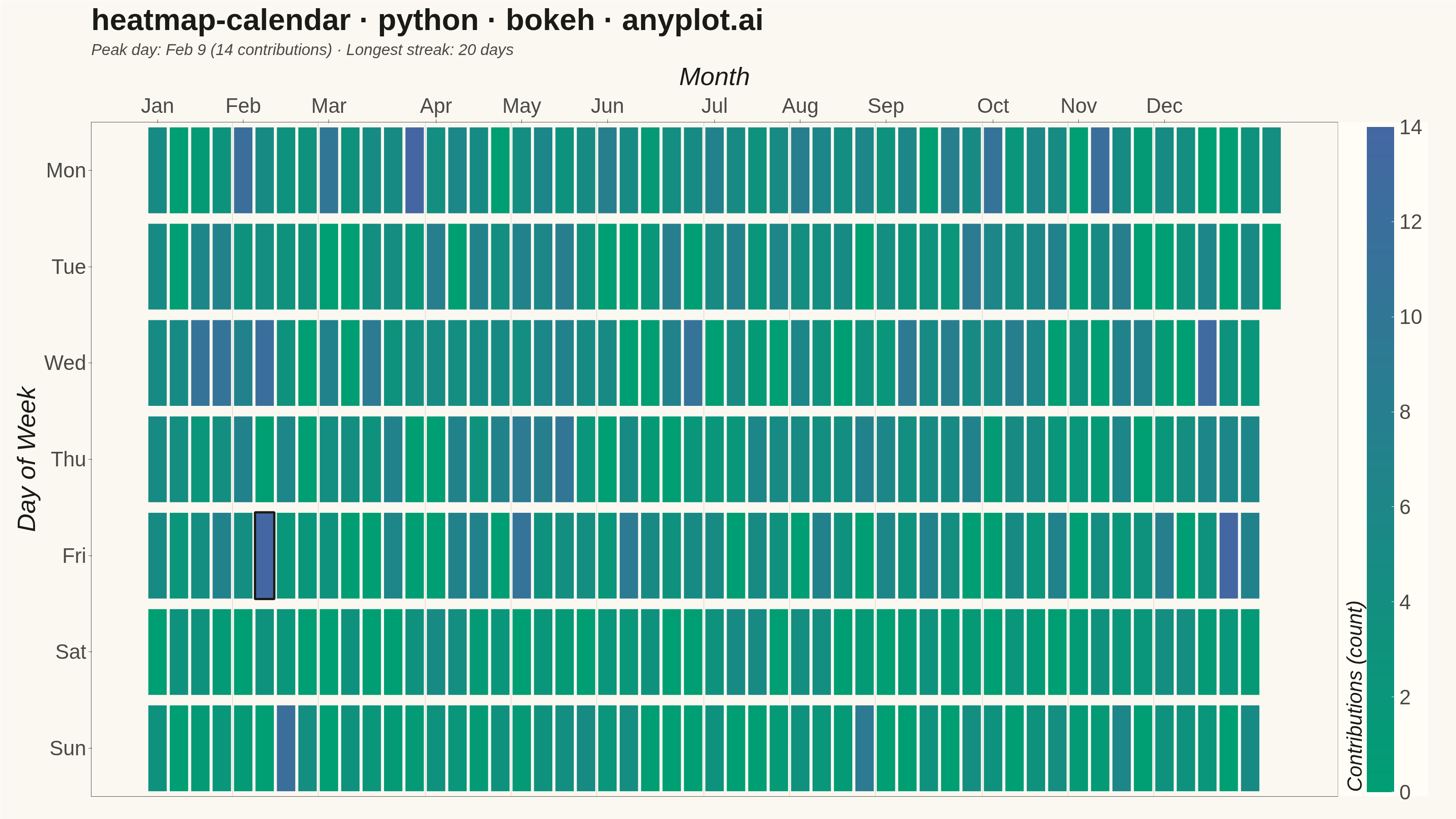
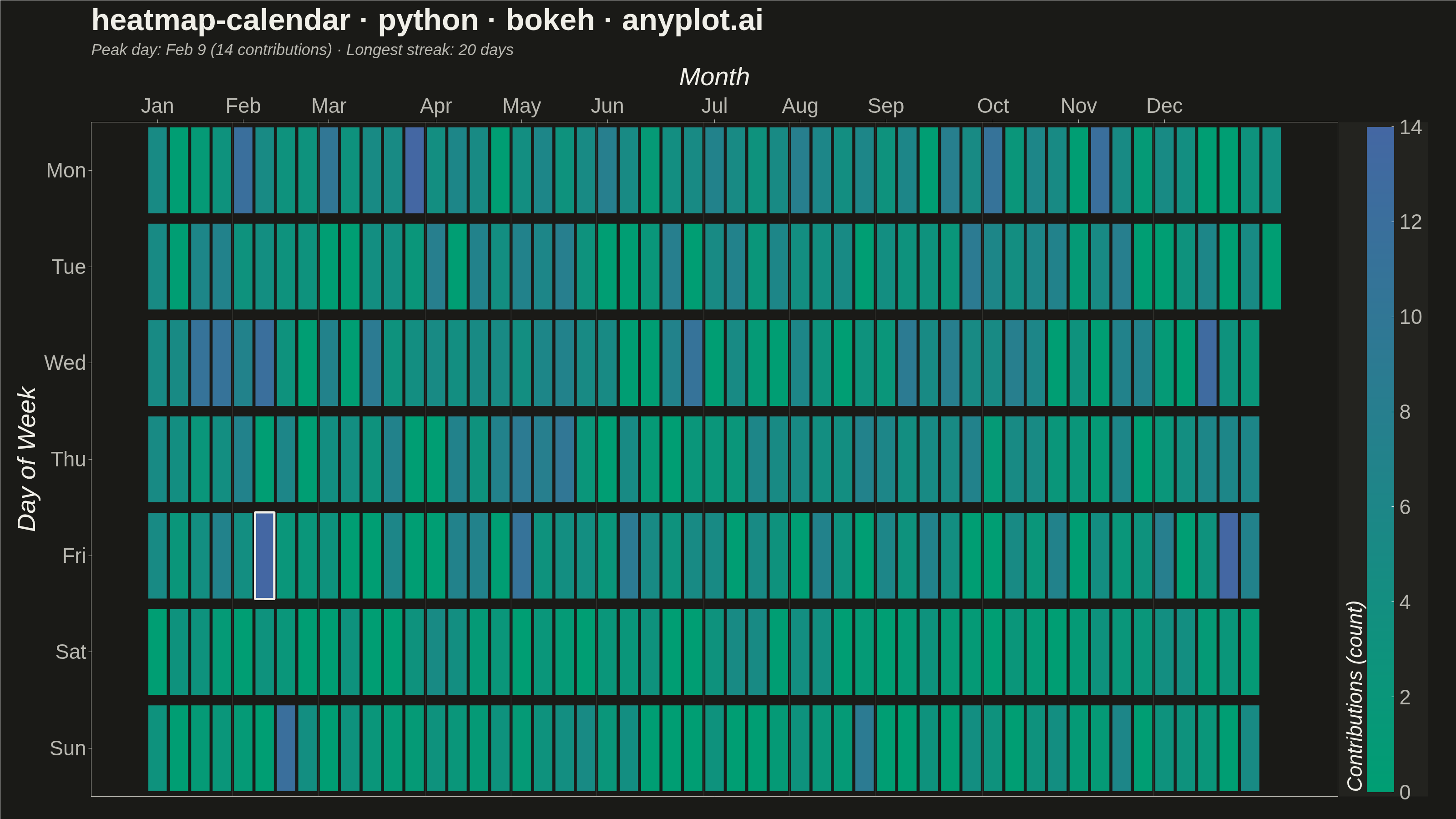
A calendar heatmap visualizes time-series data on a calendar grid, where each day is represented as a cell and color intensity indicates the value magnitude. The layout follows a calendar structure with days as cells, weeks as rows, and months as columns or sections. This visualization excels at revealing daily patterns, seasonal trends, and temporal anomalies over extended time periods.
""" anyplot.ai
heatmap-calendar: Basic Calendar Heatmap
Library: bokeh 3.9.1 | Python 3.13.14
Quality: 94/100 | Updated: 2026-07-23
"""

import os
import time
from pathlib import Path

import numpy as np
import pandas as pd
from bokeh.io import output_file, save
from bokeh.models import (
    BasicTicker,
    ColorBar,
    ColumnDataSource,
    FixedTicker,
    LinearAxis,
    LinearColorMapper,
    Span,
    Title,
)
from bokeh.plotting import figure
from selenium import webdriver
from selenium.webdriver.chrome.options import Options


# Theme tokens
THEME = os.getenv("ANYPLOT_THEME", "light")
PAGE_BG = "#FAF8F1" if THEME == "light" else "#1A1A17"
ELEVATED_BG = "#FFFDF6" if THEME == "light" else "#242420"
INK = "#1A1A17" if THEME == "light" else "#F0EFE8"
INK_SOFT = "#4A4A44" if THEME == "light" else "#B8B7B0"

# Data - Generate daily values for one year
np.random.seed(42)
start_date = pd.Timestamp("2024-01-01")
end_date = pd.Timestamp("2024-12-31")
dates = pd.date_range(start=start_date, end=end_date, freq="D")

# Simulate GitHub-style contributions with realistic patterns
values = []
for date in dates:
    weekday = date.weekday()
    base = 2 if weekday >= 5 else 5
    val = np.random.poisson(base)
    if np.random.random() < 0.05:
        val += np.random.randint(5, 15)
    if np.random.random() < 0.15:
        val = 0
    values.append(val)

df = pd.DataFrame({"date": dates, "value": values})
df["weekday"] = df["date"].dt.weekday
df["week_of_year"] = (df["date"] - start_date).dt.days // 7
df["month"] = df["date"].dt.month

weekday_names = ["Mon", "Tue", "Wed", "Thu", "Fri", "Sat", "Sun"]

source = ColumnDataSource(
    data={
        "week": df["week_of_year"].tolist(),
        "weekday": [weekday_names[w] for w in df["weekday"]],
        "value": df["value"].tolist(),
        "date": df["date"].dt.strftime("%Y-%m-%d").tolist(),
    }
)


# Imprint sequential colormap (brand green -> blue), 256-stop ramp
def _lerp_hex(c0, c1, t):
    r0, g0, b0 = (int(c0[i : i + 2], 16) for i in (1, 3, 5))
    r1, g1, b1 = (int(c1[i : i + 2], 16) for i in (1, 3, 5))
    r, g, b = (int(round(a + (b - a) * t)) for a, b in ((r0, r1), (g0, g1), (b0, b1)))
    return f"#{r:02X}{g:02X}{b:02X}"


imprint_seq = [_lerp_hex("#009E73", "#4467A3", t / 255.0) for t in range(256)]
mapper = LinearColorMapper(palette=imprint_seq, low=0, high=df["value"].max())

# Month positions for the top axis and separator lines
month_names = ["Jan", "Feb", "Mar", "Apr", "May", "Jun", "Jul", "Aug", "Sep", "Oct", "Nov", "Dec"]
month_starts = df.groupby("month")["week_of_year"].min().to_dict()
month_ticks = list(month_starts.values())
month_labels = {v: month_names[k - 1] for k, v in month_starts.items()}

# Peak contribution day, highlighted as the visual focal point
peak_row = df.loc[df["value"].idxmax()]
peak_week = int(peak_row["week_of_year"])
peak_weekday = weekday_names[peak_row["weekday"]]

# Longest streak of consecutive days with contributions, for the data-driven subtitle
streak = longest_streak = 0
for v in df["value"]:
    streak = streak + 1 if v > 0 else 0
    longest_streak = max(longest_streak, streak)

title = "heatmap-calendar · python · bokeh · anyplot.ai"
subtitle = (
    f"Peak day: {peak_row['date'].strftime('%b %-d')} ({int(peak_row['value'])} contributions) "
    f"· Longest streak: {longest_streak} days"
)

# Plot
p = figure(
    width=3200,
    height=1800,
    title=title,
    y_range=list(reversed(weekday_names)),
    y_axis_label="Day of Week",
    tools="hover",
    tooltips=[("Date", "@date"), ("Contributions", "@value")],
    toolbar_location=None,
    min_border_bottom=50,
    min_border_left=200,
    min_border_top=250,
    min_border_right=260,
)

p.rect(
    x="week",
    y="weekday",
    width=0.9,
    height=0.9,
    source=source,
    fill_color={"field": "value", "transform": mapper},
    line_color=PAGE_BG,
    line_width=2,
    # Inspection glyph (bokeh-specific): cells pop under the HoverTool cursor
    # without any CustomJS wiring, distinct from a plain static rect.
    hover_fill_alpha=0.75,
    hover_line_color=INK,
    hover_line_width=3,
)

# Peak day focal point — outline only, no fill change
p.rect(x=[peak_week], y=[peak_weekday], width=0.9, height=0.9, fill_color=None, line_color=INK, line_width=5)

# Month divider lines — structural guide, not a text annotation
for week in month_ticks[1:]:
    p.add_layout(Span(location=week - 0.5, dimension="height", line_color=INK_SOFT, line_alpha=0.25, line_width=1))

# Month labels along the top, per spec ("top or as section headers")
p.xaxis.visible = False
month_axis = LinearAxis(ticker=FixedTicker(ticks=month_ticks), major_label_overrides=month_labels, axis_label="Month")
p.add_layout(month_axis, "above")

# Data-driven subtitle (peak day + longest streak) — placed between the title
# and the month axis, adding real storytelling instead of a bare default heatmap.
# Bokeh stacks "above" layout renderers with each new addition inserted closer
# to the frame, so adding this *after* month_axis puts it above the axis.
p.add_layout(Title(text=subtitle, text_font_size="26pt", text_color=INK_SOFT, text_font_style="italic"), "above")

# Color bar
color_bar = ColorBar(
    color_mapper=mapper,
    ticker=BasicTicker(desired_num_ticks=6),
    label_standoff=12,
    major_label_text_font_size="34pt",
    major_label_text_color=INK_SOFT,
    title="Contributions (count)",
    title_text_font_size="34pt",
    title_text_color=INK,
    background_fill_color=ELEVATED_BG,
    width=60,
    location=(0, 0),
)
p.add_layout(color_bar, "right")

# Text sizes
p.title.text_font_size = "50pt"
p.title.text_color = INK

p.yaxis.axis_label_text_font_size = "42pt"
p.yaxis.axis_label_text_color = INK
p.yaxis.major_label_text_font_size = "34pt"
p.yaxis.major_label_text_color = INK_SOFT
p.yaxis.axis_line_color = INK_SOFT
p.yaxis.major_tick_line_color = INK_SOFT

month_axis.axis_label_text_font_size = "42pt"
month_axis.axis_label_text_color = INK
month_axis.major_label_text_font_size = "34pt"
month_axis.major_label_text_color = INK_SOFT
month_axis.axis_line_color = INK_SOFT
month_axis.major_tick_line_color = INK_SOFT

# No grid for heatmap
p.xgrid.grid_line_color = None
p.ygrid.grid_line_color = None

# Background
p.background_fill_color = PAGE_BG
p.border_fill_color = PAGE_BG
p.outline_line_color = INK_SOFT

# Save — export_png needs a working chromedriver, unavailable here; screenshot
# the saved HTML with Selenium instead (matches highcharts.py's approach).
output_file(f"plot-{THEME}.html")
save(p)

W, H = 3200, 1800
opts = Options()
for arg in (
    "--headless=new",
    "--no-sandbox",
    "--disable-dev-shm-usage",
    "--disable-gpu",
    f"--window-size={W},{H}",
    "--hide-scrollbars",
):
    opts.add_argument(arg)
driver = webdriver.Chrome(options=opts)
driver.set_window_size(W, H)
driver.get(f"file://{Path(f'plot-{THEME}.html').resolve()}")
time.sleep(2)
# Headless Chrome's outer window size includes non-viewport chrome, so the
# actual viewport ends up a bit shorter than W,H — force it exactly via CDP.
driver.execute_cdp_cmd(
    "Emulation.setDeviceMetricsOverride", {"width": W, "height": H, "deviceScaleFactor": 1, "mobile": False}
)
time.sleep(1)
driver.save_screenshot(f"plot-{THEME}.png")
driver.quit()
Runnable source as JSON, for any HTTP client: https://api.anyplot.ai/specs/heatmap-calendar/bokeh/code. Any spec id and library id listed in llms-full.txt fit the same URL shape; every URL below is complete and callable.
{
  "spec_id": "heatmap-calendar",
  "language": "python",
  "library": "bokeh",
  "page": "https://anyplot.ai/heatmap-calendar/python/bokeh",
  "hub": "https://anyplot.ai/heatmap-calendar",
  "code_json": "https://api.anyplot.ai/specs/heatmap-calendar/bokeh/code",
  "spec_json": "https://api.anyplot.ai/specs/heatmap-calendar",
  "render_light_png": "https://storage.googleapis.com/anyplot-images/plots/heatmap-calendar/python/bokeh/plot-light.png",
  "render_dark_png": "https://storage.googleapis.com/anyplot-images/plots/heatmap-calendar/python/bokeh/plot-dark.png",
  "interactive_light_html": "https://storage.googleapis.com/anyplot-images/plots/heatmap-calendar/python/bokeh/plot-light.html",
  "interactive_dark_html": "https://storage.googleapis.com/anyplot-images/plots/heatmap-calendar/python/bokeh/plot-dark.html",
  "quality_score": 94.0,
  "license": "MIT",
  "guide": "https://anyplot.ai/llms.txt"
}
Part of Basic Calendar Heatmap on anyplot.ai.