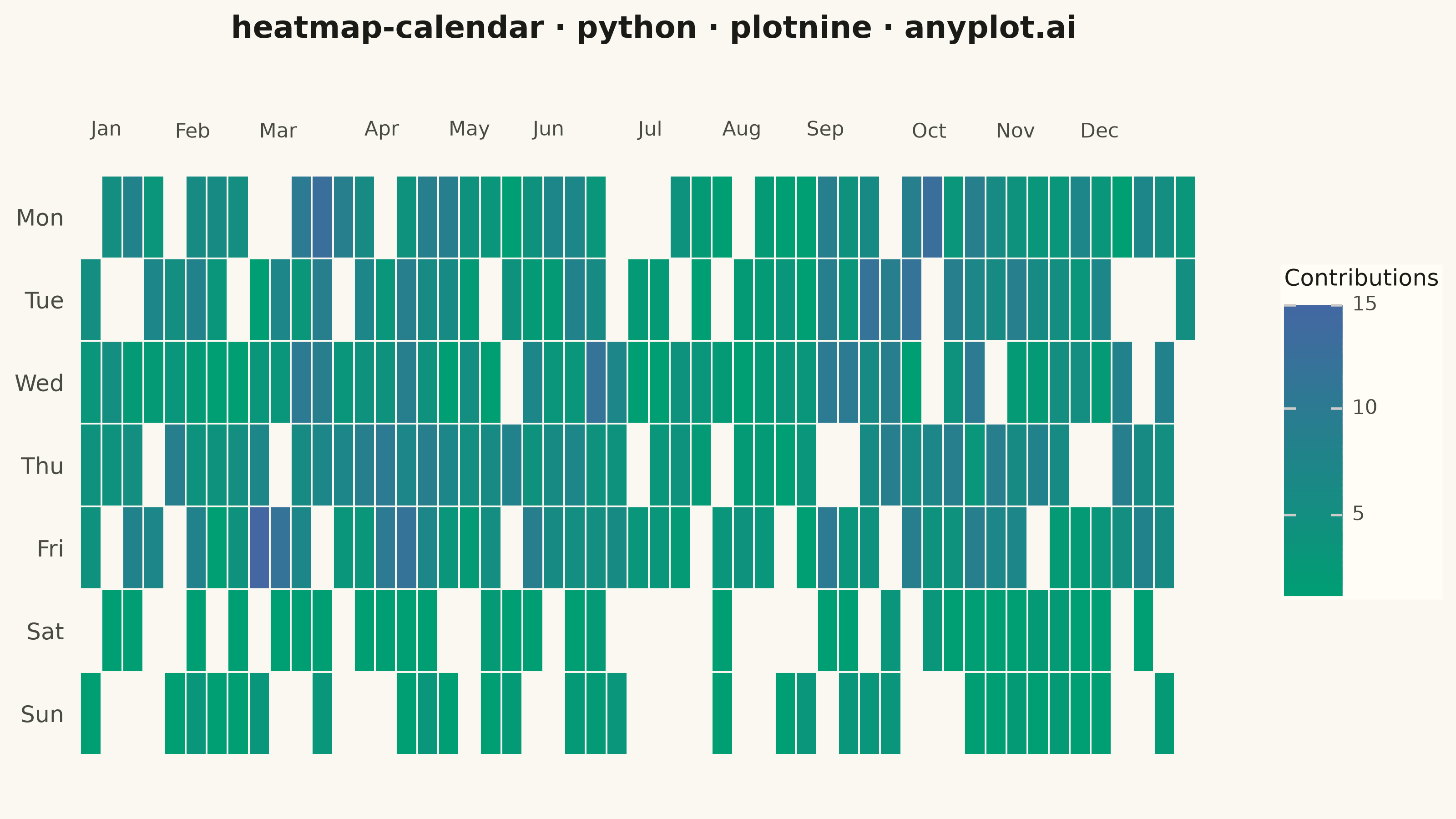
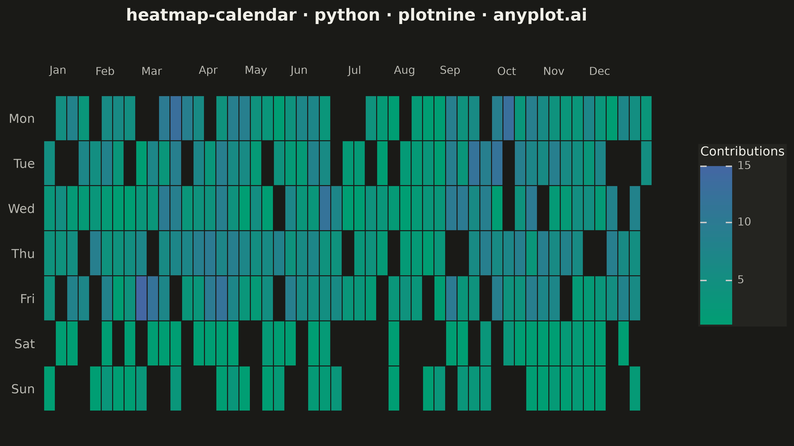
A calendar heatmap visualizes time-series data on a calendar grid, where each day is represented as a cell and color intensity indicates the value magnitude. The layout follows a calendar structure with days as cells, weeks as rows, and months as columns or sections. This visualization excels at revealing daily patterns, seasonal trends, and temporal anomalies over extended time periods.
""" anyplot.ai
heatmap-calendar: Basic Calendar Heatmap
Library: plotnine 0.15.7 | Python 3.13.14
Quality: 93/100 | Updated: 2026-07-23
"""

import os

import numpy as np
import pandas as pd
from plotnine import (
    aes,
    element_blank,
    element_rect,
    element_text,
    geom_text,
    geom_tile,
    ggplot,
    ggsave,
    labs,
    scale_fill_gradient,
    scale_x_continuous,
    scale_y_discrete,
    theme,
    theme_minimal,
)


THEME = os.getenv("ANYPLOT_THEME", "light")
PAGE_BG = "#FAF8F1" if THEME == "light" else "#1A1A17"
ELEVATED_BG = "#FFFDF6" if THEME == "light" else "#242420"
INK = "#1A1A17" if THEME == "light" else "#F0EFE8"
INK_SOFT = "#4A4A44" if THEME == "light" else "#B8B7B0"
IMPRINT_PALETTE = ["#009E73", "#C475FD", "#4467A3"]

# Data - One year of daily activity (GitHub-style contribution data)
np.random.seed(42)

start_date = pd.Timestamp("2024-01-01")
end_date = pd.Timestamp("2024-12-31")
dates = pd.date_range(start=start_date, end=end_date, freq="D")

values = []
for date in dates:
    base = np.random.poisson(5)
    if date.dayofweek >= 5:
        base = int(base * 0.3)
    if date.month in [3, 4, 9, 10]:
        base = int(base * 1.5)
    if date.month in [7, 8]:
        base = int(base * 0.5)
    if np.random.random() < 0.15:
        base = 0
    values.append(max(0, base))

df = pd.DataFrame({"date": dates, "value": values})

df["week"] = df["date"].dt.isocalendar().week
df["day_of_week"] = df["date"].dt.dayofweek
df["month"] = df["date"].dt.month

df["week_adjusted"] = df["week"].astype(int)
mask = (df["month"] == 1) & (df["week"] > 50)
df.loc[mask, "week_adjusted"] = 0
mask = (df["month"] == 12) & (df["week"] == 1)
df.loc[mask, "week_adjusted"] = 53

weekday_labels = ["Mon", "Tue", "Wed", "Thu", "Fri", "Sat", "Sun"]
df["weekday"] = df["day_of_week"].map(lambda x: weekday_labels[x])
df["weekday"] = pd.Categorical(df["weekday"], categories=weekday_labels[::-1], ordered=True)

# Zero-activity days rendered as NA so they blend with the panel background
df["value_display"] = df["value"].where(df["value"] > 0, other=None)

# Month labels are placed as text above the top row (spec asks for "top or
# section headers") instead of on a conventional bottom x-axis.
month_labels = df.groupby("month")["week_adjusted"].min().reset_index()
month_names = ["Jan", "Feb", "Mar", "Apr", "May", "Jun", "Jul", "Aug", "Sep", "Oct", "Nov", "Dec"]
month_labels["month_name"] = month_labels["month"].map(lambda x: month_names[x - 1])
month_labels["top_row"] = weekday_labels[0]

plot = (
    ggplot(df, aes(x="week_adjusted", y="weekday", fill="value_display"))
    + geom_tile(color=PAGE_BG, size=0.4)
    + geom_text(
        month_labels,
        aes(x="week_adjusted", y="top_row", label="month_name"),
        inherit_aes=False,
        nudge_y=0.9,
        ha="left",
        va="bottom",
        size=8,
        color=INK_SOFT,
    )
    + scale_fill_gradient(low=IMPRINT_PALETTE[0], high=IMPRINT_PALETTE[2], na_value=PAGE_BG, name="Contributions")
    + scale_x_continuous(breaks=[], expand=(0, 0.5, 0, 2))
    + scale_y_discrete(expand=(0, 0.6, 0, 1))
    + labs(x="", y="", title="heatmap-calendar · python · plotnine · anyplot.ai")
    + theme_minimal()
    + theme(
        figure_size=(8, 4.5),
        text=element_text(size=7, color=INK_SOFT),
        axis_title=element_blank(),
        axis_text_x=element_blank(),
        axis_ticks_major_x=element_blank(),
        axis_text_y=element_text(size=9, color=INK_SOFT),
        plot_title=element_text(size=12, weight="bold", color=INK),
        legend_title=element_text(size=9, color=INK),
        legend_text=element_text(size=8, color=INK_SOFT),
        panel_grid_major=element_blank(),
        panel_grid_minor=element_blank(),
        plot_background=element_rect(fill=PAGE_BG, color=PAGE_BG),
        panel_background=element_rect(fill=PAGE_BG),
        legend_background=element_rect(fill=ELEVATED_BG, color=ELEVATED_BG),
        legend_frame=element_blank(),
    )
)

ggsave(plot, filename=f"plot-{THEME}.png", dpi=400, width=8, height=4.5, units="in", verbose=False)
Runnable source as JSON, for any HTTP client: https://api.anyplot.ai/specs/heatmap-calendar/plotnine/code. Any spec id and library id listed in llms-full.txt fit the same URL shape; every URL below is complete and callable.
{
  "spec_id": "heatmap-calendar",
  "language": "python",
  "library": "plotnine",
  "page": "https://anyplot.ai/heatmap-calendar/python/plotnine",
  "hub": "https://anyplot.ai/heatmap-calendar",
  "code_json": "https://api.anyplot.ai/specs/heatmap-calendar/plotnine/code",
  "spec_json": "https://api.anyplot.ai/specs/heatmap-calendar",
  "render_light_png": "https://storage.googleapis.com/anyplot-images/plots/heatmap-calendar/python/plotnine/plot-light.png",
  "render_dark_png": "https://storage.googleapis.com/anyplot-images/plots/heatmap-calendar/python/plotnine/plot-dark.png",
  "quality_score": 93.0,
  "license": "MIT",
  "guide": "https://anyplot.ai/llms.txt"
}
Part of Basic Calendar Heatmap on anyplot.ai.