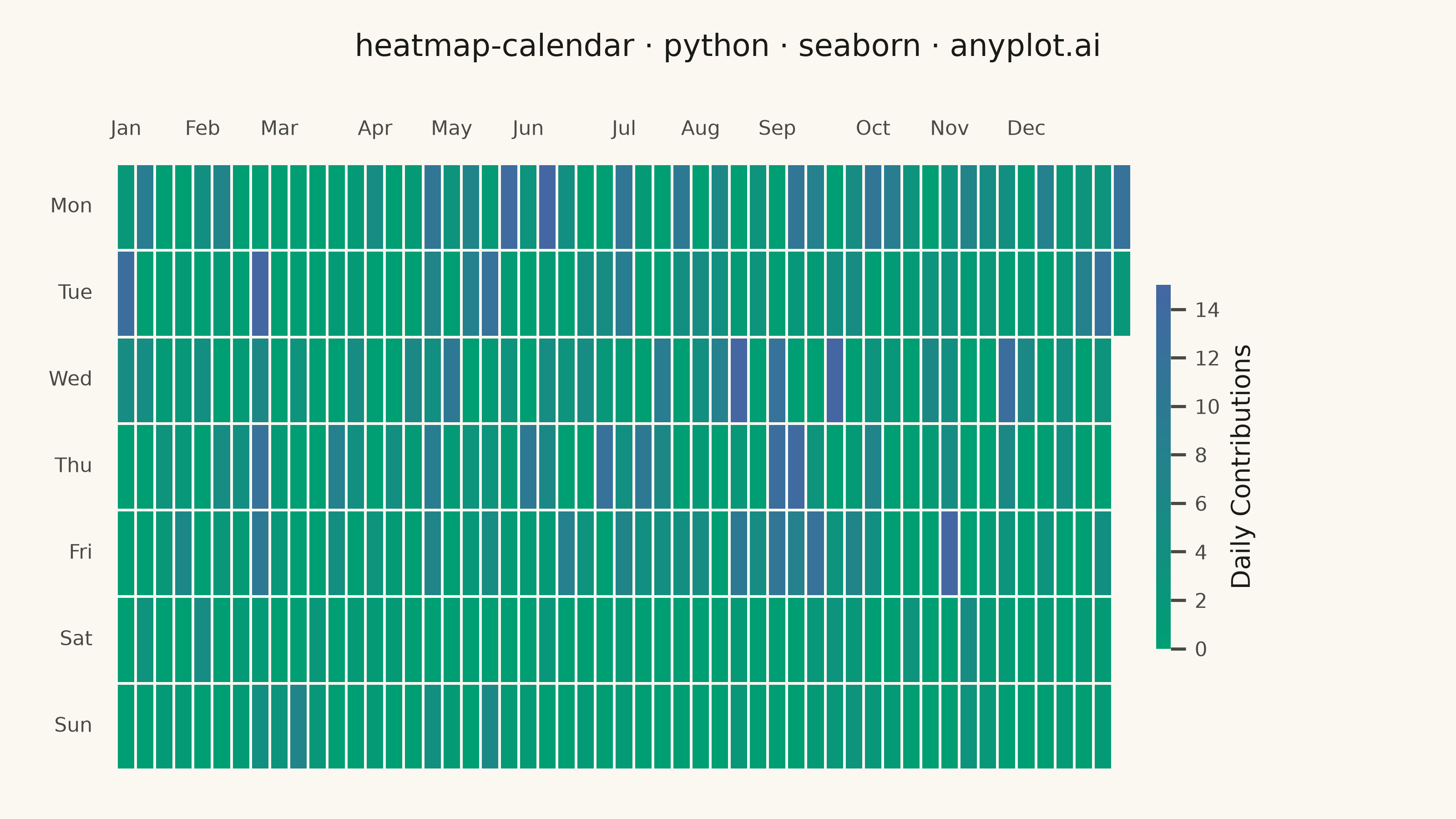
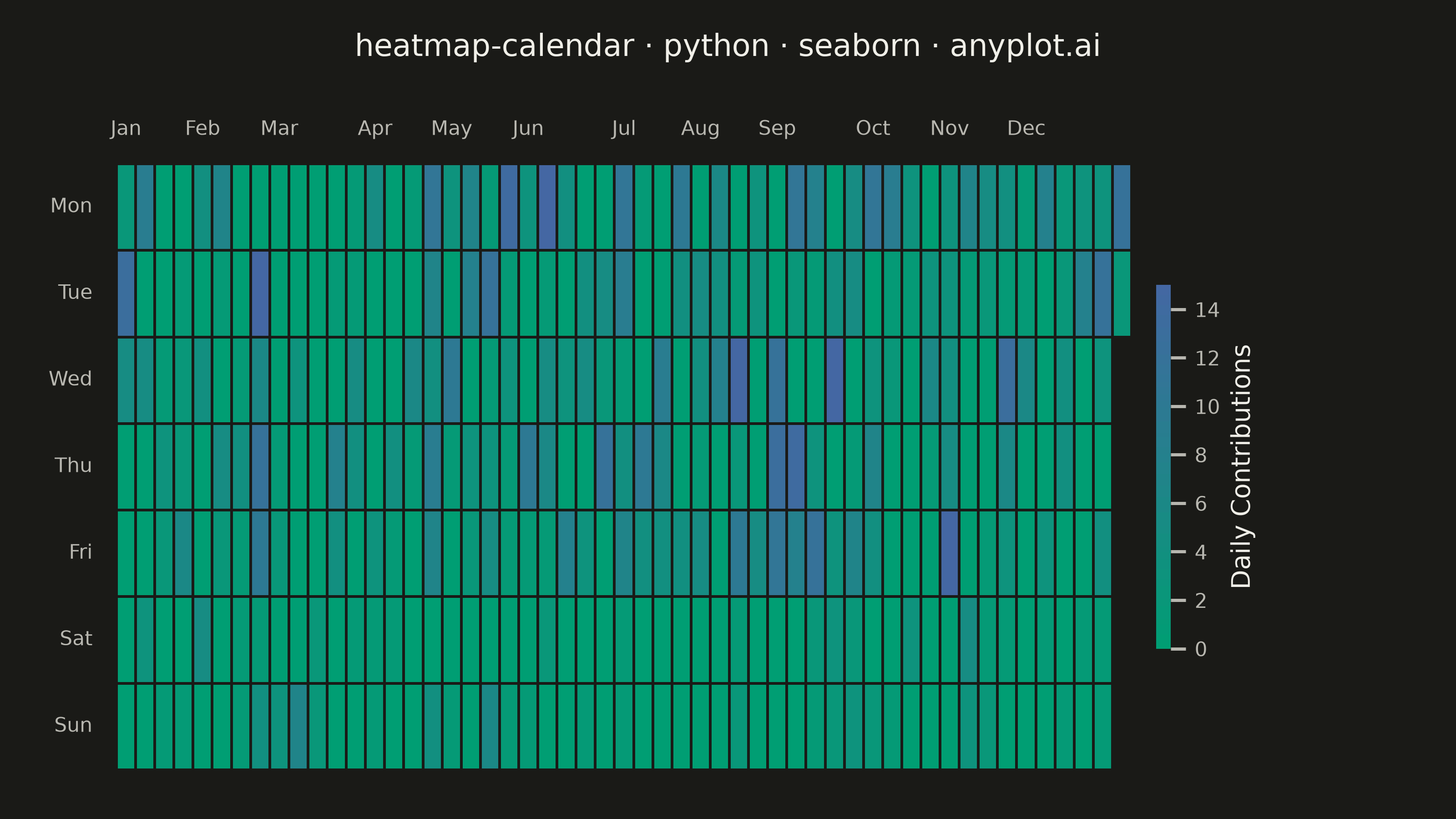
A calendar heatmap visualizes time-series data on a calendar grid, where each day is represented as a cell and color intensity indicates the value magnitude. The layout follows a calendar structure with days as cells, weeks as rows, and months as columns or sections. This visualization excels at revealing daily patterns, seasonal trends, and temporal anomalies over extended time periods.
""" anyplot.ai
heatmap-calendar: Basic Calendar Heatmap
Library: seaborn 0.13.2 | Python 3.13.14
Quality: 88/100 | Updated: 2026-07-23
"""

import os

import matplotlib.pyplot as plt
import numpy as np
import pandas as pd
import seaborn as sns
from matplotlib.colors import LinearSegmentedColormap


# Theme-adaptive chrome tokens (Imprint)
THEME = os.getenv("ANYPLOT_THEME", "light")
PAGE_BG = "#FAF8F1" if THEME == "light" else "#1A1A17"
ELEVATED_BG = "#FFFDF6" if THEME == "light" else "#242420"
INK = "#1A1A17" if THEME == "light" else "#F0EFE8"
INK_SOFT = "#4A4A44" if THEME == "light" else "#B8B7B0"
INK_MUTED = "#6B6A63" if THEME == "light" else "#A8A79F"

sns.set_theme(
    style="ticks",
    rc={
        "figure.facecolor": PAGE_BG,
        "axes.facecolor": PAGE_BG,
        "axes.edgecolor": INK_SOFT,
        "axes.labelcolor": INK,
        "text.color": INK,
        "xtick.color": INK_SOFT,
        "ytick.color": INK_SOFT,
        "grid.color": INK,
        "grid.alpha": 0.15,
        "legend.facecolor": ELEVATED_BG,
        "legend.edgecolor": INK_SOFT,
    },
)

# Imprint sequential colormap (single-polarity contribution counts): brand green -> blue
imprint_seq = LinearSegmentedColormap.from_list("imprint_seq", ["#009E73", "#4467A3"])

# Data - one year of daily activity (simulating GitHub-style contributions)
np.random.seed(42)
start_date = pd.Timestamp("2024-01-01")
end_date = pd.Timestamp("2024-12-31")
dates = pd.date_range(start=start_date, end=end_date, freq="D")

# Simulate daily activity with realistic patterns
# Higher activity on weekdays, lower on weekends, with some variation
base_activity = np.random.exponential(scale=3, size=len(dates))
weekday_boost = np.where(dates.weekday < 5, 1.5, 0.6)  # Weekdays higher
activity = (base_activity * weekday_boost).astype(int)
# Add some zero days and cap max
activity = np.clip(activity, 0, 15)
# Add more zeros for realism
zero_mask = np.random.random(len(dates)) < 0.15
activity[zero_mask] = 0

df = pd.DataFrame({"date": dates, "value": activity})

# Extract calendar components
df["weekday"] = df["date"].dt.weekday  # 0=Monday, 6=Sunday
df["month"] = df["date"].dt.month

# Calculate week number as continuous count from start of year
# This avoids issues with ISO week numbers crossing year boundaries
df["week_num"] = ((df["date"] - start_date).dt.days + start_date.weekday()) // 7

# Track the single highest-activity day from the unclipped signal (several
# days tie at the vmax=15 cap post-clip, so the pre-clip value picks one
# genuine peak rather than an arbitrary tied cell).
peak_row = df.loc[base_activity.argmax()]

# Create pivot table for heatmap (weekdays as rows, weeks as columns)
pivot_df = df.pivot(index="weekday", columns="week_num", values="value")

# Explicit mask for missing calendar cells (partial final week) rather than
# relying on implicit NaN blanking
missing_mask = pivot_df.isna()

# Weekday labels (Monday at top)
weekday_labels = ["Mon", "Tue", "Wed", "Thu", "Fri", "Sat", "Sun"]

# Landscape canvas (16:9) -> 3200x1800 px at dpi=400. The 52-week x 7-day grid
# is inherently wide, so landscape suits this calendar layout better than square.
fig, ax = plt.subplots(figsize=(8, 4.5), dpi=400)

# Create heatmap with the Imprint sequential colormap; cell borders match the
# page background so gaps read as "punched out" rather than a harsh fixed color.
# `mask` makes the partial-final-week handling explicit rather than relying on
# implicit NaN blanking.
sns.heatmap(
    pivot_df,
    ax=ax,
    mask=missing_mask,
    cmap=imprint_seq,
    linewidths=0.8,
    linecolor=PAGE_BG,
    cbar_kws={"label": "Daily Contributions", "shrink": 0.7, "aspect": 18, "fraction": 0.035, "pad": 0.015},
    vmin=0,
    vmax=15,
)

# Set weekday labels on y-axis
ax.set_yticks(np.arange(7) + 0.5)
ax.set_yticklabels(weekday_labels, fontsize=8, rotation=0, color=INK_SOFT)

# Create month labels, placed along the top of the grid (per spec)
# Find first week of each month
month_starts = df.groupby("month")["week_num"].min()
month_labels = ["Jan", "Feb", "Mar", "Apr", "May", "Jun", "Jul", "Aug", "Sep", "Oct", "Nov", "Dec"]

ax.xaxis.set_ticks_position("top")
ax.xaxis.set_label_position("top")
ax.set_xticks([month_starts[m] + 0.5 for m in range(1, 13)])
ax.set_xticklabels(month_labels, fontsize=8, color=INK_SOFT)

# Style adjustments
ax.set_xlabel("")
ax.set_ylabel("")

# Reserve headroom above the top-mounted month labels so the title doesn't clip
fig.subplots_adjust(top=0.80, bottom=0.06, left=0.08, right=0.96)
fig.suptitle("heatmap-calendar · python · seaborn · anyplot.ai", fontsize=12, y=0.96, color=INK)
fig.text(
    0.5,
    0.885,
    f"Peak day: {peak_row['date']:%b %-d} · {int(peak_row['value'])} contributions",
    fontsize=9,
    color=INK_SOFT,
    ha="center",
)

# Adjust colorbar chrome to match theme
cbar = ax.collections[0].colorbar
cbar.ax.tick_params(labelsize=8, color=INK_SOFT, labelcolor=INK_SOFT)
cbar.ax.set_ylabel("Daily Contributions", fontsize=10, color=INK)
cbar.outline.set_edgecolor(INK_SOFT)

# Remove tick marks (keep tick labels) for a clean grid look
ax.tick_params(top=False, bottom=False, left=False, right=False)

# Ring out the single highest-activity day (the data-storytelling callout
# above) directly on the grid
peak_x = peak_row["week_num"] + 0.5
peak_y = peak_row["weekday"] + 0.5
ax.plot(
    peak_x, peak_y, marker="o", markersize=9, markerfacecolor="none", markeredgecolor=INK, markeredgewidth=1.4, zorder=5
)

plt.savefig(f"plot-{THEME}.png", dpi=400, facecolor=PAGE_BG)
Runnable source as JSON, for any HTTP client: https://api.anyplot.ai/specs/heatmap-calendar/seaborn/code. Any spec id and library id listed in llms-full.txt fit the same URL shape; every URL below is complete and callable.
{
  "spec_id": "heatmap-calendar",
  "language": "python",
  "library": "seaborn",
  "page": "https://anyplot.ai/heatmap-calendar/python/seaborn",
  "hub": "https://anyplot.ai/heatmap-calendar",
  "code_json": "https://api.anyplot.ai/specs/heatmap-calendar/seaborn/code",
  "spec_json": "https://api.anyplot.ai/specs/heatmap-calendar",
  "render_light_png": "https://storage.googleapis.com/anyplot-images/plots/heatmap-calendar/python/seaborn/plot-light.png",
  "render_dark_png": "https://storage.googleapis.com/anyplot-images/plots/heatmap-calendar/python/seaborn/plot-dark.png",
  "quality_score": 88.0,
  "license": "MIT",
  "guide": "https://anyplot.ai/llms.txt"
}
Part of Basic Calendar Heatmap on anyplot.ai.