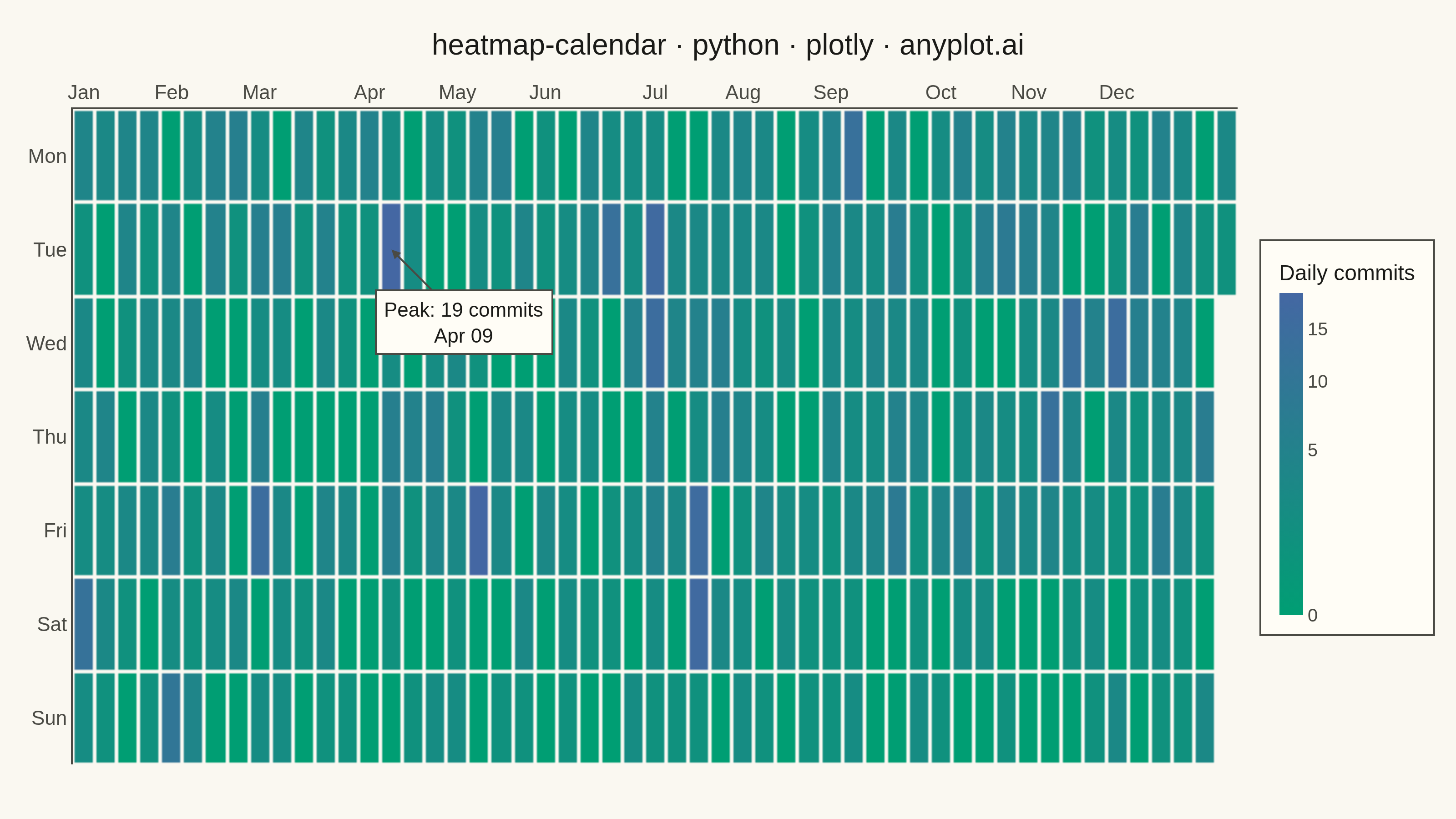
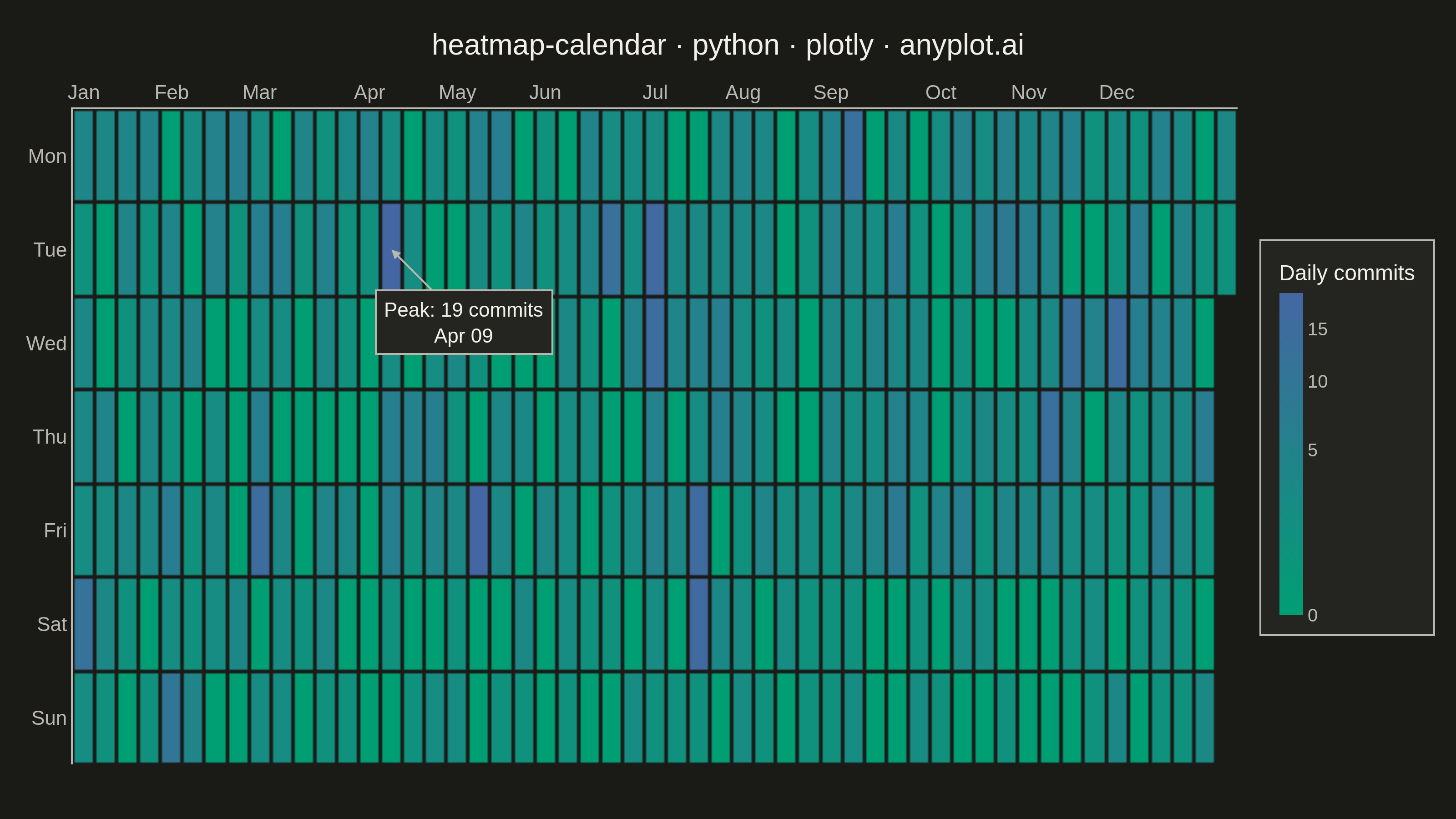
A calendar heatmap visualizes time-series data on a calendar grid, where each day is represented as a cell and color intensity indicates the value magnitude. The layout follows a calendar structure with days as cells, weeks as rows, and months as columns or sections. This visualization excels at revealing daily patterns, seasonal trends, and temporal anomalies over extended time periods.
""" anyplot.ai
heatmap-calendar: Basic Calendar Heatmap
Library: plotly 6.9.0 | Python 3.13.14
Quality: 91/100 | Updated: 2026-07-23
"""

import os
import sys


# Prevent this file from shadowing the installed plotly package
_here = os.path.dirname(os.path.abspath(__file__))
sys.path = [p for p in sys.path if os.path.abspath(p) != _here]
del _here

import numpy as np
import pandas as pd
import plotly.graph_objects as go


# Theme tokens
THEME = os.getenv("ANYPLOT_THEME", "light")
PAGE_BG = "#FAF8F1" if THEME == "light" else "#1A1A17"
ELEVATED_BG = "#FFFDF6" if THEME == "light" else "#242420"
INK = "#1A1A17" if THEME == "light" else "#F0EFE8"
INK_SOFT = "#4A4A44" if THEME == "light" else "#B8B7B0"

# Data - GitHub-style activity over one year
np.random.seed(42)
start_date = pd.Timestamp("2024-01-01")
end_date = pd.Timestamp("2024-12-31")
dates = pd.date_range(start=start_date, end=end_date, freq="D")

# Realistic activity with weekly patterns and occasional bursts
base_activity = np.random.poisson(lam=3, size=len(dates))
weekend_mask = dates.dayofweek >= 5
base_activity[weekend_mask] = np.random.poisson(lam=1, size=weekend_mask.sum())
burst_days = np.random.choice(len(dates), size=20, replace=False)
base_activity[burst_days] = np.random.randint(10, 20, size=20)
zero_days = np.random.choice(len(dates), size=50, replace=False)
base_activity[zero_days] = 0

df = pd.DataFrame({"date": dates, "value": base_activity})
df["dayofweek"] = df["date"].dt.dayofweek
df["month"] = df["date"].dt.month
df["week_of_year"] = (df["date"] - start_date).dt.days // 7

# Build heatmap matrix: 7 rows (days) × n_weeks columns
n_weeks = df["week_of_year"].max() + 1
heatmap_raw = np.full((7, n_weeks), np.nan)
hover_custom = np.empty((7, n_weeks, 2), dtype=object)

for _, row in df.iterrows():
    w, d = row["week_of_year"], row["dayofweek"]
    heatmap_raw[d, w] = row["value"]
    hover_custom[d, w, 0] = row["date"].strftime("%b %d, %Y")
    hover_custom[d, w, 1] = int(row["value"])

# Sqrt-transform for color mapping only — spreads out the common 0-5 range
# (a 2-stop linear scale compresses low counts into near-identical greens)
# while raw counts stay intact for the hover tooltip and colorbar ticks.
heatmap_color = np.sqrt(heatmap_raw)

day_labels = ["Mon", "Tue", "Wed", "Thu", "Fri", "Sat", "Sun"]
month_starts = df.groupby("month")["week_of_year"].min()
month_labels = ["Jan", "Feb", "Mar", "Apr", "May", "Jun", "Jul", "Aug", "Sep", "Oct", "Nov", "Dec"]

# Imprint sequential colorscale (single-polarity: commit count intensity)
imprint_seq = [[0.0, "#009E73"], [1.0, "#4467A3"]]

# Colorbar ticks in raw-commit units, positioned at their sqrt-transformed location
raw_max = np.nanmax(heatmap_raw)
tick_raw_vals = list(range(0, int(np.ceil(raw_max / 5)) * 5 + 1, 5))
tick_positions = [np.sqrt(v) for v in tick_raw_vals]

peak_row = df.loc[df["value"].idxmax()]
peak_w, peak_d = int(peak_row["week_of_year"]), int(peak_row["dayofweek"])

# Plot
fig = go.Figure()

fig.add_trace(
    go.Heatmap(
        z=heatmap_color,
        x=list(range(n_weeks)),
        y=day_labels,
        customdata=hover_custom,
        colorscale=imprint_seq,
        showscale=True,
        colorbar={
            "title": {"text": "Daily commits", "font": {"size": 12, "color": INK}},
            "tickmode": "array",
            "tickvals": tick_positions,
            "ticktext": [str(v) for v in tick_raw_vals],
            "tickfont": {"size": 10, "color": INK_SOFT},
            "thickness": 13,
            "len": 0.6,
            "bgcolor": ELEVATED_BG,
            "bordercolor": INK_SOFT,
            "borderwidth": 1,
        },
        hoverongaps=False,
        hovertemplate="%{customdata[0]}<br>Commits: %{customdata[1]}<extra></extra>",
        xgap=2,
        ygap=2,
        zmin=0,
    )
)

# Callout on the single busiest day — an authored focal point rather than
# relying on the color scale alone to surface the burst.
fig.add_annotation(
    x=peak_w,
    y=day_labels[peak_d],
    text=f"Peak: {int(peak_row['value'])} commits<br>{peak_row['date'].strftime('%b %d')}",
    showarrow=True,
    arrowhead=2,
    arrowwidth=1,
    arrowcolor=INK_SOFT,
    ax=-40 if peak_w > n_weeks / 2 else 40,
    ay=40 if peak_d <= 1 else -40,
    font={"size": 11, "color": INK},
    bgcolor=ELEVATED_BG,
    bordercolor=INK_SOFT,
    borderwidth=1,
    borderpad=4,
)

fig.update_layout(
    autosize=False,
    title={
        "text": "heatmap-calendar · python · plotly · anyplot.ai",
        "font": {"size": 16, "color": INK},
        "x": 0.5,
        "xanchor": "center",
    },
    xaxis={
        "tickmode": "array",
        "tickvals": list(month_starts.values),
        "ticktext": month_labels,
        "tickfont": {"size": 11, "color": INK_SOFT},
        "side": "top",
        "showgrid": False,
        "zeroline": False,
        "linecolor": INK_SOFT,
        "ticks": "",
    },
    yaxis={
        "tickfont": {"size": 11, "color": INK_SOFT},
        "autorange": "reversed",
        "showgrid": False,
        "zeroline": False,
        "linecolor": INK_SOFT,
        "ticks": "",
    },
    paper_bgcolor=PAGE_BG,
    plot_bgcolor=PAGE_BG,
    font={"color": INK},
    margin={"l": 40, "r": 70, "t": 60, "b": 30},
)

# Save — hard target: 3200 x 1800 (landscape)
fig.write_image(f"plot-{THEME}.png", width=800, height=450, scale=4)
fig.write_html(f"plot-{THEME}.html", include_plotlyjs="cdn")
Runnable source as JSON, for any HTTP client: https://api.anyplot.ai/specs/heatmap-calendar/plotly/code. Any spec id and library id listed in llms-full.txt fit the same URL shape; every URL below is complete and callable.
{
  "spec_id": "heatmap-calendar",
  "language": "python",
  "library": "plotly",
  "page": "https://anyplot.ai/heatmap-calendar/python/plotly",
  "hub": "https://anyplot.ai/heatmap-calendar",
  "code_json": "https://api.anyplot.ai/specs/heatmap-calendar/plotly/code",
  "spec_json": "https://api.anyplot.ai/specs/heatmap-calendar",
  "render_light_png": "https://storage.googleapis.com/anyplot-images/plots/heatmap-calendar/python/plotly/plot-light.png",
  "render_dark_png": "https://storage.googleapis.com/anyplot-images/plots/heatmap-calendar/python/plotly/plot-dark.png",
  "interactive_light_html": "https://storage.googleapis.com/anyplot-images/plots/heatmap-calendar/python/plotly/plot-light.html",
  "interactive_dark_html": "https://storage.googleapis.com/anyplot-images/plots/heatmap-calendar/python/plotly/plot-dark.html",
  "quality_score": 91.0,
  "license": "MIT",
  "guide": "https://anyplot.ai/llms.txt"
}
Part of Basic Calendar Heatmap on anyplot.ai.