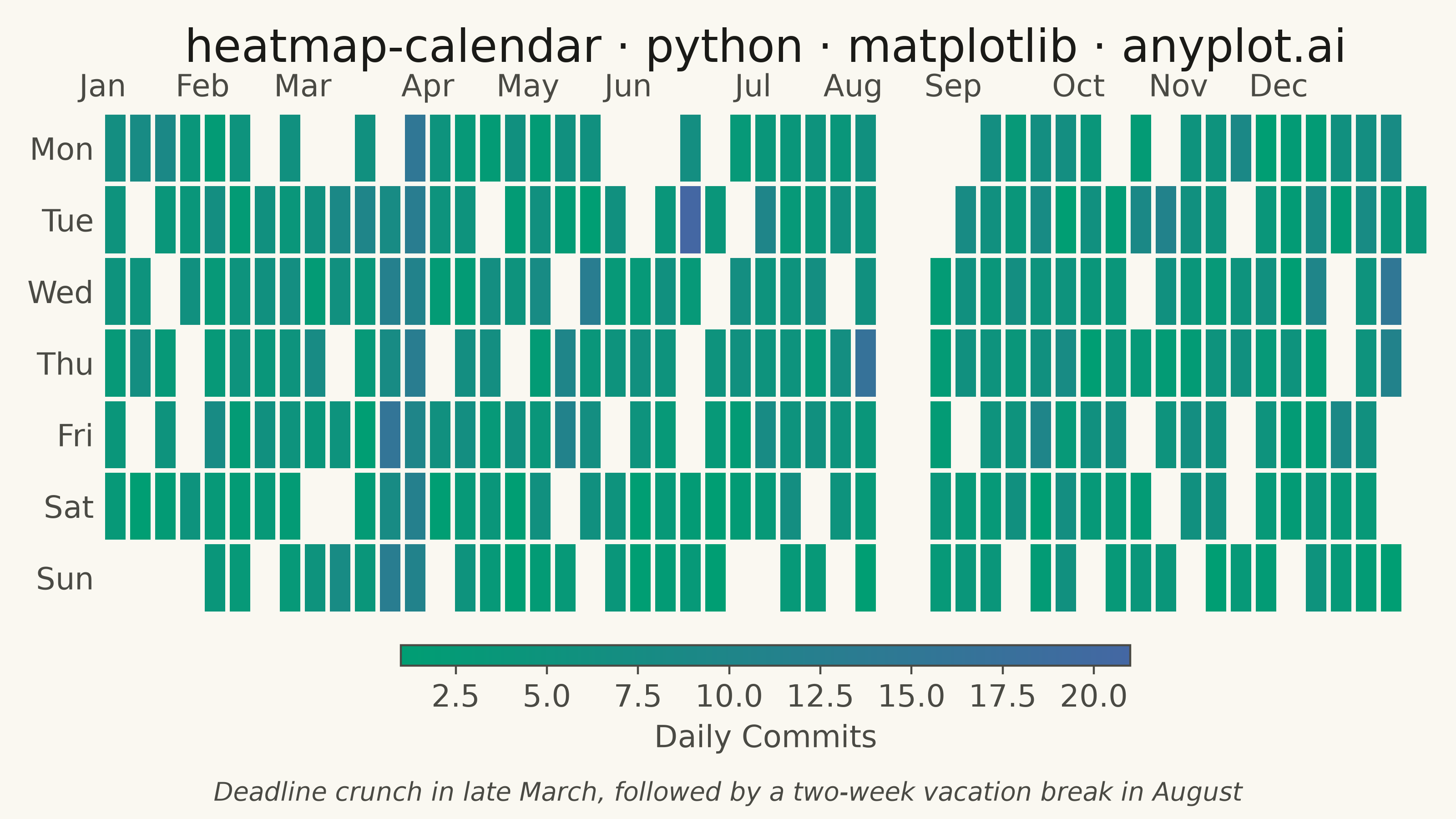
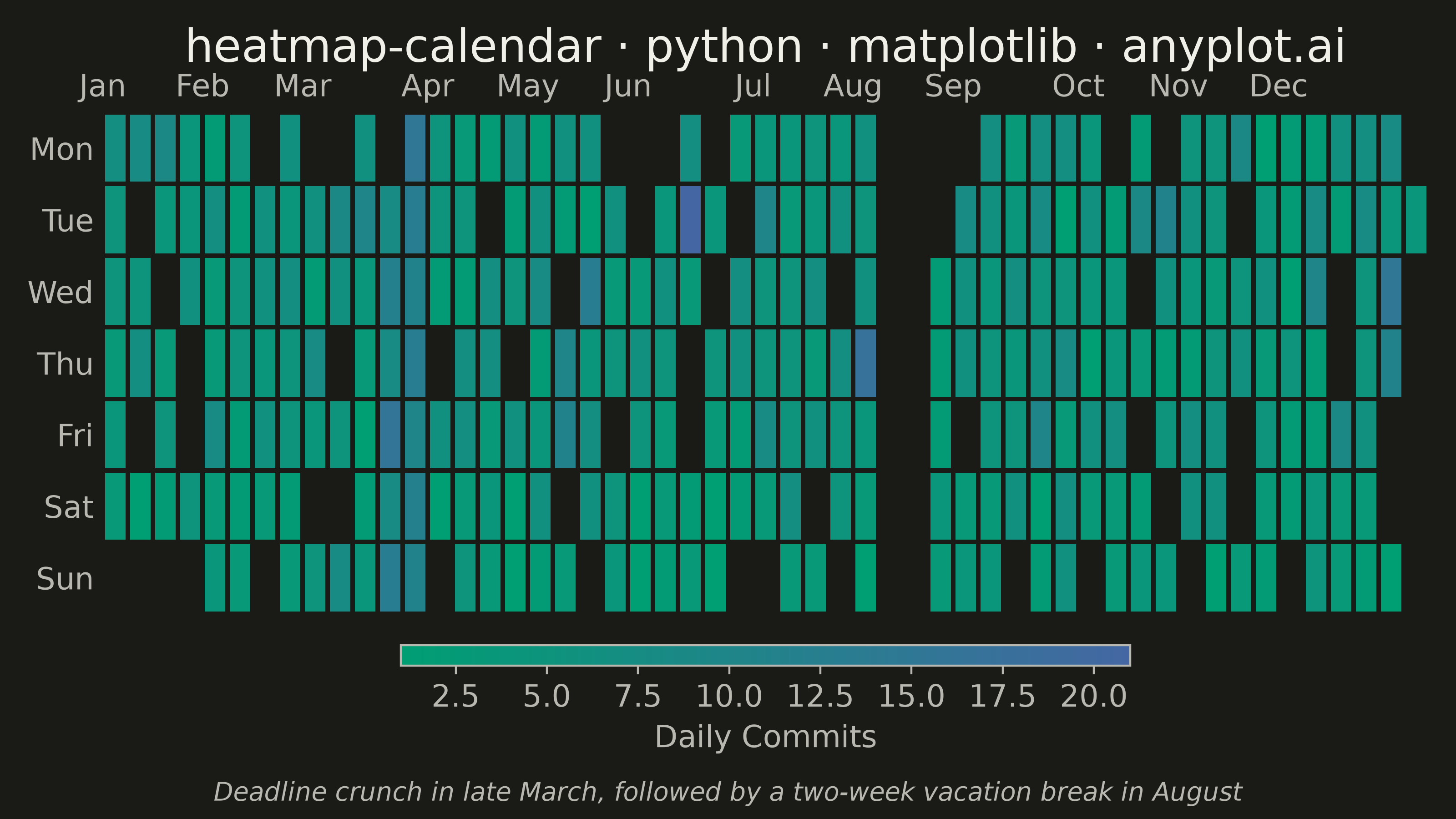
A calendar heatmap visualizes time-series data on a calendar grid, where each day is represented as a cell and color intensity indicates the value magnitude. The layout follows a calendar structure with days as cells, weeks as rows, and months as columns or sections. This visualization excels at revealing daily patterns, seasonal trends, and temporal anomalies over extended time periods.
""" anyplot.ai
heatmap-calendar: Basic Calendar Heatmap
Library: matplotlib 3.11.1 | Python 3.13.14
Quality: 91/100 | Updated: 2026-07-23
"""

import os

import matplotlib.pyplot as plt
import numpy as np
import pandas as pd
from matplotlib.colors import LinearSegmentedColormap


# Theme tokens
THEME = os.getenv("ANYPLOT_THEME", "light")
PAGE_BG = "#FAF8F1" if THEME == "light" else "#1A1A17"
INK = "#1A1A17" if THEME == "light" else "#F0EFE8"
INK_SOFT = "#4A4A44" if THEME == "light" else "#B8B7B0"

# Imprint sequential colormap (brand green -> blue) — identical across themes,
# only chrome (background/text) adapts
cmap = LinearSegmentedColormap.from_list("imprint_seq", ["#009E73", "#4467A3"], N=256)
cmap.set_bad(PAGE_BG)

# Data
np.random.seed(42)
dates = pd.date_range(start="2024-01-01", end="2024-12-31", freq="D")
n_days = len(dates)
date_idx = pd.DatetimeIndex(dates)

# Vectorized activity generation with realistic developer patterns
base = np.random.poisson(3, n_days)
weekday_mask = np.asarray(date_idx.dayofweek < 5)
weekday_bonus = np.random.poisson(2, n_days) * weekday_mask
zero_mask = np.random.random(n_days) < 0.15
spike_mask = np.random.random(n_days) < 0.05

activity = (base + weekday_bonus).astype(float)
activity[zero_mask] = 0
activity += np.random.randint(0, 15, n_days) * spike_mask

# Vacation period: 2 weeks of no activity in August
vacation = np.asarray((date_idx.month == 8) & (date_idx.day >= 5) & (date_idx.day <= 19))
activity[vacation] = 0

# Project deadline spike: high activity in late March
deadline = np.asarray((date_idx.month == 3) & (date_idx.day >= 20))
activity[deadline] += np.random.randint(5, 12, int(deadline.sum()))

# Calendar layout — vectorized grid assignment
week_of_year = np.asarray((dates - dates[0]).days // 7)
dayofweek = np.asarray(date_idx.dayofweek)

n_weeks = week_of_year.max() + 1
heatmap_data = np.full((7, n_weeks), np.nan)
heatmap_data[dayofweek, week_of_year] = activity

# Zero-activity days (vacation, off days) render as empty cells alongside
# out-of-range grid padding, so the inactive stretch reads as a clear gap
# rather than a low value on the imprint_seq scale
plot_data = np.where(heatmap_data == 0, np.nan, heatmap_data)

# Plot
fig, ax = plt.subplots(figsize=(8, 4.5), dpi=400, facecolor=PAGE_BG)
ax.set_facecolor(PAGE_BG)

x = np.arange(n_weeks + 1)
y = np.arange(8)
mesh = ax.pcolormesh(
    x,
    y,
    np.ma.masked_invalid(plot_data),
    cmap=cmap,
    vmin=np.nanmin(plot_data),
    vmax=np.nanmax(plot_data),
    edgecolors=PAGE_BG,
    linewidth=1.5,
)

# Style: weekday labels on y-axis (kept well below the title's fontsize so the
# title reads as the clear typographic anchor)
weekday_labels = ["Mon", "Tue", "Wed", "Thu", "Fri", "Sat", "Sun"]
ax.set_yticks(np.arange(7) + 0.5)
ax.set_yticklabels(weekday_labels, fontsize=12, color=INK_SOFT)

# Month labels at top
month_positions = []
month_labels = []
for month in range(1, 13):
    mask = np.asarray(date_idx.month == month)
    if mask.any():
        month_positions.append(week_of_year[mask][0])
        month_labels.append(pd.Timestamp(2024, month, 1).strftime("%b"))

ax.set_xticks(month_positions)
ax.set_xticklabels(month_labels, fontsize=12, color=INK_SOFT)
ax.xaxis.tick_top()
ax.xaxis.set_label_position("top")

for spine in ax.spines.values():
    spine.set_visible(False)

ax.invert_yaxis()
ax.tick_params(colors=INK_SOFT, length=0)

# Colorbar
cbar = plt.colorbar(mesh, ax=ax, orientation="horizontal", pad=0.05, shrink=0.55, aspect=35)
cbar.ax.tick_params(labelsize=12, labelcolor=INK_SOFT, color=INK_SOFT)
cbar.set_label("Daily Commits", fontsize=12, color=INK_SOFT)
cbar.outline.set_edgecolor(INK_SOFT)

ax.set_title("heatmap-calendar · python · matplotlib · anyplot.ai", fontsize=18, fontweight="medium", color=INK, pad=20)

# Caption calling out the two visible narrative moments: the August vacation
# gap and the late-March deadline spike
plt.tight_layout(rect=(0, 0.05, 1, 1))
fig.text(
    0.5,
    0.015,
    "Deadline crunch in late March, followed by a two-week vacation break in August",
    ha="center",
    va="bottom",
    fontsize=10,
    color=INK_SOFT,
    style="italic",
)

plt.savefig(f"plot-{THEME}.png", dpi=400, facecolor=PAGE_BG)
Runnable source as JSON, for any HTTP client: https://api.anyplot.ai/specs/heatmap-calendar/matplotlib/code. Any spec id and library id listed in llms-full.txt fit the same URL shape; every URL below is complete and callable.
{
  "spec_id": "heatmap-calendar",
  "language": "python",
  "library": "matplotlib",
  "page": "https://anyplot.ai/heatmap-calendar/python/matplotlib",
  "hub": "https://anyplot.ai/heatmap-calendar",
  "code_json": "https://api.anyplot.ai/specs/heatmap-calendar/matplotlib/code",
  "spec_json": "https://api.anyplot.ai/specs/heatmap-calendar",
  "render_light_png": "https://storage.googleapis.com/anyplot-images/plots/heatmap-calendar/python/matplotlib/plot-light.png",
  "render_dark_png": "https://storage.googleapis.com/anyplot-images/plots/heatmap-calendar/python/matplotlib/plot-dark.png",
  "quality_score": 91.0,
  "license": "MIT",
  "guide": "https://anyplot.ai/llms.txt"
}
Part of Basic Calendar Heatmap on anyplot.ai.