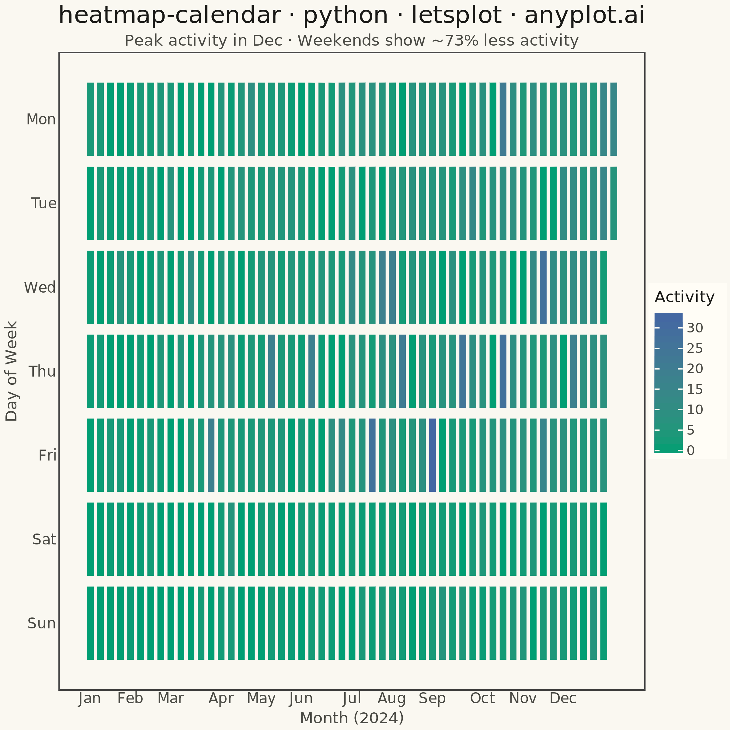
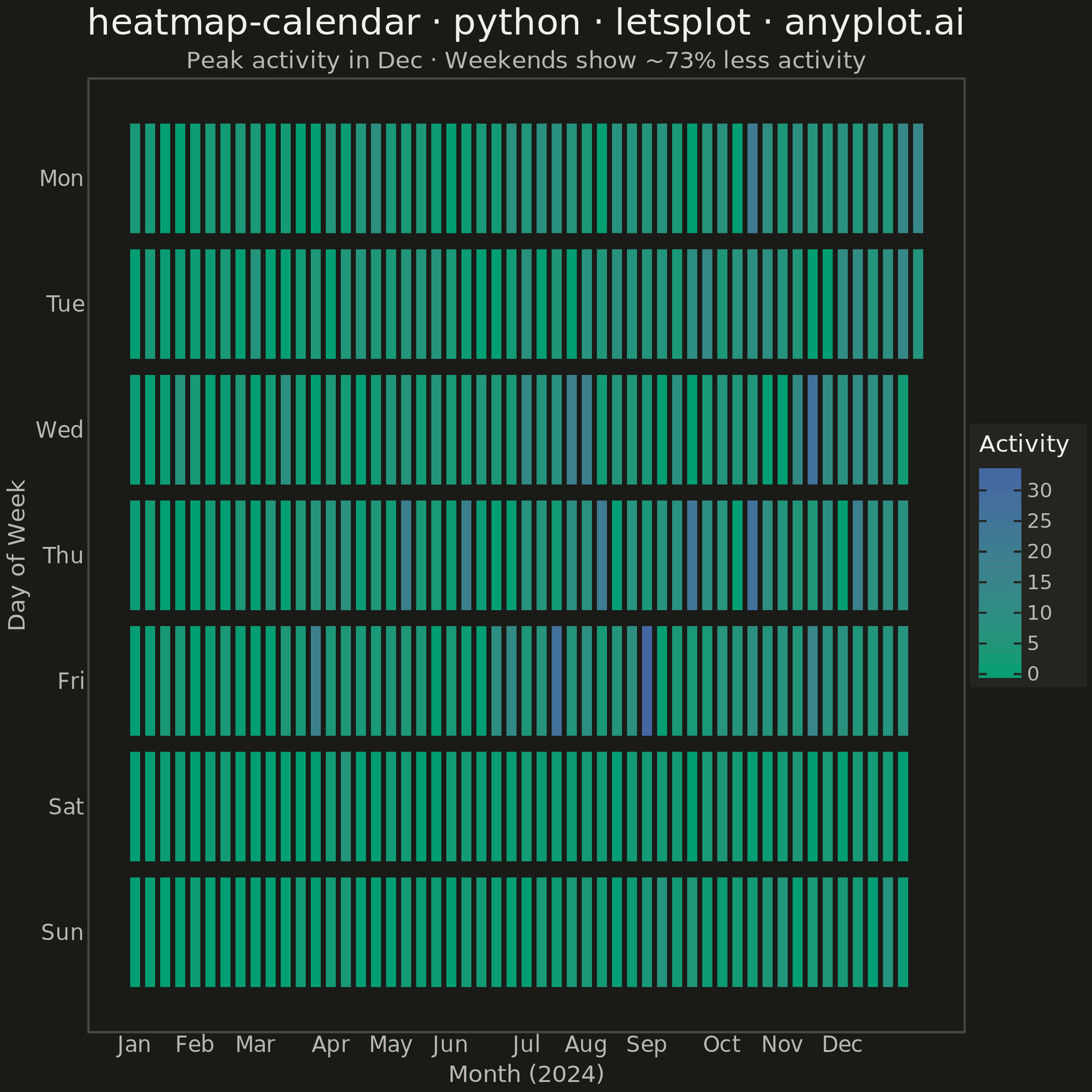
A calendar heatmap visualizes time-series data on a calendar grid, where each day is represented as a cell and color intensity indicates the value magnitude. The layout follows a calendar structure with days as cells, weeks as rows, and months as columns or sections. This visualization excels at revealing daily patterns, seasonal trends, and temporal anomalies over extended time periods.
""" anyplot.ai
heatmap-calendar: Basic Calendar Heatmap
Library: letsplot 4.11.0 | Python 3.13.14
Quality: 89/100 | Updated: 2026-07-23
"""
# ruff: noqa: F405

import os
import shutil

import numpy as np
import pandas as pd
from lets_plot import *


LetsPlot.setup_html()

# Theme tokens
THEME = os.getenv("ANYPLOT_THEME", "light")
PAGE_BG = "#FAF8F1" if THEME == "light" else "#1A1A17"
ELEVATED_BG = "#FFFDF6" if THEME == "light" else "#242420"
INK = "#1A1A17" if THEME == "light" else "#F0EFE8"
INK_SOFT = "#4A4A44" if THEME == "light" else "#B8B7B0"

# Imprint sequential colormap (brand green -> blue) for single-polarity activity counts
IMPRINT_SEQ_LOW = "#009E73"
IMPRINT_SEQ_HIGH = "#4467A3"

# Data - Generate one year of daily activity data
np.random.seed(42)
start_date = pd.Timestamp("2024-01-01")
end_date = pd.Timestamp("2024-12-31")
dates = pd.date_range(start=start_date, end=end_date, freq="D")

# Generate realistic activity data (like GitHub contributions), with a mild
# year-end ramp-up so the "peak in December" narrative is genuinely visible
values = []
for date in dates:
    seasonal_factor = 0.35 + 1.3 * (date.month - 1) / 11
    base = np.random.poisson(5 * seasonal_factor)
    if date.dayofweek >= 5:
        base = int(base * 0.4)
    if np.random.random() < 0.1:
        base = int(base * 3)
    if np.random.random() < 0.15:
        base = 0
    values.append(base)

df = pd.DataFrame({"date": dates, "value": values})
df["date_str"] = df["date"].dt.strftime("%b %d, %Y")
df["weekday"] = df["date"].dt.dayofweek  # 0=Monday, 6=Sunday
df["month"] = df["date"].dt.month
df["week_of_year"] = (df["date"] - start_date).dt.days // 7

weekday_labels = ["Mon", "Tue", "Wed", "Thu", "Fri", "Sat", "Sun"]
month_names = ["Jan", "Feb", "Mar", "Apr", "May", "Jun", "Jul", "Aug", "Sep", "Oct", "Nov", "Dec"]
month_positions = df.groupby("month")["week_of_year"].min().tolist()

peak_month = month_names[df.groupby("month")["value"].mean().idxmax() - 1]
weekday_mean = df[df["weekday"] < 5]["value"].mean()
weekend_mean = df[df["weekday"] >= 5]["value"].mean()
weekend_drop_pct = round((1 - weekend_mean / weekday_mean) * 100)

# Plot
anyplot_theme = theme(
    plot_background=element_rect(fill=PAGE_BG, color=PAGE_BG),
    panel_background=element_rect(fill=PAGE_BG),
    panel_border=element_blank(),
    panel_grid=element_blank(),
    axis_ticks=element_blank(),
    axis_line=element_blank(),
    plot_title=element_text(color=INK, size=20, hjust=0.5),
    plot_subtitle=element_text(color=INK_SOFT, size=13, hjust=0.5),
    axis_title=element_text(color=INK_SOFT, size=13),
    axis_text_x=element_text(size=12, color=INK_SOFT),
    axis_text_y=element_text(size=12, color=INK_SOFT),
    legend_background=element_rect(fill=ELEVATED_BG, color=INK_SOFT),
    legend_text=element_text(color=INK_SOFT, size=11),
    legend_title=element_text(color=INK, size=13),
)

plot = (
    ggplot(df, aes(x="week_of_year", y="weekday", fill="value"))
    + geom_tile(
        tooltips=layer_tooltips().line("@date_str").line("Activity: @value"),
        color=PAGE_BG,
        size=0.8,
        width=0.9,
        height=0.9,
    )
    + scale_fill_gradient(low=IMPRINT_SEQ_LOW, high=IMPRINT_SEQ_HIGH, name="Activity")
    + scale_y_reverse(breaks=[0, 1, 2, 3, 4, 5, 6], labels=weekday_labels)
    + scale_x_continuous(breaks=month_positions, labels=month_names)
    + labs(
        title="heatmap-calendar · python · letsplot · anyplot.ai",
        subtitle=f"Peak activity in {peak_month} · Weekends show ~{weekend_drop_pct}% less activity",
        x="Month (2024)",
        y="Day of Week",
    )
    + theme_minimal()
    + anyplot_theme
    + ggsize(600, 600)
)

# Save as PNG and HTML
ggsave(plot, f"plot-{THEME}.png", scale=4, path=".")
ggsave(plot, f"plot-{THEME}.html", path=".")

# Clean up lets-plot-images directory if created
if os.path.exists("lets-plot-images"):
    shutil.rmtree("lets-plot-images")
Runnable source as JSON, for any HTTP client: https://api.anyplot.ai/specs/heatmap-calendar/letsplot/code. Any spec id and library id listed in llms-full.txt fit the same URL shape; every URL below is complete and callable.
{
  "spec_id": "heatmap-calendar",
  "language": "python",
  "library": "letsplot",
  "page": "https://anyplot.ai/heatmap-calendar/python/letsplot",
  "hub": "https://anyplot.ai/heatmap-calendar",
  "code_json": "https://api.anyplot.ai/specs/heatmap-calendar/letsplot/code",
  "spec_json": "https://api.anyplot.ai/specs/heatmap-calendar",
  "render_light_png": "https://storage.googleapis.com/anyplot-images/plots/heatmap-calendar/python/letsplot/plot-light.png",
  "render_dark_png": "https://storage.googleapis.com/anyplot-images/plots/heatmap-calendar/python/letsplot/plot-dark.png",
  "interactive_light_html": "https://storage.googleapis.com/anyplot-images/plots/heatmap-calendar/python/letsplot/plot-light.html",
  "interactive_dark_html": "https://storage.googleapis.com/anyplot-images/plots/heatmap-calendar/python/letsplot/plot-dark.html",
  "quality_score": 89.0,
  "license": "MIT",
  "guide": "https://anyplot.ai/llms.txt"
}
Part of Basic Calendar Heatmap on anyplot.ai.