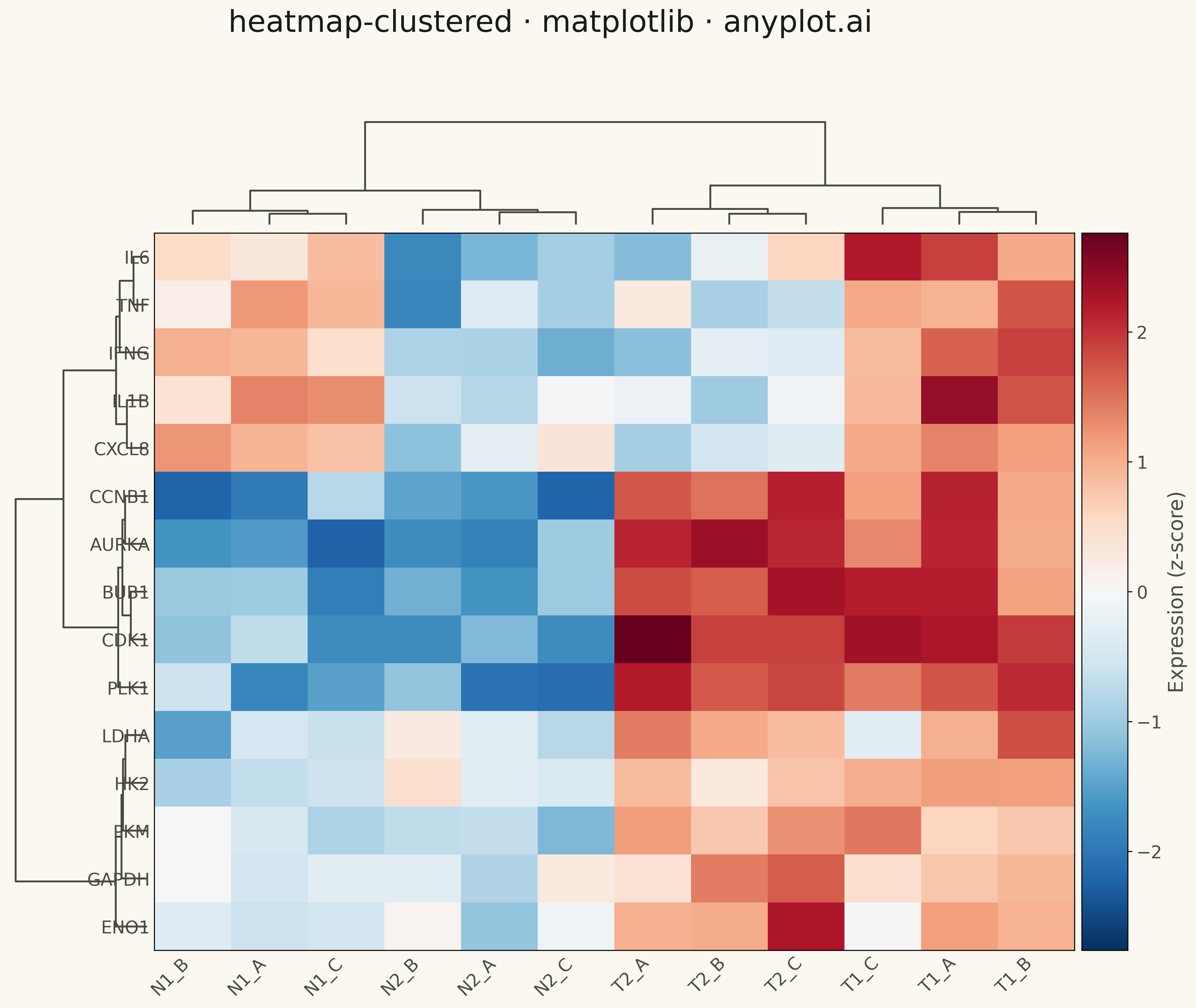
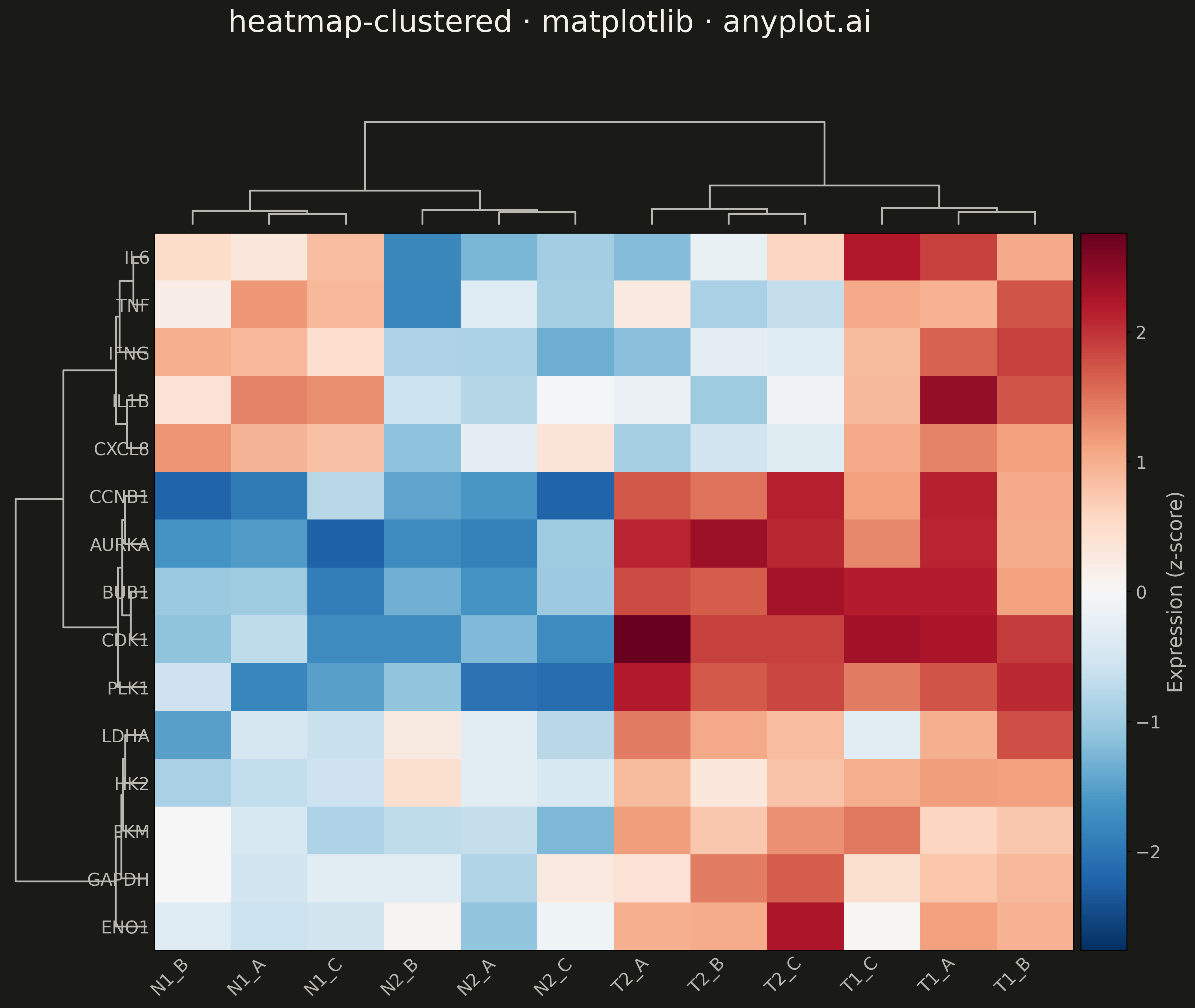
A heatmap with hierarchical clustering dendrograms on rows and/or columns, showing both data values and their hierarchical relationships. Rows and columns are automatically reordered based on clustering results to reveal natural groupings in the data. Essential for discovering patterns in high-dimensional data where similar observations or variables should be visually grouped together.
""" anyplot.ai
heatmap-clustered: Clustered Heatmap
Library: matplotlib 3.10.9 | Python 3.13.13
Quality: 78/100 | Updated: 2026-05-09
"""

import matplotlib.pyplot as plt
import numpy as np
from scipy.cluster.hierarchy import dendrogram, linkage
from scipy.spatial.distance import pdist


# Data - Gene expression analysis (15 genes x 12 samples)
np.random.seed(42)

# Create realistic gene expression data with natural clusters
n_genes = 15
n_samples = 12

# Gene names (cell cycle, metabolism, immune response clusters)
gene_names = [
    "CDK1",
    "CCNB1",
    "PLK1",
    "AURKA",
    "BUB1",  # Cell cycle genes
    "GAPDH",
    "LDHA",
    "PKM",
    "HK2",
    "ENO1",  # Metabolism genes
    "IL6",
    "TNF",
    "IFNG",
    "IL1B",
    "CXCL8",  # Immune response genes
]

# Sample names (tumor vs normal, 3 replicates each)
sample_names = [
    "T1_A",
    "T1_B",
    "T1_C",
    "T2_A",
    "T2_B",
    "T2_C",  # Tumor samples
    "N1_A",
    "N1_B",
    "N1_C",
    "N2_A",
    "N2_B",
    "N2_C",  # Normal samples
]

# Generate expression data with cluster structure
data = np.random.randn(n_genes, n_samples) * 0.5

# Cell cycle genes upregulated in tumors
data[0:5, 0:6] += 2.0
data[0:5, 6:12] -= 1.5

# Metabolism genes moderately upregulated in tumors
data[5:10, 0:6] += 1.0
data[5:10, 6:12] -= 0.5

# Immune genes show mixed pattern
data[10:15, 0:3] += 1.5
data[10:15, 3:6] -= 0.5
data[10:15, 6:9] += 0.8
data[10:15, 9:12] -= 1.0

# Perform hierarchical clustering
row_linkage = linkage(pdist(data, metric="euclidean"), method="ward")
col_linkage = linkage(pdist(data.T, metric="euclidean"), method="ward")

# Get ordering from clustering
row_order = dendrogram(row_linkage, no_plot=True)["leaves"]
col_order = dendrogram(col_linkage, no_plot=True)["leaves"]

# Reorder data and labels
data_clustered = data[row_order, :][:, col_order]
gene_names_ordered = [gene_names[i] for i in row_order]
sample_names_ordered = [sample_names[i] for i in col_order]

# Create figure with gridspec for dendrograms and heatmap
fig = plt.figure(figsize=(16, 12))

# Define grid: column dendrogram, row dendrogram, heatmap, colorbar
gs = fig.add_gridspec(2, 3, width_ratios=[0.15, 1, 0.05], height_ratios=[0.15, 1], wspace=0.02, hspace=0.02)

# Column dendrogram (top)
ax_col_dendrogram = fig.add_subplot(gs[0, 1])
dendrogram(col_linkage, ax=ax_col_dendrogram, color_threshold=0, above_threshold_color="#306998")
ax_col_dendrogram.set_xticks([])
ax_col_dendrogram.set_yticks([])
ax_col_dendrogram.spines["top"].set_visible(False)
ax_col_dendrogram.spines["right"].set_visible(False)
ax_col_dendrogram.spines["bottom"].set_visible(False)
ax_col_dendrogram.spines["left"].set_visible(False)

# Row dendrogram (left)
ax_row_dendrogram = fig.add_subplot(gs[1, 0])
dendrogram(row_linkage, ax=ax_row_dendrogram, orientation="left", color_threshold=0, above_threshold_color="#306998")
ax_row_dendrogram.set_xticks([])
ax_row_dendrogram.set_yticks([])
ax_row_dendrogram.spines["top"].set_visible(False)
ax_row_dendrogram.spines["right"].set_visible(False)
ax_row_dendrogram.spines["bottom"].set_visible(False)
ax_row_dendrogram.spines["left"].set_visible(False)

# Heatmap (center)
ax_heatmap = fig.add_subplot(gs[1, 1])
vmax = np.abs(data_clustered).max()
im = ax_heatmap.imshow(data_clustered, cmap="RdBu_r", aspect="auto", vmin=-vmax, vmax=vmax)

# Configure heatmap axes
ax_heatmap.set_xticks(np.arange(n_samples))
ax_heatmap.set_xticklabels(sample_names_ordered, fontsize=14, rotation=45, ha="right")
ax_heatmap.set_yticks(np.arange(n_genes))
ax_heatmap.set_yticklabels(gene_names_ordered, fontsize=14)
ax_heatmap.tick_params(axis="both", length=0)

# Colorbar
ax_colorbar = fig.add_subplot(gs[1, 2])
cbar = plt.colorbar(im, cax=ax_colorbar)
cbar.set_label("Expression (z-score)", fontsize=16)
cbar.ax.tick_params(labelsize=14)

# Title
fig.suptitle("heatmap-clustered · matplotlib · pyplots.ai", fontsize=24, y=0.98)

plt.savefig("plot.png", dpi=300, bbox_inches="tight", facecolor="white")
Runnable source as JSON, for any HTTP client: https://api.anyplot.ai/specs/heatmap-clustered/matplotlib/code. Any spec id and library id listed in llms-full.txt fit the same URL shape; every URL below is complete and callable.
{
  "spec_id": "heatmap-clustered",
  "language": "python",
  "library": "matplotlib",
  "page": "https://anyplot.ai/heatmap-clustered/python/matplotlib",
  "hub": "https://anyplot.ai/heatmap-clustered",
  "code_json": "https://api.anyplot.ai/specs/heatmap-clustered/matplotlib/code",
  "spec_json": "https://api.anyplot.ai/specs/heatmap-clustered",
  "render_light_png": "https://storage.googleapis.com/anyplot-images/plots/heatmap-clustered/python/matplotlib/plot-light.png",
  "render_dark_png": "https://storage.googleapis.com/anyplot-images/plots/heatmap-clustered/python/matplotlib/plot-dark.png",
  "quality_score": 78.0,
  "license": "MIT",
  "guide": "https://anyplot.ai/llms.txt"
}
Part of Clustered Heatmap on anyplot.ai.