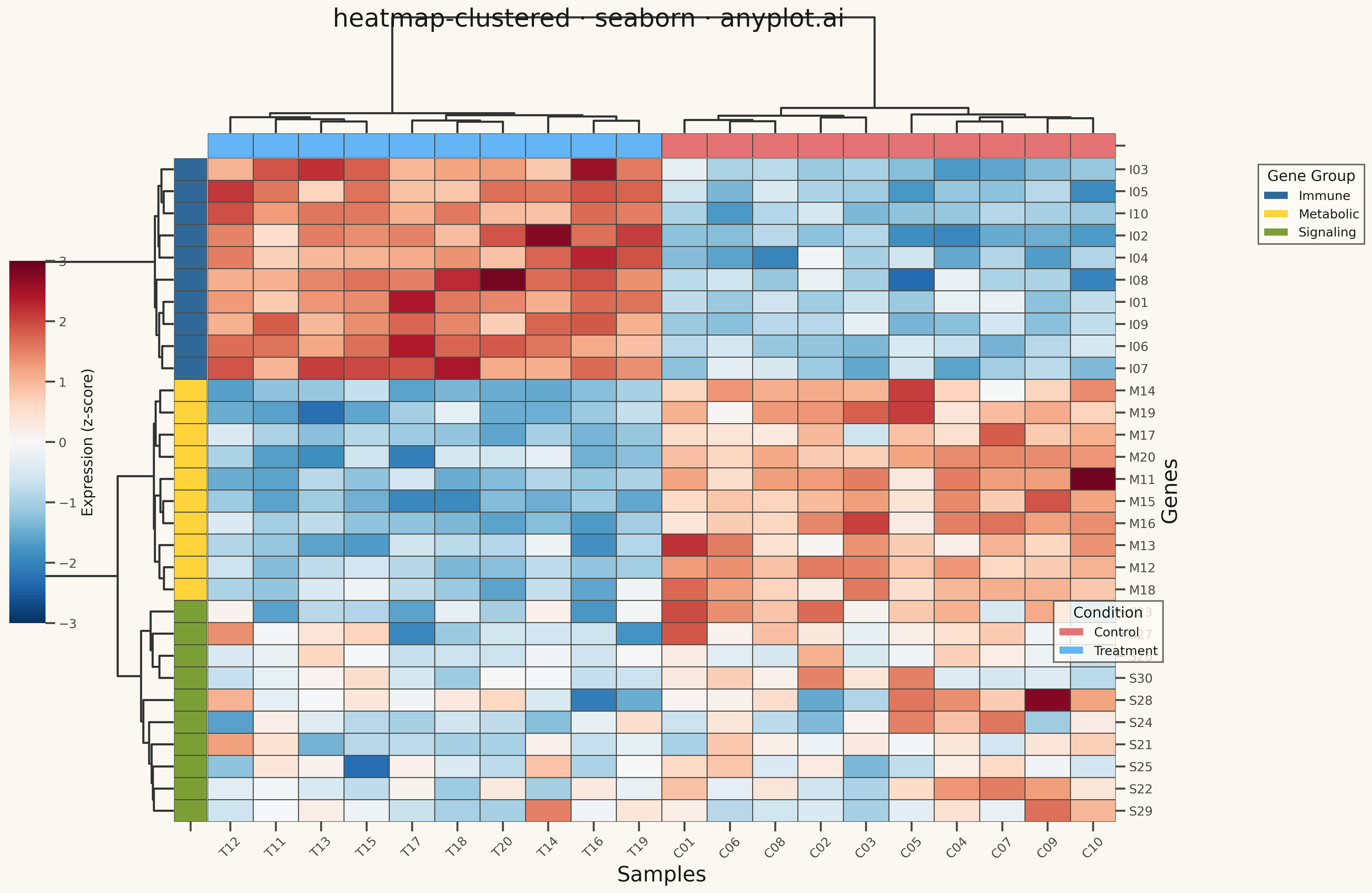
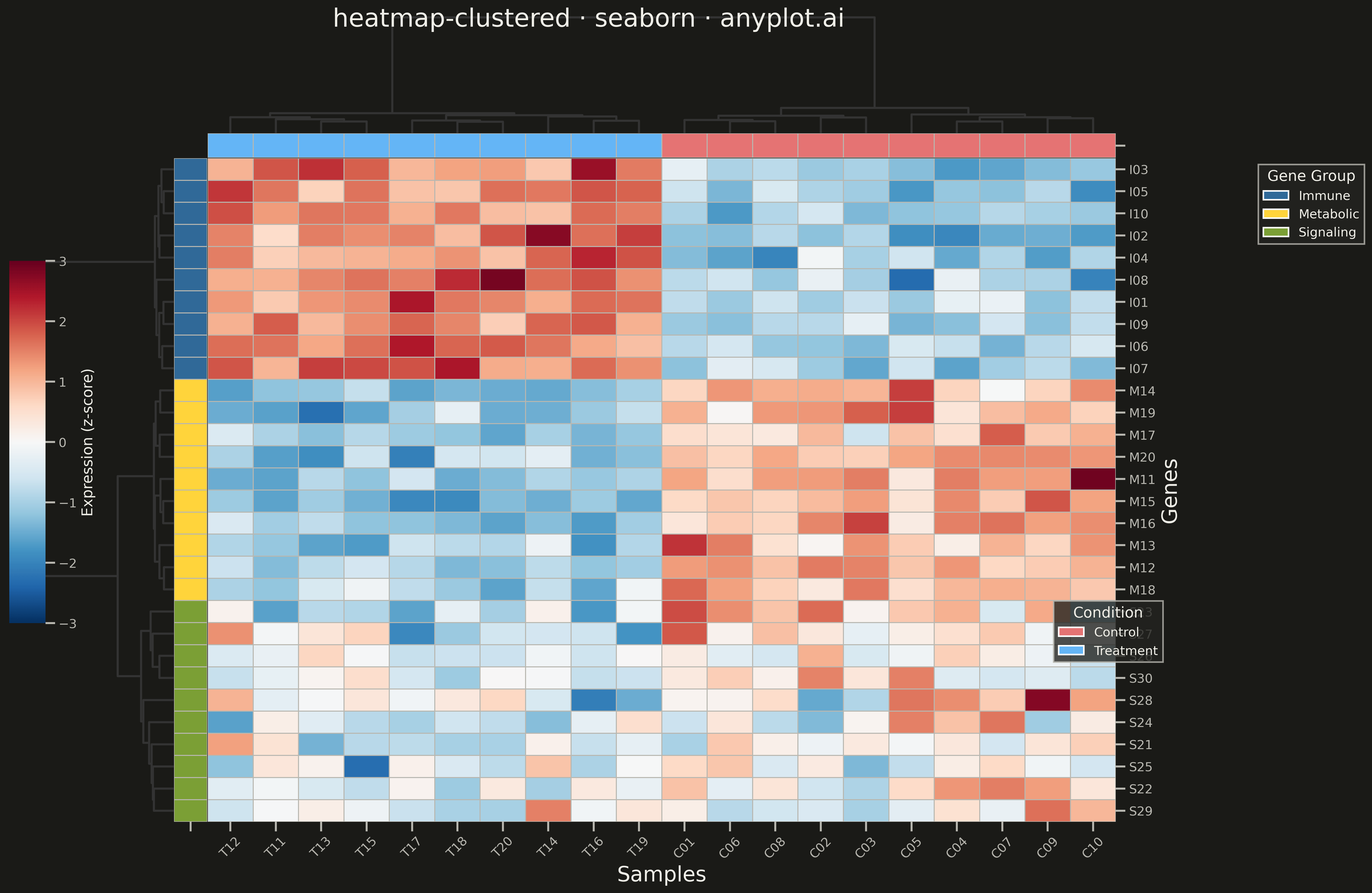
A heatmap with hierarchical clustering dendrograms on rows and/or columns, showing both data values and their hierarchical relationships. Rows and columns are automatically reordered based on clustering results to reveal natural groupings in the data. Essential for discovering patterns in high-dimensional data where similar observations or variables should be visually grouped together.
""" anyplot.ai
heatmap-clustered: Clustered Heatmap
Library: seaborn 0.13.2 | Python 3.13.13
Quality: 96/100 | Updated: 2026-05-09
"""

import os

import matplotlib.pyplot as plt
import numpy as np
import pandas as pd
import seaborn as sns
from matplotlib.patches import Patch


# Theme tokens
THEME = os.getenv("ANYPLOT_THEME", "light")
PAGE_BG = "#FAF8F1" if THEME == "light" else "#1A1A17"
ELEVATED_BG = "#FFFDF6" if THEME == "light" else "#242420"
INK = "#1A1A17" if THEME == "light" else "#F0EFE8"
INK_SOFT = "#4A4A44" if THEME == "light" else "#B8B7B0"

# Data: Gene expression matrix (simulated)
np.random.seed(42)

# Create realistic gene expression data with natural clusters
n_genes = 30
n_samples = 20

# Gene groups (3 clusters)
gene_groups = np.repeat(["Immune", "Metabolic", "Signaling"], [10, 10, 10])

# Sample groups (2 conditions)
sample_groups = np.repeat(["Control", "Treatment"], [10, 10])

# Generate base expression patterns for each gene cluster
expression = np.zeros((n_genes, n_samples))

# Immune genes: higher in treatment
expression[0:10, 0:10] = np.random.normal(-1, 0.5, (10, 10))
expression[0:10, 10:20] = np.random.normal(1.5, 0.5, (10, 10))

# Metabolic genes: lower in treatment
expression[10:20, 0:10] = np.random.normal(1, 0.5, (10, 10))
expression[10:20, 10:20] = np.random.normal(-1.2, 0.5, (10, 10))

# Signaling genes: mixed response
expression[20:30, 0:10] = np.random.normal(0.3, 0.8, (10, 10))
expression[20:30, 10:20] = np.random.normal(-0.3, 0.8, (10, 10))

# Create gene and sample labels
gene_labels = [f"{gene_groups[i][0]}{i + 1:02d}" for i in range(n_genes)]
sample_labels = [f"{sample_groups[i][0]}{i + 1:02d}" for i in range(n_samples)]

# Create DataFrame
df = pd.DataFrame(expression, index=gene_labels, columns=sample_labels)

# Create color palettes for annotations
gene_palette = {"Immune": "#306998", "Metabolic": "#FFD43B", "Signaling": "#7B9F35"}
sample_palette = {"Control": "#E57373", "Treatment": "#64B5F6"}

gene_colors = pd.Series([gene_palette[g] for g in gene_groups], index=gene_labels)
sample_colors = pd.Series([sample_palette[s] for s in sample_groups], index=sample_labels)

# Set seaborn theme for consistent styling
sns.set_theme(
    style="ticks",
    rc={
        "figure.facecolor": PAGE_BG,
        "axes.facecolor": PAGE_BG,
        "axes.edgecolor": INK_SOFT,
        "axes.labelcolor": INK,
        "text.color": INK,
        "xtick.color": INK_SOFT,
        "ytick.color": INK_SOFT,
        "grid.color": INK,
        "grid.alpha": 0.10,
        "legend.facecolor": ELEVATED_BG,
        "legend.edgecolor": INK_SOFT,
    },
)

# Plot: Clustered heatmap with dendrograms
sns.set_context("talk", font_scale=1.1)

g = sns.clustermap(
    df,
    method="ward",
    metric="euclidean",
    cmap="RdBu_r",
    center=0,
    vmin=-3,
    vmax=3,
    row_colors=gene_colors,
    col_colors=sample_colors,
    dendrogram_ratio=(0.15, 0.15),
    cbar_pos=(0.02, 0.3, 0.03, 0.4),
    figsize=(16, 12),
    linewidths=0.5,
    linecolor=INK_SOFT,
    xticklabels=True,
    yticklabels=True,
    tree_kws={"linewidths": 2},
)

# Set figure background
g.figure.patch.set_facecolor(PAGE_BG)

# Style adjustments
g.ax_heatmap.set_xlabel("Samples", fontsize=20, color=INK)
g.ax_heatmap.set_ylabel("Genes", fontsize=20, color=INK)
g.ax_heatmap.tick_params(axis="x", labelsize=12, rotation=45, colors=INK_SOFT)
g.ax_heatmap.tick_params(axis="y", labelsize=12, colors=INK_SOFT)
g.ax_heatmap.set_facecolor(PAGE_BG)

# Title
g.figure.suptitle("heatmap-clustered · seaborn · anyplot.ai", fontsize=24, fontweight="medium", color=INK, y=0.98)

# Colorbar label
g.cax.set_ylabel("Expression (z-score)", fontsize=14, color=INK)
g.cax.tick_params(labelsize=12, colors=INK_SOFT)
g.cax.set_facecolor(PAGE_BG)

# Add legends for row/column colors with better positioning
# Gene group legend
gene_legend = [Patch(facecolor=gene_palette[k], label=k) for k in gene_palette]
g.ax_heatmap.legend(
    handles=gene_legend,
    title="Gene Group",
    loc="upper left",
    bbox_to_anchor=(1.15, 1.0),
    fontsize=12,
    title_fontsize=14,
    frameon=True,
    fancybox=False,
    edgecolor=INK_SOFT,
    facecolor=ELEVATED_BG,
)

# Sample group legend positioned lower to avoid overlap
sample_legend = [Patch(facecolor=sample_palette[k], label=k) for k in sample_palette]
g.figure.legend(
    handles=sample_legend,
    title="Condition",
    loc="lower left",
    bbox_to_anchor=(0.88, 0.25),
    fontsize=12,
    title_fontsize=14,
    frameon=True,
    fancybox=False,
    edgecolor=INK_SOFT,
    facecolor=ELEVATED_BG,
)

plt.tight_layout()
plt.savefig(f"plot-{THEME}.png", dpi=300, bbox_inches="tight", facecolor=PAGE_BG)
Runnable source as JSON, for any HTTP client: https://api.anyplot.ai/specs/heatmap-clustered/seaborn/code. Any spec id and library id listed in llms-full.txt fit the same URL shape; every URL below is complete and callable.
{
  "spec_id": "heatmap-clustered",
  "language": "python",
  "library": "seaborn",
  "page": "https://anyplot.ai/heatmap-clustered/python/seaborn",
  "hub": "https://anyplot.ai/heatmap-clustered",
  "code_json": "https://api.anyplot.ai/specs/heatmap-clustered/seaborn/code",
  "spec_json": "https://api.anyplot.ai/specs/heatmap-clustered",
  "render_light_png": "https://storage.googleapis.com/anyplot-images/plots/heatmap-clustered/python/seaborn/plot-light.png",
  "render_dark_png": "https://storage.googleapis.com/anyplot-images/plots/heatmap-clustered/python/seaborn/plot-dark.png",
  "quality_score": 96.0,
  "license": "MIT",
  "guide": "https://anyplot.ai/llms.txt"
}
Part of Clustered Heatmap on anyplot.ai.