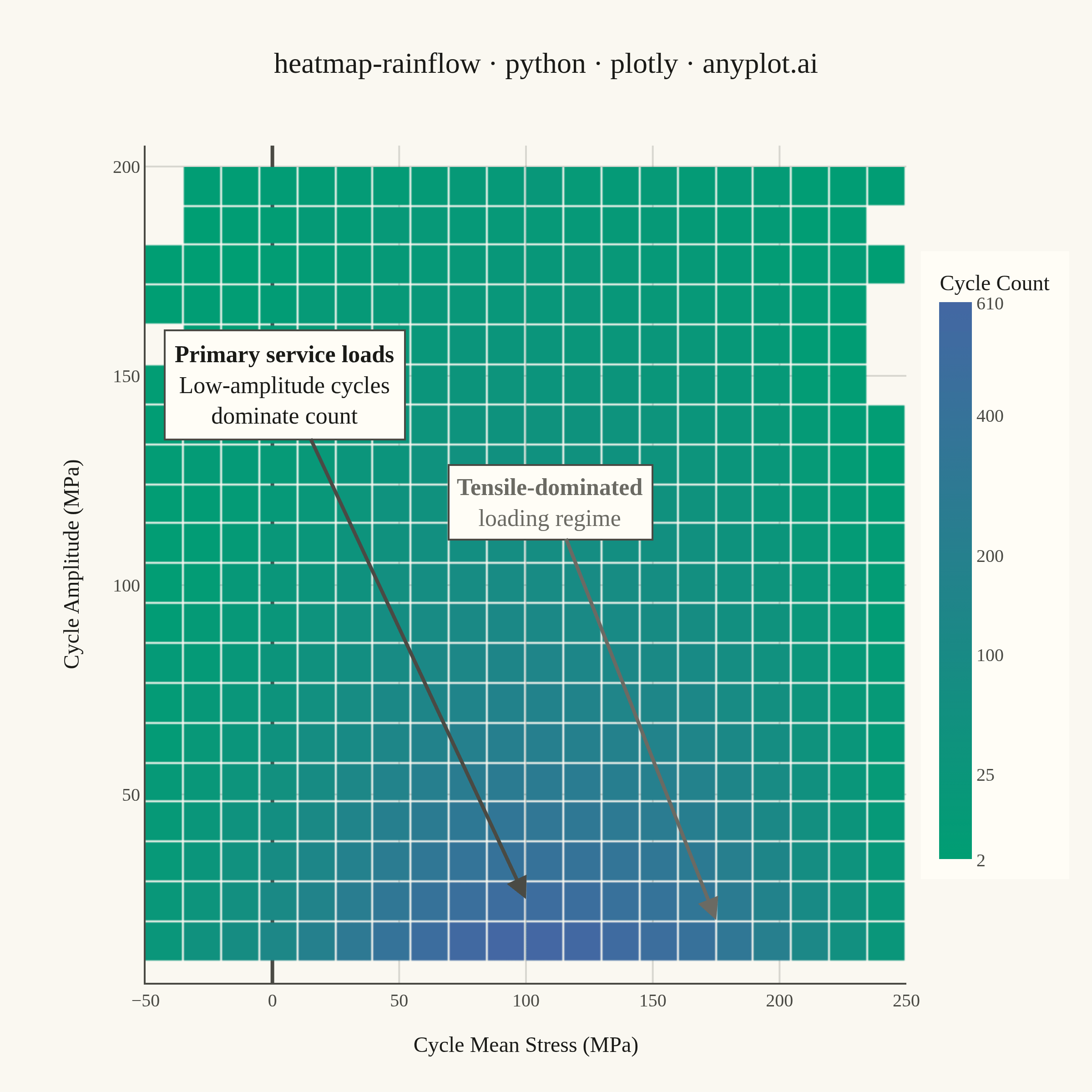
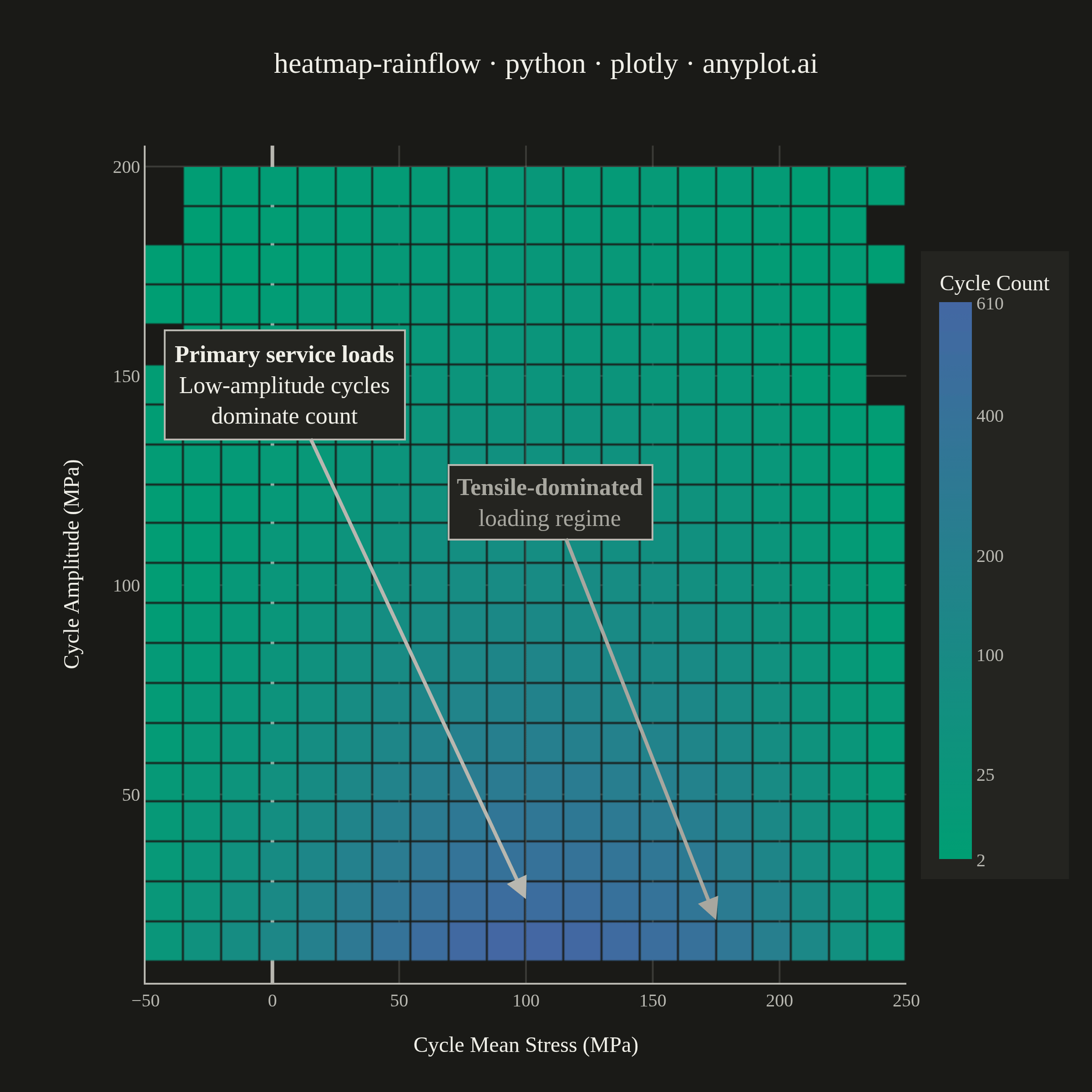
A rainflow counting matrix visualizes the results of rainflow cycle counting from a load or stress time history. The matrix displays cycle counts as a 2D heatmap where one axis represents cycle amplitude (half-range), the other represents cycle mean value, and color intensity represents the frequency of each cycle combination. This is a fundamental tool in fatigue analysis and durability engineering, used to characterize variable-amplitude loading for fatigue life prediction.
""" anyplot.ai
heatmap-rainflow: Rainflow Counting Matrix for Fatigue Analysis
Library: plotly 6.7.0 | Python 3.13.13
Quality: 90/100 | Updated: 2026-06-02
"""

import os

import numpy as np
import plotly.graph_objects as go


# Theme tokens — Imprint palette chrome
THEME = os.getenv("ANYPLOT_THEME", "light")
PAGE_BG = "#FAF8F1" if THEME == "light" else "#1A1A17"
ELEVATED_BG = "#FFFDF6" if THEME == "light" else "#242420"
INK = "#1A1A17" if THEME == "light" else "#F0EFE8"
INK_SOFT = "#4A4A44" if THEME == "light" else "#B8B7B0"
INK_MUTED = "#6B6A63" if THEME == "light" else "#A8A79F"
GRID = "rgba(26,26,23,0.15)" if THEME == "light" else "rgba(240,239,232,0.15)"

# Imprint sequential colormap for single-polarity cycle count data
imprint_seq = [[0.0, "#009E73"], [1.0, "#4467A3"]]

# Data — rainflow matrix: exponential decay in amplitude × Gaussian in mean stress
# Physically realistic: most cycles are small (exponential amplitude distribution),
# centred around service mean stress with a tensile-dominated secondary regime.
np.random.seed(42)

n_bins = 20
amplitude_edges = np.linspace(10, 200, n_bins + 1)
mean_edges = np.linspace(-50, 250, n_bins + 1)
amplitude_centers = (amplitude_edges[:-1] + amplitude_edges[1:]) / 2
mean_centers = (mean_edges[:-1] + mean_edges[1:]) / 2

amp_grid, mean_grid = np.meshgrid(amplitude_centers, mean_centers, indexing="ij")

# Exponential amplitude decay (characteristic amplitude ~45 MPa)
amp_decay = np.exp(-amp_grid / 45)

# Primary cluster: baseline service loads, mean ~100 MPa
mean_primary = np.exp(-((mean_grid - 100) ** 2) / (2 * 55**2))
counts = 850 * amp_decay * mean_primary

# Secondary cluster: tensile-dominated regime, mean ~175 MPa
mean_secondary = np.exp(-((mean_grid - 175) ** 2) / (2 * 25**2))
counts += 180 * amp_decay * mean_secondary

# Poisson-like scatter noise
counts += np.random.exponential(1.5, counts.shape)
counts = np.round(counts).astype(int)
counts = np.clip(counts, 0, None)
counts[counts < 2] = 0

# NaN for zero-count bins → transparent (PAGE_BG shows through)
z_display = counts.astype(float)
z_display[z_display == 0] = np.nan

# Sqrt-transform for perceptual range enhancement — the 2-600 linear span makes
# moderate bins indistinguishable; sqrt(2)≈1.4 → sqrt(600)≈24.5 spreads them well.
z_max = int(np.nanmax(z_display))
z_plot = np.sqrt(z_display)

# Colorbar ticks: sqrt-transformed positions labeled with original counts
raw_ticks = [v for v in [2, 25, 100, 200, 400, z_max] if v <= z_max]
cb_tickvals = [np.sqrt(v) for v in raw_ticks]
cb_ticktext = [str(v) for v in raw_ticks]

font_family = "Palatino, Georgia, serif"

title_text = "heatmap-rainflow · python · plotly · anyplot.ai"
n_chars = len(title_text)
ratio = 67 / n_chars if n_chars > 67 else 1.0
title_size = max(11, round(16 * ratio))

# Plot
fig = go.Figure(
    data=go.Heatmap(
        z=z_plot,
        x=np.round(mean_centers, 1),
        y=np.round(amplitude_centers, 1),
        colorscale=imprint_seq,
        colorbar={
            "title": {"text": "Cycle Count", "font": {"size": 12, "family": font_family, "color": INK}},
            "tickfont": {"size": 10, "family": font_family, "color": INK_SOFT},
            "tickvals": cb_tickvals,
            "ticktext": cb_ticktext,
            "thickness": 18,
            "len": 0.75,
            "outlinewidth": 0,
            "bgcolor": ELEVATED_BG,
        },
        hovertemplate="Mean: %{x} MPa<br>Amplitude: %{y} MPa<br>Cycles: %{customdata:.0f}<extra></extra>",
        customdata=z_display,
        xgap=1,
        ygap=1,
        connectgaps=False,
    )
)

# Annotations — absolute data-coordinate placement (axref/ayref="x"/"y") keeps
# text boxes inside the plot regardless of pixel scaling.
fig.add_annotation(
    xref="x",
    yref="y",
    axref="x",
    ayref="y",
    x=100,
    y=25,
    ax=5,
    ay=148,
    text="<b>Primary service loads</b><br>Low-amplitude cycles<br>dominate count",
    showarrow=True,
    arrowhead=2,
    arrowsize=1.2,
    arrowwidth=2,
    arrowcolor=INK_SOFT,
    font={"size": 13, "family": font_family, "color": INK},
    bgcolor=ELEVATED_BG,
    bordercolor=INK_SOFT,
    borderpad=5,
    borderwidth=1,
)
fig.add_annotation(
    xref="x",
    yref="y",
    axref="x",
    ayref="y",
    x=175,
    y=20,
    ax=110,
    ay=120,
    text="<b>Tensile-dominated</b><br>loading regime",
    showarrow=True,
    arrowhead=2,
    arrowsize=1.2,
    arrowwidth=2,
    arrowcolor=INK_MUTED,
    font={"size": 13, "family": font_family, "color": INK_MUTED},
    bgcolor=ELEVATED_BG,
    bordercolor=INK_SOFT,
    borderpad=4,
    borderwidth=1,
)

fig.update_layout(
    autosize=False,
    title={
        "text": title_text,
        "font": {"size": title_size, "family": font_family, "color": INK},
        "x": 0.5,
        "xanchor": "center",
    },
    xaxis={
        "title": {"text": "Cycle Mean Stress (MPa)", "font": {"size": 12, "family": font_family, "color": INK}},
        "tickfont": {"size": 10, "family": font_family, "color": INK_SOFT},
        "gridcolor": GRID,
        "linecolor": INK_SOFT,
        "zerolinecolor": INK_SOFT,
    },
    yaxis={
        "title": {"text": "Cycle Amplitude (MPa)", "font": {"size": 12, "family": font_family, "color": INK}},
        "tickfont": {"size": 10, "family": font_family, "color": INK_SOFT},
        "gridcolor": GRID,
        "linecolor": INK_SOFT,
        "zerolinecolor": INK_SOFT,
        "range": [5, 205],
    },
    paper_bgcolor=PAGE_BG,
    plot_bgcolor=PAGE_BG,
    font={"color": INK},
    margin={"l": 80, "r": 60, "t": 80, "b": 60},
)

# Save — square canvas (2400×2400) suits the symmetric heatmap grid
fig.write_image(f"plot-{THEME}.png", width=600, height=600, scale=4)
fig.write_html(f"plot-{THEME}.html", include_plotlyjs="cdn")
Runnable source as JSON, for any HTTP client: https://api.anyplot.ai/specs/heatmap-rainflow/plotly/code. Any spec id and library id listed in llms-full.txt fit the same URL shape; every URL below is complete and callable.
{
  "spec_id": "heatmap-rainflow",
  "language": "python",
  "library": "plotly",
  "page": "https://anyplot.ai/heatmap-rainflow/python/plotly",
  "hub": "https://anyplot.ai/heatmap-rainflow",
  "code_json": "https://api.anyplot.ai/specs/heatmap-rainflow/plotly/code",
  "spec_json": "https://api.anyplot.ai/specs/heatmap-rainflow",
  "render_light_png": "https://storage.googleapis.com/anyplot-images/plots/heatmap-rainflow/python/plotly/plot-light.png",
  "render_dark_png": "https://storage.googleapis.com/anyplot-images/plots/heatmap-rainflow/python/plotly/plot-dark.png",
  "interactive_light_html": "https://storage.googleapis.com/anyplot-images/plots/heatmap-rainflow/python/plotly/plot-light.html",
  "interactive_dark_html": "https://storage.googleapis.com/anyplot-images/plots/heatmap-rainflow/python/plotly/plot-dark.html",
  "quality_score": 90.0,
  "license": "MIT",
  "guide": "https://anyplot.ai/llms.txt"
}
Part of Rainflow Counting Matrix for Fatigue Analysis on anyplot.ai.