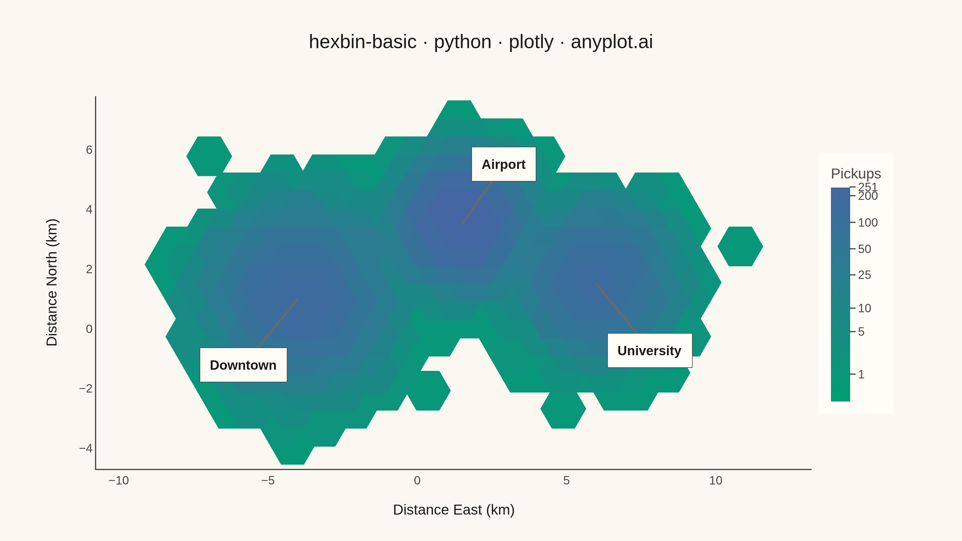
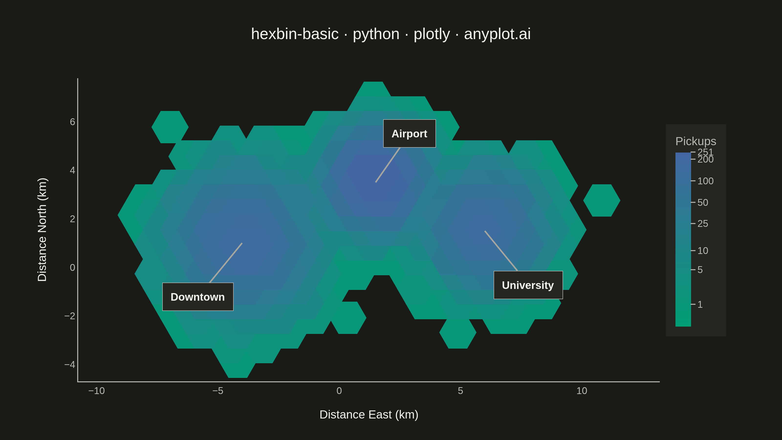
A hexagonal binning plot that visualizes the density of 2D point data by aggregating points into hexagonal bins. The color intensity of each hexagon represents the count of points within it, making it ideal for revealing density patterns in large datasets where traditional scatter plots would show overlapping points. Hexagonal bins provide better visual representation than square pixels due to their isotropy (equal distance to neighboring cells in all directions).
""" anyplot.ai
hexbin-basic: Basic Hexbin Plot
Library: plotly 6.7.0 | Python 3.13.13
Quality: 87/100 | Created: 2026-05-29
"""

import os
import sys


# Prevent self-shadowing: remove this script's directory from sys.path so
# 'import plotly' resolves to the installed package, not this file.
_here = os.path.dirname(os.path.abspath(__file__))
sys.path = [p for p in sys.path if p and os.path.abspath(p) != _here]

import numpy as np
import plotly.graph_objects as go


# Theme tokens
THEME = os.getenv("ANYPLOT_THEME", "light")
PAGE_BG = "#FAF8F1" if THEME == "light" else "#1A1A17"
ELEVATED_BG = "#FFFDF6" if THEME == "light" else "#242420"
INK = "#1A1A17" if THEME == "light" else "#F0EFE8"
INK_SOFT = "#4A4A44" if THEME == "light" else "#B8B7B0"
INK_MUTED = "#6B6A63" if THEME == "light" else "#A8A79F"

# Imprint sequential colorscale for continuous density data
imprint_seq = [[0.0, "#009E73"], [1.0, "#4467A3"]]

# Data - ride-share pickup density across a metro area
np.random.seed(42)

# Three pickup hotspots: Downtown (dense hub), Airport (tight cluster), University (diffuse)
clusters = [(-4, 1.0, 1.3, 4000), (1.5, 3.5, 0.9, 3500), (6, 1.5, 1.1, 2500)]

x_all, y_all = [], []
for cx, cy, spread, n in clusters:
    x_all.extend(np.random.randn(n) * spread + cx)
    y_all.extend(np.random.randn(n) * spread + cy)

x = np.array(x_all)
y = np.array(y_all)

# Hexagonal binning (manual — plotly lacks a native hexbin trace)
gridsize = 25
x_min, x_max = x.min() - 0.5, x.max() + 0.5
y_min, y_max = y.min() - 0.5, y.max() + 0.5

hex_size = (x_max - x_min) / (gridsize * 2)
hex_w = hex_size * np.sqrt(3)
hex_h = hex_size * 2
vert_spacing = hex_h * 0.75

hex_bins = {}
for xi, yi in zip(x, y, strict=True):
    row = int((yi - y_min) / vert_spacing)
    offset = (row % 2) * hex_w * 0.5
    col = int((xi - x_min - offset) / hex_w)
    hx = x_min + col * hex_w + offset + hex_w / 2
    hy = y_min + row * vert_spacing + hex_h / 2
    key = (col, row)
    if key not in hex_bins:
        hex_bins[key] = [hx, hy, 0]
    hex_bins[key][2] += 1

hex_x = np.array([v[0] for v in hex_bins.values()])
hex_y = np.array([v[1] for v in hex_bins.values()])
counts = np.array([v[2] for v in hex_bins.values()])

# Sort by count so dense hexagons render on top at overlaps
order = np.argsort(counts)
hex_x, hex_y, counts = hex_x[order], hex_y[order], counts[order]

# Log-scale color mapping for wide density range — spec recommendation
log_counts = np.log1p(counts)
log_max = float(log_counts.max())

# Colorbar ticks at meaningful count thresholds, displayed in raw count space
tick_vals_counts = [v for v in [1, 5, 10, 25, 50, 100, 200] if v <= int(counts.max())]
tick_vals_counts.append(int(counts.max()))
tick_vals_log = [float(np.log1p(v)) for v in tick_vals_counts]
tick_text = [str(v) for v in tick_vals_counts]

# Marker size calibrated to logical canvas (800×450) for seamless tessellation
margins = {"l": 80, "r": 125, "t": 80, "b": 60}
plot_w = 800 - margins["l"] - margins["r"]
plot_h = 450 - margins["t"] - margins["b"]
ax_x_range = (hex_x.max() + hex_w) - (hex_x.min() - hex_w)
ax_y_range = (hex_y.max() + hex_h) - (hex_y.min() - hex_h)
px_per_unit = min(plot_w / ax_x_range, plot_h / ax_y_range)
marker_size = 2 * hex_size * px_per_unit * 1.85

title = "hexbin-basic · python · plotly · anyplot.ai"

fig = go.Figure(
    go.Scatter(
        x=hex_x,
        y=hex_y,
        mode="markers",
        marker={
            "symbol": "hexagon2",
            "size": marker_size,
            "color": log_counts,
            "colorscale": imprint_seq,
            "cmin": 0,
            "cmax": log_max,
            "colorbar": {
                "title": {"text": "Pickups", "font": {"size": 12, "color": INK_SOFT}},
                "tickfont": {"size": 10, "color": INK_SOFT},
                "tickcolor": INK_SOFT,
                "tickvals": tick_vals_log,
                "ticktext": tick_text,
                "outlinewidth": 0,
                "thickness": 16,
                "len": 0.7,
                "x": 1.01,
                "bgcolor": ELEVATED_BG,
            },
            "line": {"width": 1, "color": log_counts, "colorscale": imprint_seq, "cmin": 0, "cmax": log_max},
        },
        customdata=counts,
        hovertemplate="East: %{x:.1f} km<br>North: %{y:.1f} km<br>Pickups: %{customdata}<extra></extra>",
        showlegend=False,
    )
)

fig.update_layout(
    autosize=False,
    width=800,
    height=450,
    paper_bgcolor=PAGE_BG,
    plot_bgcolor=PAGE_BG,
    margin=margins,
    font={"color": INK},
    title={"text": title, "font": {"size": 16, "color": INK}, "x": 0.5, "xanchor": "center"},
    xaxis={
        "title": {"text": "Distance East (km)", "font": {"size": 12, "color": INK}},
        "tickfont": {"size": 10, "color": INK_SOFT},
        "showgrid": False,
        "zeroline": False,
        "linecolor": INK_SOFT,
        "linewidth": 1,
        "range": [hex_x.min() - hex_w, hex_x.max() + hex_w],
    },
    yaxis={
        "title": {"text": "Distance North (km)", "font": {"size": 12, "color": INK}},
        "tickfont": {"size": 10, "color": INK_SOFT},
        "showgrid": False,
        "zeroline": False,
        "linecolor": INK_SOFT,
        "linewidth": 1,
        "scaleanchor": "x",
        "scaleratio": 1,
        "range": [hex_y.min() - hex_h, hex_y.max() + hex_h],
    },
    hoverlabel={"bgcolor": ELEVATED_BG, "font": {"size": 10, "color": INK}, "bordercolor": INK_SOFT},
)

# Annotate cluster hotspots for spatial narrative
for label, cx, cy, ax_offset, ay_offset in [
    ("Downtown", -4, 1.0, -45, 55),
    ("Airport", 1.5, 3.5, 35, -50),
    ("University", 6, 1.5, 45, 55),
]:
    fig.add_annotation(
        x=cx,
        y=cy,
        text=f"<b>{label}</b>",
        showarrow=True,
        arrowhead=0,
        arrowwidth=1.5,
        arrowcolor=INK_MUTED,
        ax=ax_offset,
        ay=ay_offset,
        font={"size": 11, "color": INK},
        bgcolor=ELEVATED_BG,
        borderpad=8,
        bordercolor=INK_SOFT,
        borderwidth=0.5,
    )

fig.write_image(f"plot-{THEME}.png", width=800, height=450, scale=4)
fig.write_html(f"plot-{THEME}.html", include_plotlyjs="cdn")
Runnable source as JSON, for any HTTP client: https://api.anyplot.ai/specs/hexbin-basic/plotly/code. Any spec id and library id listed in llms-full.txt fit the same URL shape; every URL below is complete and callable.
{
  "spec_id": "hexbin-basic",
  "language": "python",
  "library": "plotly",
  "page": "https://anyplot.ai/hexbin-basic/python/plotly",
  "hub": "https://anyplot.ai/hexbin-basic",
  "code_json": "https://api.anyplot.ai/specs/hexbin-basic/plotly/code",
  "spec_json": "https://api.anyplot.ai/specs/hexbin-basic",
  "render_light_png": "https://storage.googleapis.com/anyplot-images/plots/hexbin-basic/python/plotly/plot-light.png",
  "render_dark_png": "https://storage.googleapis.com/anyplot-images/plots/hexbin-basic/python/plotly/plot-dark.png",
  "interactive_light_html": "https://storage.googleapis.com/anyplot-images/plots/hexbin-basic/python/plotly/plot-light.html",
  "interactive_dark_html": "https://storage.googleapis.com/anyplot-images/plots/hexbin-basic/python/plotly/plot-dark.html",
  "quality_score": 87.0,
  "license": "MIT",
  "guide": "https://anyplot.ai/llms.txt"
}
Part of Basic Hexbin Plot on anyplot.ai.