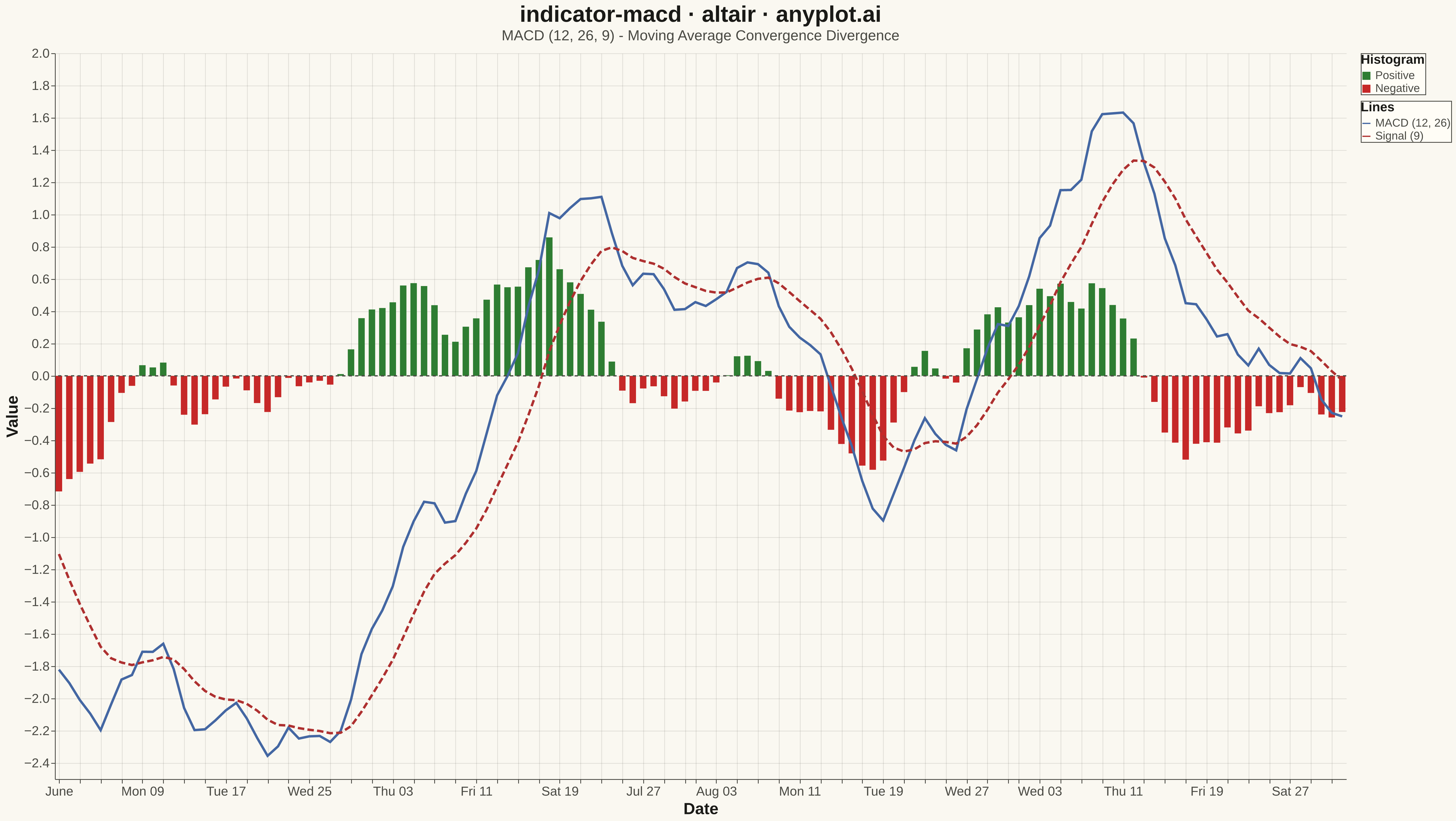
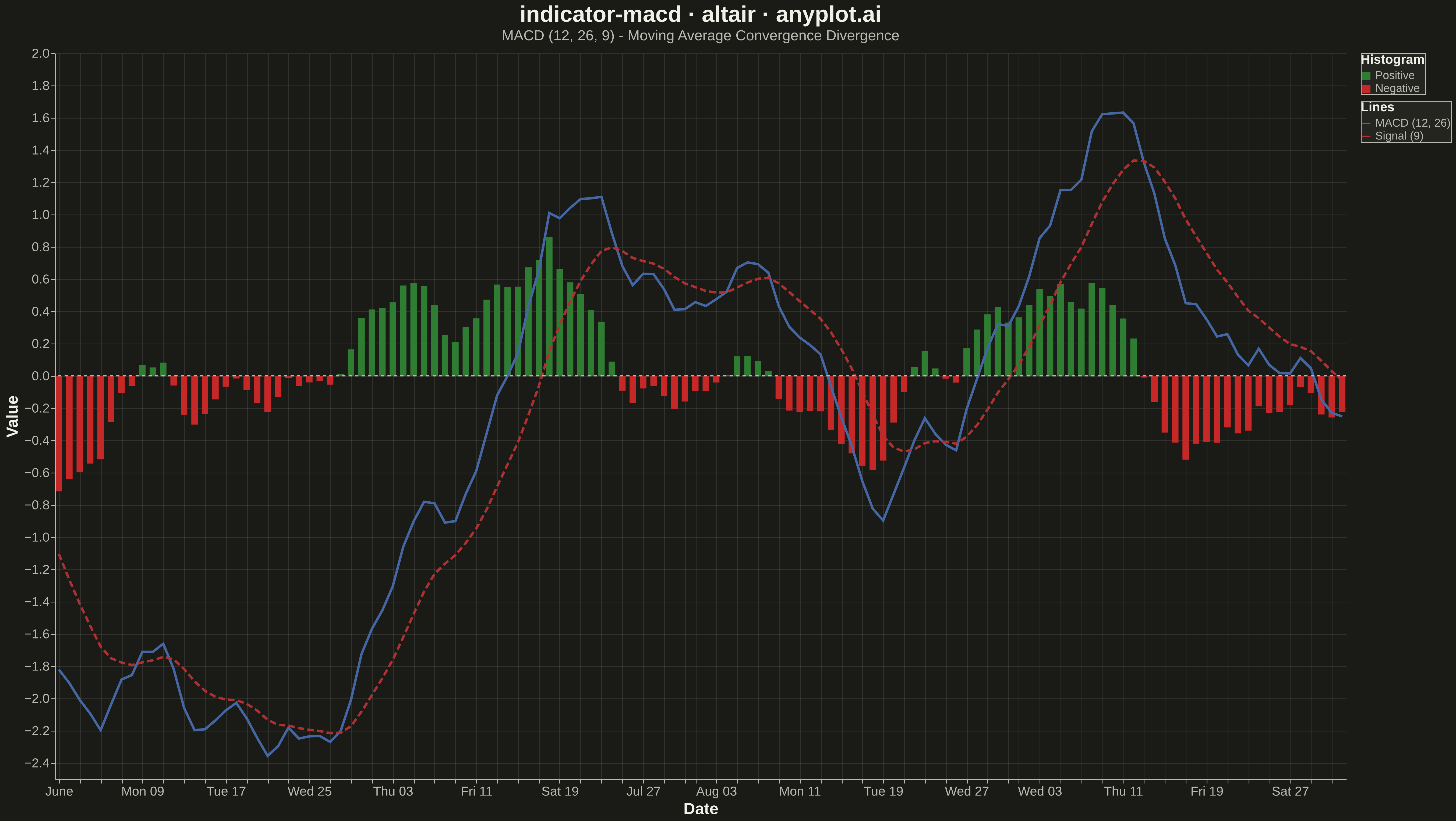
A MACD (Moving Average Convergence Divergence) chart displaying three components: the MACD line, signal line, and histogram. The MACD line represents the difference between 12-day and 26-day exponential moving averages, while the signal line is a 9-day EMA of the MACD. The histogram visualizes the difference between these two lines. This is an essential momentum oscillator for technical analysis, helping traders identify trend direction, momentum strength, and potential buy/sell signals through line crossovers.
""" anyplot.ai
indicator-macd: MACD Technical Indicator Chart
Library: altair 6.1.0 | Python 3.13.13
Quality: 89/100 | Updated: 2026-05-16
"""

import importlib.util
import os
import sys
from pathlib import Path

import numpy as np
import pandas as pd


# Load altair from site-packages, bypassing the local altair.py file
script_dir = Path(__file__).parent
spec = importlib.util.find_spec("altair")
if spec and spec.origin and "site-packages" in spec.origin:
    alt = importlib.util.module_from_spec(spec)
    sys.modules["altair"] = alt
    spec.loader.exec_module(alt)
else:
    original_path = sys.path.copy()
    sys.path = [p for p in sys.path if str(script_dir) not in p]
    import altair as alt

    sys.path = original_path


THEME = os.getenv("ANYPLOT_THEME", "light")
PAGE_BG = "#FAF8F1" if THEME == "light" else "#1A1A17"
ELEVATED_BG = "#FFFDF6" if THEME == "light" else "#242420"
INK = "#1A1A17" if THEME == "light" else "#F0EFE8"
INK_SOFT = "#4A4A44" if THEME == "light" else "#B8B7B0"

# Data - Generate realistic stock price data and calculate MACD
np.random.seed(42)
n_days = 150

# Generate a random walk with moderate trend for closing prices
returns = np.random.normal(0.001, 0.015, n_days)
price = 100 * np.cumprod(1 + returns)

# Calculate EMAs using pandas
ema_12 = pd.Series(price).ewm(span=12, adjust=False).mean().values
ema_26 = pd.Series(price).ewm(span=26, adjust=False).mean().values
macd_line = ema_12 - ema_26
signal_line = pd.Series(macd_line).ewm(span=9, adjust=False).mean().values
histogram = macd_line - signal_line

# Create DataFrame with dates (skip first 26 days for meaningful MACD values)
start_idx = 26
dates = pd.date_range("2025-06-01", periods=n_days - start_idx, freq="D")

df = pd.DataFrame(
    {
        "date": dates,
        "macd": macd_line[start_idx:],
        "signal": signal_line[start_idx:],
        "histogram": histogram[start_idx:],
    }
)

# Add color column for histogram
df["hist_color"] = df["histogram"].apply(lambda x: "Positive" if x >= 0 else "Negative")

# Melt dataframe for line chart
df_lines = df.melt(id_vars=["date"], value_vars=["macd", "signal"], var_name="line_type", value_name="value")

# Map line types to labels
line_labels = {"macd": "MACD (12, 26)", "signal": "Signal (9)"}
df_lines["line_label"] = df_lines["line_type"].map(line_labels)

# Create histogram chart with green/red coloring
histogram_chart = (
    alt.Chart(df)
    .mark_bar(size=8)
    .encode(
        x=alt.X("date:T", title="Date", axis=alt.Axis(labelFontSize=16, titleFontSize=20)),
        y=alt.Y("histogram:Q", title="Value", axis=alt.Axis(labelFontSize=16, titleFontSize=20)),
        color=alt.Color(
            "hist_color:N",
            scale=alt.Scale(domain=["Positive", "Negative"], range=["#2E7D32", "#C62828"]),
            legend=alt.Legend(title="Histogram", labelFontSize=14, titleFontSize=16),
        ),
        tooltip=[alt.Tooltip("date:T", title="Date"), alt.Tooltip("histogram:Q", title="Histogram", format=".4f")],
    )
)

# Create MACD and Signal line chart
line_chart = (
    alt.Chart(df_lines)
    .mark_line(strokeWidth=3)
    .encode(
        x=alt.X("date:T", title="Date"),
        y=alt.Y("value:Q", title="Value"),
        color=alt.Color(
            "line_label:N",
            scale=alt.Scale(domain=["MACD (12, 26)", "Signal (9)"], range=["#4467A3", "#AE3030"]),
            legend=alt.Legend(title="Lines", labelFontSize=14, titleFontSize=16),
        ),
        strokeDash=alt.StrokeDash(
            "line_label:N", scale=alt.Scale(domain=["MACD (12, 26)", "Signal (9)"], range=[[0], [8, 4]]), legend=None
        ),
        tooltip=[
            alt.Tooltip("date:T", title="Date"),
            alt.Tooltip("line_label:N", title="Line"),
            alt.Tooltip("value:Q", title="Value", format=".4f"),
        ],
    )
)

# Create zero reference line
zero_line = (
    alt.Chart(pd.DataFrame({"y": [0]})).mark_rule(color=INK_SOFT, strokeWidth=1.5, strokeDash=[4, 4]).encode(y="y:Q")
)

# Combine charts: histogram + lines + zero line
chart = (
    alt.layer(histogram_chart, line_chart, zero_line)
    .properties(
        width=1600,
        height=900,
        background=PAGE_BG,
        title=alt.Title(
            "indicator-macd · altair · anyplot.ai",
            fontSize=28,
            anchor="middle",
            color=INK,
            subtitle="MACD (12, 26, 9) - Moving Average Convergence Divergence",
            subtitleFontSize=18,
            subtitleColor=INK_SOFT,
        ),
    )
    .configure_axis(
        labelFontSize=16,
        titleFontSize=20,
        gridColor=INK,
        gridOpacity=0.10,
        domainColor=INK_SOFT,
        tickColor=INK_SOFT,
        labelColor=INK_SOFT,
        titleColor=INK,
    )
    .configure_view(fill=PAGE_BG, stroke=INK_SOFT, strokeWidth=0)
    .configure_legend(
        labelFontSize=14,
        titleFontSize=16,
        orient="right",
        fillColor=ELEVATED_BG,
        strokeColor=INK_SOFT,
        labelColor=INK_SOFT,
        titleColor=INK,
    )
    .resolve_scale(color="independent")
)

# Save outputs
chart.save(str(script_dir / f"plot-{THEME}.png"), scale_factor=3.0)
chart.save(str(script_dir / f"plot-{THEME}.html"))
Runnable source as JSON, for any HTTP client: https://api.anyplot.ai/specs/indicator-macd/altair/code. Any spec id and library id listed in llms-full.txt fit the same URL shape; every URL below is complete and callable.
{
  "spec_id": "indicator-macd",
  "language": "python",
  "library": "altair",
  "page": "https://anyplot.ai/indicator-macd/python/altair",
  "hub": "https://anyplot.ai/indicator-macd",
  "code_json": "https://api.anyplot.ai/specs/indicator-macd/altair/code",
  "spec_json": "https://api.anyplot.ai/specs/indicator-macd",
  "render_light_png": "https://storage.googleapis.com/anyplot-images/plots/indicator-macd/python/altair/plot-light.png",
  "render_dark_png": "https://storage.googleapis.com/anyplot-images/plots/indicator-macd/python/altair/plot-dark.png",
  "interactive_light_html": "https://storage.googleapis.com/anyplot-images/plots/indicator-macd/python/altair/plot-light.html",
  "interactive_dark_html": "https://storage.googleapis.com/anyplot-images/plots/indicator-macd/python/altair/plot-dark.html",
  "quality_score": 89.0,
  "license": "MIT",
  "guide": "https://anyplot.ai/llms.txt"
}
Part of MACD Technical Indicator Chart on anyplot.ai.