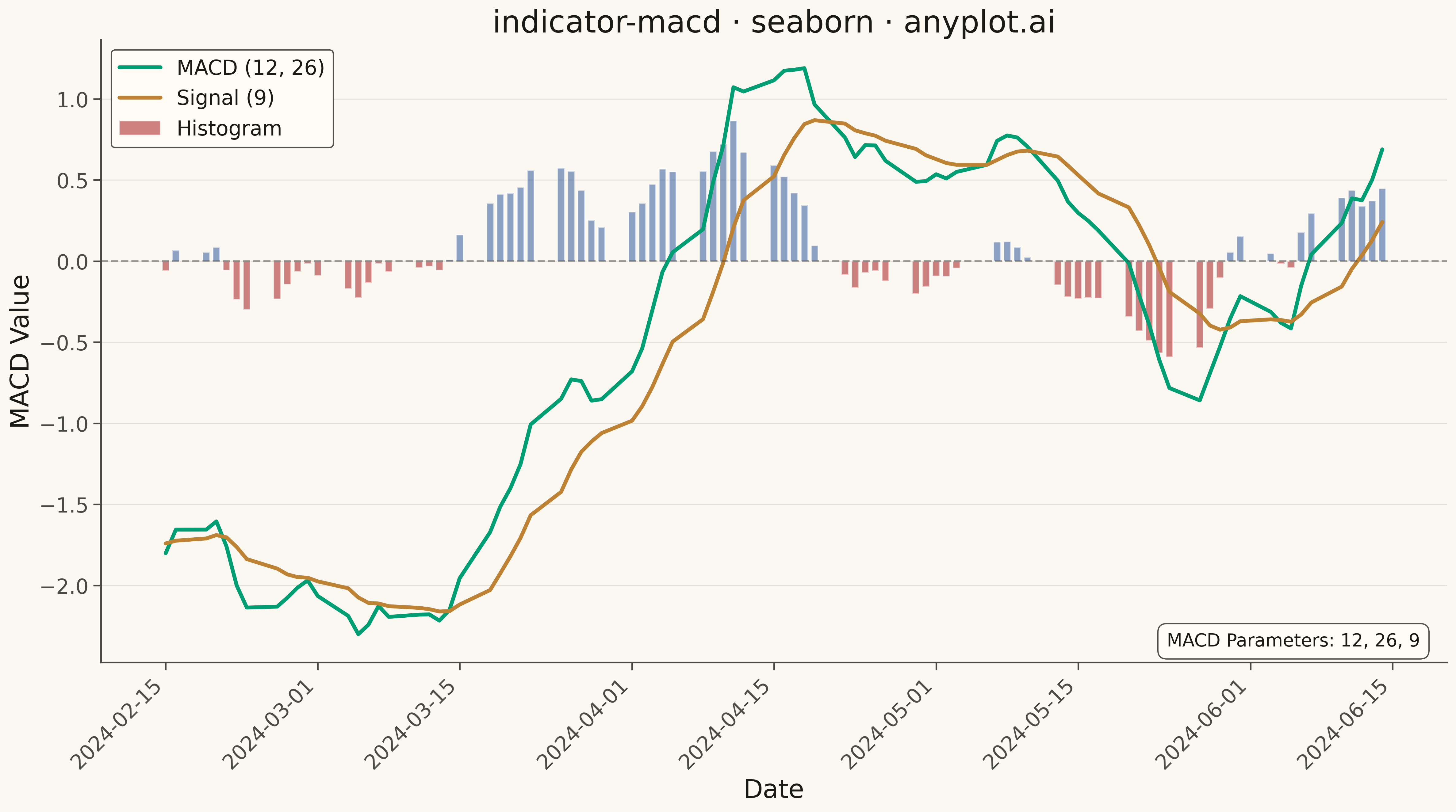
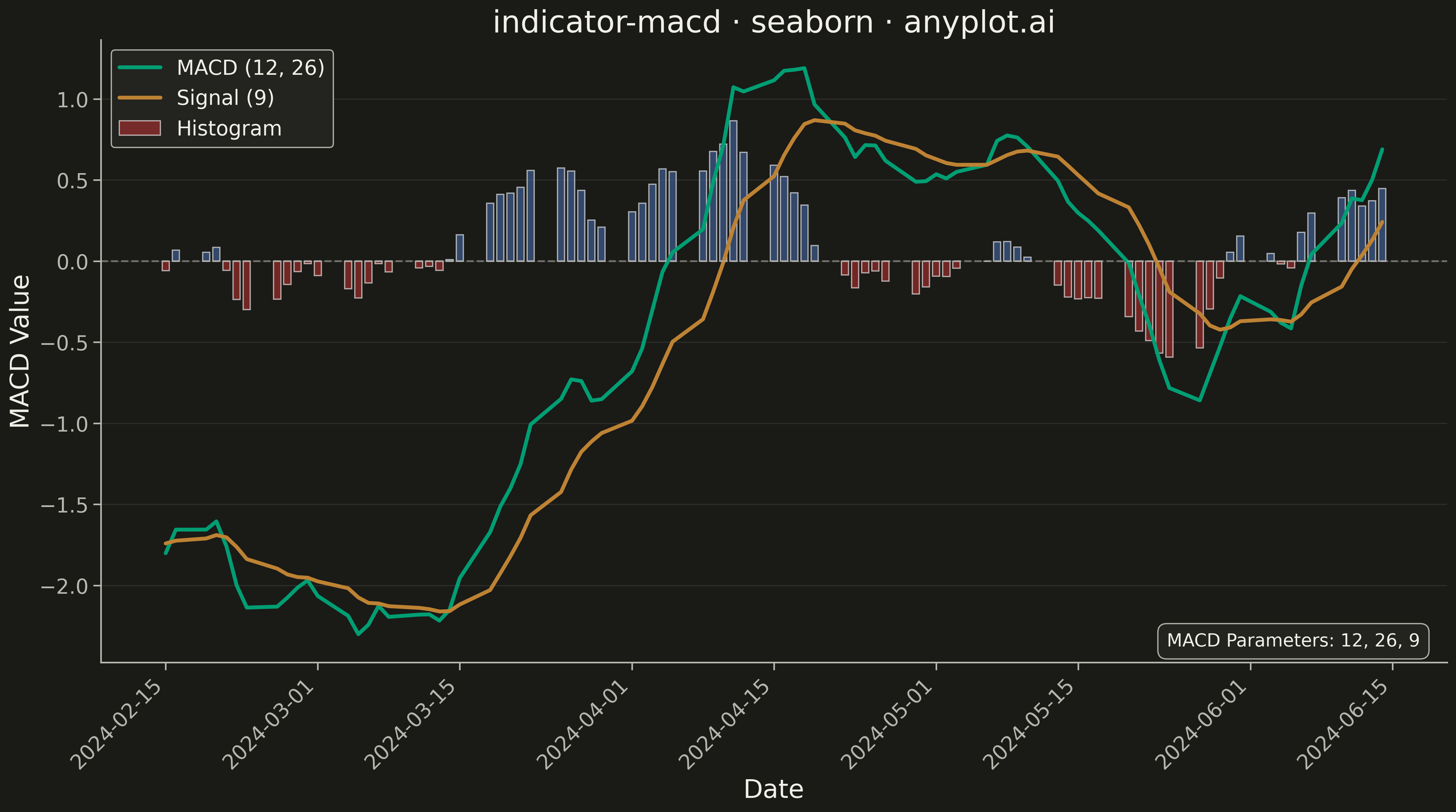
A MACD (Moving Average Convergence Divergence) chart displaying three components: the MACD line, signal line, and histogram. The MACD line represents the difference between 12-day and 26-day exponential moving averages, while the signal line is a 9-day EMA of the MACD. The histogram visualizes the difference between these two lines. This is an essential momentum oscillator for technical analysis, helping traders identify trend direction, momentum strength, and potential buy/sell signals through line crossovers.
""" anyplot.ai
indicator-macd: MACD Technical Indicator Chart
Library: seaborn 0.13.2 | Python 3.13.13
Quality: 91/100 | Updated: 2026-05-16
"""

import os

import matplotlib.pyplot as plt
import numpy as np
import pandas as pd
import seaborn as sns


# Theme tokens
THEME = os.getenv("ANYPLOT_THEME", "light")
PAGE_BG = "#FAF8F1" if THEME == "light" else "#1A1A17"
ELEVATED_BG = "#FFFDF6" if THEME == "light" else "#242420"
INK = "#1A1A17" if THEME == "light" else "#F0EFE8"
INK_SOFT = "#4A4A44" if THEME == "light" else "#B8B7B0"

# imprint palette
MACD_COLOR = "#009E73"  # green — MACD line
SIGNAL_COLOR = "#BD8233"  # ochre — signal line (categorical contrast with MACD green)

# Histogram colors — semantic positive/negative
HIST_POSITIVE = "#4467A3"  # blue — above zero
HIST_NEGATIVE = "#AE3030"  # red — below zero

# Configure seaborn styling
sns.set_theme(
    style="ticks",
    rc={
        "figure.facecolor": PAGE_BG,
        "axes.facecolor": PAGE_BG,
        "axes.edgecolor": INK_SOFT,
        "axes.labelcolor": INK,
        "text.color": INK,
        "xtick.color": INK_SOFT,
        "ytick.color": INK_SOFT,
        "grid.color": INK,
        "grid.alpha": 0.10,
        "legend.facecolor": ELEVATED_BG,
        "legend.edgecolor": INK_SOFT,
    },
)

# Generate synthetic stock price data for MACD calculation
np.random.seed(42)
n_days = 120
dates = pd.date_range("2024-01-01", periods=n_days, freq="B")

# Simulate stock price movement with trend and volatility
returns = np.random.normal(0.001, 0.015, n_days)
price = 100 * np.exp(np.cumsum(returns))

# Calculate Exponential Moving Averages
df = pd.DataFrame({"date": dates, "close": price})
df["ema12"] = df["close"].ewm(span=12, adjust=False).mean()
df["ema26"] = df["close"].ewm(span=26, adjust=False).mean()

# Calculate MACD components
df["macd"] = df["ema12"] - df["ema26"]
df["signal"] = df["macd"].ewm(span=9, adjust=False).mean()
df["histogram"] = df["macd"] - df["signal"]

# Drop initial periods where EMAs are not stable
df = df.iloc[33:].reset_index(drop=True)

# Prepare histogram colors
df["hist_color"] = np.where(df["histogram"] >= 0, HIST_POSITIVE, HIST_NEGATIVE)

# Create figure with proper sizing for 4800x2700 at 300 DPI
fig, ax = plt.subplots(figsize=(16, 9), facecolor=PAGE_BG)

# Plot histogram as bars using seaborn-compatible approach
for i, row in df.iterrows():
    ax.bar(
        row["date"],
        row["histogram"],
        width=0.7,
        color=row["hist_color"],
        alpha=0.6,
        label="Histogram" if i == 0 else "",
    )

# Plot MACD line
sns.lineplot(data=df, x="date", y="macd", ax=ax, color=MACD_COLOR, linewidth=3, label="MACD (12, 26)")

# Plot Signal line
sns.lineplot(data=df, x="date", y="signal", ax=ax, color=SIGNAL_COLOR, linewidth=3, label="Signal (9)")

# Add zero reference line
ax.axhline(y=0, color=INK_SOFT, linestyle="--", linewidth=1.5, alpha=0.5)

# Style the plot
ax.set_xlabel("Date", fontsize=20, color=INK)
ax.set_ylabel("MACD Value", fontsize=20, color=INK)
ax.set_title("indicator-macd · seaborn · anyplot.ai", fontsize=24, color=INK)
ax.tick_params(axis="both", labelsize=16, colors=INK_SOFT)

# Remove top and right spines
ax.spines["top"].set_visible(False)
ax.spines["right"].set_visible(False)
ax.spines["left"].set_color(INK_SOFT)
ax.spines["bottom"].set_color(INK_SOFT)

# Grid styling
ax.yaxis.grid(True, alpha=0.10, linewidth=0.8, color=INK)

# Legend configuration
ax.legend(fontsize=16, loc="upper left", framealpha=0.95)

# Rotate x-axis labels for better readability
plt.xticks(rotation=45, ha="right")

# Add annotation for MACD parameters
ax.annotate(
    "MACD Parameters: 12, 26, 9",
    xy=(0.98, 0.02),
    xycoords="axes fraction",
    fontsize=14,
    ha="right",
    va="bottom",
    color=INK,
    bbox={"boxstyle": "round,pad=0.5", "facecolor": ELEVATED_BG, "edgecolor": INK_SOFT, "alpha": 0.95},
)

plt.tight_layout()
plt.savefig(f"plot-{THEME}.png", dpi=300, bbox_inches="tight", facecolor=PAGE_BG)
Runnable source as JSON, for any HTTP client: https://api.anyplot.ai/specs/indicator-macd/seaborn/code. Any spec id and library id listed in llms-full.txt fit the same URL shape; every URL below is complete and callable.
{
  "spec_id": "indicator-macd",
  "language": "python",
  "library": "seaborn",
  "page": "https://anyplot.ai/indicator-macd/python/seaborn",
  "hub": "https://anyplot.ai/indicator-macd",
  "code_json": "https://api.anyplot.ai/specs/indicator-macd/seaborn/code",
  "spec_json": "https://api.anyplot.ai/specs/indicator-macd",
  "render_light_png": "https://storage.googleapis.com/anyplot-images/plots/indicator-macd/python/seaborn/plot-light.png",
  "render_dark_png": "https://storage.googleapis.com/anyplot-images/plots/indicator-macd/python/seaborn/plot-dark.png",
  "quality_score": 91.0,
  "license": "MIT",
  "guide": "https://anyplot.ai/llms.txt"
}
Part of MACD Technical Indicator Chart on anyplot.ai.