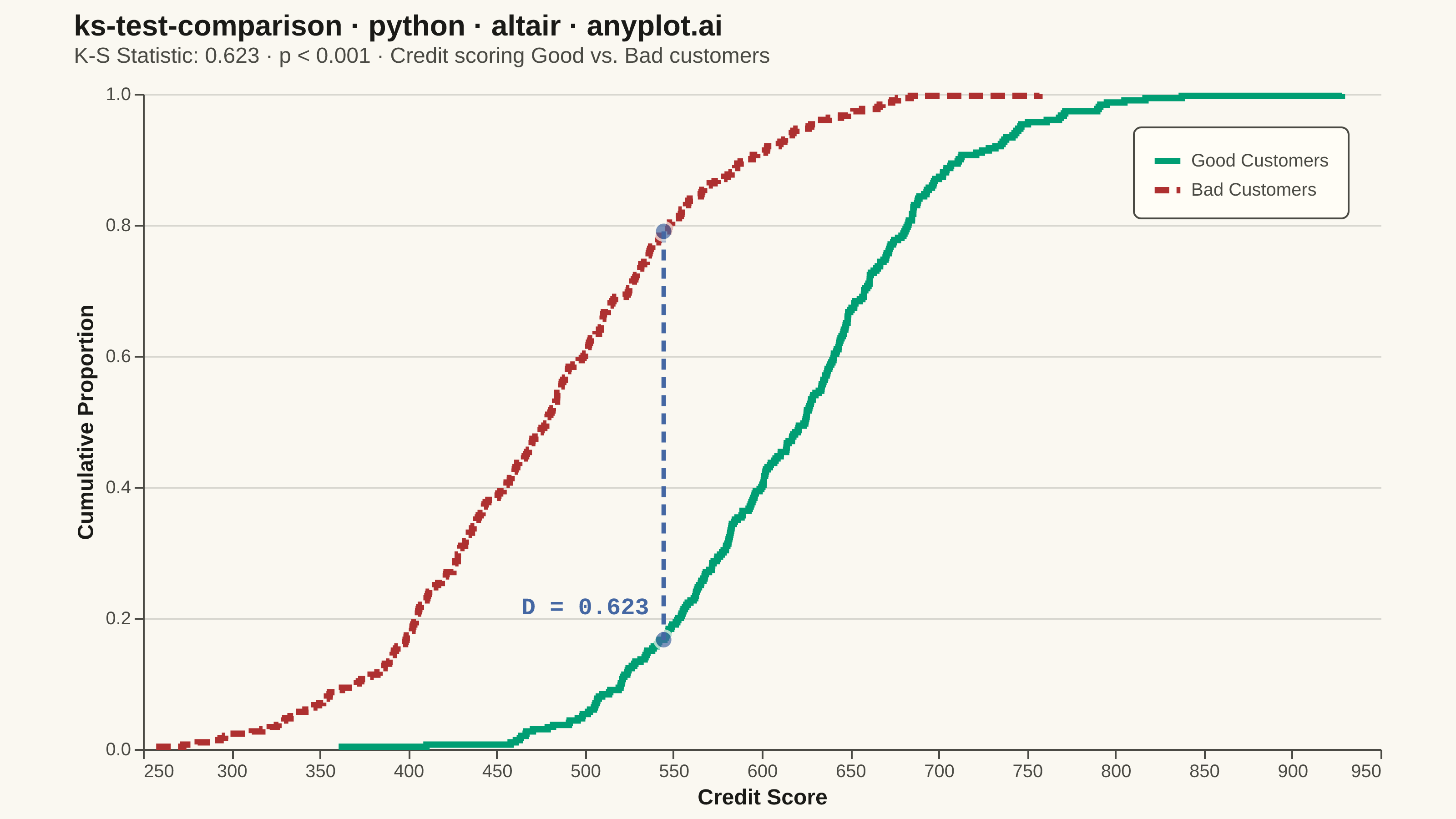
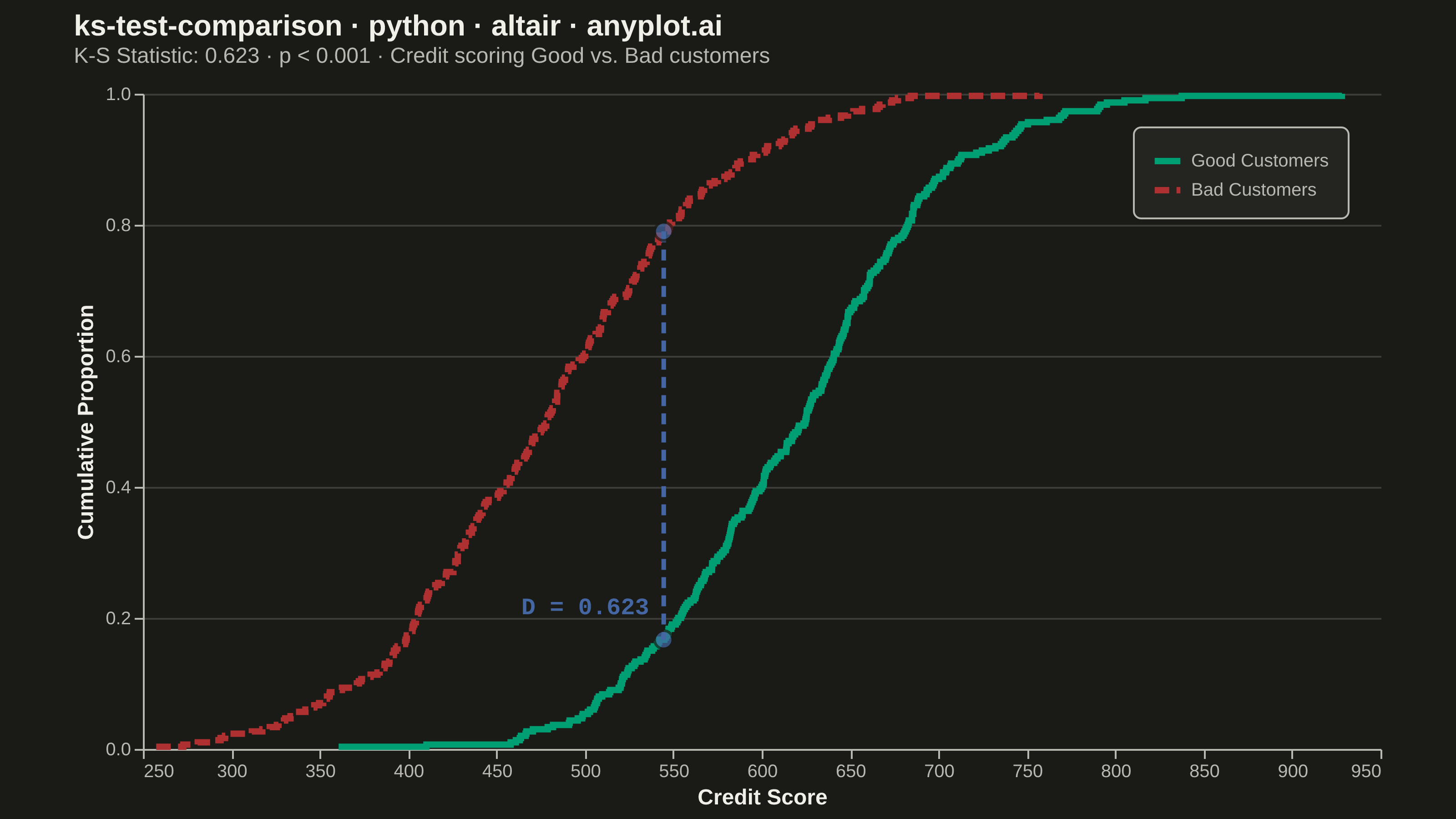
A Kolmogorov-Smirnov (K-S) plot compares two empirical cumulative distribution functions (ECDFs) and visualizes the K-S statistic, which is the maximum vertical distance between the two distributions. The plot displays both ECDFs as step functions, highlights the point of maximum divergence, and typically reports the K-S statistic value and p-value for hypothesis testing. This visualization is essential for determining whether two samples come from the same underlying distribution.
""" anyplot.ai
ks-test-comparison: Kolmogorov-Smirnov Plot for Distribution Comparison
Library: altair 6.1.0 | Python 3.13.13
Quality: 89/100 | Updated: 2026-05-29
"""

import importlib
import os
import sys

import numpy as np
import pandas as pd
from PIL import Image
from scipy import stats


# Drop script directory from sys.path so `altair` resolves the package, not this file
sys.path[:] = [p for p in sys.path if os.path.abspath(p or ".") != os.path.dirname(os.path.abspath(__file__))]
alt = importlib.import_module("altair")

# Theme tokens
THEME = os.getenv("ANYPLOT_THEME", "light")
PAGE_BG = "#FAF8F1" if THEME == "light" else "#1A1A17"
ELEVATED_BG = "#FFFDF6" if THEME == "light" else "#242420"
INK = "#1A1A17" if THEME == "light" else "#F0EFE8"
INK_SOFT = "#4A4A44" if THEME == "light" else "#B8B7B0"

# Imprint palette — semantic coloring for credit quality
COLOR_GOOD = "#009E73"  # Imprint position 1: brand green, semantic good/pass
COLOR_BAD = "#AE3030"  # Imprint semantic anchor: matte red, bad/loss/error
COLOR_KS = "#4467A3"  # Imprint position 3: blue, neutral annotation

# Data — credit scoring: Good vs Bad customer score distributions
np.random.seed(42)
good_scores = np.random.normal(loc=620, scale=80, size=300)
bad_scores = np.random.normal(loc=480, scale=90, size=300)

# K-S test
ks_stat, p_value = stats.ks_2samp(good_scores, bad_scores)

# Compute ECDFs using sorted arrays and normalized ranks
good_sorted = np.sort(good_scores)
bad_sorted = np.sort(bad_scores)
good_ecdf = np.arange(1, len(good_sorted) + 1) / len(good_sorted)
bad_ecdf = np.arange(1, len(bad_sorted) + 1) / len(bad_sorted)

# Find max divergence point by evaluating both ECDFs on a combined grid
all_values = np.union1d(good_sorted, bad_sorted)
good_at_all = np.searchsorted(good_sorted, all_values, side="right") / len(good_sorted)
bad_at_all = np.searchsorted(bad_sorted, all_values, side="right") / len(bad_sorted)
max_idx = np.argmax(np.abs(good_at_all - bad_at_all))
ks_x = all_values[max_idx]
ks_y_good = good_at_all[max_idx]
ks_y_bad = bad_at_all[max_idx]

# Assemble DataFrames
good_df = pd.DataFrame({"Score": good_sorted, "ECDF": good_ecdf, "Group": "Good Customers"})
bad_df = pd.DataFrame({"Score": bad_sorted, "ECDF": bad_ecdf, "Group": "Bad Customers"})
ecdf_df = pd.concat([good_df, bad_df], ignore_index=True)

# K-S distance vertical line endpoints
ks_line_df = pd.DataFrame({"Score": [ks_x, ks_x], "ECDF": [ks_y_bad, ks_y_good]})

# Label just above the lower endpoint (ks_y_good), in the gap — extends left into clear whitespace
ks_label_y = ks_y_good + 0.05
ks_label_df = pd.DataFrame({"Score": [ks_x], "ECDF": [ks_label_y], "label": [f"D = {ks_stat:.3f}"]})

# Color and dash scales
color_scale = alt.Scale(domain=["Good Customers", "Bad Customers"], range=[COLOR_GOOD, COLOR_BAD])
dash_scale = alt.Scale(domain=["Good Customers", "Bad Customers"], range=[[1, 0], [8, 4]])

# Title — compute fontsize scaled to title length (floor: 11px)
title = "ks-test-comparison · python · altair · anyplot.ai"
title_fontsize = round(16 * 67 / len(title)) if len(title) > 67 else 16

p_text = "p < 0.001" if p_value < 0.001 else f"p = {p_value:.4f}"
subtitle_text = f"K-S Statistic: {ks_stat:.3f}  ·  {p_text}  ·  Credit scoring Good vs. Bad customers"

# ECDF step lines with redundant dash encoding for colorblind safety
ecdf_lines = (
    alt.Chart(ecdf_df)
    .mark_line(interpolate="step-after", strokeWidth=3.5)
    .encode(
        x=alt.X("Score:Q", title="Credit Score", scale=alt.Scale(nice=True)),
        y=alt.Y(
            "ECDF:Q",
            title="Cumulative Proportion",
            scale=alt.Scale(domain=[0, 1]),
            axis=alt.Axis(values=[0, 0.2, 0.4, 0.6, 0.8, 1.0], format=".1f"),
        ),
        color=alt.Color("Group:N", scale=color_scale, legend=alt.Legend(title=None)),
        strokeDash=alt.StrokeDash("Group:N", scale=dash_scale, legend=None),
        tooltip=["Group:N", alt.Tooltip("Score:Q", format=".0f"), alt.Tooltip("ECDF:Q", format=".3f")],
    )
)

# K-S distance vertical line marking maximum divergence
ks_distance = (
    alt.Chart(ks_line_df).mark_line(color=COLOR_KS, strokeWidth=2.5, strokeDash=[6, 4]).encode(x="Score:Q", y="ECDF:Q")
)

# Endpoint dots on the distance line (reuse ks_line_df)
ks_dots = (
    alt.Chart(ks_line_df)
    .mark_point(color=COLOR_KS, size=100, filled=True, stroke=PAGE_BG, strokeWidth=1.5)
    .encode(x="Score:Q", y="ECDF:Q")
)

# K-S statistic label — right-aligned so text extends left of the KS line into clean whitespace
ks_label = (
    alt.Chart(ks_label_df)
    .mark_text(align="right", dx=-8, fontSize=13, fontWeight="bold", color=COLOR_KS, font="monospace")
    .encode(x="Score:Q", y="ECDF:Q", text="label:N")
)

# Combine layers and apply theme-adaptive chrome
chart = (
    alt.layer(ecdf_lines, ks_distance, ks_dots, ks_label)
    .properties(
        width=680,
        height=360,
        background=PAGE_BG,
        title=alt.Title(
            title,
            subtitle=subtitle_text,
            fontSize=title_fontsize,
            subtitleFontSize=12,
            subtitleColor=INK_SOFT,
            color=INK,
            anchor="start",
            offset=10,
        ),
    )
    .configure_view(fill=PAGE_BG, strokeWidth=0)
    .configure_axis(
        labelFontSize=10,
        titleFontSize=12,
        titleColor=INK,
        labelColor=INK_SOFT,
        gridColor=INK,
        gridOpacity=0.15,
        domainColor=INK_SOFT,
        tickColor=INK_SOFT,
    )
    .configure_axisX(grid=False)
    .configure_legend(
        labelFontSize=10,
        titleFontSize=10,
        symbolSize=200,
        symbolStrokeWidth=3.5,
        orient="top-right",
        padding=10,
        cornerRadius=4,
        strokeColor=INK_SOFT,
        fillColor=ELEVATED_BG,
        labelColor=INK_SOFT,
        titleColor=INK,
    )
)

# Save PNG — pad to exact 3200×1800 canvas (altair canvas rule)
TW, TH = 3200, 1800
chart.save(f"plot-{THEME}.png", scale_factor=4.0)
_img = Image.open(f"plot-{THEME}.png").convert("RGB")
_w, _h = _img.size
if _w > TW or _h > TH:
    raise SystemExit(
        f"altair vl-convert produced {_w}×{_h}, exceeds target {TW}×{TH}. "
        f"Shrink chart .properties(width=, height=) values and re-render."
    )
if _w < TW or _h < TH:
    _canvas = Image.new("RGB", (TW, TH), PAGE_BG)
    _canvas.paste(_img, ((TW - _w) // 2, (TH - _h) // 2))
    _canvas.save(f"plot-{THEME}.png")

# Save HTML
chart.save(f"plot-{THEME}.html")
Runnable source as JSON, for any HTTP client: https://api.anyplot.ai/specs/ks-test-comparison/altair/code. Any spec id and library id listed in llms-full.txt fit the same URL shape; every URL below is complete and callable.
{
  "spec_id": "ks-test-comparison",
  "language": "python",
  "library": "altair",
  "page": "https://anyplot.ai/ks-test-comparison/python/altair",
  "hub": "https://anyplot.ai/ks-test-comparison",
  "code_json": "https://api.anyplot.ai/specs/ks-test-comparison/altair/code",
  "spec_json": "https://api.anyplot.ai/specs/ks-test-comparison",
  "render_light_png": "https://storage.googleapis.com/anyplot-images/plots/ks-test-comparison/python/altair/plot-light.png",
  "render_dark_png": "https://storage.googleapis.com/anyplot-images/plots/ks-test-comparison/python/altair/plot-dark.png",
  "interactive_light_html": "https://storage.googleapis.com/anyplot-images/plots/ks-test-comparison/python/altair/plot-light.html",
  "interactive_dark_html": "https://storage.googleapis.com/anyplot-images/plots/ks-test-comparison/python/altair/plot-dark.html",
  "quality_score": 89.0,
  "license": "MIT",
  "guide": "https://anyplot.ai/llms.txt"
}
Part of Kolmogorov-Smirnov Plot for Distribution Comparison on anyplot.ai.