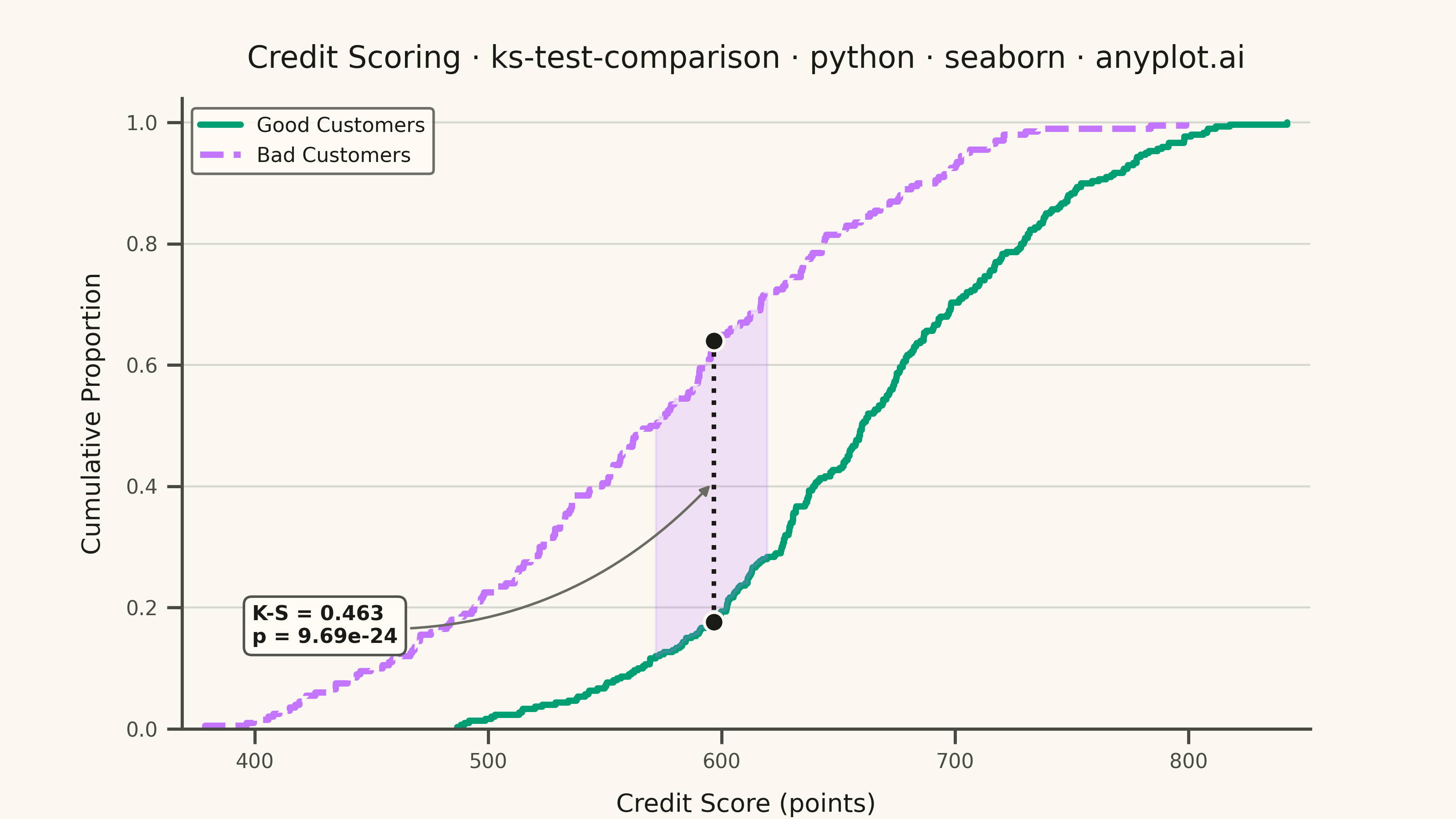
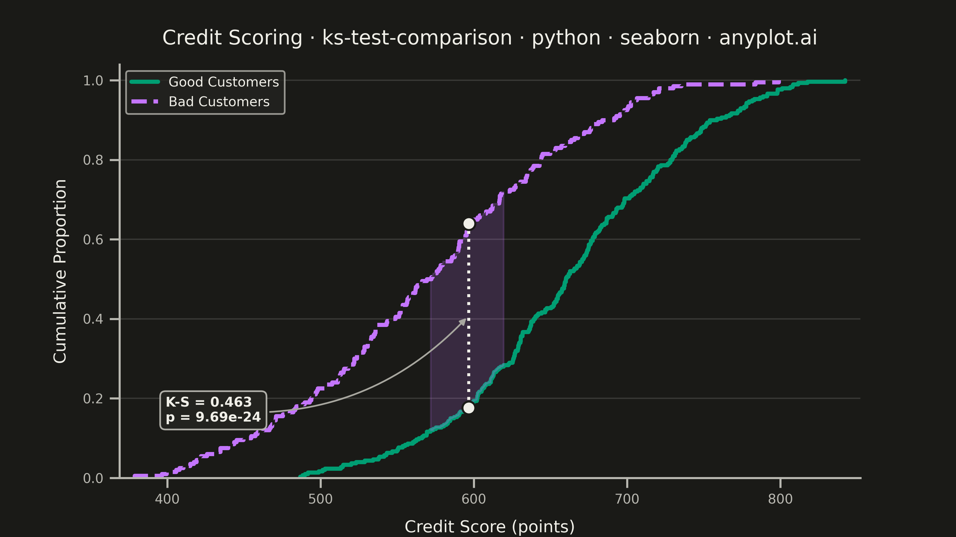
A Kolmogorov-Smirnov (K-S) plot compares two empirical cumulative distribution functions (ECDFs) and visualizes the K-S statistic, which is the maximum vertical distance between the two distributions. The plot displays both ECDFs as step functions, highlights the point of maximum divergence, and typically reports the K-S statistic value and p-value for hypothesis testing. This visualization is essential for determining whether two samples come from the same underlying distribution.
""" anyplot.ai
ks-test-comparison: Kolmogorov-Smirnov Plot for Distribution Comparison
Library: seaborn 0.13.2 | Python 3.13.13
Quality: 90/100 | Updated: 2026-05-29
"""

import os

import matplotlib.pyplot as plt
import matplotlib.ticker as mticker
import numpy as np
import seaborn as sns
from matplotlib.lines import Line2D
from scipy import stats


# Theme tokens
THEME = os.getenv("ANYPLOT_THEME", "light")
PAGE_BG = "#FAF8F1" if THEME == "light" else "#1A1A17"
ELEVATED_BG = "#FFFDF6" if THEME == "light" else "#242420"
INK = "#1A1A17" if THEME == "light" else "#F0EFE8"
INK_SOFT = "#4A4A44" if THEME == "light" else "#B8B7B0"
INK_MUTED = "#6B6A63" if THEME == "light" else "#A8A79F"

# Imprint palette — position 1 (green) for Good Customers, position 2 (lavender) for Bad
GOOD_COLOR = "#009E73"
BAD_COLOR = "#C475FD"

# Data — credit scoring: Good vs Bad customer score distributions
np.random.seed(42)
good_scores = np.random.beta(5, 3, size=300) * 500 + 350
bad_scores = np.random.beta(3, 4, size=200) * 500 + 350

# Compute K-S statistic
ks_stat, p_value = stats.ks_2samp(good_scores, bad_scores)

# Compute ECDFs for identifying max-distance point
good_sorted = np.sort(good_scores)
bad_sorted = np.sort(bad_scores)
all_values = np.sort(np.concatenate([good_sorted, bad_sorted]))
good_ecdf = np.searchsorted(good_sorted, all_values, side="right") / len(good_sorted)
bad_ecdf = np.searchsorted(bad_sorted, all_values, side="right") / len(bad_sorted)
distances = np.abs(good_ecdf - bad_ecdf)
max_idx = np.argmax(distances)
max_x = all_values[max_idx]
max_y_good = good_ecdf[max_idx]
max_y_bad = bad_ecdf[max_idx]
y_lo, y_hi = min(max_y_good, max_y_bad), max(max_y_good, max_y_bad)

# Seaborn theme — theme-adaptive chrome
sns.set_theme(
    style="ticks",
    rc={
        "figure.facecolor": PAGE_BG,
        "axes.facecolor": PAGE_BG,
        "axes.edgecolor": INK_SOFT,
        "axes.labelcolor": INK,
        "text.color": INK,
        "xtick.color": INK_SOFT,
        "ytick.color": INK_SOFT,
        "grid.color": INK,
        "grid.alpha": 0.15,
        "legend.facecolor": ELEVATED_BG,
        "legend.edgecolor": INK_SOFT,
    },
)

# Figure — landscape 3200×1800 px; no bbox_inches="tight" (trims canvas)
fig, ax = plt.subplots(figsize=(8, 4.5), dpi=400)
fig.patch.set_facecolor(PAGE_BG)
ax.set_facecolor(PAGE_BG)

# ECDFs — separate calls give direct linestyle control (avoids fragile hue-color matching)
sns.ecdfplot(x=good_scores, color=GOOD_COLOR, linewidth=2.5, linestyle="-", ax=ax)
sns.ecdfplot(x=bad_scores, color=BAD_COLOR, linewidth=2.5, linestyle="--", ax=ax)

# Shaded band between ECDFs around the max-divergence region
band_half = 25
band_mask = (all_values >= max_x - band_half) & (all_values <= max_x + band_half)
ax.fill_between(all_values[band_mask], good_ecdf[band_mask], bad_ecdf[band_mask], alpha=0.25, color=BAD_COLOR, zorder=2)

# K-S statistic: dotted vertical line at max divergence
ax.plot([max_x, max_x], [y_lo, y_hi], color=INK, linewidth=1.8, linestyle=":", zorder=5)

# Dots at max-divergence intersection points
ax.scatter([max_x, max_x], [max_y_good, max_y_bad], color=INK, s=60, zorder=6, edgecolors=PAGE_BG, linewidth=1.2)

# x limits for tight framing
x_min = min(good_scores.min(), bad_scores.min()) - 10
x_max = max(good_scores.max(), bad_scores.max()) + 10

# Annotation in lower-left dead space (where both CDFs are near zero) — arrow to KS line
ax.annotate(
    f"K-S = {ks_stat:.3f}\np = {p_value:.2e}",
    xy=(max_x, (y_lo + y_hi) / 2),
    xytext=(x_min + 30, 0.17),
    fontsize=9,
    fontweight="bold",
    color=INK,
    ha="left",
    va="center",
    bbox={
        "boxstyle": "round,pad=0.4",
        "facecolor": ELEVATED_BG,
        "edgecolor": INK_SOFT,
        "linewidth": 1.0,
        "alpha": 0.95,
    },
    arrowprops={"arrowstyle": "-|>", "color": INK_MUTED, "linewidth": 1.0, "connectionstyle": "arc3,rad=0.25"},
)

# Axis limits and labels
ax.set_xlim(x_min, x_max)
ax.set_ylim(0, 1.04)

title = "Credit Scoring · ks-test-comparison · python · seaborn · anyplot.ai"
n = len(title)
ratio = 67 / n if n > 67 else 1.0
title_fontsize = max(8, round(12 * ratio))

ax.set_xlabel("Credit Score (points)", fontsize=10, labelpad=8)
ax.set_ylabel("Cumulative Proportion", fontsize=10, labelpad=8)
ax.set_title(title, fontsize=title_fontsize, fontweight="medium", pad=12)
ax.tick_params(axis="both", labelsize=8)
ax.xaxis.set_major_formatter(mticker.FormatStrFormatter("%.0f"))

# Grid — y-axis only, subtle
ax.yaxis.grid(True, alpha=0.15, linewidth=0.8)
ax.xaxis.grid(False)
ax.spines["top"].set_visible(False)
ax.spines["right"].set_visible(False)

# Legend with explicit handles — robust, no fragile color-matching
legend_handles = [
    Line2D([0], [0], color=GOOD_COLOR, linewidth=2.5, linestyle="-", label="Good Customers"),
    Line2D([0], [0], color=BAD_COLOR, linewidth=2.5, linestyle="--", label="Bad Customers"),
]
ax.legend(handles=legend_handles, fontsize=8, loc="upper left")

# Inset: seaborn kdeplot with fill — shows underlying score density to complement the ECDF
ax_inset = ax.inset_axes([0.66, 0.04, 0.30, 0.27])
ax_inset.set_facecolor(ELEVATED_BG)
sns.kdeplot(x=good_scores, color=GOOD_COLOR, linewidth=1.2, fill=True, alpha=0.25, ax=ax_inset)
sns.kdeplot(x=bad_scores, color=BAD_COLOR, linewidth=1.2, fill=True, alpha=0.25, linestyle="--", ax=ax_inset)
ax_inset.set_xlabel("Score", fontsize=6, labelpad=2, color=INK_SOFT)
ax_inset.set_ylabel("", fontsize=6)
ax_inset.set_title("Score Density", fontsize=6.5, color=INK_SOFT, pad=3, fontweight="medium")
ax_inset.tick_params(axis="x", labelsize=5, colors=INK_SOFT)
ax_inset.tick_params(axis="y", labelleft=False, left=False)
ax_inset.spines["top"].set_visible(False)
ax_inset.spines["right"].set_visible(False)
for spine in ["left", "bottom"]:
    ax_inset.spines[spine].set_color(INK_SOFT)
    ax_inset.spines[spine].set_linewidth(0.6)

plt.savefig(f"plot-{THEME}.png", dpi=400, facecolor=PAGE_BG)
Runnable source as JSON, for any HTTP client: https://api.anyplot.ai/specs/ks-test-comparison/seaborn/code. Any spec id and library id listed in llms-full.txt fit the same URL shape; every URL below is complete and callable.
{
  "spec_id": "ks-test-comparison",
  "language": "python",
  "library": "seaborn",
  "page": "https://anyplot.ai/ks-test-comparison/python/seaborn",
  "hub": "https://anyplot.ai/ks-test-comparison",
  "code_json": "https://api.anyplot.ai/specs/ks-test-comparison/seaborn/code",
  "spec_json": "https://api.anyplot.ai/specs/ks-test-comparison",
  "render_light_png": "https://storage.googleapis.com/anyplot-images/plots/ks-test-comparison/python/seaborn/plot-light.png",
  "render_dark_png": "https://storage.googleapis.com/anyplot-images/plots/ks-test-comparison/python/seaborn/plot-dark.png",
  "quality_score": 90.0,
  "license": "MIT",
  "guide": "https://anyplot.ai/llms.txt"
}
Part of Kolmogorov-Smirnov Plot for Distribution Comparison on anyplot.ai.