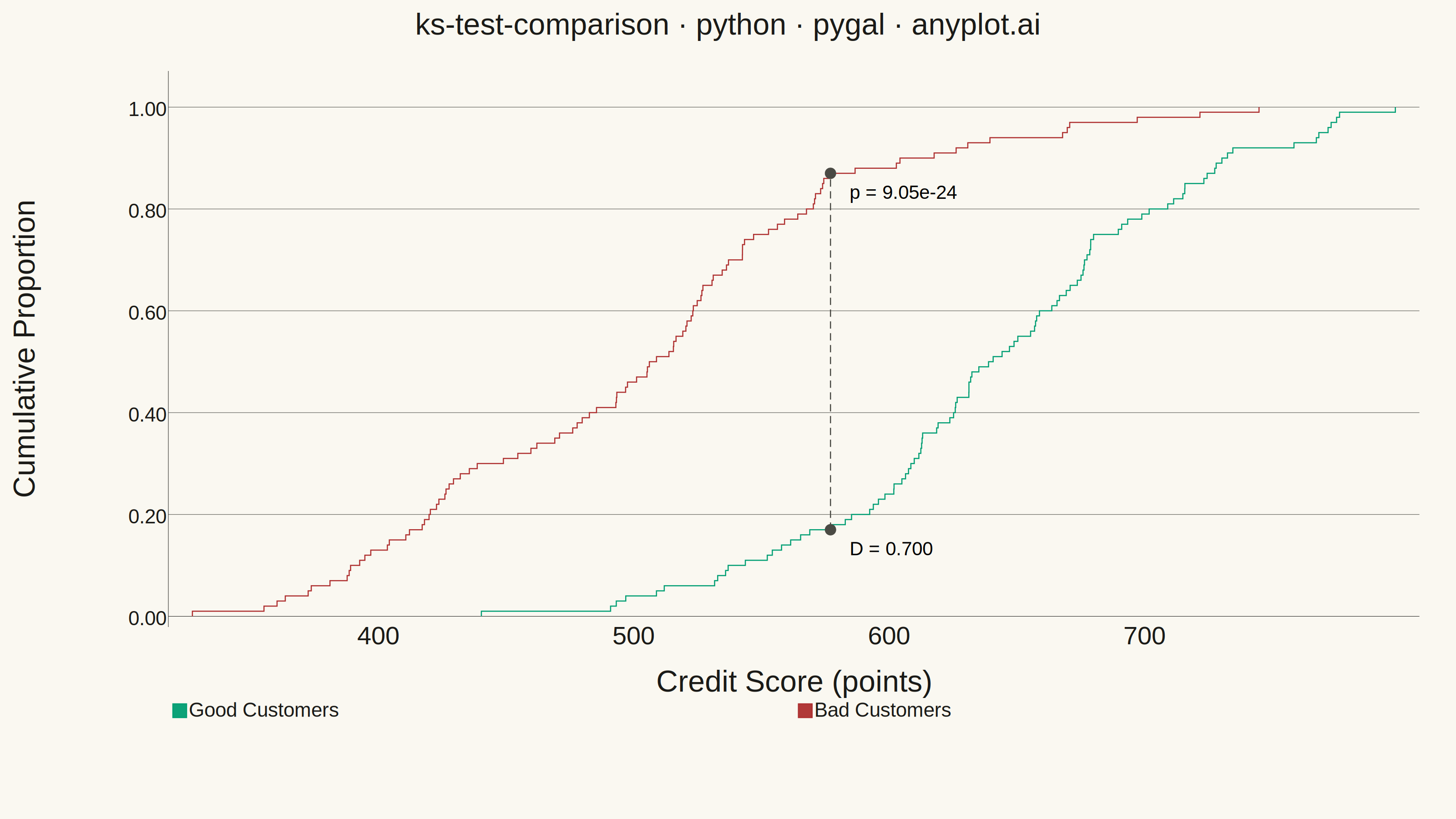
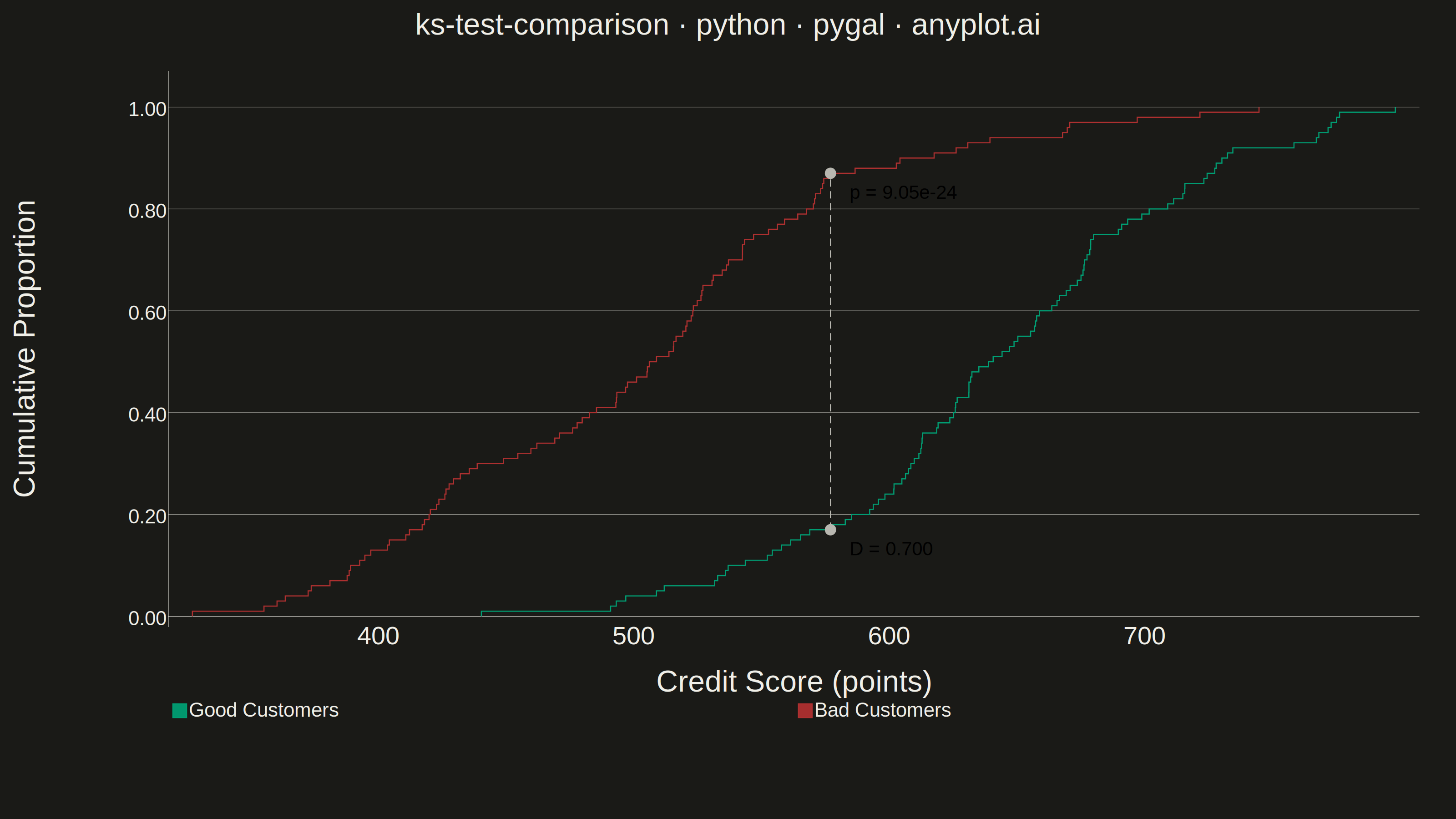
A Kolmogorov-Smirnov (K-S) plot compares two empirical cumulative distribution functions (ECDFs) and visualizes the K-S statistic, which is the maximum vertical distance between the two distributions. The plot displays both ECDFs as step functions, highlights the point of maximum divergence, and typically reports the K-S statistic value and p-value for hypothesis testing. This visualization is essential for determining whether two samples come from the same underlying distribution.
""" anyplot.ai
ks-test-comparison: Kolmogorov-Smirnov Plot for Distribution Comparison
Library: pygal 3.1.0 | Python 3.13.13
Quality: 88/100 | Updated: 2026-05-29
"""

import importlib.util
import os
import sys

import numpy as np
from scipy import stats


# Prevent this file (pygal.py) from shadowing the installed pygal package
pygal_spec = importlib.util.find_spec("pygal")
if pygal_spec and pygal_spec.origin != __file__:
    import pygal
    from pygal.style import Style
else:
    _here = os.path.dirname(os.path.abspath(__file__))
    sys.path = [p for p in sys.path if os.path.abspath(p) != _here]
    try:
        import pygal
        from pygal.style import Style
    finally:
        sys.path.insert(0, _here)

# Theme-adaptive chrome — Imprint palette
THEME = os.getenv("ANYPLOT_THEME", "light")
PAGE_BG = "#FAF8F1" if THEME == "light" else "#1A1A17"
INK = "#1A1A17" if THEME == "light" else "#F0EFE8"
INK_SOFT = "#4A4A44" if THEME == "light" else "#B8B7B0"
INK_MUTED = "#6B6A63" if THEME == "light" else "#A8A79F"

# Imprint palette — semantic mapping: green=good, matte red=bad
GOOD_COLOR = "#009E73"  # Imprint position 1 — brand green / "good"
BAD_COLOR = "#AE3030"  # Imprint matte red — semantic anchor for "bad/loss/error"
KS_COLOR = INK_SOFT  # theme-adaptive neutral for annotation reference line

# Data — credit scoring: Good vs Bad customer score distributions
# 100 samples keeps the step-function nature clearly visible
np.random.seed(42)
n_samples = 100
good_scores = np.random.normal(loc=650, scale=80, size=n_samples)
bad_scores = np.random.normal(loc=500, scale=90, size=n_samples)

# Compute ECDFs
good_sorted = np.sort(good_scores)
bad_sorted = np.sort(bad_scores)
n_good, n_bad = len(good_sorted), len(bad_sorted)
good_ecdf_y = np.arange(1, n_good + 1) / n_good
bad_ecdf_y = np.arange(1, n_bad + 1) / n_bad

# KS test
ks_stat, p_value = stats.ks_2samp(good_scores, bad_scores)

# Find point of maximum divergence on a combined grid
all_values = np.sort(np.concatenate([good_sorted, bad_sorted]))
good_ecdf_on_grid = np.searchsorted(good_sorted, all_values, side="right") / n_good
bad_ecdf_on_grid = np.searchsorted(bad_sorted, all_values, side="right") / n_bad
diffs = np.abs(good_ecdf_on_grid - bad_ecdf_on_grid)
max_idx = np.argmax(diffs)
max_x = all_values[max_idx]
max_y_good = good_ecdf_on_grid[max_idx]
max_y_bad = bad_ecdf_on_grid[max_idx]

# Build step-function data using vectorized numpy (no loops)
good_x_steps = np.repeat(good_sorted, 2)
good_y_steps = np.empty_like(good_x_steps)
good_y_steps[0::2] = np.concatenate([[0], good_ecdf_y[:-1]])
good_y_steps[1::2] = good_ecdf_y
good_xy = list(zip(good_x_steps.tolist(), good_y_steps.tolist(), strict=True))

bad_x_steps = np.repeat(bad_sorted, 2)
bad_y_steps = np.empty_like(bad_x_steps)
bad_y_steps[0::2] = np.concatenate([[0], bad_ecdf_y[:-1]])
bad_y_steps[1::2] = bad_ecdf_y
bad_xy = list(zip(bad_x_steps.tolist(), bad_y_steps.tolist(), strict=True))

_font = "Helvetica, Arial, sans-serif"

# Imprint palette — canonical order; first series always #009E73
# Series slots: Good, Bad, KS line, KS dot bottom, KS dot top
custom_style = Style(
    background=PAGE_BG,
    plot_background=PAGE_BG,
    foreground=INK,
    foreground_strong=INK,
    foreground_subtle=INK_MUTED,
    colors=(GOOD_COLOR, BAD_COLOR, KS_COLOR, KS_COLOR, KS_COLOR),
    opacity="0.95",
    opacity_hover="1",
    stroke_opacity="1",
    stroke_opacity_hover="1",
    stroke_width=2.5,
    guide_stroke_color=INK_MUTED,
    guide_stroke_dasharray="6, 8",
    major_guide_stroke_color=INK_SOFT,
    major_guide_stroke_dasharray="0",
    # Font sizes for 3200×1800 canvas (pygal unitless = source pixels)
    title_font_size=66,
    label_font_size=56,
    major_label_font_size=44,
    legend_font_size=44,
    value_font_size=42,
    value_label_font_size=42,
    tooltip_font_size=32,
    font_family=_font,
    label_font_family=_font,
    major_label_font_family=_font,
    legend_font_family=_font,
    title_font_family=_font,
    value_font_family=_font,
    value_label_font_family=_font,
)

chart = pygal.XY(
    style=custom_style,
    width=3200,
    height=1800,
    title="ks-test-comparison · python · pygal · anyplot.ai",
    x_title="Credit Score (points)",
    y_title="Cumulative Proportion",
    show_dots=False,
    fill=False,
    show_x_guides=False,
    show_y_guides=True,
    legend_at_bottom=True,
    legend_at_bottom_columns=2,
    legend_box_size=30,
    truncate_legend=-1,
    range=(0, 1.05),
    print_values=False,
    print_labels=True,
    print_zeroes=False,
    margin=60,
    margin_top=80,
    margin_bottom=160,
    margin_left=150,
    margin_right=80,
    x_value_formatter=lambda x: f"{x:.0f}",
    value_formatter=lambda y: f"{y:.2f}",
    y_labels_major_count=6,
    show_minor_y_labels=False,
    js=[],
)

# Good Customers ECDF — bold green line
chart.add("Good Customers", good_xy, stroke_style={"width": 5})

# Bad Customers ECDF — bold red line
chart.add("Bad Customers", bad_xy, stroke_style={"width": 5})

# KS divergence line — dashed neutral annotation
ks_line_points = [(max_x, min(max_y_good, max_y_bad)), (max_x, max(max_y_good, max_y_bad))]
chart.add(None, ks_line_points, stroke_style={"width": 4, "dasharray": "16, 10"}, show_dots=False)

# KS annotation dot at bottom with D statistic
chart.add(
    None,
    [{"value": (max_x, min(max_y_good, max_y_bad)), "label": f"D = {ks_stat:.3f}"}],
    stroke_style={"width": 0},
    show_dots=True,
    dots_size=12,
)

# KS annotation dot at top with p-value
chart.add(
    None,
    [{"value": (max_x, max(max_y_good, max_y_bad)), "label": f"p = {p_value:.2e}"}],
    stroke_style={"width": 0},
    show_dots=True,
    dots_size=12,
)

chart.render_to_png(f"plot-{THEME}.png")
with open(f"plot-{THEME}.html", "wb") as f:
    f.write(chart.render())
Runnable source as JSON, for any HTTP client: https://api.anyplot.ai/specs/ks-test-comparison/pygal/code. Any spec id and library id listed in llms-full.txt fit the same URL shape; every URL below is complete and callable.
{
  "spec_id": "ks-test-comparison",
  "language": "python",
  "library": "pygal",
  "page": "https://anyplot.ai/ks-test-comparison/python/pygal",
  "hub": "https://anyplot.ai/ks-test-comparison",
  "code_json": "https://api.anyplot.ai/specs/ks-test-comparison/pygal/code",
  "spec_json": "https://api.anyplot.ai/specs/ks-test-comparison",
  "render_light_png": "https://storage.googleapis.com/anyplot-images/plots/ks-test-comparison/python/pygal/plot-light.png",
  "render_dark_png": "https://storage.googleapis.com/anyplot-images/plots/ks-test-comparison/python/pygal/plot-dark.png",
  "interactive_light_html": "https://storage.googleapis.com/anyplot-images/plots/ks-test-comparison/python/pygal/plot-light.html",
  "interactive_dark_html": "https://storage.googleapis.com/anyplot-images/plots/ks-test-comparison/python/pygal/plot-dark.html",
  "quality_score": 88.0,
  "license": "MIT",
  "guide": "https://anyplot.ai/llms.txt"
}
Part of Kolmogorov-Smirnov Plot for Distribution Comparison on anyplot.ai.