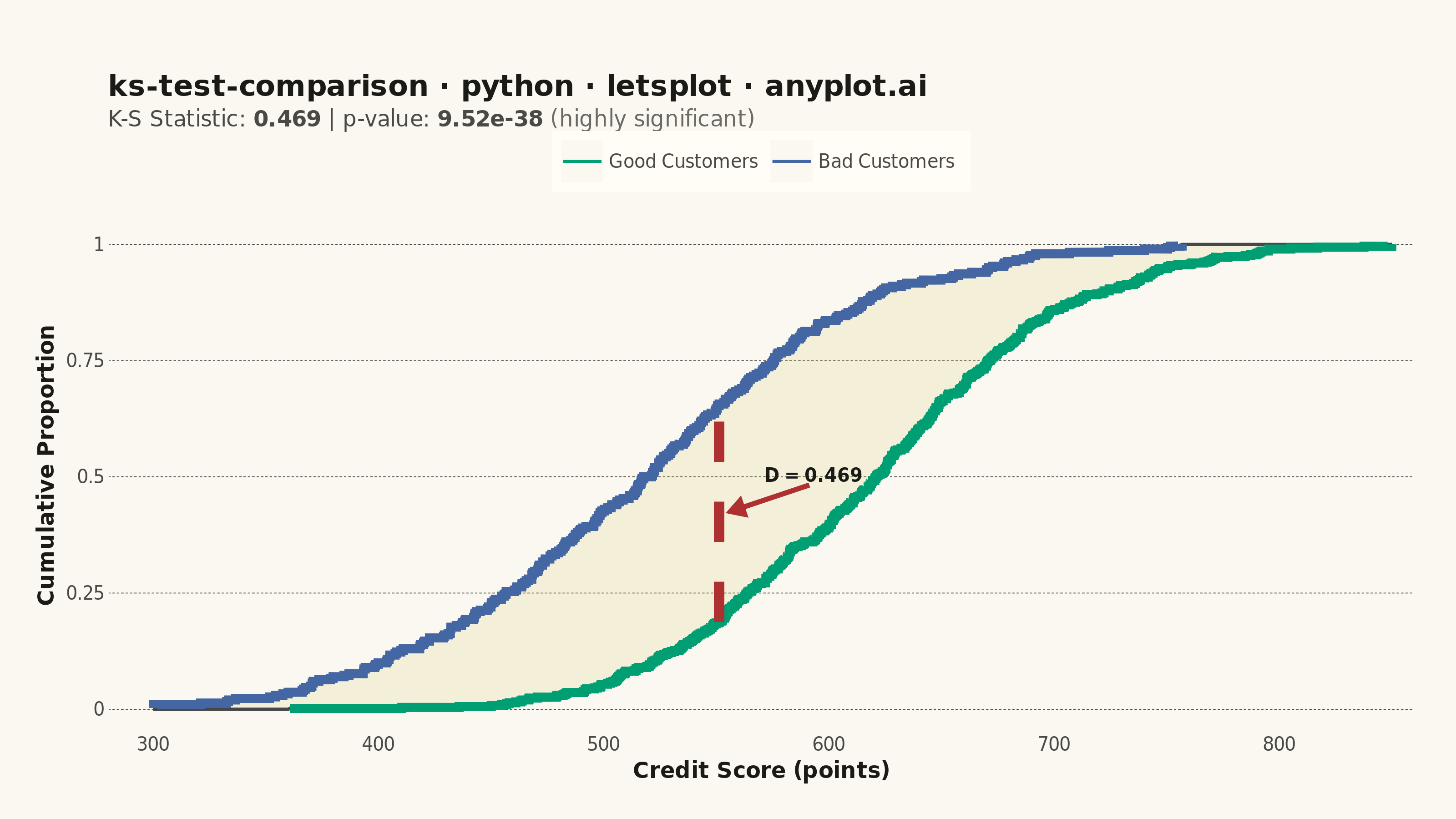
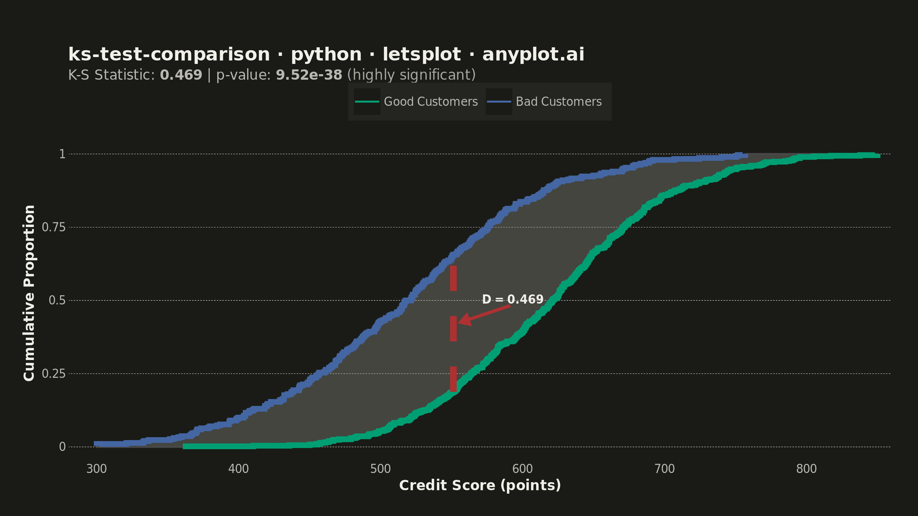
A Kolmogorov-Smirnov (K-S) plot compares two empirical cumulative distribution functions (ECDFs) and visualizes the K-S statistic, which is the maximum vertical distance between the two distributions. The plot displays both ECDFs as step functions, highlights the point of maximum divergence, and typically reports the K-S statistic value and p-value for hypothesis testing. This visualization is essential for determining whether two samples come from the same underlying distribution.
""" anyplot.ai
ks-test-comparison: Kolmogorov-Smirnov Plot for Distribution Comparison
Library: letsplot 4.10.1 | Python 3.13.13
Quality: 90/100 | Updated: 2026-05-29
"""

import os

import numpy as np
import pandas as pd
from lets_plot import (
    LetsPlot,
    aes,
    arrow,
    coord_cartesian,
    element_blank,
    element_line,
    element_markdown,
    element_rect,
    element_text,
    geom_ribbon,
    geom_segment,
    geom_step,
    geom_text,
    ggplot,
    ggsave,
    ggsize,
    labs,
    layer_tooltips,
    scale_color_manual,
    scale_x_continuous,
    scale_y_continuous,
    theme,
    theme_minimal,
)
from scipy import stats


LetsPlot.setup_html()

# Theme tokens — Imprint palette chrome (theme-adaptive)
THEME = os.getenv("ANYPLOT_THEME", "light")
PAGE_BG = "#FAF8F1" if THEME == "light" else "#1A1A17"
ELEVATED_BG = "#FFFDF6" if THEME == "light" else "#242420"
INK = "#1A1A17" if THEME == "light" else "#F0EFE8"
INK_SOFT = "#4A4A44" if THEME == "light" else "#B8B7B0"
INK_MUTED = "#6B6A63" if THEME == "light" else "#A8A79F"

# Imprint categorical palette — hybrid-v3 sort
IMPRINT_PALETTE = ["#009E73", "#C475FD", "#4467A3", "#BD8233", "#AE3030", "#2ABCCD", "#954477", "#99B314"]
ANYPLOT_AMBER = "#DDCC77"  # warning / caution semantic anchor (outside categorical pool)

# Data — credit scoring: Good vs Bad customer score distributions
np.random.seed(42)
good_scores = np.clip(np.random.normal(loc=620, scale=80, size=500), 300, 850)
bad_scores = np.clip(np.random.normal(loc=520, scale=90, size=300), 300, 850)

# Compute ECDFs
good_sorted = np.sort(good_scores)
good_ecdf = np.arange(1, len(good_sorted) + 1) / len(good_sorted)
bad_sorted = np.sort(bad_scores)
bad_ecdf = np.arange(1, len(bad_sorted) + 1) / len(bad_sorted)

# K-S test
ks_stat, p_value = stats.ks_2samp(good_scores, bad_scores)

# Find point of maximum divergence
all_values = np.sort(np.concatenate([good_sorted, bad_sorted]))
good_ecdf_all = np.searchsorted(good_sorted, all_values, side="right") / len(good_sorted)
bad_ecdf_all = np.searchsorted(bad_sorted, all_values, side="right") / len(bad_sorted)
max_idx = np.argmax(np.abs(good_ecdf_all - bad_ecdf_all))
max_x = all_values[max_idx]
max_good_y = good_ecdf_all[max_idx]
max_bad_y = bad_ecdf_all[max_idx]
ks_mid_y = (max_good_y + max_bad_y) / 2

# DataFrames for ggplot layers
df_good = pd.DataFrame({"score": good_sorted, "ecdf": good_ecdf, "group": "Good Customers"})
df_bad = pd.DataFrame({"score": bad_sorted, "ecdf": bad_ecdf, "group": "Bad Customers"})
df_ecdf = pd.concat([df_good, df_bad], ignore_index=True)

ribbon_ymin = np.minimum(good_ecdf_all, bad_ecdf_all)
ribbon_ymax = np.maximum(good_ecdf_all, bad_ecdf_all)
df_ribbon = pd.DataFrame({"score": all_values, "ymin": ribbon_ymin, "ymax": ribbon_ymax})

df_ks_seg = pd.DataFrame(
    {"x": [max_x], "y": [min(max_good_y, max_bad_y)], "xend": [max_x], "yend": [max(max_good_y, max_bad_y)]}
)
df_ks_arrow = pd.DataFrame({"x": [max_x + 40], "y": [ks_mid_y + 0.06], "xend": [max_x + 3], "yend": [ks_mid_y]})
df_ks_label = pd.DataFrame({"score": [max_x + 42], "ecdf": [ks_mid_y + 0.08], "label": [f"D = {ks_stat:.3f}"]})

# Subtitle with formatted K-S stats (element_markdown renders the bold/span tags)
subtitle_text = (
    f"K-S Statistic: **{ks_stat:.3f}** | "
    f"p-value: **{p_value:.2e}** "
    f"<span style='color:{INK_MUTED}'>(highly significant)</span>"
)

title = "ks-test-comparison · python · letsplot · anyplot.ai"

# Ribbon: amber on light (caution semantic), neutral-muted on dark (amber+dark = olive)
ribbon_color = ANYPLOT_AMBER if THEME == "light" else INK_MUTED
ribbon_alpha = 0.20 if THEME == "light" else 0.30

# Plot
plot = (
    ggplot(df_ecdf, aes(x="score", y="ecdf"))
    # Ribbon shows total divergence area (amber on light = caution; muted on dark = neutral)
    + geom_ribbon(
        data=df_ribbon,
        mapping=aes(x="score", ymin="ymin", ymax="ymax"),
        fill=ribbon_color,
        alpha=ribbon_alpha,
        tooltips="none",
    )
    # Both ECDFs as step functions — Imprint positions 1 (green) and 3 (blue)
    + geom_step(
        mapping=aes(color="group"),
        size=2.2,
        tooltips=layer_tooltips()
        .line("@group")
        .line("Score|@score")
        .line("ECDF|@ecdf")
        .format("@score", ".0f")
        .format("@ecdf", ".3f"),
    )
    # Dashed red segment at maximum divergence
    + geom_segment(
        data=df_ks_seg,
        mapping=aes(x="x", y="y", xend="xend", yend="yend"),
        color=IMPRINT_PALETTE[4],
        size=2.5,
        linetype="dashed",
        tooltips="none",
    )
    # Arrow pointing from annotation label to K-S midpoint
    + geom_segment(
        data=df_ks_arrow,
        mapping=aes(x="x", y="y", xend="xend", yend="yend"),
        color=IMPRINT_PALETTE[4],
        size=1.2,
        arrow=arrow(length=8, type="closed"),
        tooltips="none",
    )
    # Bold annotation of K-S statistic value — ink color for readability on both themes
    + geom_text(
        data=df_ks_label,
        mapping=aes(x="score", y="ecdf", label="label"),
        color=INK,
        size=5,
        fontface="bold",
        tooltips="none",
    )
    + scale_color_manual(
        values={
            "Good Customers": IMPRINT_PALETTE[0],  # brand green
            "Bad Customers": IMPRINT_PALETTE[2],  # blue
        }
    )
    + labs(x="Credit Score (points)", y="Cumulative Proportion", title=title, subtitle=subtitle_text, color="")
    + coord_cartesian(xlim=[280, 860])
    + scale_x_continuous(breaks=list(range(300, 851, 100)))
    + scale_y_continuous(limits=[0, 1.05], breaks=[0, 0.25, 0.5, 0.75, 1.0])
    + ggsize(800, 450)
    + theme_minimal()
    + theme(
        plot_background=element_rect(fill=PAGE_BG, color=PAGE_BG),
        panel_background=element_rect(fill=PAGE_BG, color=PAGE_BG),
        panel_border=element_blank(),
        plot_title=element_text(size=16, face="bold", color=INK),
        plot_subtitle=element_markdown(size=12, color=INK_SOFT),
        axis_title=element_text(size=12, face="bold", color=INK),
        axis_text=element_text(size=10, color=INK_SOFT),
        legend_text=element_text(size=10, color=INK_SOFT),
        legend_background=element_rect(fill=ELEVATED_BG, color=INK_SOFT),
        legend_position="top",
        panel_grid_major_x=element_blank(),
        panel_grid_major_y=element_line(color=INK_SOFT, size=0.3, linetype="dashed"),
        panel_grid_minor=element_blank(),
        axis_line_x=element_line(color=INK_SOFT, size=0.5),
        axis_line_y=element_line(color=INK_SOFT, size=0.5),
        plot_margin=[40, 20, 20, 20],
    )
)

# Save PNG (3200×1800 via scale=4) and HTML with interactive tooltips
ggsave(plot, f"plot-{THEME}.png", path=".", scale=4)
ggsave(plot, f"plot-{THEME}.html", path=".")
Runnable source as JSON, for any HTTP client: https://api.anyplot.ai/specs/ks-test-comparison/letsplot/code. Any spec id and library id listed in llms-full.txt fit the same URL shape; every URL below is complete and callable.
{
  "spec_id": "ks-test-comparison",
  "language": "python",
  "library": "letsplot",
  "page": "https://anyplot.ai/ks-test-comparison/python/letsplot",
  "hub": "https://anyplot.ai/ks-test-comparison",
  "code_json": "https://api.anyplot.ai/specs/ks-test-comparison/letsplot/code",
  "spec_json": "https://api.anyplot.ai/specs/ks-test-comparison",
  "render_light_png": "https://storage.googleapis.com/anyplot-images/plots/ks-test-comparison/python/letsplot/plot-light.png",
  "render_dark_png": "https://storage.googleapis.com/anyplot-images/plots/ks-test-comparison/python/letsplot/plot-dark.png",
  "interactive_light_html": "https://storage.googleapis.com/anyplot-images/plots/ks-test-comparison/python/letsplot/plot-light.html",
  "interactive_dark_html": "https://storage.googleapis.com/anyplot-images/plots/ks-test-comparison/python/letsplot/plot-dark.html",
  "quality_score": 90.0,
  "license": "MIT",
  "guide": "https://anyplot.ai/llms.txt"
}
Part of Kolmogorov-Smirnov Plot for Distribution Comparison on anyplot.ai.