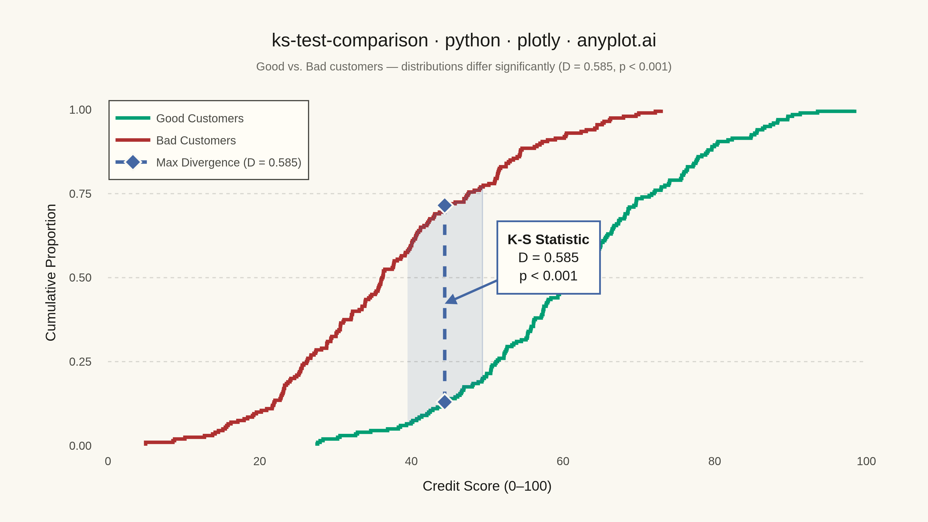
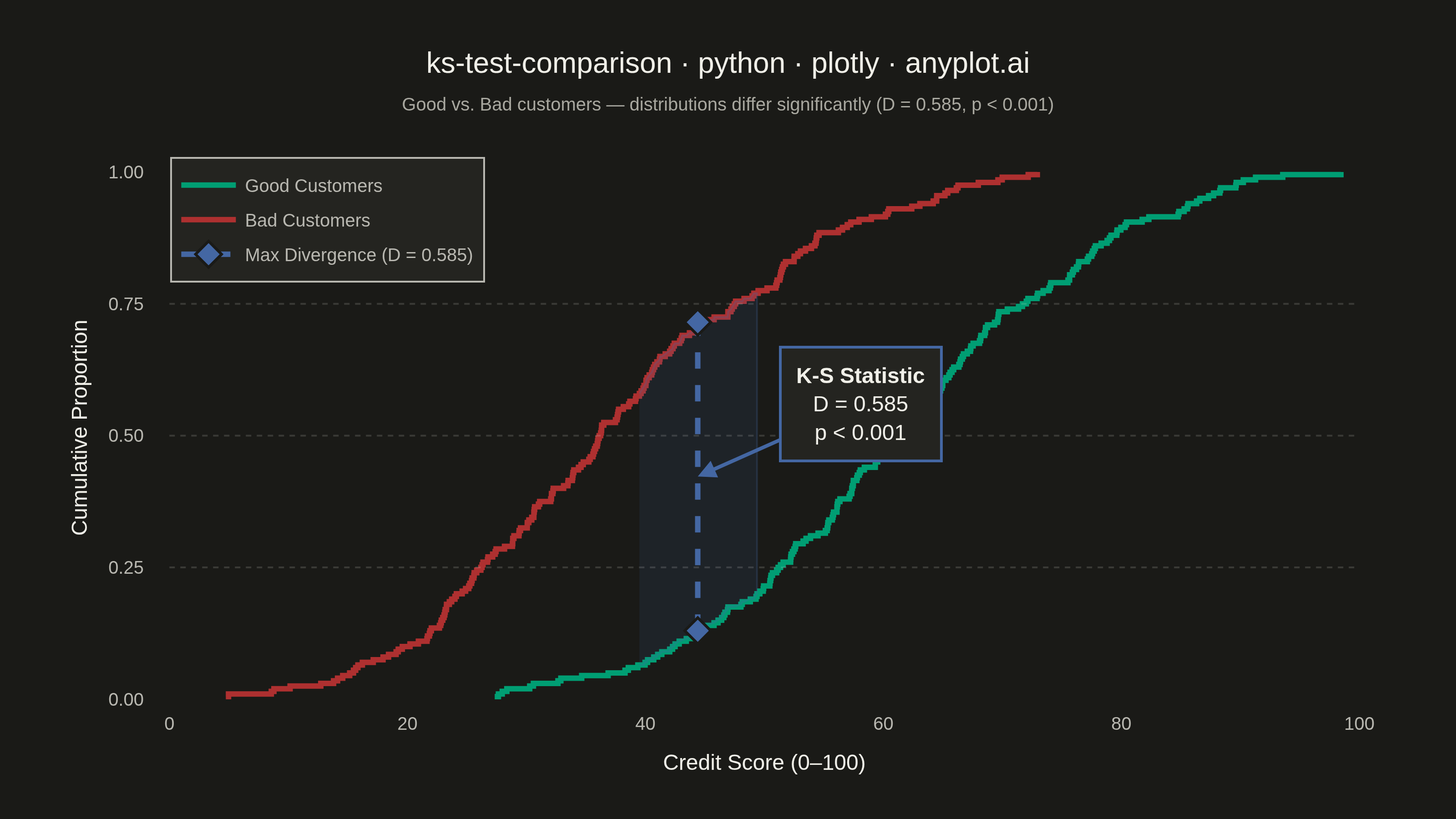
A Kolmogorov-Smirnov (K-S) plot compares two empirical cumulative distribution functions (ECDFs) and visualizes the K-S statistic, which is the maximum vertical distance between the two distributions. The plot displays both ECDFs as step functions, highlights the point of maximum divergence, and typically reports the K-S statistic value and p-value for hypothesis testing. This visualization is essential for determining whether two samples come from the same underlying distribution.
""" anyplot.ai
ks-test-comparison: Kolmogorov-Smirnov Plot for Distribution Comparison
Library: plotly 6.7.0 | Python 3.13.13
Quality: 93/100 | Updated: 2026-05-29
"""

import os

import numpy as np
import plotly.graph_objects as go
from scipy.stats import ecdf, ks_2samp


# Theme-adaptive chrome — Imprint palette
THEME = os.getenv("ANYPLOT_THEME", "light")
PAGE_BG = "#FAF8F1" if THEME == "light" else "#1A1A17"
ELEVATED_BG = "#FFFDF6" if THEME == "light" else "#242420"
INK = "#1A1A17" if THEME == "light" else "#F0EFE8"
INK_SOFT = "#4A4A44" if THEME == "light" else "#B8B7B0"
INK_MUTED = "#6B6A63" if THEME == "light" else "#A8A79F"
GRID = "rgba(26,26,23,0.15)" if THEME == "light" else "rgba(240,239,232,0.15)"

# Imprint categorical colors — semantic mapping: green=good/pass, red=bad/fail
GREEN = "#009E73"  # Imprint slot 1 — Good Customers
RED = "#AE3030"  # Imprint slot 5 — Bad Customers (semantic bad/fail anchor)
BLUE = "#4467A3"  # Imprint slot 3 — max divergence marker

# Data — credit scoring; symmetric betas ensure ECDFs cross near score 50
np.random.seed(42)
good_customers = np.random.beta(5, 3, size=200) * 100
bad_customers = np.random.beta(3, 5, size=200) * 100

# ECDFs via scipy
good_ecdf_result = ecdf(good_customers)
bad_ecdf_result = ecdf(bad_customers)
good_sorted = good_ecdf_result.cdf.quantiles
good_cdf = good_ecdf_result.cdf.probabilities
bad_sorted = bad_ecdf_result.cdf.quantiles
bad_cdf = bad_ecdf_result.cdf.probabilities

# K-S test
ks_stat, p_value = ks_2samp(good_customers, bad_customers)

# Find point of maximum divergence
all_values = np.sort(np.concatenate([good_sorted, bad_sorted]))
good_cdf_at_all = good_ecdf_result.cdf.evaluate(all_values)
bad_cdf_at_all = bad_ecdf_result.cdf.evaluate(all_values)
diff = np.abs(good_cdf_at_all - bad_cdf_at_all)
max_idx = np.argmax(diff)
max_x = all_values[max_idx]
max_good_y = good_cdf_at_all[max_idx]
max_bad_y = bad_cdf_at_all[max_idx]
y_lo = min(max_good_y, max_bad_y)
y_hi = max(max_good_y, max_bad_y)

p_text = f"p = {p_value:.2e}" if p_value >= 0.001 else "p < 0.001"

# Figure
fig = go.Figure()

# Good Customers ECDF — Imprint green (semantic "good/pass")
fig.add_trace(
    go.Scatter(
        x=good_sorted,
        y=good_cdf,
        mode="lines",
        name="Good Customers",
        line={"color": GREEN, "width": 3, "shape": "hv"},
        hovertemplate="<b>Good Customers</b><br>Credit Score: %{x:.1f}<br>Cumulative: %{y:.3f}<extra></extra>",
    )
)

# Bad Customers ECDF — Imprint matte red (semantic "bad/fail")
fig.add_trace(
    go.Scatter(
        x=bad_sorted,
        y=bad_cdf,
        mode="lines",
        name="Bad Customers",
        line={"color": RED, "width": 3, "shape": "hv"},
        hovertemplate="<b>Bad Customers</b><br>Credit Score: %{x:.1f}<br>Cumulative: %{y:.3f}<extra></extra>",
    )
)

# Shaded region between ECDFs around point of maximum divergence
region_width = 5
region_mask = (all_values >= max_x - region_width) & (all_values <= max_x + region_width)
region_x = all_values[region_mask]
region_upper = np.maximum(good_cdf_at_all[region_mask], bad_cdf_at_all[region_mask])
region_lower = np.minimum(good_cdf_at_all[region_mask], bad_cdf_at_all[region_mask])

fig.add_trace(
    go.Scatter(
        x=np.concatenate([region_x, region_x[::-1]]),
        y=np.concatenate([region_upper, region_lower[::-1]]),
        fill="toself",
        fillcolor="rgba(68,103,163,0.12)",
        line={"color": "rgba(68,103,163,0.25)", "width": 1},
        showlegend=False,
        hoverinfo="skip",
    )
)

# Maximum divergence line with diamond endpoint markers
fig.add_trace(
    go.Scatter(
        x=[max_x, max_x],
        y=[y_lo, y_hi],
        mode="lines+markers",
        name=f"Max Divergence (D = {ks_stat:.3f})",
        line={"color": BLUE, "width": 3, "dash": "dash"},
        marker={"color": BLUE, "size": 11, "symbol": "diamond", "line": {"color": PAGE_BG, "width": 1.5}},
        hovertemplate=f"<b>Max Divergence</b><br>Score: {max_x:.1f}<br>D = {ks_stat:.3f}<extra></extra>",
    )
)

# K-S statistic annotation with arrow
fig.add_annotation(
    x=max_x,
    y=(y_lo + y_hi) / 2,
    text=f"<b>K-S Statistic</b><br>D = {ks_stat:.3f}<br>{p_text}",
    showarrow=True,
    arrowhead=2,
    arrowsize=1.0,
    arrowwidth=2,
    arrowcolor=BLUE,
    ax=90,
    ay=-40,
    font={"size": 12, "color": INK, "family": "Arial, sans-serif"},
    bordercolor=BLUE,
    borderwidth=1.5,
    borderpad=8,
    bgcolor=ELEVATED_BG,
)

# Subtle dotted quartile reference lines
for y_ref in [0.25, 0.50, 0.75]:
    fig.add_shape(type="line", x0=0, x1=100, y0=y_ref, y1=y_ref, line={"color": GRID, "width": 1, "dash": "dot"})

fig.update_layout(
    autosize=False,
    title={
        "text": (
            "ks-test-comparison · python · plotly · anyplot.ai"
            f'<br><span style="font-size:10px;color:{INK_MUTED}">'
            f"Good vs. Bad customers — distributions differ significantly "
            f"(D = {ks_stat:.3f}, {p_text})</span>"
        ),
        "font": {"size": 16, "color": INK, "family": "Arial, sans-serif"},
        "x": 0.5,
        "xanchor": "center",
    },
    xaxis={
        "title": {"text": "Credit Score (0–100)", "font": {"size": 12, "color": INK}, "standoff": 12},
        "tickfont": {"size": 10, "color": INK_SOFT},
        "showgrid": False,
        "zeroline": False,
        "showline": False,
        "range": [-2, 102],
        "dtick": 20,
    },
    yaxis={
        "title": {"text": "Cumulative Proportion", "font": {"size": 12, "color": INK}, "standoff": 8},
        "tickfont": {"size": 10, "color": INK_SOFT},
        "range": [-0.02, 1.05],
        "showgrid": False,
        "zeroline": False,
        "showline": False,
        "dtick": 0.25,
        "tickformat": ".2f",
    },
    legend={
        "font": {"size": 10, "color": INK_SOFT},
        "x": 0.02,
        "y": 0.98,
        "bgcolor": ELEVATED_BG,
        "bordercolor": INK_SOFT,
        "borderwidth": 1,
    },
    paper_bgcolor=PAGE_BG,
    plot_bgcolor=PAGE_BG,
    margin={"l": 80, "r": 40, "t": 80, "b": 60},
    hoverlabel={"font": {"size": 12}, "bgcolor": ELEVATED_BG, "bordercolor": INK_SOFT},
    hovermode="x unified",
    xaxis_spikemode="across",
    xaxis_spikesnap="cursor",
    xaxis_spikethickness=1,
    xaxis_spikecolor=GRID,
    xaxis_spikedash="dot",
    yaxis_spikemode="across",
    yaxis_spikesnap="cursor",
    yaxis_spikethickness=1,
    yaxis_spikecolor=GRID,
    yaxis_spikedash="dot",
)

fig.write_image(f"plot-{THEME}.png", width=800, height=450, scale=4)
fig.write_html(
    f"plot-{THEME}.html",
    include_plotlyjs="cdn",
    config={"displayModeBar": True, "modeBarButtonsToAdd": ["drawline", "eraseshape"]},
)
Runnable source as JSON, for any HTTP client: https://api.anyplot.ai/specs/ks-test-comparison/plotly/code. Any spec id and library id listed in llms-full.txt fit the same URL shape; every URL below is complete and callable.
{
  "spec_id": "ks-test-comparison",
  "language": "python",
  "library": "plotly",
  "page": "https://anyplot.ai/ks-test-comparison/python/plotly",
  "hub": "https://anyplot.ai/ks-test-comparison",
  "code_json": "https://api.anyplot.ai/specs/ks-test-comparison/plotly/code",
  "spec_json": "https://api.anyplot.ai/specs/ks-test-comparison",
  "render_light_png": "https://storage.googleapis.com/anyplot-images/plots/ks-test-comparison/python/plotly/plot-light.png",
  "render_dark_png": "https://storage.googleapis.com/anyplot-images/plots/ks-test-comparison/python/plotly/plot-dark.png",
  "interactive_light_html": "https://storage.googleapis.com/anyplot-images/plots/ks-test-comparison/python/plotly/plot-light.html",
  "interactive_dark_html": "https://storage.googleapis.com/anyplot-images/plots/ks-test-comparison/python/plotly/plot-dark.html",
  "quality_score": 93.0,
  "license": "MIT",
  "guide": "https://anyplot.ai/llms.txt"
}
Part of Kolmogorov-Smirnov Plot for Distribution Comparison on anyplot.ai.