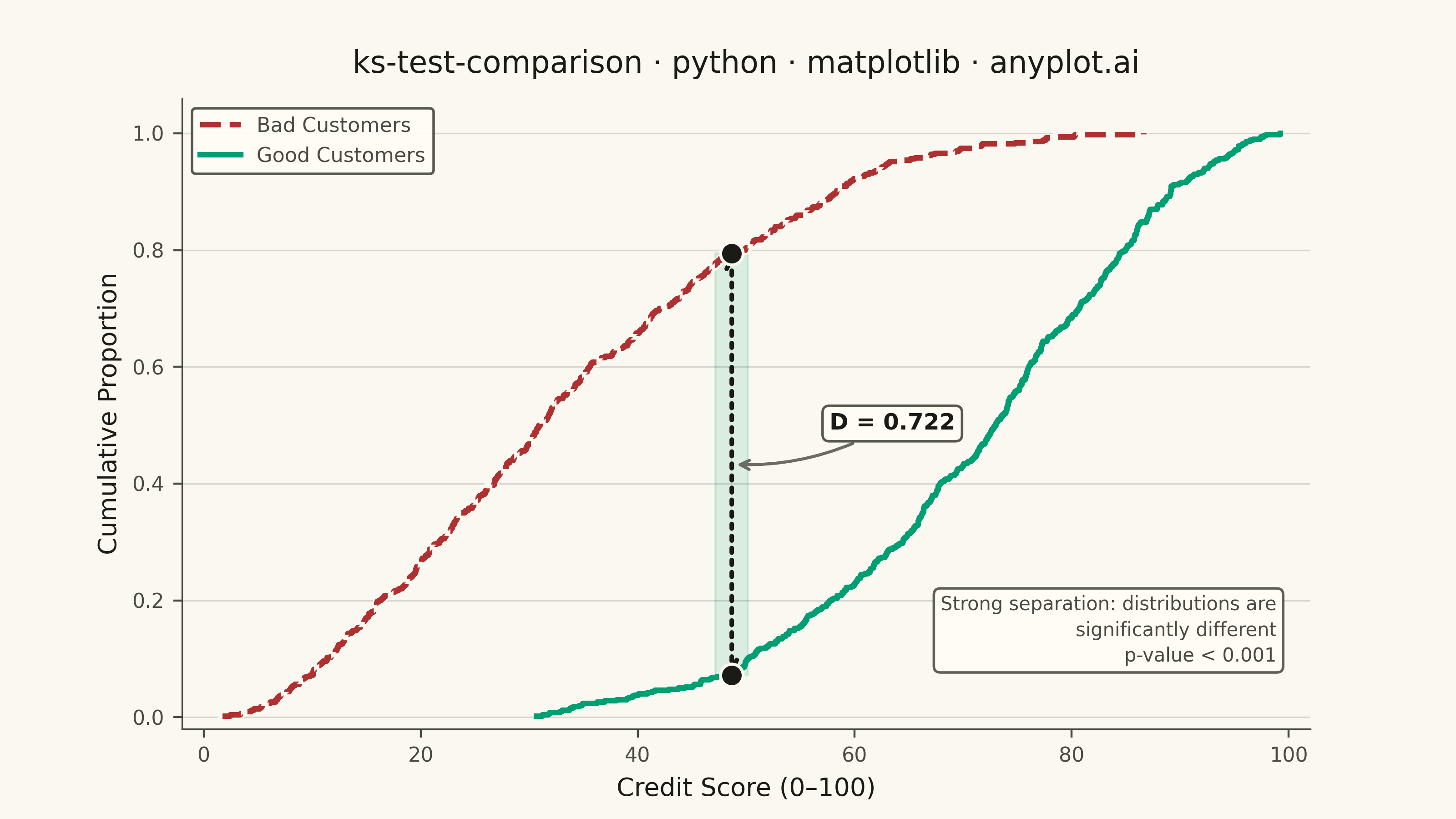
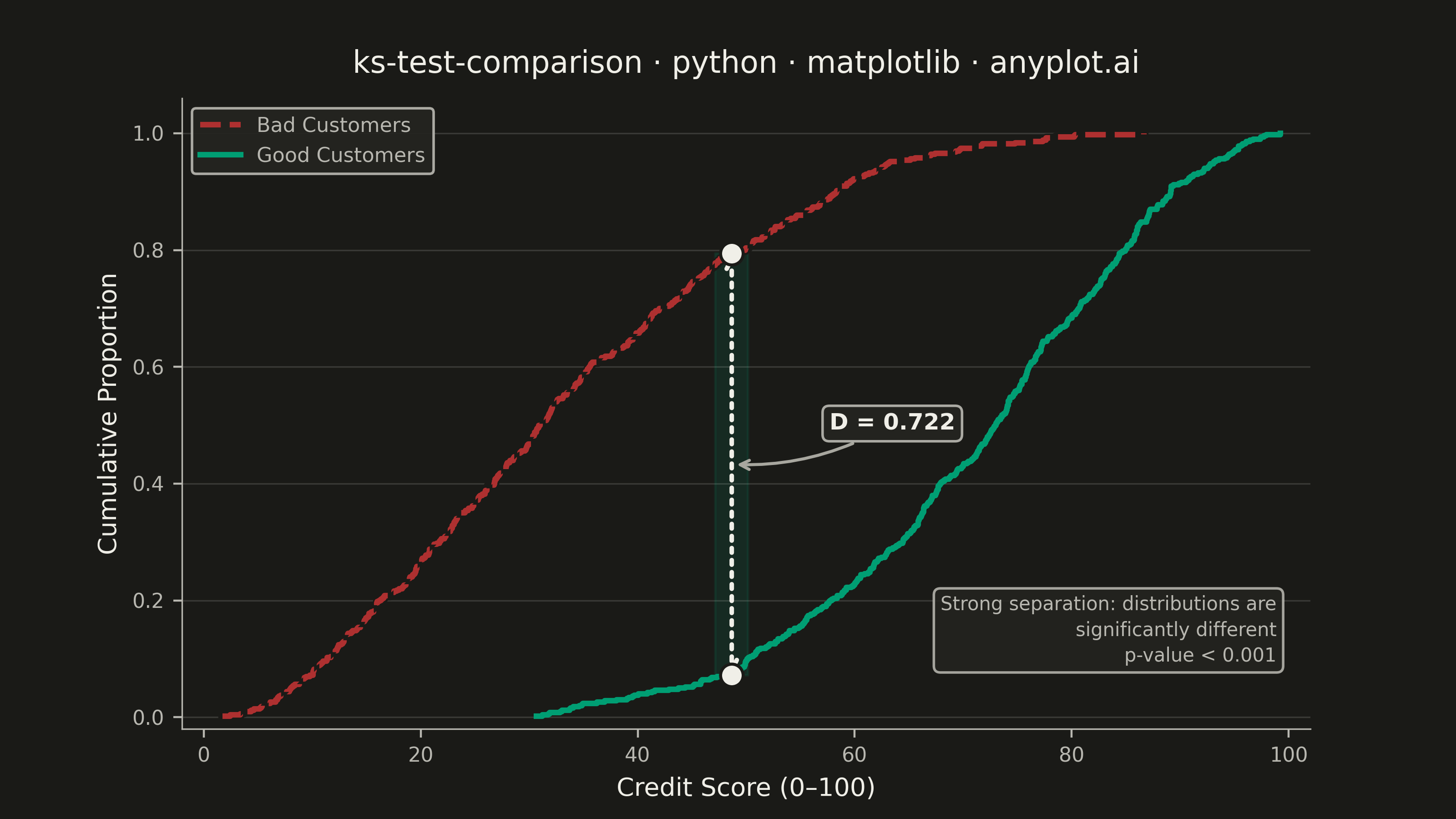
A Kolmogorov-Smirnov (K-S) plot compares two empirical cumulative distribution functions (ECDFs) and visualizes the K-S statistic, which is the maximum vertical distance between the two distributions. The plot displays both ECDFs as step functions, highlights the point of maximum divergence, and typically reports the K-S statistic value and p-value for hypothesis testing. This visualization is essential for determining whether two samples come from the same underlying distribution.
""" anyplot.ai
ks-test-comparison: Kolmogorov-Smirnov Plot for Distribution Comparison
Library: matplotlib 3.10.9 | Python 3.13.13
Quality: 89/100 | Updated: 2026-05-29
"""

import os

import matplotlib.pyplot as plt
import numpy as np
from scipy import stats


# Theme tokens (Imprint palette — see prompts/default-style-guide.md)
THEME = os.getenv("ANYPLOT_THEME", "light")
PAGE_BG = "#FAF8F1" if THEME == "light" else "#1A1A17"
ELEVATED_BG = "#FFFDF6" if THEME == "light" else "#242420"
INK = "#1A1A17" if THEME == "light" else "#F0EFE8"
INK_SOFT = "#4A4A44" if THEME == "light" else "#B8B7B0"
INK_MUTED = "#6B6A63" if THEME == "light" else "#A8A79F"

# Imprint palette — semantic assignment: green = good, red = bad
GOOD_COLOR = "#009E73"  # Imprint position 1 — brand green (good / pass)
BAD_COLOR = "#AE3030"  # Imprint position 5 — matte red (bad / fail)

# Data
np.random.seed(42)
good_customers = np.random.beta(5, 2, 500) * 100
bad_customers = np.random.beta(2, 4, 500) * 100

# K-S test
ks_stat, p_value = stats.ks_2samp(good_customers, bad_customers)

# Compute ECDFs
good_sorted = np.sort(good_customers)
bad_sorted = np.sort(bad_customers)
good_ecdf = np.arange(1, len(good_sorted) + 1) / len(good_sorted)
bad_ecdf = np.arange(1, len(bad_sorted) + 1) / len(bad_sorted)

# Find maximum distance point
all_values = np.sort(np.concatenate([good_sorted, bad_sorted]))
good_cdf_at_all = np.searchsorted(good_sorted, all_values, side="right") / len(good_sorted)
bad_cdf_at_all = np.searchsorted(bad_sorted, all_values, side="right") / len(bad_sorted)
differences = np.abs(good_cdf_at_all - bad_cdf_at_all)
max_idx = np.argmax(differences)
max_x = all_values[max_idx]
max_y_good = good_cdf_at_all[max_idx]
max_y_bad = bad_cdf_at_all[max_idx]
mid_y = (max_y_good + max_y_bad) / 2

# Plot — landscape 3200×1800 px (figsize=(8, 4.5), dpi=400)
fig, ax = plt.subplots(figsize=(8, 4.5), dpi=400, facecolor=PAGE_BG)
ax.set_facecolor(PAGE_BG)

# "Bad Customers" — matte red with white outline for visual separation from gridlines
ax.step(bad_sorted, bad_ecdf, where="post", linewidth=3.5, color=PAGE_BG, zorder=3)
ax.step(
    bad_sorted, bad_ecdf, where="post", linewidth=2.2, color=BAD_COLOR, label="Bad Customers", linestyle="--", zorder=4
)

# "Good Customers" — brand green, solid line
ax.step(
    good_sorted,
    good_ecdf,
    where="post",
    linewidth=2.2,
    color=GOOD_COLOR,
    label="Good Customers",
    linestyle="-",
    zorder=3,
)

# Vertical reference line at maximum distance point — stronger visual anchor
ax.axvline(max_x, color=INK_SOFT, linestyle="--", linewidth=0.9, alpha=0.45, zorder=2)

# Shaded region at maximum distance — wider band and higher alpha for visibility
ax.fill_betweenx([max_y_bad, max_y_good], max_x - 2.5, max_x + 2.5, color=GOOD_COLOR, alpha=0.20, zorder=1)

# K-S distance line with double-ended annotation arrows
ax.annotate(
    "",
    xy=(max_x, max_y_good),
    xytext=(max_x, max_y_bad),
    arrowprops={"arrowstyle": "<->", "color": INK, "linewidth": 1.8, "linestyle": ":", "shrinkA": 0, "shrinkB": 0},
    zorder=5,
)

# Endpoint markers at the KS distance extremes
ax.scatter([max_x, max_x], [max_y_bad, max_y_good], color=INK, s=80, zorder=6, edgecolors=PAGE_BG, linewidth=1.2)

# K-S statistic annotation box
ax.annotate(
    f"D = {ks_stat:.3f}",
    xy=(max_x, mid_y),
    xytext=(max_x + 9, mid_y + 0.07),
    fontsize=9,
    fontweight="bold",
    color=INK,
    arrowprops={"arrowstyle": "->", "color": INK_MUTED, "linewidth": 1.2, "connectionstyle": "arc3,rad=-0.15"},
    va="center",
    bbox={"boxstyle": "round,pad=0.3", "facecolor": ELEVATED_BG, "edgecolor": INK_SOFT, "alpha": 0.92},
)

# Interpretation box — lower right
p_label = "p-value < 0.001" if p_value < 0.001 else f"p-value = {p_value:.4f}"
ax.text(
    0.97,
    0.10,
    f"Strong separation: distributions are\nsignificantly different\n{p_label}",
    transform=ax.transAxes,
    fontsize=8,
    ha="right",
    va="bottom",
    color=INK_SOFT,
    linespacing=1.45,
    bbox={"boxstyle": "round,pad=0.35", "facecolor": ELEVATED_BG, "edgecolor": INK_SOFT, "alpha": 0.88},
)

# Title and axis labels
title = "ks-test-comparison · python · matplotlib · anyplot.ai"
title_fontsize = max(8, round(12 * 67 / len(title))) if len(title) > 67 else 12
ax.set_title(title, fontsize=title_fontsize, fontweight="medium", color=INK, pad=10)
ax.set_xlabel("Credit Score (0–100)", fontsize=10, color=INK)
ax.set_ylabel("Cumulative Proportion", fontsize=10, color=INK)

# Tick styling
ax.tick_params(axis="both", labelsize=8, colors=INK_SOFT)
ax.set_ylim(-0.02, 1.06)
ax.set_xlim(-2, 102)

# Legend
leg = ax.legend(fontsize=8, loc="upper left", framealpha=0.92)
if leg:
    leg.get_frame().set_facecolor(ELEVATED_BG)
    leg.get_frame().set_edgecolor(INK_SOFT)
    plt.setp(leg.get_texts(), color=INK_SOFT)

# Spines and grid
ax.spines["top"].set_visible(False)
ax.spines["right"].set_visible(False)
for s in ("left", "bottom"):
    ax.spines[s].set_color(INK_SOFT)
    ax.spines[s].set_linewidth(0.6)
ax.yaxis.grid(True, alpha=0.15, linewidth=0.6, color=INK)

# Save — do NOT add bbox_inches='tight' (causes canvas drift)
plt.savefig(f"plot-{THEME}.png", dpi=400, facecolor=PAGE_BG)
Runnable source as JSON, for any HTTP client: https://api.anyplot.ai/specs/ks-test-comparison/matplotlib/code. Any spec id and library id listed in llms-full.txt fit the same URL shape; every URL below is complete and callable.
{
  "spec_id": "ks-test-comparison",
  "language": "python",
  "library": "matplotlib",
  "page": "https://anyplot.ai/ks-test-comparison/python/matplotlib",
  "hub": "https://anyplot.ai/ks-test-comparison",
  "code_json": "https://api.anyplot.ai/specs/ks-test-comparison/matplotlib/code",
  "spec_json": "https://api.anyplot.ai/specs/ks-test-comparison",
  "render_light_png": "https://storage.googleapis.com/anyplot-images/plots/ks-test-comparison/python/matplotlib/plot-light.png",
  "render_dark_png": "https://storage.googleapis.com/anyplot-images/plots/ks-test-comparison/python/matplotlib/plot-dark.png",
  "quality_score": 89.0,
  "license": "MIT",
  "guide": "https://anyplot.ai/llms.txt"
}
Part of Kolmogorov-Smirnov Plot for Distribution Comparison on anyplot.ai.