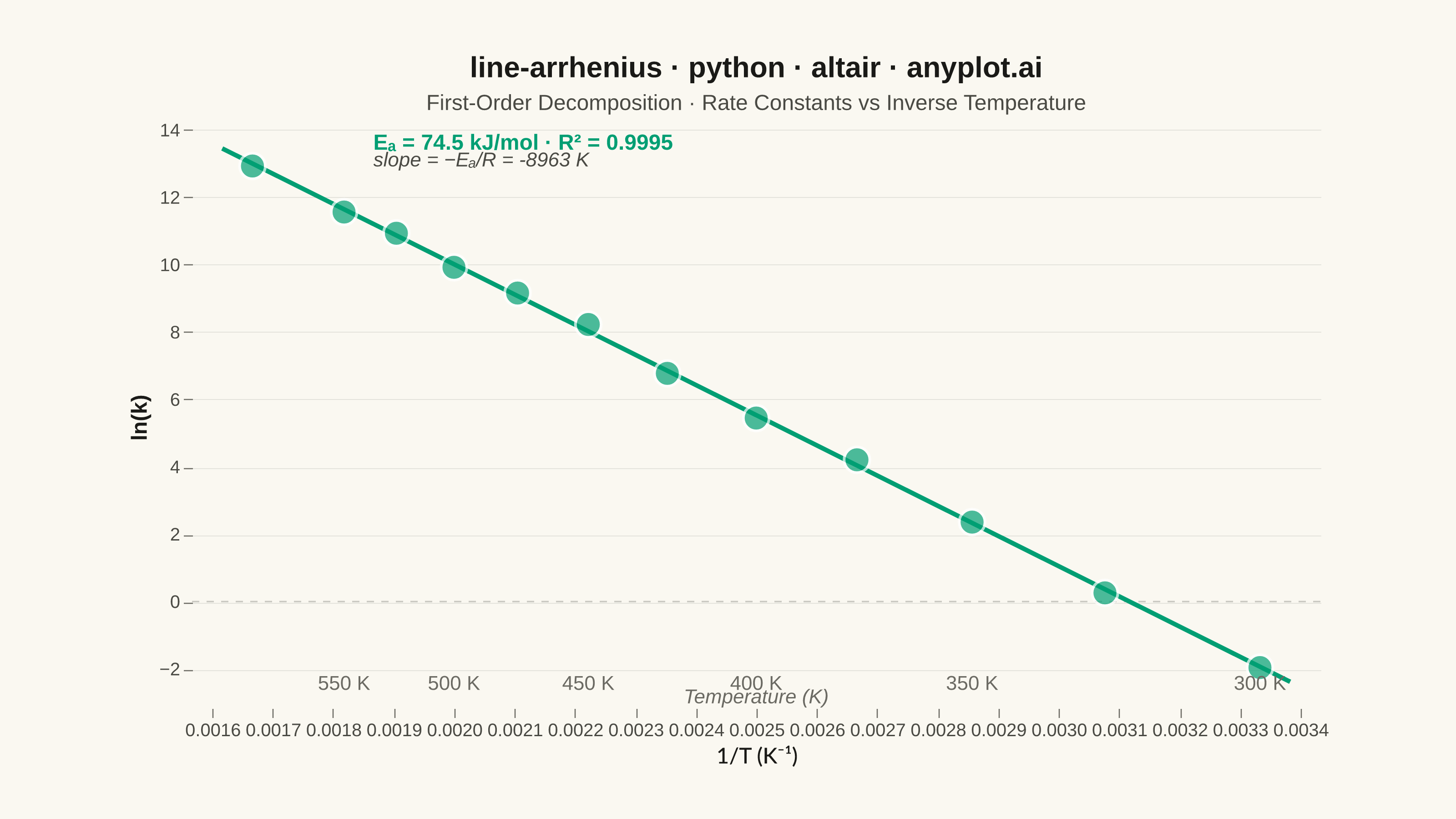
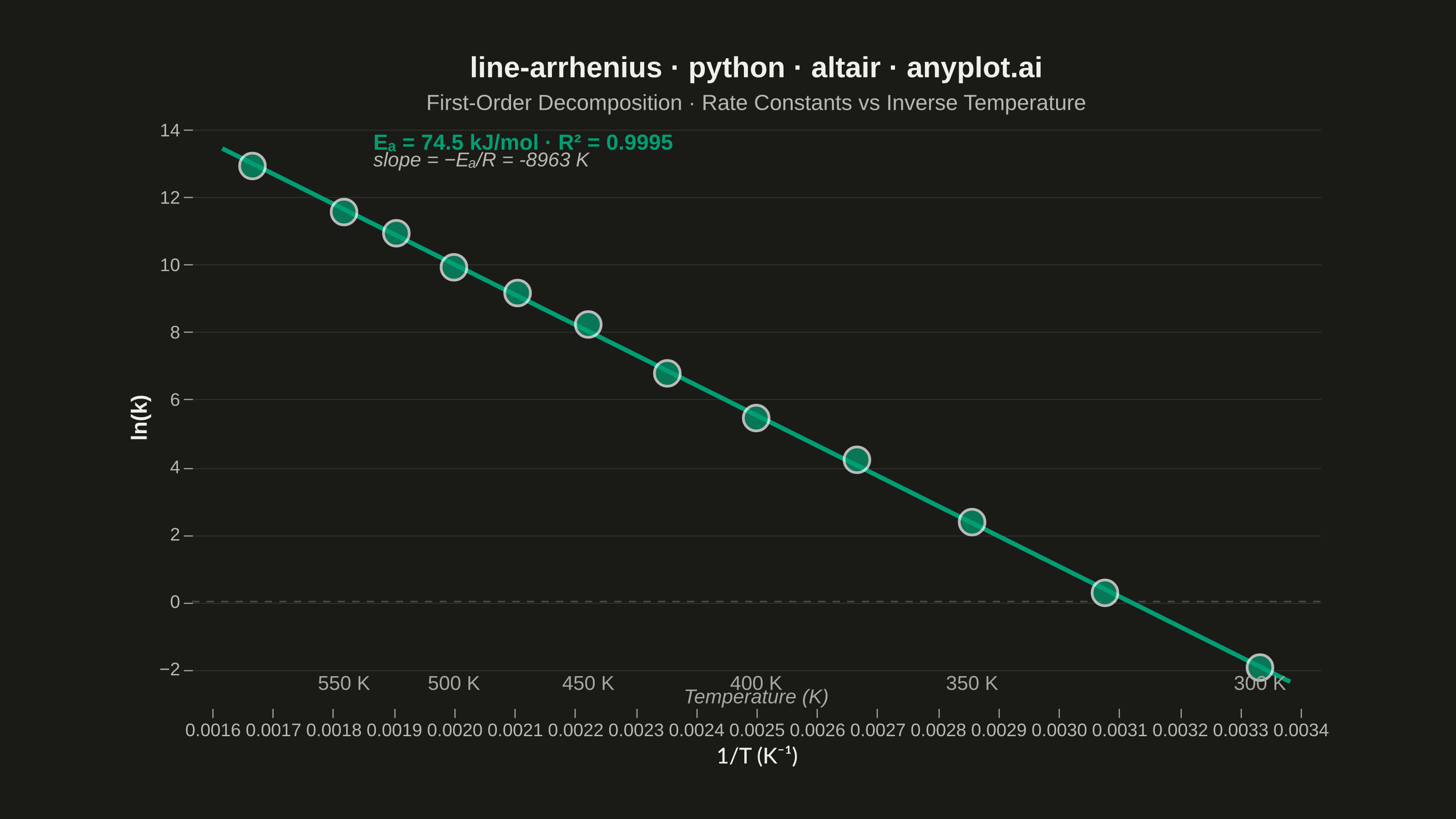
An Arrhenius plot displays ln(k) versus 1/T to determine the activation energy of a chemical reaction from experimental rate constant data. The Arrhenius equation predicts a linear relationship on this transformed scale, where the slope equals -Ea/R (activation energy divided by the gas constant). This visualization is fundamental in physical chemistry and chemical engineering for characterizing reaction kinetics and comparing catalytic performance.
""" anyplot.ai
line-arrhenius: Arrhenius Plot for Reaction Kinetics
Library: altair 6.2.2 | Python 3.13.14
Quality: 90/100 | Updated: 2026-06-24
"""

import os

import altair as alt
import numpy as np
import pandas as pd
from PIL import Image


THEME = os.getenv("ANYPLOT_THEME", "light")

# Theme-adaptive chrome (Imprint palette)
PAGE_BG = "#FAF8F1" if THEME == "light" else "#1A1A17"
ELEVATED_BG = "#FFFDF6" if THEME == "light" else "#242420"
INK = "#1A1A17" if THEME == "light" else "#F0EFE8"
INK_SOFT = "#4A4A44" if THEME == "light" else "#B8B7B0"
INK_MUTED = "#6B6A63" if THEME == "light" else "#A8A79F"

# Imprint palette — first series always #009E73
BRAND = "#009E73"

# Data — first-order decomposition reaction rate constants at various temperatures
np.random.seed(42)
temperature_K = np.array([300, 325, 350, 375, 400, 425, 450, 475, 500, 525, 550, 600])
R = 8.314  # J/(mol·K)
Ea_true = 75000  # J/mol (75 kJ/mol)
A_true = 1.5e12  # Pre-exponential factor (s⁻¹)

# Arrhenius equation: k = A * exp(-Ea / (R*T))
ln_k_true = np.log(A_true) - Ea_true / (R * temperature_K)
ln_k_measured = ln_k_true + np.random.normal(0, 0.15, len(temperature_K))

inv_T = 1.0 / temperature_K  # 1/T in K⁻¹

# Regression parameters for annotations
coeffs = np.polyfit(inv_T, ln_k_measured, 1)
slope_fit, intercept_fit = coeffs
y_pred = slope_fit * inv_T + intercept_fit
ss_res = np.sum((ln_k_measured - y_pred) ** 2)
ss_tot = np.sum((ln_k_measured - np.mean(ln_k_measured)) ** 2)
r_squared = 1 - ss_res / ss_tot
Ea_fit = -slope_fit * R  # Activation energy in J/mol

# DataFrame
data_df = pd.DataFrame({"inv_T": inv_T, "ln_k": ln_k_measured, "T_K": temperature_K})

# Shared scales
x_scale = alt.Scale(domain=[inv_T.min() - 0.0001, inv_T.max() + 0.0001], nice=False)
y_scale = alt.Scale(domain=[ln_k_measured.min() - 1.2, ln_k_measured.max() + 1.2])

# Regression line via native transform_regression
reg_line = (
    alt.Chart(data_df)
    .mark_line(strokeWidth=2.5, color=BRAND)
    .transform_regression("inv_T", "ln_k", extent=[inv_T.min() - 0.00005, inv_T.max() + 0.00005])
    .encode(x=alt.X("inv_T:Q", scale=x_scale), y=alt.Y("ln_k:Q", scale=y_scale))
)

# Data points with interactive hover highlight
highlight = alt.selection_point(on="pointerover", nearest=True, empty=False)

points = (
    alt.Chart(data_df)
    .mark_point(filled=True, color=BRAND, stroke="white", strokeWidth=1.5)
    .encode(
        x=alt.X("inv_T:Q", scale=x_scale, title="1/T (K⁻¹)"),
        y=alt.Y("ln_k:Q", scale=y_scale, title="ln(k)"),
        size=alt.condition(highlight, alt.value(350), alt.value(200)),
        tooltip=[
            alt.Tooltip("T_K:Q", title="Temperature", format=".0f"),
            alt.Tooltip("inv_T:Q", title="1/T", format=".5f"),
            alt.Tooltip("ln_k:Q", title="ln(k)", format=".2f"),
        ],
    )
    .add_params(highlight)
)

# Annotations: Ea and R²
ea_kj = Ea_fit / 1000
annotation_text = f"Eₐ = {ea_kj:.1f} kJ/mol  ·  R² = {r_squared:.4f}"
slope_text = f"slope = −Eₐ/R = {slope_fit:.0f} K"

annotation_df = pd.DataFrame(
    {"inv_T": [inv_T.min() + 0.0002], "ln_k": [ln_k_measured.max() + 0.7], "text": [annotation_text]}
)
slope_ann_df = pd.DataFrame(
    {"inv_T": [inv_T.min() + 0.0002], "ln_k": [ln_k_measured.max() + 0.15], "text": [slope_text]}
)

ea_label = (
    alt.Chart(annotation_df)
    .mark_text(fontSize=12, align="left", fontWeight="bold", color=BRAND)
    .encode(x=alt.X("inv_T:Q", scale=x_scale), y=alt.Y("ln_k:Q", scale=y_scale), text="text:N")
)

slope_label = (
    alt.Chart(slope_ann_df)
    .mark_text(fontSize=11, align="left", fontStyle="italic", color=INK_SOFT)
    .encode(x=alt.X("inv_T:Q", scale=x_scale), y=alt.Y("ln_k:Q", scale=y_scale), text="text:N")
)

# Secondary x-axis: temperature reference labels at data point positions
temp_labels_df = pd.DataFrame(
    {
        "inv_T": inv_T[::2],
        "ln_k": [ln_k_measured.min() - 0.5] * len(inv_T[::2]),
        "text": [f"{int(t)} K" for t in temperature_K[::2]],
    }
)

temp_tick_labels = (
    alt.Chart(temp_labels_df)
    .mark_text(fontSize=11, color=INK_MUTED, angle=0)
    .encode(x=alt.X("inv_T:Q", scale=x_scale), y=alt.Y("ln_k:Q", scale=y_scale), text="text:N")
)

temp_axis_label_df = pd.DataFrame(
    {"inv_T": [(inv_T.min() + inv_T.max()) / 2], "ln_k": [ln_k_measured.min() - 0.9], "text": ["Temperature (K)"]}
)

temp_axis_label = (
    alt.Chart(temp_axis_label_df)
    .mark_text(fontSize=11, color=INK_MUTED, fontStyle="italic")
    .encode(x=alt.X("inv_T:Q", scale=x_scale), y=alt.Y("ln_k:Q", scale=y_scale), text="text:N")
)

# Reference rule at ln(k) = 0 (rate constant = 1 s⁻¹ boundary)
zero_rule = (
    alt.Chart(pd.DataFrame({"y": [0]}))
    .mark_rule(strokeDash=[4, 4], color=INK_MUTED, opacity=0.35, strokeWidth=0.8)
    .encode(y=alt.Y("y:Q", scale=y_scale))
)

# Combine all layers
chart = (
    alt.layer(zero_rule, reg_line, points, ea_label, slope_label, temp_tick_labels, temp_axis_label)
    .properties(
        width=620,
        height=320,
        background=PAGE_BG,
        title=alt.Title(
            "line-arrhenius · python · altair · anyplot.ai",
            fontSize=16,
            anchor="middle",
            color=INK,
            subtitle="First-Order Decomposition · Rate Constants vs Inverse Temperature",
            subtitleFontSize=12,
            subtitleColor=INK_SOFT,
            subtitlePadding=6,
        ),
    )
    .configure_view(fill=PAGE_BG, strokeWidth=0)
    .configure_axis(
        labelFontSize=10,
        titleFontSize=12,
        titleFont="Helvetica Neue, Arial, sans-serif",
        labelFont="Helvetica Neue, Arial, sans-serif",
        titleColor=INK,
        labelColor=INK_SOFT,
        grid=False,
        domain=False,
        tickColor=INK_MUTED,
        tickSize=5,
        tickWidth=0.6,
    )
    .configure_axisY(grid=True, gridColor=INK_MUTED, gridOpacity=0.15, gridWidth=0.5)
    .configure_title(font="Helvetica Neue, Arial, sans-serif", color=INK)
    .interactive()
)

# Save PNG (scale_factor=4.0) then pad to exact 3200×1800 target
chart.save(f"plot-{THEME}.png", scale_factor=4.0)
TW, TH = 3200, 1800
_img = Image.open(f"plot-{THEME}.png").convert("RGB")
_w, _h = _img.size
if _w > TW or _h > TH:
    raise SystemExit(
        f"altair vl-convert produced {_w}×{_h}, exceeds target {TW}×{TH}. "
        f"Shrink chart .properties(width=, height=) values and re-render."
    )
if _w < TW or _h < TH:
    _bg = tuple(int(PAGE_BG.lstrip("#")[i : i + 2], 16) for i in (0, 2, 4))
    _canvas = Image.new("RGB", (TW, TH), _bg)
    _canvas.paste(_img, ((TW - _w) // 2, (TH - _h) // 2))
    _canvas.save(f"plot-{THEME}.png")

chart.save(f"plot-{THEME}.html")
Runnable source as JSON, for any HTTP client: https://api.anyplot.ai/specs/line-arrhenius/altair/code. Any spec id and library id listed in llms-full.txt fit the same URL shape; every URL below is complete and callable.
{
  "spec_id": "line-arrhenius",
  "language": "python",
  "library": "altair",
  "page": "https://anyplot.ai/line-arrhenius/python/altair",
  "hub": "https://anyplot.ai/line-arrhenius",
  "code_json": "https://api.anyplot.ai/specs/line-arrhenius/altair/code",
  "spec_json": "https://api.anyplot.ai/specs/line-arrhenius",
  "render_light_png": "https://storage.googleapis.com/anyplot-images/plots/line-arrhenius/python/altair/plot-light.png",
  "render_dark_png": "https://storage.googleapis.com/anyplot-images/plots/line-arrhenius/python/altair/plot-dark.png",
  "interactive_light_html": "https://storage.googleapis.com/anyplot-images/plots/line-arrhenius/python/altair/plot-light.html",
  "interactive_dark_html": "https://storage.googleapis.com/anyplot-images/plots/line-arrhenius/python/altair/plot-dark.html",
  "quality_score": 90.0,
  "license": "MIT",
  "guide": "https://anyplot.ai/llms.txt"
}
Part of Arrhenius Plot for Reaction Kinetics on anyplot.ai.