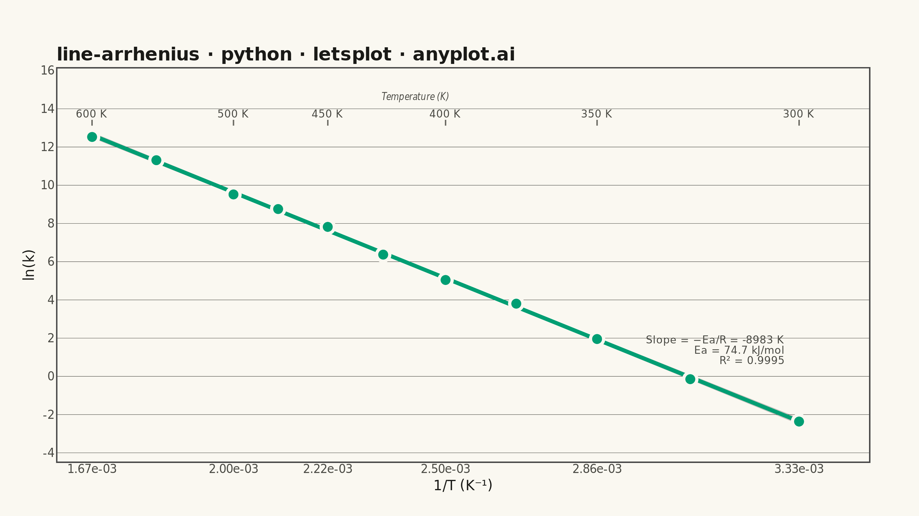
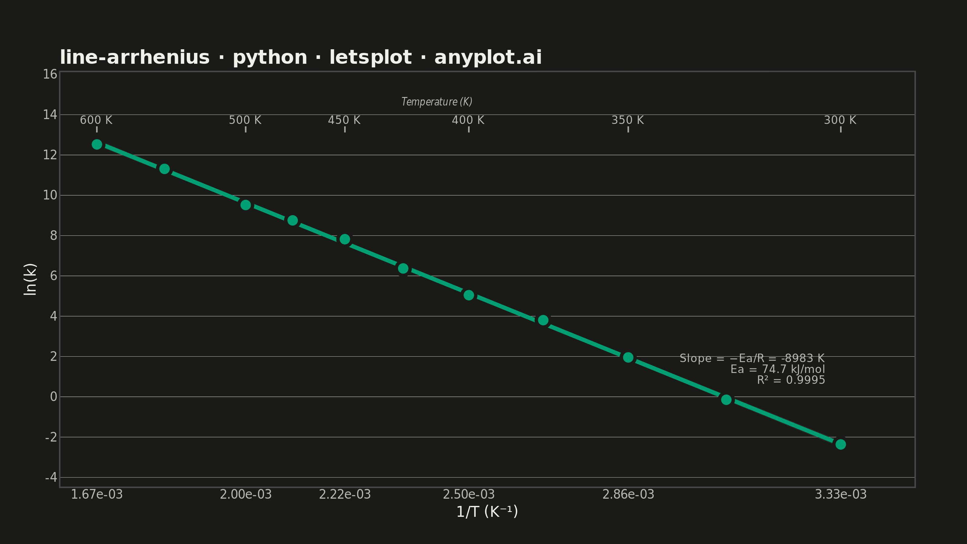
An Arrhenius plot displays ln(k) versus 1/T to determine the activation energy of a chemical reaction from experimental rate constant data. The Arrhenius equation predicts a linear relationship on this transformed scale, where the slope equals -Ea/R (activation energy divided by the gas constant). This visualization is fundamental in physical chemistry and chemical engineering for characterizing reaction kinetics and comparing catalytic performance.
""" anyplot.ai
line-arrhenius: Arrhenius Plot for Reaction Kinetics
Library: letsplot 4.10.1 | Python 3.13.14
Quality: 89/100 | Updated: 2026-06-24
"""

import os

import numpy as np
import pandas as pd
from lets_plot import *
from lets_plot import ggsave
from scipy import stats


LetsPlot.setup_html()

THEME = os.getenv("ANYPLOT_THEME", "light")

# Imprint palette — position 1 (brand green) for first/only series
BRAND = "#009E73"

# Theme-adaptive chrome
PAGE_BG = "#FAF8F1" if THEME == "light" else "#1A1A17"
ELEVATED_BG = "#FFFDF6" if THEME == "light" else "#242420"
INK = "#1A1A17" if THEME == "light" else "#F0EFE8"
INK_SOFT = "#4A4A44" if THEME == "light" else "#B8B7B0"
INK_MUTED = "#6B6A63" if THEME == "light" else "#A8A79F"

# Data — first-order decomposition reaction rate constants at various temperatures
np.random.seed(42)
temperature_K = np.array([300, 325, 350, 375, 400, 425, 450, 475, 500, 550, 600])
R = 8.314  # gas constant (J/(mol·K))
Ea_true = 75000  # activation energy (J/mol) ~75 kJ/mol
A_true = 1e12  # pre-exponential factor (s⁻¹)

rate_constant_k = A_true * np.exp(-Ea_true / (R * temperature_K))
noise = np.random.normal(0, 0.15, len(temperature_K))
ln_k = np.log(rate_constant_k) + noise

inv_T = 1.0 / temperature_K

# Linear regression for annotation values
slope, intercept, r_value, _, _ = stats.linregress(inv_T, ln_k)
r_squared = r_value**2
Ea_extracted = -slope * R / 1000  # kJ/mol

df_points = pd.DataFrame(
    {
        "inv_T": inv_T,
        "ln_k": ln_k,
        "temp_K": [f"{t} K" for t in temperature_K],
        "k_val": [f"{np.exp(lk):.2e}" for lk in ln_k],
    }
)

# Annotation text for regression parameters
eq_text = f"Slope = −Ea/R = {slope:.0f} K\nEa = {Ea_extracted:.1f} kJ/mol\nR² = {r_squared:.4f}"
y_range = ln_k.max() - ln_k.min()
annot_x = inv_T.max() - (inv_T.max() - inv_T.min()) * 0.02
annot_y = ln_k.min() + y_range * 0.25

# Secondary x-axis: temperature labels at top of plot (manual, lets-plot limitation)
temp_ticks = np.array([600, 500, 450, 400, 350, 300])
inv_T_ticks = 1.0 / temp_ticks
y_top = ln_k.max() + y_range * 0.08

df_ticks = pd.DataFrame(
    {
        "inv_T": inv_T_ticks,
        "y_label": [y_top] * len(temp_ticks),
        "y_tick_start": [y_top - y_range * 0.02] * len(temp_ticks),
        "y_tick_end": [y_top - y_range * 0.04] * len(temp_ticks),
        "label": [f"{t} K" for t in temp_ticks],
    }
)
df_title = pd.DataFrame(
    {"inv_T": [np.mean(inv_T_ticks)], "y_label": [y_top + y_range * 0.06], "label": ["Temperature (K)"]}
)

anyplot_theme = theme(
    plot_background=element_rect(fill=PAGE_BG, color=PAGE_BG),
    panel_background=element_rect(fill=PAGE_BG),
    panel_grid_major_x=element_blank(),
    panel_grid_major_y=element_line(color=INK_SOFT, size=0.3),
    panel_grid_minor=element_blank(),
    panel_border=element_blank(),
    axis_line=element_line(color=INK_SOFT),
    axis_ticks=element_blank(),
    axis_ticks_length=0,
    axis_title=element_text(size=12, color=INK),
    axis_text=element_text(size=10, color=INK_SOFT),
    plot_title=element_text(size=16, color=INK, face="bold"),
    plot_margin=[40, 40, 20, 20],
)

plot = (
    ggplot()
    # Confidence band + regression line via geom_smooth
    + geom_smooth(
        aes(x="inv_T", y="ln_k"),
        data=df_points,
        method="lm",
        color=BRAND,
        size=1.5,
        alpha=0.30,
        se=True,
        level=0.95,
    )
    # Data points with tooltips
    + geom_point(
        aes(x="inv_T", y="ln_k"),
        data=df_points,
        fill=BRAND,
        color=PAGE_BG,
        size=4,
        shape=21,
        stroke=1.2,
        tooltips=layer_tooltips()
        .line("@temp_K")
        .line("1/T = @inv_T")
        .line("ln(k) = @ln_k")
        .line("k = @k_val"),
    )
    # Regression parameters annotation
    + geom_text(
        aes(x="x", y="y", label="label"),
        data=pd.DataFrame({"x": [annot_x], "y": [annot_y], "label": [eq_text]}),
        size=4.5,
        color=INK_SOFT,
        hjust=1,
    )
    # Secondary axis: temperature tick labels
    + geom_text(
        aes(x="inv_T", y="y_label", label="label"),
        data=df_ticks,
        size=4.5,
        color=INK_SOFT,
    )
    + geom_segment(
        aes(x="inv_T", y="y_tick_start", xend="inv_T", yend="y_tick_end"),
        data=df_ticks,
        color=INK_MUTED,
        size=0.5,
    )
    # Secondary axis title
    + geom_text(
        aes(x="inv_T", y="y_label", label="label"),
        data=df_title,
        size=4,
        color=INK_SOFT,
        fontface="italic",
    )
    + labs(
        x="1/T (K⁻¹)", y="ln(k)", title="line-arrhenius · python · letsplot · anyplot.ai"
    )
    + scale_x_continuous(
        breaks=inv_T_ticks.tolist(), labels=[f"{v:.2e}" for v in inv_T_ticks]
    )
    + scale_y_continuous(
        limits=[ln_k.min() - y_range * 0.08, y_top + y_range * 0.10]
    )
    + coord_cartesian(xlim=[inv_T.min() * 0.95, inv_T.max() * 1.05])
    + ggsize(800, 450)
    + anyplot_theme
)

ggsave(plot, f"plot-{THEME}.png", path=".", scale=4)
ggsave(plot, f"plot-{THEME}.html", path=".")
Runnable source as JSON, for any HTTP client: https://api.anyplot.ai/specs/line-arrhenius/letsplot/code. Any spec id and library id listed in llms-full.txt fit the same URL shape; every URL below is complete and callable.
{
  "spec_id": "line-arrhenius",
  "language": "python",
  "library": "letsplot",
  "page": "https://anyplot.ai/line-arrhenius/python/letsplot",
  "hub": "https://anyplot.ai/line-arrhenius",
  "code_json": "https://api.anyplot.ai/specs/line-arrhenius/letsplot/code",
  "spec_json": "https://api.anyplot.ai/specs/line-arrhenius",
  "render_light_png": "https://storage.googleapis.com/anyplot-images/plots/line-arrhenius/python/letsplot/plot-light.png",
  "render_dark_png": "https://storage.googleapis.com/anyplot-images/plots/line-arrhenius/python/letsplot/plot-dark.png",
  "interactive_light_html": "https://storage.googleapis.com/anyplot-images/plots/line-arrhenius/python/letsplot/plot-light.html",
  "interactive_dark_html": "https://storage.googleapis.com/anyplot-images/plots/line-arrhenius/python/letsplot/plot-dark.html",
  "quality_score": 89.0,
  "license": "MIT",
  "guide": "https://anyplot.ai/llms.txt"
}
Part of Arrhenius Plot for Reaction Kinetics on anyplot.ai.