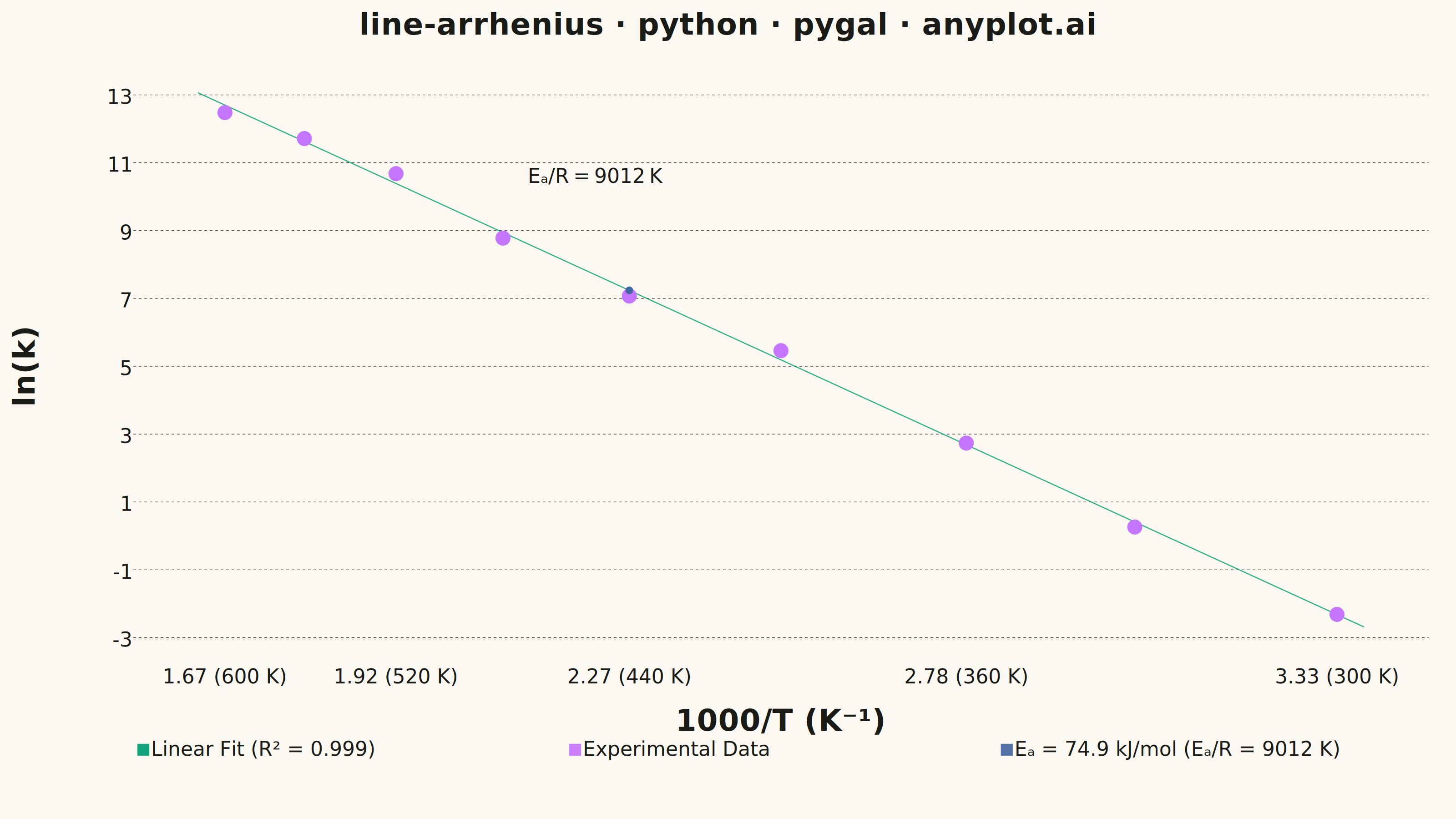
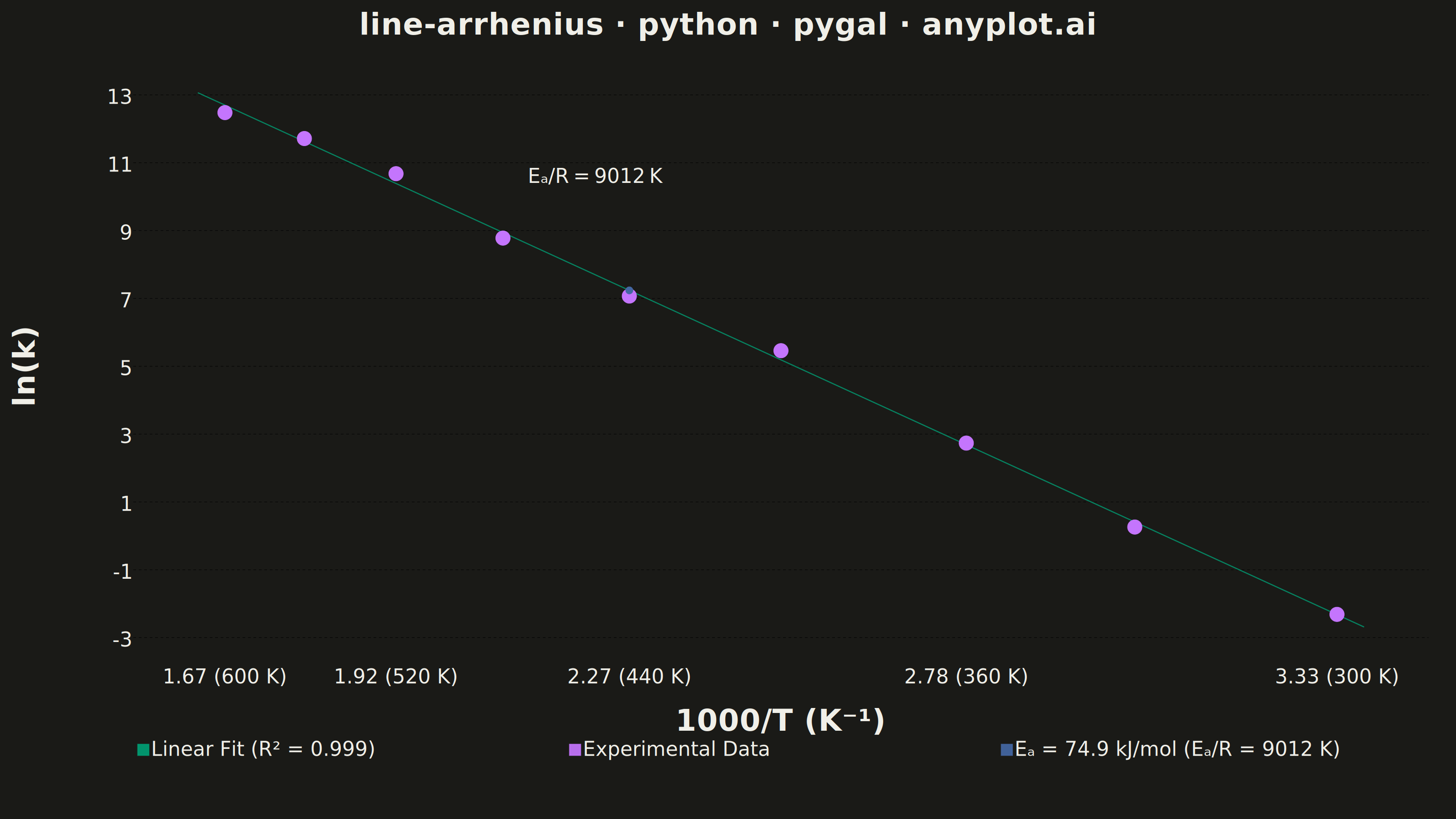
An Arrhenius plot displays ln(k) versus 1/T to determine the activation energy of a chemical reaction from experimental rate constant data. The Arrhenius equation predicts a linear relationship on this transformed scale, where the slope equals -Ea/R (activation energy divided by the gas constant). This visualization is fundamental in physical chemistry and chemical engineering for characterizing reaction kinetics and comparing catalytic performance.
""" anyplot.ai
line-arrhenius: Arrhenius Plot for Reaction Kinetics
Library: pygal 3.1.3 | Python 3.13.14
Quality: 87/100 | Updated: 2026-06-24
"""

import os
import re
import sys


# Script filename shadows the installed 'pygal' package when run as 'python pygal.py';
# dropping the script directory from sys.path lets the real package resolve.
sys.path.pop(0)

import cairosvg
import numpy as np
import pygal
from pygal.style import Style
from scipy import stats


# Theme tokens
THEME = os.getenv("ANYPLOT_THEME", "light")
PAGE_BG = "#FAF8F1" if THEME == "light" else "#1A1A17"
INK = "#1A1A17" if THEME == "light" else "#F0EFE8"
INK_MUTED = "#6B6A63" if THEME == "light" else "#A8A79F"

# Imprint palette — canonical positions 1→8, first series always #009E73
IMPRINT_PALETTE = (
    "#009E73",  # brand green  — position 1
    "#C475FD",  # lavender     — position 2
    "#4467A3",  # blue         — position 3
    "#BD8233",  # ochre        — position 4
    "#AE3030",  # matte red    — position 5
    "#2ABCCD",  # cyan         — position 6
    "#954477",  # rose         — position 7
    "#99B314",  # lime         — position 8
)

# Data — first-order decomposition reaction rate constants spanning 300–600 K
temperature_K = np.array([300, 330, 360, 400, 440, 480, 520, 560, 600])
np.random.seed(42)
activation_energy = 75000  # J/mol (75 kJ/mol)
R = 8.314  # gas constant J/(mol·K)
pre_exponential = 1.0e12  # s⁻¹
rate_constant_k = pre_exponential * np.exp(-activation_energy / (R * temperature_K))
rate_constant_k *= np.exp(np.random.normal(0, 0.25, len(temperature_K)))

# Arrhenius transformed coordinates
inv_T = 1000.0 / temperature_K  # 1000/T (×10⁻³ K⁻¹) for readable x-axis
ln_k = np.log(rate_constant_k)

# Linear regression: ln(k) = ln(A) − Ea/R × (1/T)
slope, intercept, r_value, p_value, std_err = stats.linregress(inv_T, ln_k)
r_squared = r_value**2
Ea_extracted = -slope * R * 1000  # factor of 1000 accounts for the 1000/T scaling

# Smooth regression line — 80 points, slightly extended beyond data
x_pad = 0.04
inv_T_fit = np.linspace(float(min(inv_T)) - x_pad, float(max(inv_T)) + x_pad, 80)
ln_k_fit = slope * inv_T_fit + intercept

# Y-axis range tight to data
y_floor = int(np.floor(float(min(ln_k))))
y_ceil = int(np.ceil(float(max(ln_k))))
y_labels_list = list(range(y_floor, y_ceil + 1, 2))
if y_labels_list[-1] < y_ceil:
    y_labels_list.append(y_ceil)

# Title fontsize — scaled from 67-char baseline (44 chars here, so ratio=1.0)
title = "line-arrhenius · python · pygal · anyplot.ai"
n = len(title)
ratio = 67 / n if n > 67 else 1.0
title_font_size = max(44, round(66 * ratio))

# Style — Imprint palette + theme-adaptive chrome
custom_style = Style(
    background=PAGE_BG,
    plot_background=PAGE_BG,
    foreground=INK,
    foreground_strong=INK,
    foreground_subtle=INK_MUTED,
    colors=IMPRINT_PALETTE,
    title_font_size=title_font_size,
    label_font_size=56,
    major_label_font_size=44,
    legend_font_size=44,
    value_font_size=36,
    stroke_width=2.5,
    opacity=0.92,
    opacity_hover=1.0,
    title_font_family="sans-serif",
    label_font_family="sans-serif",
    major_label_font_family="sans-serif",
    legend_font_family="sans-serif",
    value_font_family="sans-serif",
)

# Chart — canonical 3200×1800 landscape canvas
chart = pygal.XY(
    style=custom_style,
    width=3200,
    height=1800,
    title=title,
    x_title="1000/T (K⁻¹)",
    y_title="ln(k)",
    show_dots=True,
    dots_size=12,
    show_x_guides=False,
    show_y_guides=True,
    legend_at_bottom=True,
    legend_at_bottom_columns=3,
    legend_box_size=24,
    truncate_legend=-1,
    margin=40,
    margin_top=70,
    margin_bottom=140,
    margin_left=140,
    margin_right=60,
    tooltip_fancy_mode=True,
    tooltip_border_radius=8,
    x_value_formatter=lambda x: f"{x:.2f}",
    y_value_formatter=lambda y: f"{y:.1f}",
    range=(y_floor - 0.5, y_ceil + 0.5),
    xrange=(float(min(inv_T) - 0.1), float(max(inv_T) + 0.1)),
    y_labels=y_labels_list,
    y_labels_major_every=1,
    print_values=False,
    show_minor_x_labels=False,
    css=[
        "file://style.css",
        "file://graph.css",
        "inline:"
        ".axis > .line { stroke: transparent !important; } "
        ".plot .background { rx: 10; ry: 10; } "
        ".legends .legend text { font-weight: 500; } "
        ".title { font-weight: 600; letter-spacing: 1px; }",
    ],
)

# X-axis labels: 1000/T value with corresponding temperature in parentheses
x_label_temps = np.array([300, 360, 440, 520, 600])
x_label_positions = sorted(1000.0 / x_label_temps)
chart.x_labels = [float(x) for x in x_label_positions]
chart.x_labels_major = [float(x) for x in x_label_positions]
chart.x_label_rotation = 0
chart.x_value_formatter = lambda x: f"{x:.2f} ({int(round(1000.0 / x))} K)"

# Regression fit line — smooth, no dots
fit_points = [
    {"value": (float(x), float(y)), "label": f"Fit: ln(k) = {slope:.2f} × (1000/T) + {intercept:.2f}"}
    for x, y in zip(inv_T_fit, ln_k_fit, strict=False)
]
chart.add(
    f"Linear Fit (R² = {r_squared:.3f})",
    fit_points,
    show_dots=False,
    stroke_style={"width": 4, "linecap": "round", "linejoin": "round"},
)

# Experimental data points — ochre markers with rich tooltips
data_points = [
    {"value": (float(x), float(y)), "label": f"T = {int(t)} K\nk = {k:.3e} s⁻¹\nln(k) = {y:.2f}\n1000/T = {x:.3f}"}
    for x, y, t, k in zip(inv_T, ln_k, temperature_K, rate_constant_k, strict=False)
]
chart.add("Experimental Data", data_points, stroke=False, dots_size=16)

# Activation energy — visible dot + label at regression line midpoint
mid_x = float(np.median(inv_T))
mid_y = float(slope * mid_x + intercept)
ea_r = -slope * 1000  # Ea/R in K (accounts for 1000/T axis scaling)
chart.add(
    f"Eₐ = {Ea_extracted / 1000:.1f} kJ/mol  (Eₐ/R = {ea_r:.0f} K)",
    [{"value": (mid_x, mid_y), "label": f"Eₐ/R = {ea_r:.0f} K"}],
    dots_size=8,
    stroke=False,
    print_labels=True,
)

# Render SVG and inject Ea/R slope annotation as a text element on the chart
svg_bytes = chart.render()
svg_str = svg_bytes.decode("utf-8")

# Locate the annotation dot (dots_size=8 → r="8") and place label next to it
dot_match = re.search(r'<circle cx="([^"]+)" cy="([^"]+)" r="8"', svg_str)
if dot_match:
    cx, cy = float(dot_match.group(1)), float(dot_match.group(2))
    annotation = (
        f'<text x="{cx + 70:.0f}" y="{cy - 90:.0f}" '
        f'font-family="sans-serif" font-size="44" '
        f'fill="{INK}" font-weight="500">'
        f"Eₐ/R = {ea_r:.0f} K</text>"
    )
    svg_str = svg_str.replace("</svg>", annotation + "\n</svg>")

annotated_svg = svg_str.encode("utf-8")
cairosvg.svg2png(bytestring=annotated_svg, write_to=f"plot-{THEME}.png")
chart.render_to_file(f"plot-{THEME}.html")
Runnable source as JSON, for any HTTP client: https://api.anyplot.ai/specs/line-arrhenius/pygal/code. Any spec id and library id listed in llms-full.txt fit the same URL shape; every URL below is complete and callable.
{
  "spec_id": "line-arrhenius",
  "language": "python",
  "library": "pygal",
  "page": "https://anyplot.ai/line-arrhenius/python/pygal",
  "hub": "https://anyplot.ai/line-arrhenius",
  "code_json": "https://api.anyplot.ai/specs/line-arrhenius/pygal/code",
  "spec_json": "https://api.anyplot.ai/specs/line-arrhenius",
  "render_light_png": "https://storage.googleapis.com/anyplot-images/plots/line-arrhenius/python/pygal/plot-light.png",
  "render_dark_png": "https://storage.googleapis.com/anyplot-images/plots/line-arrhenius/python/pygal/plot-dark.png",
  "interactive_light_html": "https://storage.googleapis.com/anyplot-images/plots/line-arrhenius/python/pygal/plot-light.html",
  "interactive_dark_html": "https://storage.googleapis.com/anyplot-images/plots/line-arrhenius/python/pygal/plot-dark.html",
  "quality_score": 87.0,
  "license": "MIT",
  "guide": "https://anyplot.ai/llms.txt"
}
Part of Arrhenius Plot for Reaction Kinetics on anyplot.ai.