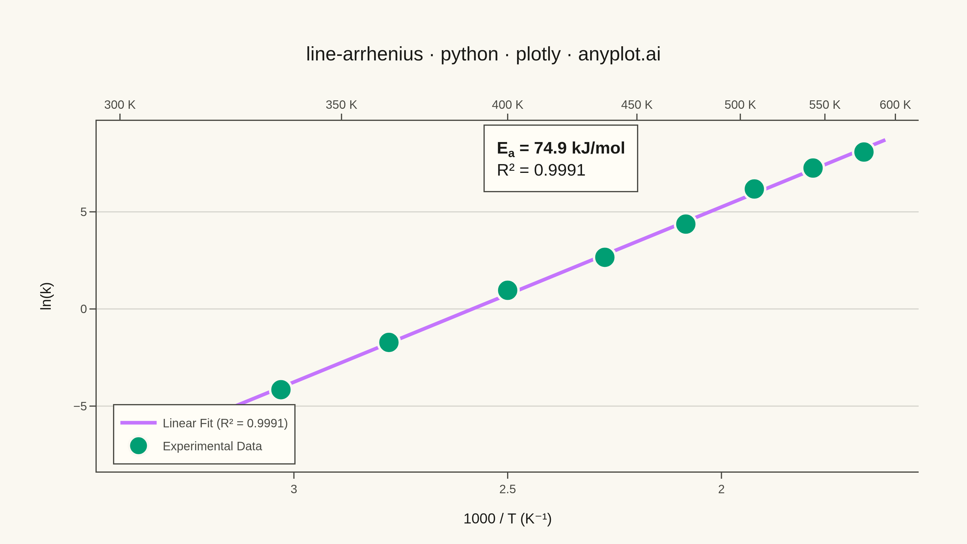
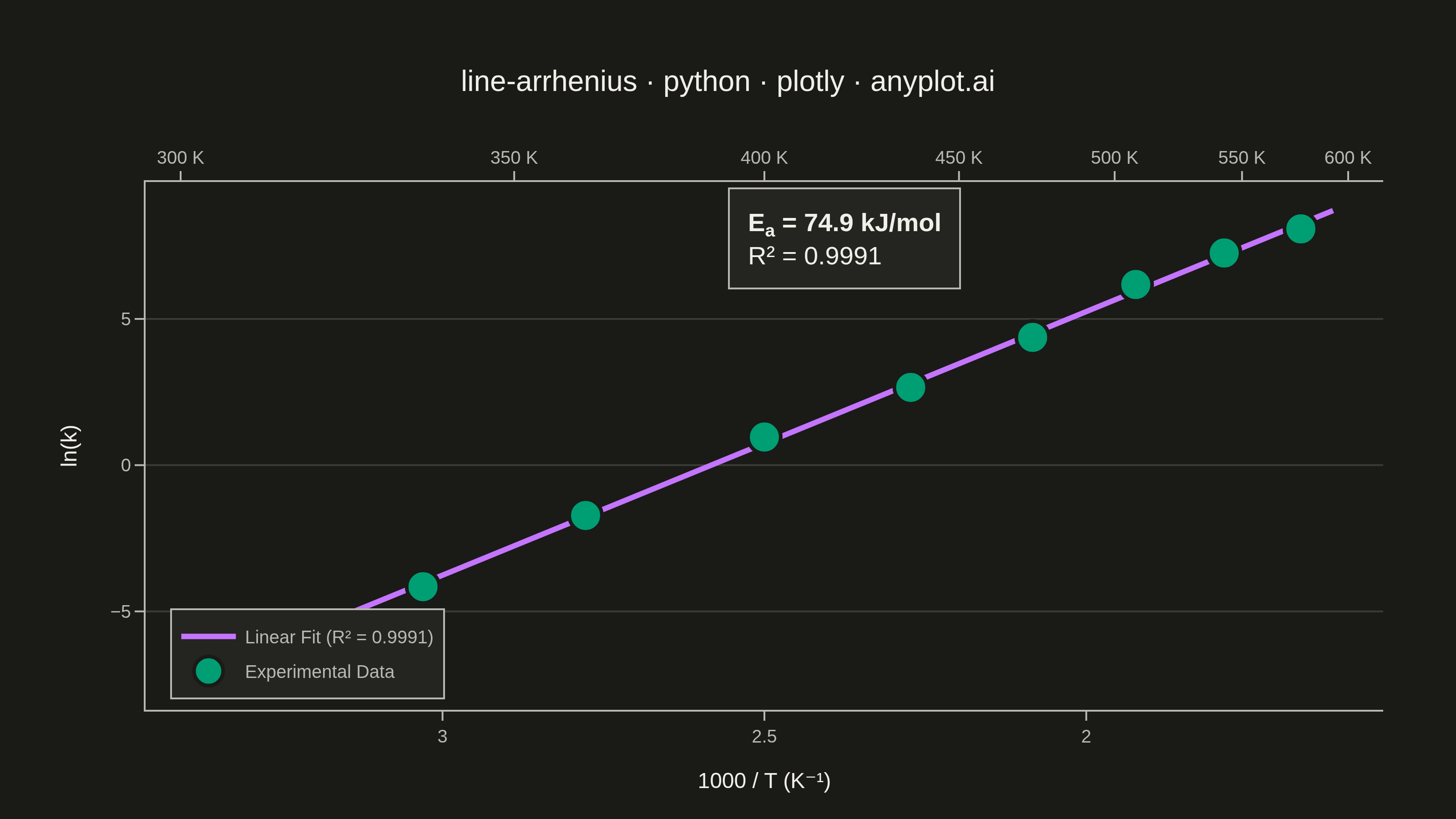
An Arrhenius plot displays ln(k) versus 1/T to determine the activation energy of a chemical reaction from experimental rate constant data. The Arrhenius equation predicts a linear relationship on this transformed scale, where the slope equals -Ea/R (activation energy divided by the gas constant). This visualization is fundamental in physical chemistry and chemical engineering for characterizing reaction kinetics and comparing catalytic performance.
""" anyplot.ai
line-arrhenius: Arrhenius Plot for Reaction Kinetics
Library: plotly 6.8.0 | Python 3.13.14
Quality: 90/100 | Updated: 2026-06-24
"""

import os

import numpy as np
import plotly.graph_objects as go


# Theme
THEME = os.getenv("ANYPLOT_THEME", "light")
PAGE_BG = "#FAF8F1" if THEME == "light" else "#1A1A17"
ELEVATED_BG = "#FFFDF6" if THEME == "light" else "#242420"
INK = "#1A1A17" if THEME == "light" else "#F0EFE8"
INK_SOFT = "#4A4A44" if THEME == "light" else "#B8B7B0"
GRID = "rgba(26,26,23,0.15)" if THEME == "light" else "rgba(240,239,232,0.15)"

# Imprint palette
BRAND = "#009E73"  # position 1 — data markers
LINE_COLOR = "#C475FD"  # position 2 — regression line

# Data — first-order decomposition reaction rate constants at various temperatures
temperature_K = np.array([300, 330, 360, 400, 440, 480, 520, 560, 600])
activation_energy = 75000  # J/mol (75 kJ/mol)
R_gas = 8.314  # J/(mol·K)
pre_exponential = 1.2e10  # s⁻¹

np.random.seed(42)
rate_constant_k = pre_exponential * np.exp(-activation_energy / (R_gas * temperature_K))
rate_constant_k *= np.exp(np.random.normal(0, 0.20, len(temperature_K)))

# Arrhenius transform (use 1000/T for cleaner axis values)
inv_T = 1000 / temperature_K
ln_k = np.log(rate_constant_k)

# Linear regression
coeffs = np.polyfit(inv_T, ln_k, 1)
slope, intercept = coeffs[0], coeffs[1]
ln_k_pred = slope * inv_T + intercept
ss_res = np.sum((ln_k - ln_k_pred) ** 2)
ss_tot = np.sum((ln_k - np.mean(ln_k)) ** 2)
r_squared = 1 - ss_res / ss_tot
Ea_extracted = -slope * R_gas * 1000  # factor of 1000 from using 1000/T

# Fit line for display
inv_T_fit = np.linspace(inv_T.min() - 0.05, inv_T.max() + 0.05, 200)
ln_k_fit = slope * inv_T_fit + intercept

# Secondary x-axis tick values — temperature in K
temp_ticks = np.array([300, 350, 400, 450, 500, 550, 600])
inv_T_ticks = 1000 / temp_ticks
x_range_reversed = [inv_T_fit.max(), inv_T_fit.min()]

# Plot
fig = go.Figure()

# Regression line (behind markers)
fig.add_trace(
    go.Scatter(
        x=inv_T_fit,
        y=ln_k_fit,
        mode="lines",
        name=f"Linear Fit (R² = {r_squared:.4f})",
        line={"color": LINE_COLOR, "width": 3},
        hovertemplate="1000/T: %{x:.3f} K⁻¹<br>ln(k): %{y:.2f}<extra></extra>",
    )
)

# Experimental data points
fig.add_trace(
    go.Scatter(
        x=inv_T,
        y=ln_k,
        mode="markers",
        name="Experimental Data",
        marker={"size": 18, "color": BRAND, "line": {"color": PAGE_BG, "width": 2}, "symbol": "circle"},
        hovertemplate=(
            "<b>T = %{customdata[0]:.0f} K</b><br>"
            "1000/T: %{x:.3f} K⁻¹<br>"
            "ln(k): %{y:.2f}<br>"
            "k: %{customdata[1]:.2e} s⁻¹<extra></extra>"
        ),
        customdata=np.column_stack([temperature_K, rate_constant_k]),
    )
)

# Invisible trace to activate secondary x-axis (required Plotly workaround)
fig.add_trace(
    go.Scatter(
        x=inv_T,
        y=ln_k,
        mode="markers",
        marker={"size": 0.01, "opacity": 0},
        showlegend=False,
        xaxis="x2",
        hoverinfo="skip",
    )
)

# Activation energy annotation
fig.add_annotation(
    x=inv_T.mean(),
    y=ln_k.max() - 0.3,
    text=f"<b>E<sub>a</sub> = {Ea_extracted / 1000:.1f} kJ/mol</b><br>R² = {r_squared:.4f}",
    showarrow=False,
    font={"size": 14, "color": INK},
    bgcolor=ELEVATED_BG,
    bordercolor=INK_SOFT,
    borderwidth=1,
    borderpad=10,
    align="left",
)

# Layout
title = "line-arrhenius · python · plotly · anyplot.ai"
fig.update_layout(
    autosize=False,
    paper_bgcolor=PAGE_BG,
    plot_bgcolor=PAGE_BG,
    font={"color": INK},
    title={"text": title, "font": {"size": 16, "color": INK}, "x": 0.5, "xanchor": "center"},
    xaxis={
        "title": {"text": "1000 / T (K⁻¹)", "font": {"size": 12, "color": INK}},
        "tickfont": {"size": 10, "color": INK_SOFT},
        "showgrid": False,
        "zeroline": False,
        "linecolor": INK_SOFT,
        "linewidth": 1,
        "ticks": "outside",
        "tickcolor": INK_SOFT,
        "autorange": "reversed",
    },
    xaxis2={
        "tickfont": {"size": 10, "color": INK_SOFT},
        "tickvals": inv_T_ticks.tolist(),
        "ticktext": [f"{t:.0f} K" for t in temp_ticks],
        "overlaying": "x",
        "side": "top",
        "showgrid": False,
        "zeroline": False,
        "linecolor": INK_SOFT,
        "linewidth": 1,
        "ticks": "outside",
        "tickcolor": INK_SOFT,
        "range": x_range_reversed,
    },
    yaxis={
        "title": {"text": "ln(k)", "font": {"size": 12, "color": INK}},
        "tickfont": {"size": 10, "color": INK_SOFT},
        "gridcolor": GRID,
        "gridwidth": 1,
        "zeroline": False,
        "linecolor": INK_SOFT,
        "linewidth": 1,
        "ticks": "outside",
        "tickcolor": INK_SOFT,
    },
    legend={
        "font": {"size": 10, "color": INK_SOFT},
        "x": 0.02,
        "y": 0.02,
        "xanchor": "left",
        "yanchor": "bottom",
        "bgcolor": ELEVATED_BG,
        "bordercolor": INK_SOFT,
        "borderwidth": 1,
    },
    margin={"l": 80, "r": 40, "t": 100, "b": 60},
)

# Save
fig.write_image(f"plot-{THEME}.png", width=800, height=450, scale=4)
fig.write_html(f"plot-{THEME}.html", include_plotlyjs="cdn")
Runnable source as JSON, for any HTTP client: https://api.anyplot.ai/specs/line-arrhenius/plotly/code. Any spec id and library id listed in llms-full.txt fit the same URL shape; every URL below is complete and callable.
{
  "spec_id": "line-arrhenius",
  "language": "python",
  "library": "plotly",
  "page": "https://anyplot.ai/line-arrhenius/python/plotly",
  "hub": "https://anyplot.ai/line-arrhenius",
  "code_json": "https://api.anyplot.ai/specs/line-arrhenius/plotly/code",
  "spec_json": "https://api.anyplot.ai/specs/line-arrhenius",
  "render_light_png": "https://storage.googleapis.com/anyplot-images/plots/line-arrhenius/python/plotly/plot-light.png",
  "render_dark_png": "https://storage.googleapis.com/anyplot-images/plots/line-arrhenius/python/plotly/plot-dark.png",
  "interactive_light_html": "https://storage.googleapis.com/anyplot-images/plots/line-arrhenius/python/plotly/plot-light.html",
  "interactive_dark_html": "https://storage.googleapis.com/anyplot-images/plots/line-arrhenius/python/plotly/plot-dark.html",
  "quality_score": 90.0,
  "license": "MIT",
  "guide": "https://anyplot.ai/llms.txt"
}
Part of Arrhenius Plot for Reaction Kinetics on anyplot.ai.