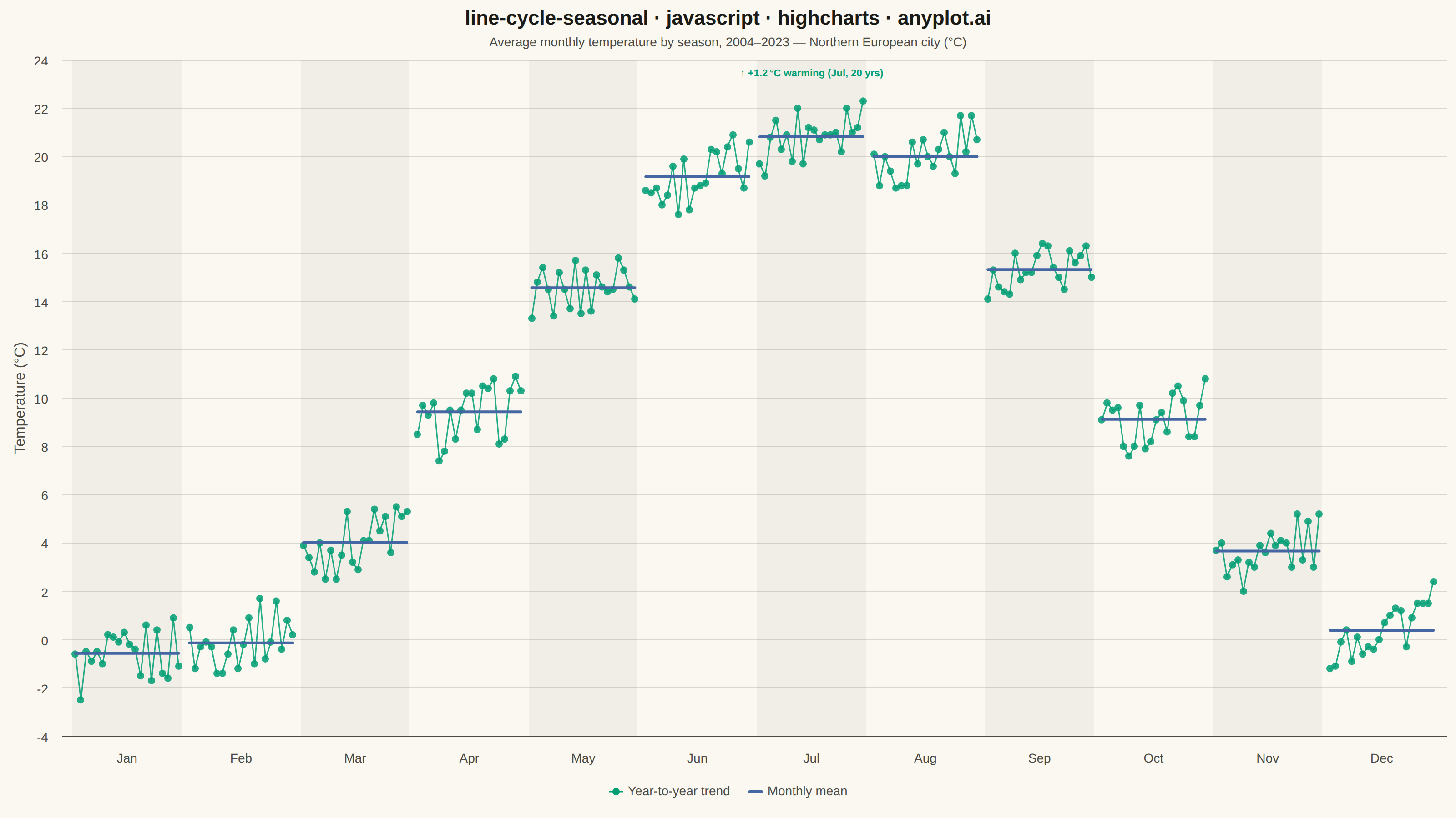
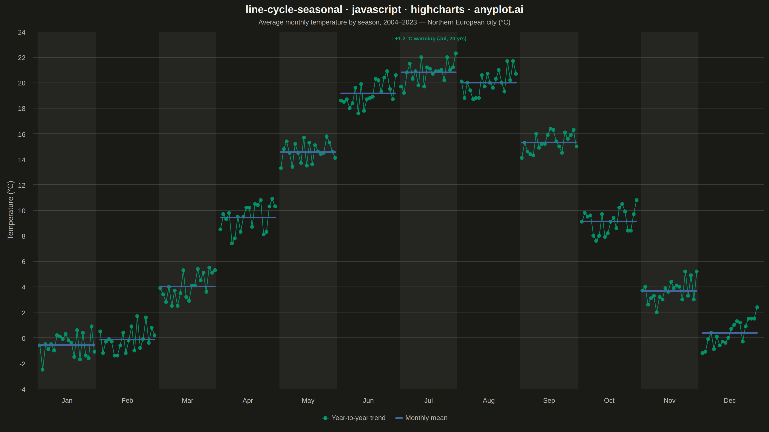
A cycle plot, also known as a seasonal subseries plot (introduced by William Cleveland), separates the seasonal pattern of a time series from the trend within each season. The series is split by seasonal period (e.g. one group per month or weekday); within each group the values are drawn in chronological order as a small line, and a horizontal reference line marks that group's mean. Comparing the mean lines across groups reveals the seasonal effect, while the slope of each subseries reveals the trend within that season — two patterns that are entangled in a standard time series plot.
// anyplot.ai
// line-cycle-seasonal: Cycle Plot (Seasonal Subseries)
// Library: highcharts 12.6.0 | JavaScript 22.22.3
// Quality: 90/100 | Created: 2026-06-15

//# anyplot-orientation: landscape
const t = window.ANYPLOT_TOKENS;

// --- Data (deterministic) ---
const MONTHS = ['Jan', 'Feb', 'Mar', 'Apr', 'May', 'Jun', 'Jul', 'Aug', 'Sep', 'Oct', 'Nov', 'Dec'];
const N_YEARS = 20;
const START_YEAR = 2004;

// Base monthly mean temperatures (°C) for a temperate Northern European city
const BASE_TEMPS = [-1.5, -0.5, 3.5, 8.5, 14.0, 18.5, 20.5, 19.5, 14.5, 8.5, 3.0, 0.0];
const WARMING_RATE = 0.065; // °C per year warming trend

// Deterministic pseudo-noise via sin-based hash (±1.4 °C amplitude)
function fakeNoise(seed) {
    const x = Math.sin(seed * 127.1 + 311.7) * 43758.5453;
    return (x - Math.floor(x) - 0.5) * 2.8;
}

// temps[m][y] = temperature for month m, year y offset from START_YEAR
const temps = BASE_TEMPS.map((base, m) =>
    Array.from({ length: N_YEARS }, (_, y) =>
        parseFloat((base + WARMING_RATE * y + fakeNoise(m * 23 + y)).toFixed(1))
    )
);

// Monthly means across all years
const means = temps.map(ys =>
    parseFloat((ys.reduce((a, b) => a + b, 0) / ys.length).toFixed(2))
);

// --- Layout constants ---
const GAP = 1;                  // gap units between month groups on x-axis
const GROUP_W = N_YEARS + GAP;  // 21 x-units per month group

// --- Colors ---
const TREND_COLOR = t.palette[0]; // #009E73 — brand green, first categorical series
const MEAN_COLOR  = t.palette[2]; // #4467A3 — blue for mean reference lines

// Theme-adaptive band color for alternating group separators
const BAND_COLOR = window.ANYPLOT_THEME === 'dark'
    ? 'rgba(255,255,255,0.05)'
    : 'rgba(0,0,0,0.04)';

// --- Series ---
// 12 subseries: one connected trend line per month, plotted chronologically
const trendSeries = MONTHS.map((name, m) => ({
    type: 'line',
    name: 'Year-to-year trend',
    color: TREND_COLOR,
    lineWidth: 1.5,
    opacity: 0.85,
    marker: { radius: 4, symbol: 'circle', enabled: true },
    data: temps[m].map((val, y) => ({ x: m * GROUP_W + y, y: val })),
    showInLegend: m === 0,
    zIndex: 1,
}));

// 12 horizontal mean reference lines: one per month, spanning the group's x-range
const meanSeries = MONTHS.map((name, m) => ({
    type: 'line',
    name: 'Monthly mean',
    color: MEAN_COLOR,
    lineWidth: 3,
    marker: { enabled: false },
    data: [
        { x: m * GROUP_W,               y: means[m] },
        { x: m * GROUP_W + N_YEARS - 1, y: means[m] },
    ],
    showInLegend: m === 0,
    enableMouseTracking: false,
    zIndex: 2,
}));

// x-axis tick positions at the midpoint of each month group
const tickPositions = MONTHS.map((_, m) => m * GROUP_W + (N_YEARS - 1) / 2);

// Alternating background bands to visually separate month groups
const plotBands = MONTHS.map((_, m) => ({
    from:  m * GROUP_W - 0.5,
    to:    m * GROUP_W + N_YEARS - 0.5,
    color: m % 2 === 0 ? BAND_COLOR : 'transparent',
}));

// Total warming to annotate
const totalWarming = (WARMING_RATE * (N_YEARS - 1)).toFixed(1);

// --- Chart ---
const chart = Highcharts.chart('container', {
    chart: {
        type: 'line',
        backgroundColor: 'transparent',
        animation: false,
        style: { fontFamily: 'inherit' },
    },
    credits: { enabled: false },
    colors: t.palette,

    title: {
        text: 'line-cycle-seasonal · javascript · highcharts · anyplot.ai',
        style: { color: t.ink, fontSize: '22px', fontWeight: '600' },
    },
    subtitle: {
        text: 'Average monthly temperature by season, ' + START_YEAR + '–' + (START_YEAR + N_YEARS - 1) + ' — Northern European city (°C)',
        style: { color: t.inkSoft, fontSize: '14px' },
    },

    xAxis: {
        tickPositions,
        labels: {
            formatter: function () {
                const m = Math.round(this.value / GROUP_W);
                return MONTHS[Math.min(m, 11)];
            },
            style: { color: t.inkSoft, fontSize: '14px' },
        },
        lineColor: t.inkSoft,
        tickColor: 'transparent',
        gridLineColor: 'transparent',
        plotBands,
    },

    yAxis: {
        title: {
            text: 'Temperature (°C)',
            style: { color: t.inkSoft, fontSize: '16px' },
        },
        gridLineColor: t.grid,
        labels: { style: { color: t.inkSoft, fontSize: '14px' } },
        lineColor: t.inkSoft,
        tickColor: t.inkSoft,
    },

    legend: {
        enabled: true,
        itemStyle: { color: t.inkSoft, fontSize: '14px' },
        itemHoverStyle: { color: t.ink },
    },

    tooltip: { enabled: false },

    plotOptions: {
        series: { animation: false },
        line: { connectNulls: false },
    },

    series: [...trendSeries, ...meanSeries],
});

// Annotation: callout on July group (hottest month) highlighting the warming trend
const JUL = 6; // July index (0-based)
const annDataX = JUL * GROUP_W + (N_YEARS - 1) / 2; // midpoint of July group
const annPx  = chart.xAxis[0].toPixels(annDataX, false);
const annPy  = chart.plotTop + 18; // near the top of the plot area

chart.renderer.text(
    `↑ +${totalWarming} °C warming (Jul, 20 yrs)`,
    annPx,
    annPy
).css({
    color: TREND_COLOR,
    fontSize: '11px',
    fontWeight: '700',
}).attr({
    align: 'center',
    zIndex: 6,
}).add();
Runnable source as JSON, for any HTTP client: https://api.anyplot.ai/specs/line-cycle-seasonal/highcharts/code. Any spec id and library id listed in llms-full.txt fit the same URL shape; every URL below is complete and callable.
{
  "spec_id": "line-cycle-seasonal",
  "language": "javascript",
  "library": "highcharts",
  "page": "https://anyplot.ai/line-cycle-seasonal/javascript/highcharts",
  "hub": "https://anyplot.ai/line-cycle-seasonal",
  "code_json": "https://api.anyplot.ai/specs/line-cycle-seasonal/highcharts/code",
  "spec_json": "https://api.anyplot.ai/specs/line-cycle-seasonal",
  "render_light_png": "https://storage.googleapis.com/anyplot-images/plots/line-cycle-seasonal/javascript/highcharts/plot-light.png",
  "render_dark_png": "https://storage.googleapis.com/anyplot-images/plots/line-cycle-seasonal/javascript/highcharts/plot-dark.png",
  "interactive_light_html": "https://storage.googleapis.com/anyplot-images/plots/line-cycle-seasonal/javascript/highcharts/plot-light.html",
  "interactive_dark_html": "https://storage.googleapis.com/anyplot-images/plots/line-cycle-seasonal/javascript/highcharts/plot-dark.html",
  "quality_score": 90.0,
  "license": "MIT",
  "guide": "https://anyplot.ai/llms.txt"
}
Part of Cycle Plot (Seasonal Subseries) on anyplot.ai.