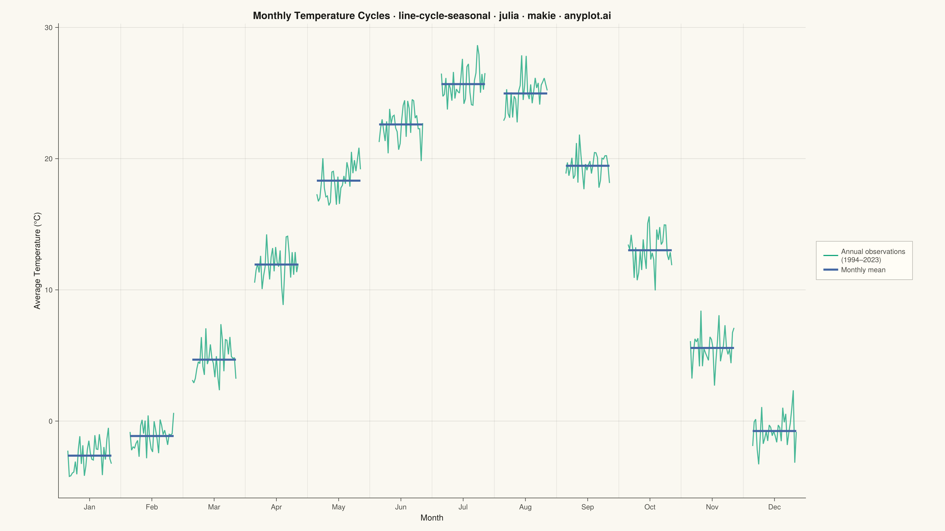
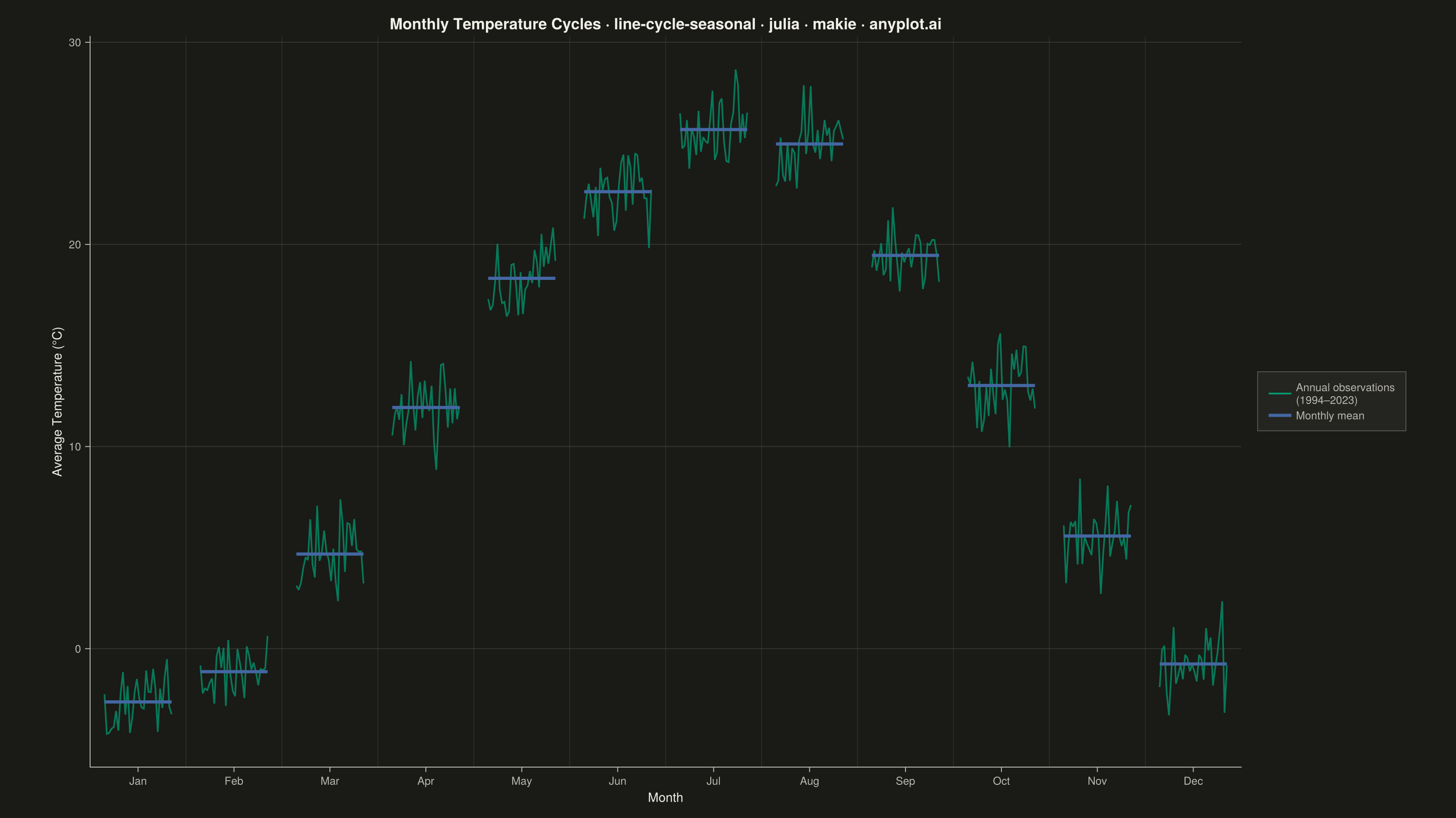
A cycle plot, also known as a seasonal subseries plot (introduced by William Cleveland), separates the seasonal pattern of a time series from the trend within each season. The series is split by seasonal period (e.g. one group per month or weekday); within each group the values are drawn in chronological order as a small line, and a horizontal reference line marks that group's mean. Comparing the mean lines across groups reveals the seasonal effect, while the slope of each subseries reveals the trend within that season — two patterns that are entangled in a standard time series plot.
# anyplot.ai
# line-cycle-seasonal: Cycle Plot (Seasonal Subseries)
# Library: makie 0.22.10 | Julia 1.11.9
# Quality: 87/100 | Created: 2026-06-15

using CairoMakie
using Colors
using Random
using Statistics

Random.seed!(42)

# Theme tokens
const THEME       = get(ENV, "ANYPLOT_THEME", "light")
const PAGE_BG     = THEME == "light" ? colorant"#FAF8F1" : colorant"#1A1A17"
const ELEVATED_BG = THEME == "light" ? colorant"#FFFDF6" : colorant"#242420"
const INK         = THEME == "light" ? colorant"#1A1A17" : colorant"#F0EFE8"
const INK_SOFT    = THEME == "light" ? colorant"#4A4A44" : colorant"#B8B7B0"
const INK_MUTED   = THEME == "light" ? colorant"#6B6A63" : colorant"#A8A79F"
const IMPRINT_PALETTE = [
    colorant"#009E73",
    colorant"#C475FD",
    colorant"#4467A3",
    colorant"#BD8233",
    colorant"#AE3030",
    colorant"#2ABCCD",
    colorant"#954477",
    colorant"#99B314",
]

# Data: Monthly average temperature (°C), mid-latitude city, 1994–2023
const N_YEARS      = 30
const N_MONTHS     = 12
const MONTH_NAMES  = ["Jan", "Feb", "Mar", "Apr", "May", "Jun",
                      "Jul", "Aug", "Sep", "Oct", "Nov", "Dec"]
const BASE_TEMPS   = [-3.2, -1.8, 4.5, 11.2, 17.8, 22.5, 25.1, 24.3, 18.6, 12.1, 4.8, -1.5]
const WARMING_RATE = 0.04  # °C per year

temps = [BASE_TEMPS[mi] + WARMING_RATE * (yi - 1) + randn() * 1.2
         for yi in 1:N_YEARS, mi in 1:N_MONTHS]

# Title with length-scaled fontsize
const TITLE      = "Monthly Temperature Cycles · line-cycle-seasonal · julia · makie · anyplot.ai"
const TITLE_LEN  = length(TITLE)
const TITLE_SIZE = round(Int, 20 * (TITLE_LEN > 67 ? 67 / TITLE_LEN : 1.0))

# Figure
fig = Figure(
    size            = (1600, 900),
    fontsize        = 14,
    backgroundcolor = PAGE_BG,
)

ax = Axis(
    fig[1, 1];
    title              = TITLE,
    titlesize          = TITLE_SIZE,
    titlecolor         = INK,
    xlabel             = "Month",
    ylabel             = "Average Temperature (°C)",
    xlabelsize         = 14,
    ylabelsize         = 14,
    xlabelcolor        = INK,
    ylabelcolor        = INK,
    xticklabelsize     = 12,
    yticklabelsize     = 12,
    xticklabelcolor    = INK_SOFT,
    yticklabelcolor    = INK_SOFT,
    xtickcolor         = INK_SOFT,
    ytickcolor         = INK_SOFT,
    backgroundcolor    = PAGE_BG,
    topspinevisible    = false,
    rightspinevisible  = false,
    leftspinecolor     = INK_SOFT,
    bottomspinecolor   = INK_SOFT,
    xgridvisible       = false,
    ygridcolor         = RGBAf(INK.r, INK.g, INK.b, 0.12),
    xticks             = (collect(1:N_MONTHS), MONTH_NAMES),
    xminorgridvisible  = false,
    yminorgridvisible  = false,
)

xlims!(ax, 0.5, 12.5)

# Seasonal groups: each month centered at its integer position ±GROUP_HALF
# Wider than original (0.42 vs 0.35) to reduce within-group line density
const GROUP_HALF    = 0.42
const SUBSERIES_COL = IMPRINT_PALETTE[1]  # #009E73 – brand green (annual subseries)
const MEAN_COL      = IMPRINT_PALETTE[3]  # #4467A3 – blue (monthly mean reference)

monthly_means = Float64[]

for mi in 1:N_MONTHS
    center     = float(mi)
    x_range    = range(center - GROUP_HALF, center + GROUP_HALF; length = N_YEARS)
    y_vals     = temps[:, mi]
    group_mean = mean(y_vals)
    push!(monthly_means, group_mean)

    # Chronological subseries line within this month group
    lines!(ax, collect(x_range), y_vals;
           color     = (SUBSERIES_COL, 0.72),
           linewidth = 1.4)

    # Horizontal mean reference line — the key seasonal comparison element
    lines!(ax, [center - GROUP_HALF, center + GROUP_HALF], [group_mean, group_mean];
           color     = MEAN_COL,
           linewidth = 3.5)

    # Subtle vertical divider between month groups
    if mi < N_MONTHS
        vlines!(ax, center + 0.5;
                color     = RGBAf(INK.r, INK.g, INK.b, 0.10),
                linewidth = 0.8)
    end
end

# Seasonal arc: dashed curve connecting monthly means — highlights the annual cycle shape
arc_color = RGBAf(INK.r, INK.g, INK.b, 0.45)
lines!(ax, collect(1.0:N_MONTHS), monthly_means;
       color     = arc_color,
       linewidth = 1.5,
       linestyle = :dash)

# Legend
elem_sub  = LineElement(color = SUBSERIES_COL, linewidth = 1.4)
elem_mean = LineElement(color = MEAN_COL,       linewidth = 3.5)
elem_arc  = LineElement(color = arc_color,      linewidth = 1.5, linestyle = :dash)
Legend(
    fig[1, 2],
    [elem_sub, elem_mean, elem_arc],
    ["Annual observations\n(1994–2023)", "Monthly mean", "Seasonal arc"];
    framecolor      = RGBAf(INK_SOFT.r, INK_SOFT.g, INK_SOFT.b, 0.35f0),
    backgroundcolor = ELEVATED_BG,
    labelcolor      = INK_SOFT,
    labelsize       = 12,
    patchsize       = (25, 14),
    padding         = (12, 12, 10, 10),
)

colsize!(fig.layout, 1, Relative(0.84))

# Warming trend annotation — makes the within-group slope insight explicit
Label(fig[2, 1:2];
      text    = "↑ Upward slope within each seasonal group reveals +0.04 °C yr⁻¹ warming signal (1994–2023)",
      fontsize = 11,
      color    = INK_MUTED,
      tellwidth = false,
      halign   = :left,
      padding  = (4, 0, 2, 4))

rowgap!(fig.layout, 1, 4)

save("plot-$(THEME).png", fig; px_per_unit = 2)
Runnable source as JSON, for any HTTP client: https://api.anyplot.ai/specs/line-cycle-seasonal/makie/code. Any spec id and library id listed in llms-full.txt fit the same URL shape; every URL below is complete and callable.
{
  "spec_id": "line-cycle-seasonal",
  "language": "julia",
  "library": "makie",
  "page": "https://anyplot.ai/line-cycle-seasonal/julia/makie",
  "hub": "https://anyplot.ai/line-cycle-seasonal",
  "code_json": "https://api.anyplot.ai/specs/line-cycle-seasonal/makie/code",
  "spec_json": "https://api.anyplot.ai/specs/line-cycle-seasonal",
  "render_light_png": "https://storage.googleapis.com/anyplot-images/plots/line-cycle-seasonal/julia/makie/plot-light.png",
  "render_dark_png": "https://storage.googleapis.com/anyplot-images/plots/line-cycle-seasonal/julia/makie/plot-dark.png",
  "quality_score": 87.0,
  "license": "MIT",
  "guide": "https://anyplot.ai/llms.txt"
}
Part of Cycle Plot (Seasonal Subseries) on anyplot.ai.