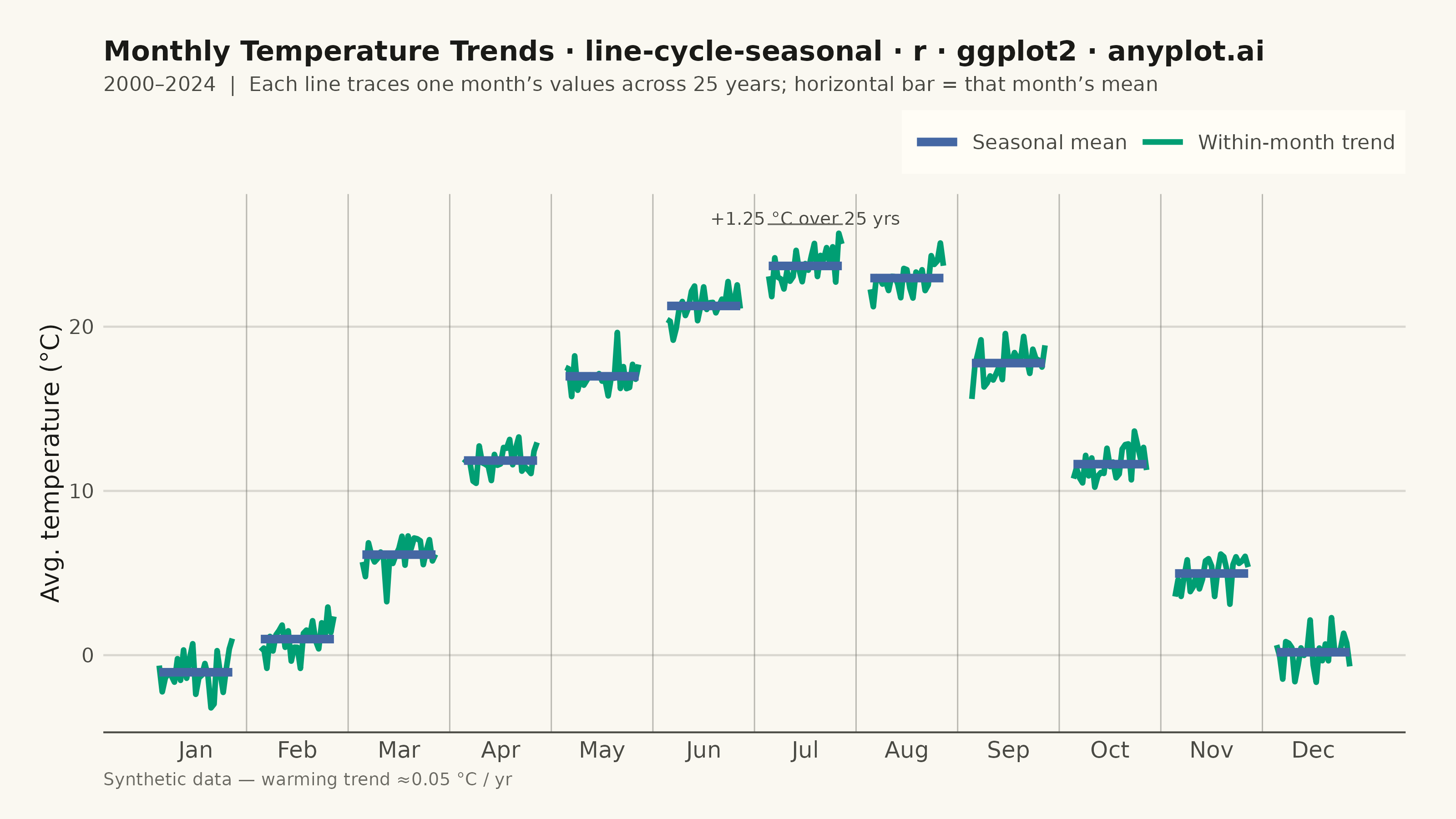
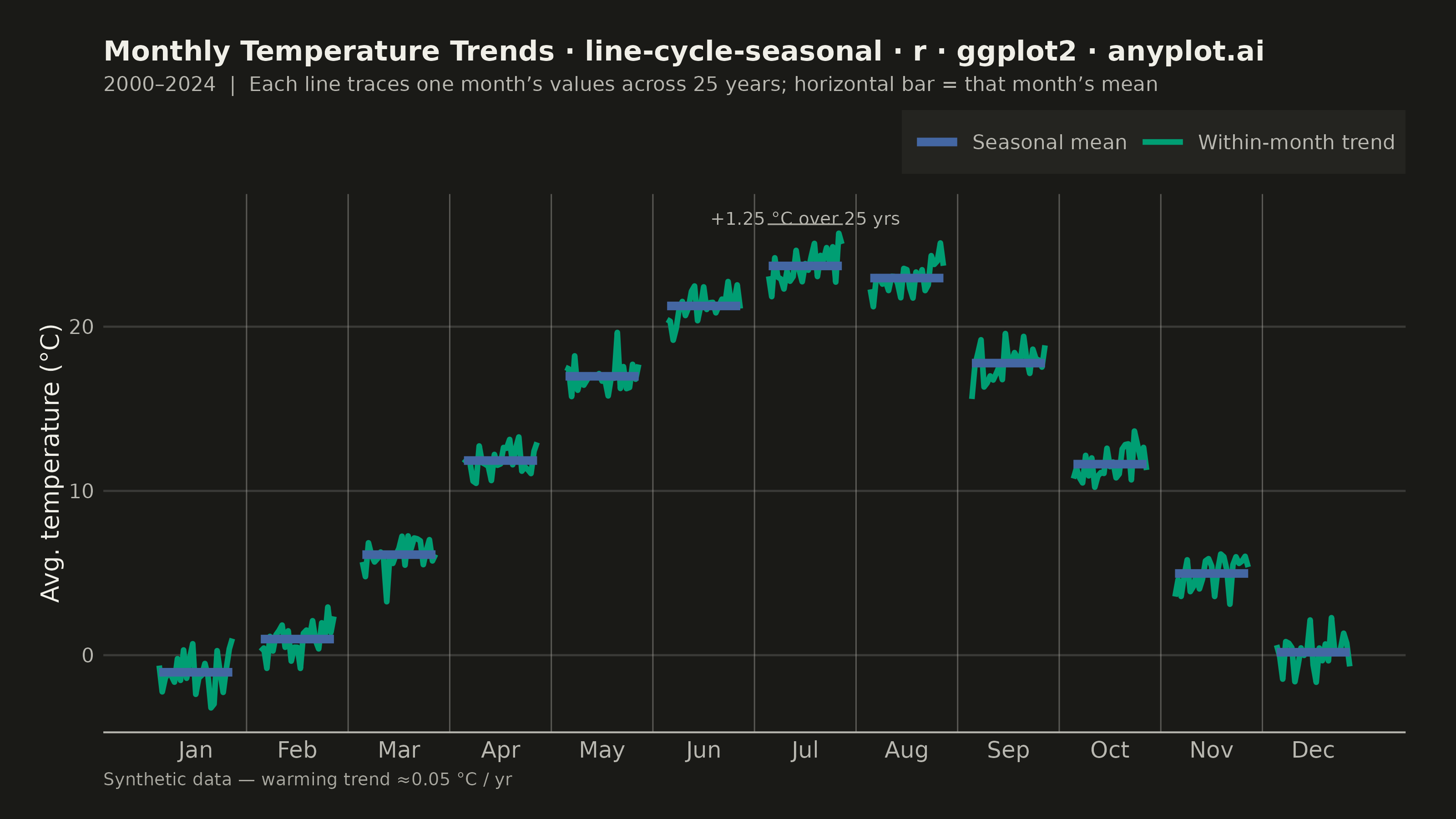
A cycle plot, also known as a seasonal subseries plot (introduced by William Cleveland), separates the seasonal pattern of a time series from the trend within each season. The series is split by seasonal period (e.g. one group per month or weekday); within each group the values are drawn in chronological order as a small line, and a horizontal reference line marks that group's mean. Comparing the mean lines across groups reveals the seasonal effect, while the slope of each subseries reveals the trend within that season — two patterns that are entangled in a standard time series plot.
#' anyplot.ai
#' line-cycle-seasonal: Cycle Plot (Seasonal Subseries)
#' Library: ggplot2 3.5.1 | R 4.4.1
#' Quality: 88/100 | Created: 2026-06-15

library(ggplot2)
library(dplyr)
library(ragg)

set.seed(42)

# Theme tokens
THEME       <- Sys.getenv("ANYPLOT_THEME", "light")
PAGE_BG     <- if (THEME == "light") "#FAF8F1" else "#1A1A17"
ELEVATED_BG <- if (THEME == "light") "#FFFDF6" else "#242420"
INK         <- if (THEME == "light") "#1A1A17" else "#F0EFE8"
INK_SOFT    <- if (THEME == "light") "#4A4A44" else "#B8B7B0"
INK_MUTED   <- if (THEME == "light") "#6B6A63" else "#A8A79F"
RULE_COLOR  <- if (THEME == "light") "#1A1A1726" else "#F0EFE826"

IMPRINT_PALETTE <- c(
  "#009E73",  # 1 brand green — first series
  "#C475FD",  # 2 lavender
  "#4467A3",  # 3 blue
  "#BD8233",  # 4 ochre
  "#AE3030",  # 5 matte red
  "#2ABCCD",  # 6 cyan
  "#954477",  # 7 rose
  "#99B314"   # 8 lime
)

# Data: synthetic monthly average temperature (degC) 2000-2024
# Scenario: temperate Northern Hemisphere city showing annual cycle + warming trend
n_years      <- 25
start_year   <- 2000
years        <- start_year:(start_year + n_years - 1)
month_nums   <- 1:12
month_labels <- c("Jan", "Feb", "Mar", "Apr", "May", "Jun",
                  "Jul", "Aug", "Sep", "Oct", "Nov", "Dec")

# Seasonal baseline (degC per month)
seasonal_base <- c(-1.8, 0.6, 5.4, 11.2, 16.5, 20.8, 23.1, 22.4, 17.3, 10.9, 4.5, -0.5)

# Build observations: expand.grid cycles year fastest within each month
raw_df <- expand.grid(year = years, month = month_nums)
noise  <- rnorm(nrow(raw_df), 0, 0.85)

df <- raw_df |>
  mutate(
    year_idx = year - start_year,                              # 0 to 24
    temp     = seasonal_base[month] + year_idx * 0.05 + noise,
    # Horizontal position: month integer + year offset in [-0.36, +0.36]
    x_pos    = month + (year_idx / (n_years - 1) - 0.5) * 0.72
  )

# Seasonal group means for horizontal reference bars
group_means <- df |>
  group_by(month) |>
  summarise(mean_temp = mean(temp), .groups = "drop")

HALF_W <- 0.36  # half-width of each mean segment (matches x_pos spread)

# Scale title font size proportionally when title > 67 chars
plot_title <- paste0(
  "Monthly Temperature Trends · line-cycle-seasonal · ",
  "r · ggplot2 · anyplot.ai"
)
title_size <- max(8L, round(12L * 67L / nchar(plot_title)))

p <- ggplot() +
  # Subtle vertical dividers between month groups
  geom_vline(
    xintercept = seq(1.5, 11.5, by = 1),
    color      = INK_MUTED,
    linewidth  = 0.25,
    alpha      = 0.45
  ) +
  # Within-month chronological trend lines (Imprint green — first series)
  geom_line(
    data      = df,
    aes(x = x_pos, y = temp, group = month, color = "Within-month trend"),
    linewidth = 1.05
  ) +
  # Seasonal mean reference segments (Imprint blue — third series)
  geom_segment(
    data = group_means,
    aes(
      x    = month - HALF_W,
      xend = month + HALF_W,
      y    = mean_temp,
      yend = mean_temp,
      color = "Seasonal mean"
    ),
    linewidth = 1.6
  ) +
  # Annotate warming trend on July (month 7) — warmest month, most visible slope
  annotate(
    "text",
    x     = 7,
    y     = max(df$temp[df$month == 7]) + 0.9,
    label = "+1.25 °C over 25 yrs",
    color = INK_SOFT,
    size  = 2.5,
    hjust = 0.5
  ) +
  annotate(
    "segment",
    x     = 6.63,
    xend  = 7.37,
    y     = max(df$temp[df$month == 7]) + 0.55,
    yend  = max(df$temp[df$month == 7]) + 0.55,
    color = INK_MUTED,
    linewidth = 0.3
  ) +
  scale_x_continuous(
    breaks = month_nums,
    labels = month_labels,
    expand = expansion(add = 0.55)
  ) +
  scale_color_manual(
    values = c(
      "Within-month trend" = IMPRINT_PALETTE[1],  # #009E73 brand green
      "Seasonal mean"      = IMPRINT_PALETTE[3]   # #4467A3 blue
    ),
    name = NULL
  ) +
  labs(
    x        = NULL,
    y        = "Avg. temperature (°C)",
    title    = plot_title,
    subtitle = paste0(
      "2000–2024  |  Each line traces one month’s values across 25 years; ",
      "horizontal bar = that month’s mean"
    ),
    caption  = "Synthetic data — warming trend ≈0.05 °C / yr"
  ) +
  theme_minimal(base_size = 8) +
  theme(
    plot.background    = element_rect(fill = PAGE_BG,  color = PAGE_BG),
    panel.background   = element_rect(fill = PAGE_BG,  color = NA),
    panel.border       = element_blank(),
    panel.grid.major.x = element_blank(),
    panel.grid.minor   = element_blank(),
    panel.grid.major.y = element_line(color = RULE_COLOR, linewidth = 0.4),
    axis.line.x        = element_line(color = INK_SOFT, linewidth = 0.35),
    axis.ticks         = element_blank(),
    axis.title.y       = element_text(color = INK,      size = 10),
    axis.text.x        = element_text(color = INK_SOFT, size = 9),
    axis.text.y        = element_text(color = INK_SOFT, size = 8),
    plot.title         = element_text(color = INK,      size = title_size, face = "bold"),
    plot.subtitle      = element_text(color = INK_SOFT, size = 8, margin = margin(b = 6)),
    plot.caption       = element_text(color = INK_MUTED, size = 7, hjust = 0),
    legend.background  = element_rect(fill = ELEVATED_BG, color = NA),
    legend.text        = element_text(color = INK_SOFT, size = 8),
    legend.position    = "top",
    legend.justification = "right",
    legend.key.width   = unit(20, "pt"),
    plot.margin        = margin(16, 20, 12, 16, "pt")
  )

ggsave(
  filename = sprintf("plot-%s.png", THEME),
  plot     = p,
  device   = ragg::agg_png,
  width    = 8,
  height   = 4.5,
  units    = "in",
  dpi      = 400
)
Runnable source as JSON, for any HTTP client: https://api.anyplot.ai/specs/line-cycle-seasonal/ggplot2/code. Any spec id and library id listed in llms-full.txt fit the same URL shape; every URL below is complete and callable.
{
  "spec_id": "line-cycle-seasonal",
  "language": "r",
  "library": "ggplot2",
  "page": "https://anyplot.ai/line-cycle-seasonal/r/ggplot2",
  "hub": "https://anyplot.ai/line-cycle-seasonal",
  "code_json": "https://api.anyplot.ai/specs/line-cycle-seasonal/ggplot2/code",
  "spec_json": "https://api.anyplot.ai/specs/line-cycle-seasonal",
  "render_light_png": "https://storage.googleapis.com/anyplot-images/plots/line-cycle-seasonal/r/ggplot2/plot-light.png",
  "render_dark_png": "https://storage.googleapis.com/anyplot-images/plots/line-cycle-seasonal/r/ggplot2/plot-dark.png",
  "quality_score": 88.0,
  "license": "MIT",
  "guide": "https://anyplot.ai/llms.txt"
}
Part of Cycle Plot (Seasonal Subseries) on anyplot.ai.