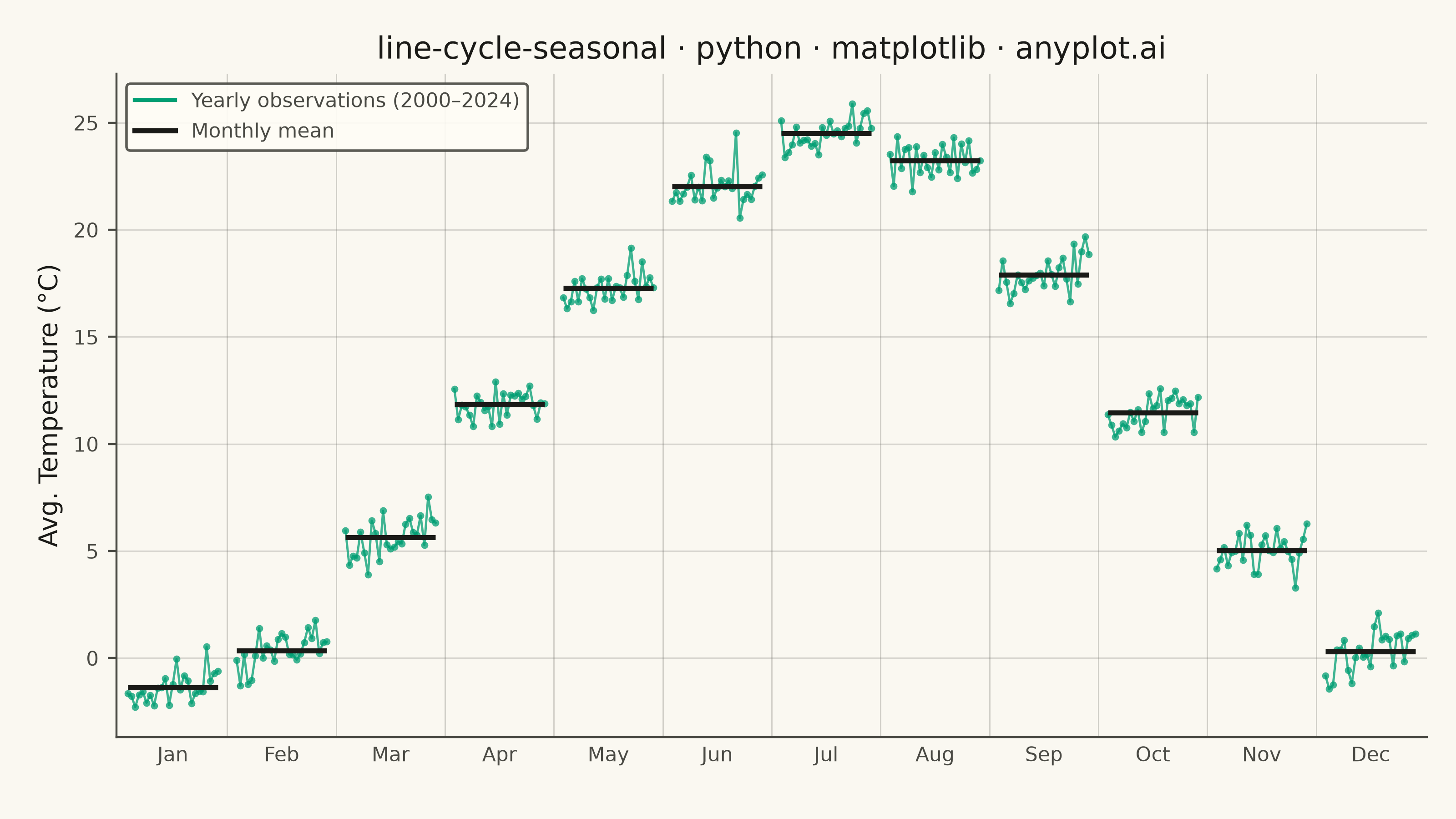
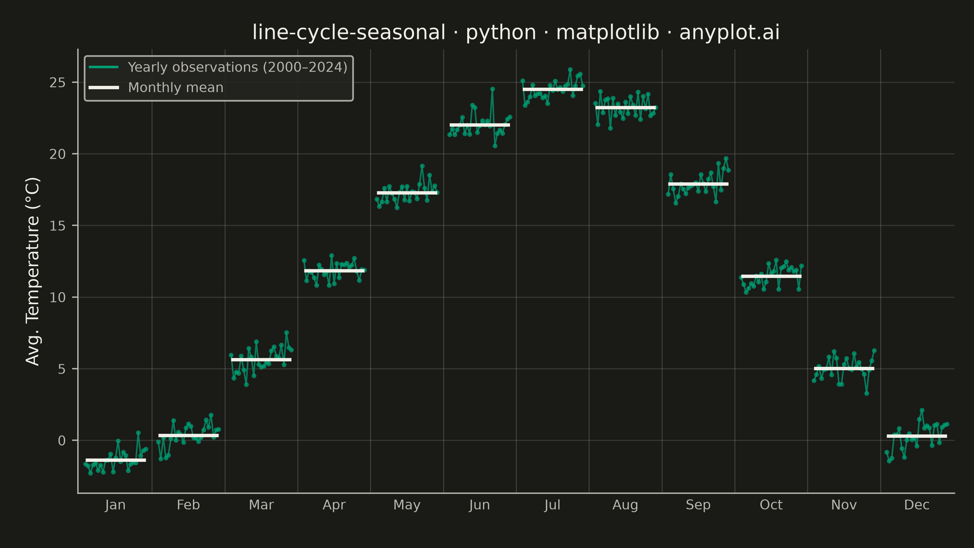
A cycle plot, also known as a seasonal subseries plot (introduced by William Cleveland), separates the seasonal pattern of a time series from the trend within each season. The series is split by seasonal period (e.g. one group per month or weekday); within each group the values are drawn in chronological order as a small line, and a horizontal reference line marks that group's mean. Comparing the mean lines across groups reveals the seasonal effect, while the slope of each subseries reveals the trend within that season — two patterns that are entangled in a standard time series plot.
""" anyplot.ai
line-cycle-seasonal: Cycle Plot (Seasonal Subseries)
Library: matplotlib 3.11.0 | Python 3.13.13
Quality: 87/100 | Created: 2026-06-15
"""

import os

import matplotlib.pyplot as plt
import numpy as np
from matplotlib.lines import Line2D


# Theme tokens
THEME = os.getenv("ANYPLOT_THEME", "light")
PAGE_BG = "#FAF8F1" if THEME == "light" else "#1A1A17"
ELEVATED_BG = "#FFFDF6" if THEME == "light" else "#242420"
INK = "#1A1A17" if THEME == "light" else "#F0EFE8"
INK_SOFT = "#4A4A44" if THEME == "light" else "#B8B7B0"
INK_MUTED = "#6B6A63" if THEME == "light" else "#A8A79F"

# Imprint palette — position 1 is always the first series
BRAND = "#009E73"

# Data: average monthly temperature (°C) in a mid-latitude city, 2000–2024
np.random.seed(42)
n_years = 25
month_names = ["Jan", "Feb", "Mar", "Apr", "May", "Jun", "Jul", "Aug", "Sep", "Oct", "Nov", "Dec"]

# Seasonal baseline (Northern Hemisphere mid-latitude, °C)
base_temp = np.array([-2.0, 0.0, 5.5, 11.5, 17.0, 21.5, 24.0, 23.0, 17.5, 11.0, 4.5, -0.5])
# Warming rate per year per month (°C / year)
warming = np.array([0.05, 0.05, 0.04, 0.03, 0.03, 0.02, 0.02, 0.03, 0.03, 0.04, 0.05, 0.05])

temps = np.zeros((n_years, 12))
for y in range(n_years):
    temps[y] = base_temp + warming * y + np.random.normal(0, 0.7, 12)

# X layout: 12 month groups, each spanning group_span x-units, separated by gap_span
group_span = n_years - 1  # 24 units (25 points spaced 1 apart)
gap_span = 5

x_group_starts = np.arange(12) * (group_span + gap_span)
tick_positions = x_group_starts + group_span / 2

# Plot
fig, ax = plt.subplots(figsize=(8, 4.5), dpi=400, facecolor=PAGE_BG)
ax.set_facecolor(PAGE_BG)

for m in range(12):
    x_vals = x_group_starts[m] + np.arange(n_years)
    y_vals = temps[:, m]
    mean_y = y_vals.mean()

    # Thin subseries line with year markers (Imprint brand green)
    ax.plot(x_vals, y_vals, color=BRAND, linewidth=1.2, alpha=0.75, zorder=2)
    ax.scatter(x_vals, y_vals, color=BRAND, s=16, alpha=0.75, zorder=3, linewidths=0)

    # Horizontal mean reference line spanning the full group width
    ax.hlines(mean_y, x_group_starts[m], x_group_starts[m] + group_span, colors=INK, linewidth=2.0, zorder=4)

# Subtle vertical separators between month groups
for m in range(1, 12):
    sep_x = x_group_starts[m] - gap_span / 2
    ax.axvline(sep_x, color=INK_MUTED, linewidth=0.5, alpha=0.3)

# Warming trend annotation — Jan has the strongest signal (0.05°C/yr × 24 yr = +1.2°C)
jan_warming = warming[0] * (n_years - 1)
ax.text(
    0.97,
    0.88,
    f"+{jan_warming:.1f}°C Jan trend\n2000 → 2024",
    fontsize=7,
    color=INK_SOFT,
    ha="right",
    va="top",
    style="italic",
    transform=ax.transAxes,
    bbox={"facecolor": ELEVATED_BG, "edgecolor": INK_MUTED, "alpha": 0.85, "pad": 3, "boxstyle": "round,pad=0.3"},
)

# Axes
ax.set_xticks(tick_positions)
ax.set_xticklabels(month_names, fontsize=8, color=INK_SOFT)
ax.tick_params(axis="x", length=0)
ax.tick_params(axis="y", labelsize=8, colors=INK_SOFT)
ax.set_ylabel("Avg. Temperature (°C)", fontsize=10, color=INK)

# Grid (y-axis only, very subtle)
ax.yaxis.grid(True, alpha=0.15, linewidth=0.6, color=INK, zorder=0)

# Spines
ax.spines["top"].set_visible(False)
ax.spines["right"].set_visible(False)
for s in ("left", "bottom"):
    ax.spines[s].set_color(INK_SOFT)

# X limits — slight padding beyond outermost groups
ax.set_xlim(x_group_starts[0] - 3, x_group_starts[-1] + group_span + 3)

# Title (54 chars < 67 baseline → default fontsize=12)
title = "line-cycle-seasonal · python · matplotlib · anyplot.ai"
ax.set_title(title, fontsize=12, fontweight="medium", color=INK)

# Legend
handles = [
    Line2D([0], [0], color=BRAND, linewidth=1.5, label="Yearly observations (2000–2024)"),
    Line2D([0], [0], color=INK, linewidth=2.0, label="Monthly mean"),
]
leg = ax.legend(handles=handles, fontsize=8, loc="upper left", framealpha=0.9)
leg.get_frame().set_facecolor(ELEVATED_BG)
leg.get_frame().set_edgecolor(INK_SOFT)
plt.setp(leg.get_texts(), color=INK_SOFT)

# Layout — fixed subplots_adjust instead of bbox_inches='tight' (avoids canvas drift)
fig.subplots_adjust(left=0.08, right=0.98, top=0.91, bottom=0.10)

# Save
plt.savefig(f"plot-{THEME}.png", dpi=400, facecolor=PAGE_BG)
Runnable source as JSON, for any HTTP client: https://api.anyplot.ai/specs/line-cycle-seasonal/matplotlib/code. Any spec id and library id listed in llms-full.txt fit the same URL shape; every URL below is complete and callable.
{
  "spec_id": "line-cycle-seasonal",
  "language": "python",
  "library": "matplotlib",
  "page": "https://anyplot.ai/line-cycle-seasonal/python/matplotlib",
  "hub": "https://anyplot.ai/line-cycle-seasonal",
  "code_json": "https://api.anyplot.ai/specs/line-cycle-seasonal/matplotlib/code",
  "spec_json": "https://api.anyplot.ai/specs/line-cycle-seasonal",
  "render_light_png": "https://storage.googleapis.com/anyplot-images/plots/line-cycle-seasonal/python/matplotlib/plot-light.png",
  "render_dark_png": "https://storage.googleapis.com/anyplot-images/plots/line-cycle-seasonal/python/matplotlib/plot-dark.png",
  "quality_score": 87.0,
  "license": "MIT",
  "guide": "https://anyplot.ai/llms.txt"
}
Part of Cycle Plot (Seasonal Subseries) on anyplot.ai.