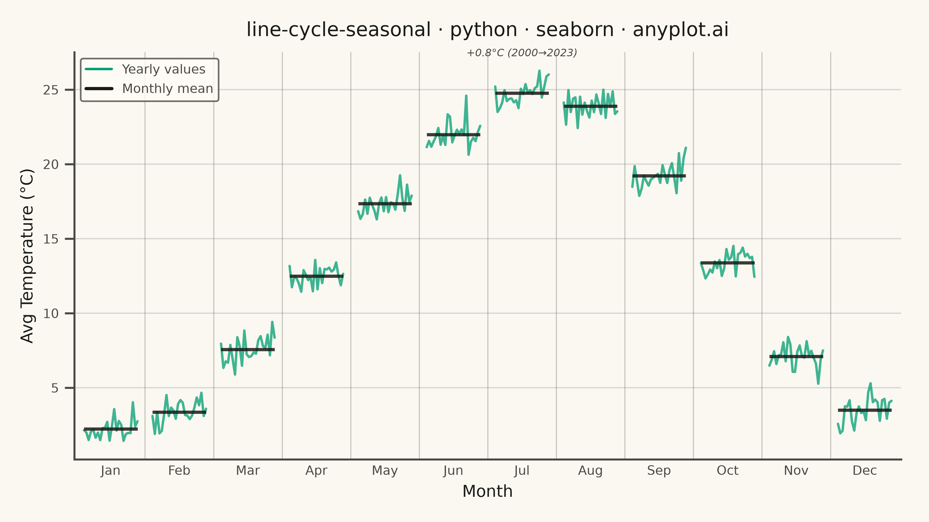
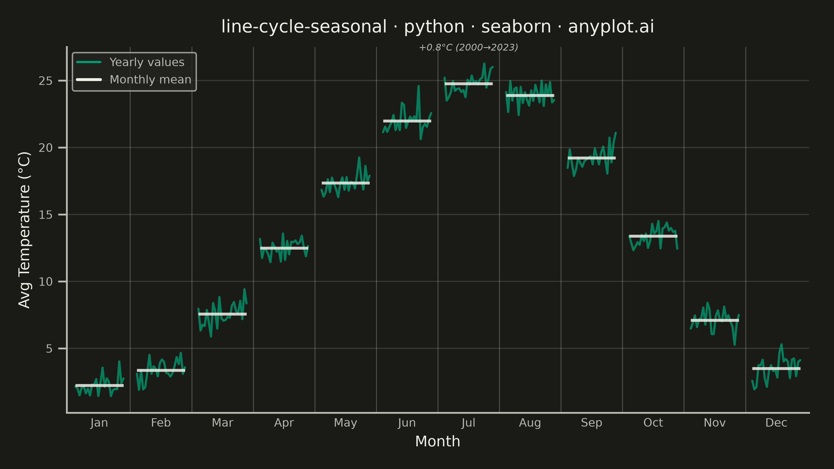
A cycle plot, also known as a seasonal subseries plot (introduced by William Cleveland), separates the seasonal pattern of a time series from the trend within each season. The series is split by seasonal period (e.g. one group per month or weekday); within each group the values are drawn in chronological order as a small line, and a horizontal reference line marks that group's mean. Comparing the mean lines across groups reveals the seasonal effect, while the slope of each subseries reveals the trend within that season — two patterns that are entangled in a standard time series plot.
""" anyplot.ai
line-cycle-seasonal: Cycle Plot (Seasonal Subseries)
Library: seaborn 0.13.2 | Python 3.13.13
Quality: 88/100 | Created: 2026-06-15
"""

import os
import sys


# Remove this script's directory from sys.path so 'import seaborn' finds the installed
# library rather than this file (Python adds the script dir to sys.path[0] automatically)
_script_dir = os.path.dirname(os.path.abspath(__file__))
sys.path = [p for p in sys.path if os.path.abspath(p or ".") != _script_dir]

import matplotlib.lines as mlines
import matplotlib.pyplot as plt
import numpy as np
import pandas as pd
import seaborn as sns


# Theme tokens (Imprint palette — see prompts/default-style-guide.md)
THEME = os.getenv("ANYPLOT_THEME", "light")
PAGE_BG = "#FAF8F1" if THEME == "light" else "#1A1A17"
ELEVATED_BG = "#FFFDF6" if THEME == "light" else "#242420"
INK = "#1A1A17" if THEME == "light" else "#F0EFE8"
INK_SOFT = "#4A4A44" if THEME == "light" else "#B8B7B0"
INK_MUTED = "#6B6A63" if THEME == "light" else "#A8A79F"
BRAND = "#009E73"  # Imprint palette position 1 — always first series

sns.set_theme(
    style="ticks",
    rc={
        "figure.facecolor": PAGE_BG,
        "axes.facecolor": PAGE_BG,
        "axes.edgecolor": INK_SOFT,
        "axes.labelcolor": INK,
        "text.color": INK,
        "xtick.color": INK_SOFT,
        "ytick.color": INK_SOFT,
        "grid.color": INK,
        "grid.alpha": 0.15,
        "legend.facecolor": ELEVATED_BG,
        "legend.edgecolor": INK_SOFT,
    },
)

# Data: monthly average temperatures (°C) over 24 years for a mid-latitude city
# A warming trend of ~0.035 °C/year is embedded within each month's subseries
np.random.seed(42)
years = np.arange(2000, 2024)
n_years = len(years)

month_names = ["Jan", "Feb", "Mar", "Apr", "May", "Jun", "Jul", "Aug", "Sep", "Oct", "Nov", "Dec"]
base_temps = np.array([1.8, 3.2, 7.5, 12.1, 17.0, 21.3, 24.1, 23.6, 18.8, 13.0, 6.8, 2.9])

rows = []
for yi, year in enumerate(years):
    for mi, (base_temp, month_name) in enumerate(zip(base_temps, month_names, strict=False)):
        temp = base_temp + 0.035 * yi + np.random.normal(0, 0.7)
        rows.append({"year": year, "month_idx": mi, "month_name": month_name, "temp": temp})

df = pd.DataFrame(rows)

# Layout: 12 month groups along the shared x-axis; years spread within each group
group_width = 1.0
gap = 0.28
group_starts = np.arange(12) * (group_width + gap)
group_centers = group_starts + group_width / 2
year_offsets = np.linspace(0, group_width, n_years)

# Compute absolute x-positions per row for seaborn plotting
df["x_pos"] = df.apply(lambda row: group_starts[int(row["month_idx"])] + year_offsets[int(row["year"]) - 2000], axis=1)

# Plot
fig, ax = plt.subplots(figsize=(8, 4.5), dpi=400, facecolor=PAGE_BG)
ax.set_facecolor(PAGE_BG)

# Chronological subseries lines via seaborn lineplot — one line per month (units='month_idx')
# estimator=None draws raw observations; each month's 24 years form a connected line
sns.lineplot(
    data=df,
    x="x_pos",
    y="temp",
    units="month_idx",
    estimator=None,
    color=BRAND,
    linewidth=1.5,
    alpha=0.75,
    ax=ax,
    zorder=2,
)

# Horizontal reference lines at each group's mean (key visual for seasonal comparison)
for mi in range(12):
    month_data = df[df["month_idx"] == mi]
    mean_val = month_data["temp"].mean()
    ax.hlines(
        mean_val, group_starts[mi], group_starts[mi] + group_width, colors=INK, linewidth=2.0, alpha=0.85, zorder=3
    )

# Vertical dividers between seasonal groups (alpha=0.4 for clear but subtle separation)
for mi in range(1, 12):
    x_div = group_starts[mi] - gap / 2
    ax.axvline(x_div, color=INK_MUTED, linewidth=0.6, alpha=0.4, zorder=1)

# Warming trend annotation on July — the within-season upward slope tells the climate story
july_df = df[df["month_idx"] == 6].sort_values("year")
july_warming = july_df.iloc[-1]["temp"] - july_df.iloc[0]["temp"]
july_y_max = july_df["temp"].max()
ax.text(
    group_centers[6],
    july_y_max + 0.8,
    f"+{july_warming:.1f}°C (2000→2023)",
    ha="center",
    va="bottom",
    fontsize=6.5,
    color=INK_SOFT,
    style="italic",
)

# Style
ax.set_xticks(group_centers)
ax.set_xticklabels(month_names, fontsize=8, color=INK_SOFT)
ax.tick_params(axis="x", length=0)
ax.tick_params(axis="y", labelsize=8, colors=INK_SOFT)
ax.set_xlim(group_starts[0] - 0.18, group_starts[-1] + group_width + 0.18)

ax.set_xlabel("Month", fontsize=10, color=INK)
ax.set_ylabel("Avg Temperature (°C)", fontsize=10, color=INK)

title = "line-cycle-seasonal · python · seaborn · anyplot.ai"
ax.set_title(title, fontsize=12, fontweight="medium", color=INK, pad=10)

sns.despine(ax=ax, top=True, right=True)
ax.spines["left"].set_color(INK_SOFT)
ax.spines["bottom"].set_color(INK_SOFT)

ax.yaxis.grid(True, alpha=0.15, linewidth=0.8, color=INK, zorder=0)
ax.set_axisbelow(True)

# Legend for the two visual elements
trend_handle = mlines.Line2D([], [], color=BRAND, linewidth=1.5, label="Yearly values")
mean_handle = mlines.Line2D([], [], color=INK, linewidth=2.0, label="Monthly mean")
ax.legend(
    handles=[trend_handle, mean_handle],
    fontsize=8,
    loc="upper left",
    frameon=True,
    facecolor=ELEVATED_BG,
    edgecolor=INK_SOFT,
    labelcolor=INK_SOFT,
)

fig.subplots_adjust(left=0.08, right=0.97, top=0.90, bottom=0.12)

# Save — no bbox_inches='tight' (would trim canvas away from exact 3200×1800 target)
plt.savefig(f"plot-{THEME}.png", dpi=400, facecolor=PAGE_BG)
plt.close()
Runnable source as JSON, for any HTTP client: https://api.anyplot.ai/specs/line-cycle-seasonal/seaborn/code. Any spec id and library id listed in llms-full.txt fit the same URL shape; every URL below is complete and callable.
{
  "spec_id": "line-cycle-seasonal",
  "language": "python",
  "library": "seaborn",
  "page": "https://anyplot.ai/line-cycle-seasonal/python/seaborn",
  "hub": "https://anyplot.ai/line-cycle-seasonal",
  "code_json": "https://api.anyplot.ai/specs/line-cycle-seasonal/seaborn/code",
  "spec_json": "https://api.anyplot.ai/specs/line-cycle-seasonal",
  "render_light_png": "https://storage.googleapis.com/anyplot-images/plots/line-cycle-seasonal/python/seaborn/plot-light.png",
  "render_dark_png": "https://storage.googleapis.com/anyplot-images/plots/line-cycle-seasonal/python/seaborn/plot-dark.png",
  "quality_score": 88.0,
  "license": "MIT",
  "guide": "https://anyplot.ai/llms.txt"
}
Part of Cycle Plot (Seasonal Subseries) on anyplot.ai.