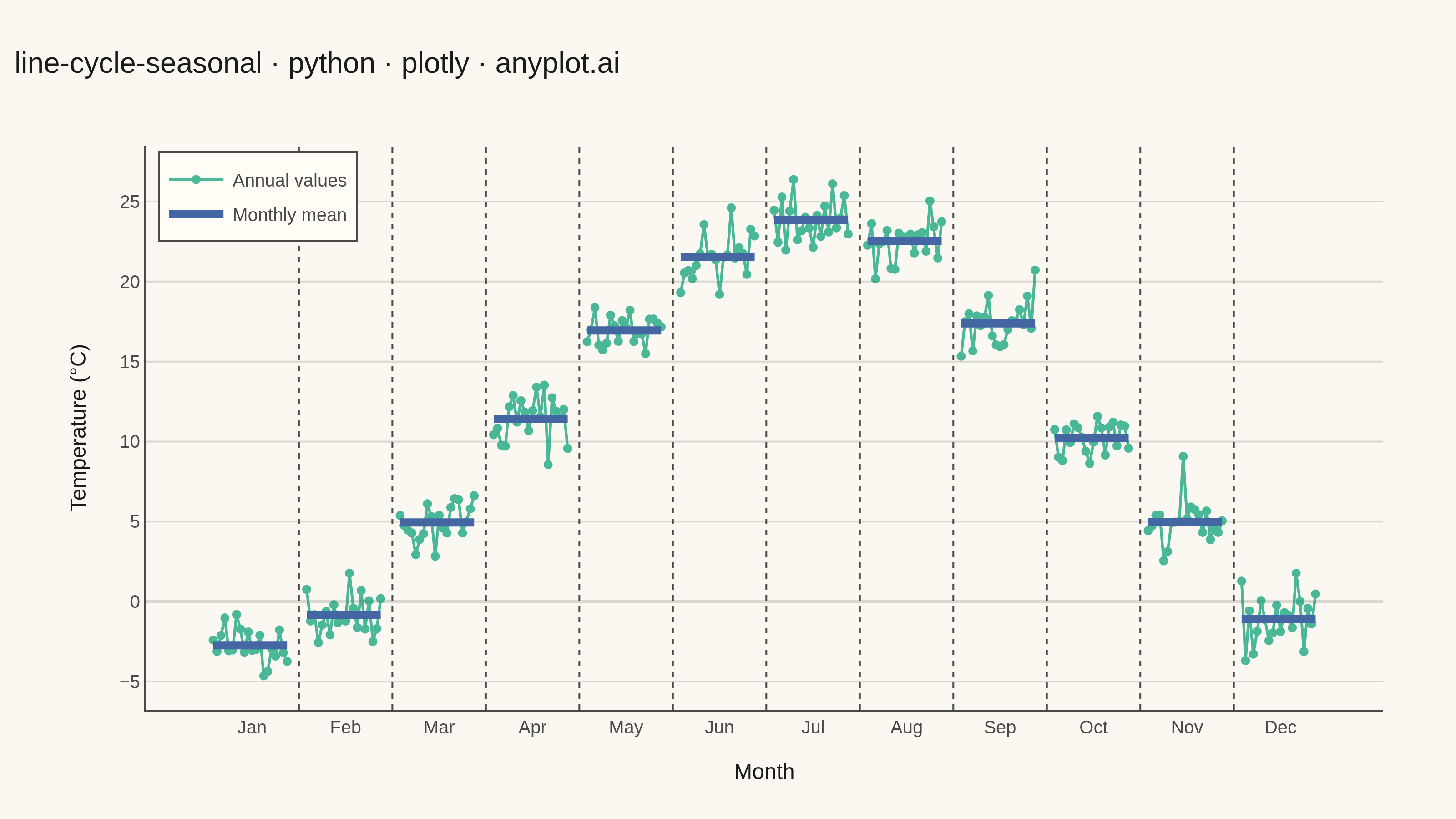
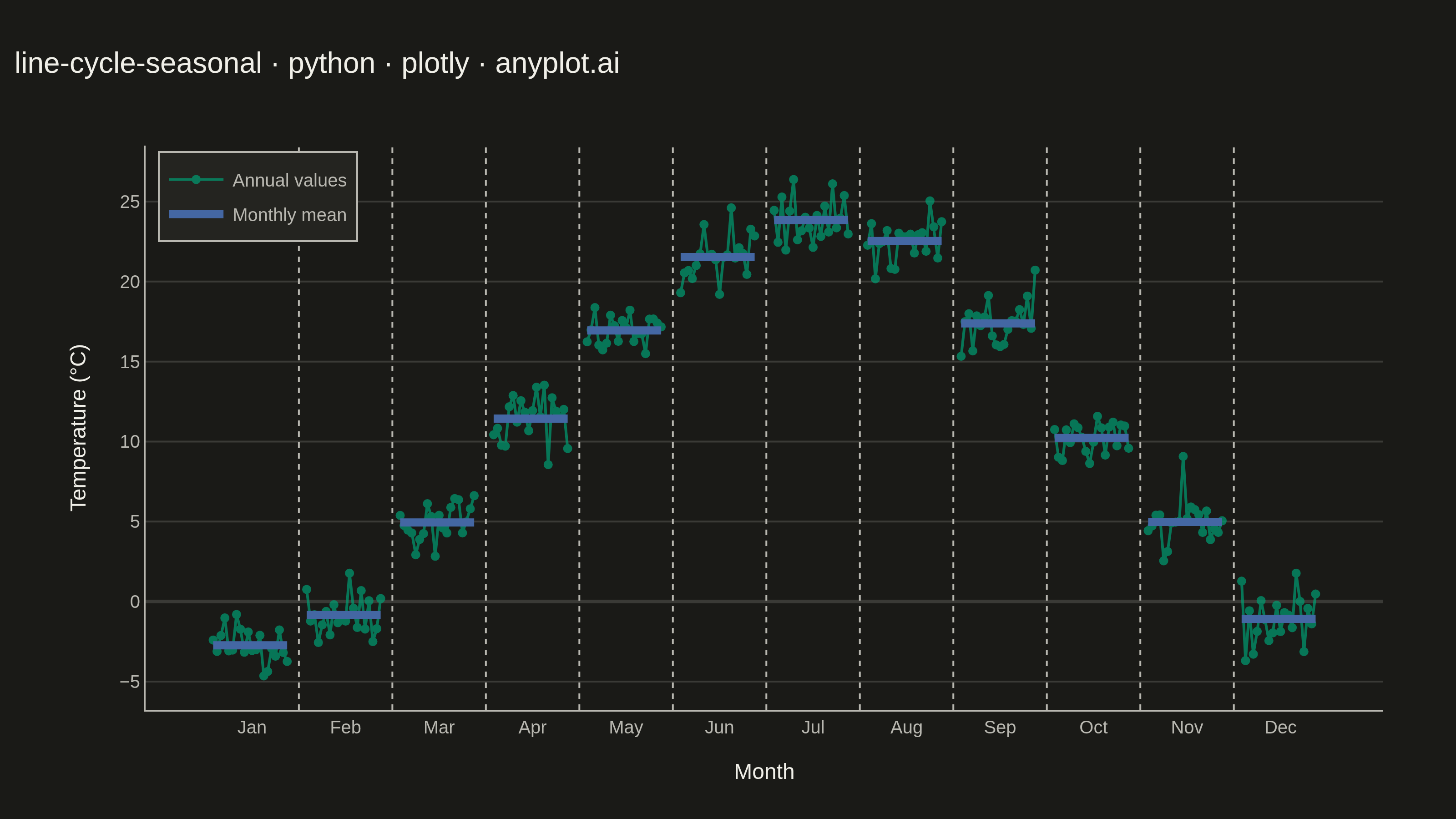
A cycle plot, also known as a seasonal subseries plot (introduced by William Cleveland), separates the seasonal pattern of a time series from the trend within each season. The series is split by seasonal period (e.g. one group per month or weekday); within each group the values are drawn in chronological order as a small line, and a horizontal reference line marks that group's mean. Comparing the mean lines across groups reveals the seasonal effect, while the slope of each subseries reveals the trend within that season — two patterns that are entangled in a standard time series plot.
""" anyplot.ai
line-cycle-seasonal: Cycle Plot (Seasonal Subseries)
Library: plotly 6.8.0 | Python 3.13.13
Quality: 88/100 | Created: 2026-06-15
"""

import os

import numpy as np
import pandas as pd
import plotly.graph_objects as go


# Theme tokens
THEME = os.getenv("ANYPLOT_THEME", "light")
PAGE_BG = "#FAF8F1" if THEME == "light" else "#1A1A17"
ELEVATED_BG = "#FFFDF6" if THEME == "light" else "#242420"
INK = "#1A1A17" if THEME == "light" else "#F0EFE8"
INK_SOFT = "#4A4A44" if THEME == "light" else "#B8B7B0"
GRID = "rgba(26,26,23,0.15)" if THEME == "light" else "rgba(240,239,232,0.15)"

# Imprint palette — first series always #009E73
BRAND = "#009E73"  # position 1 — annual subseries lines
BLUE = "#4467A3"  # position 3 — monthly mean reference lines

# Data: monthly average temperature (°C) at a northern-hemisphere city, 2000–2019
np.random.seed(42)
MONTHS = ["Jan", "Feb", "Mar", "Apr", "May", "Jun", "Jul", "Aug", "Sep", "Oct", "Nov", "Dec"]
N_YEARS = 20
BASE_TEMPS = [-3.0, -1.0, 4.5, 11.0, 16.5, 21.0, 23.5, 22.0, 16.5, 10.0, 4.0, -1.5]
WARMING_RATE = 0.05  # °C per year — slight long-term warming trend

rows = []
for m, month in enumerate(MONTHS):
    for y_idx in range(N_YEARS):
        temp = BASE_TEMPS[m] + WARMING_RATE * y_idx + np.random.normal(0, 1.2)
        rows.append({"month": month, "m": m, "y_idx": y_idx, "temp": temp})
df = pd.DataFrame(rows)

# X-axis layout: each of 12 month-groups spans N_YEARS positions, with GAP between them
GAP = 4
GROUP_W = N_YEARS

# Plot
fig = go.Figure()

for m, _month in enumerate(MONTHS):
    mdf = df[df["m"] == m].sort_values("y_idx")
    x_vals = [m * (GROUP_W + GAP) + y for y in range(N_YEARS)]
    y_vals = mdf["temp"].values
    mean_val = float(y_vals.mean())

    # Within-season chronological subseries line
    years = np.array([2000 + y for y in range(N_YEARS)])
    fig.add_trace(
        go.Scatter(
            x=x_vals,
            y=y_vals,
            mode="lines+markers",
            line={"color": BRAND, "width": 1.5},
            marker={"color": BRAND, "size": 5},
            opacity=0.7,
            customdata=years,
            hovertemplate="Year: %{customdata}<br>Temp: %{y:.1f}°C<extra></extra>",
            showlegend=(m == 0),
            name="Annual values",
        )
    )

    # Horizontal mean reference line — the key visual for comparing seasonal levels
    fig.add_trace(
        go.Scatter(
            x=[x_vals[0], x_vals[-1]],
            y=[mean_val, mean_val],
            mode="lines",
            line={"color": BLUE, "width": 4.5},
            hovertemplate=f"{_month} mean: %{{y:.1f}}°C<extra></extra>",
            showlegend=(m == 0),
            name="Monthly mean",
        )
    )

# Tick marks at center of each month group
tick_vals = [m * (GROUP_W + GAP) + GROUP_W // 2 for m in range(12)]

# Subtle vertical dividers between month groups
shapes = [
    {
        "type": "line",
        "x0": m * (GROUP_W + GAP) - GAP / 2,
        "x1": m * (GROUP_W + GAP) - GAP / 2,
        "y0": 0,
        "y1": 1,
        "yref": "paper",
        "line": {"color": INK_SOFT, "width": 1, "dash": "dot"},
    }
    for m in range(1, 12)
]

title = "line-cycle-seasonal · python · plotly · anyplot.ai"

fig.update_layout(
    autosize=False,
    paper_bgcolor=PAGE_BG,
    plot_bgcolor=PAGE_BG,
    margin={"l": 80, "r": 40, "t": 80, "b": 60},
    title={"text": title, "font": {"size": 16, "color": INK}, "x": 0.01, "xanchor": "left"},
    xaxis={
        "tickvals": tick_vals,
        "ticktext": MONTHS,
        "title": {"text": "Month", "font": {"size": 12, "color": INK}},
        "tickfont": {"size": 10, "color": INK_SOFT},
        "showgrid": False,
        "linecolor": INK_SOFT,
        "zeroline": False,
    },
    yaxis={
        "title": {"text": "Temperature (°C)", "font": {"size": 12, "color": INK}},
        "tickfont": {"size": 10, "color": INK_SOFT},
        "gridcolor": GRID,
        "linecolor": INK_SOFT,
        "zerolinecolor": GRID,
        "showgrid": True,
    },
    legend={
        "bgcolor": ELEVATED_BG,
        "bordercolor": INK_SOFT,
        "borderwidth": 1,
        "font": {"color": INK_SOFT, "size": 10},
        "x": 0.01,
        "y": 0.99,
        "xanchor": "left",
        "yanchor": "top",
    },
    shapes=shapes,
)

fig.write_image(f"plot-{THEME}.png", width=800, height=450, scale=4)
fig.write_html(f"plot-{THEME}.html", include_plotlyjs="cdn")
Runnable source as JSON, for any HTTP client: https://api.anyplot.ai/specs/line-cycle-seasonal/plotly/code. Any spec id and library id listed in llms-full.txt fit the same URL shape; every URL below is complete and callable.
{
  "spec_id": "line-cycle-seasonal",
  "language": "python",
  "library": "plotly",
  "page": "https://anyplot.ai/line-cycle-seasonal/python/plotly",
  "hub": "https://anyplot.ai/line-cycle-seasonal",
  "code_json": "https://api.anyplot.ai/specs/line-cycle-seasonal/plotly/code",
  "spec_json": "https://api.anyplot.ai/specs/line-cycle-seasonal",
  "render_light_png": "https://storage.googleapis.com/anyplot-images/plots/line-cycle-seasonal/python/plotly/plot-light.png",
  "render_dark_png": "https://storage.googleapis.com/anyplot-images/plots/line-cycle-seasonal/python/plotly/plot-dark.png",
  "interactive_light_html": "https://storage.googleapis.com/anyplot-images/plots/line-cycle-seasonal/python/plotly/plot-light.html",
  "interactive_dark_html": "https://storage.googleapis.com/anyplot-images/plots/line-cycle-seasonal/python/plotly/plot-dark.html",
  "quality_score": 88.0,
  "license": "MIT",
  "guide": "https://anyplot.ai/llms.txt"
}
Part of Cycle Plot (Seasonal Subseries) on anyplot.ai.