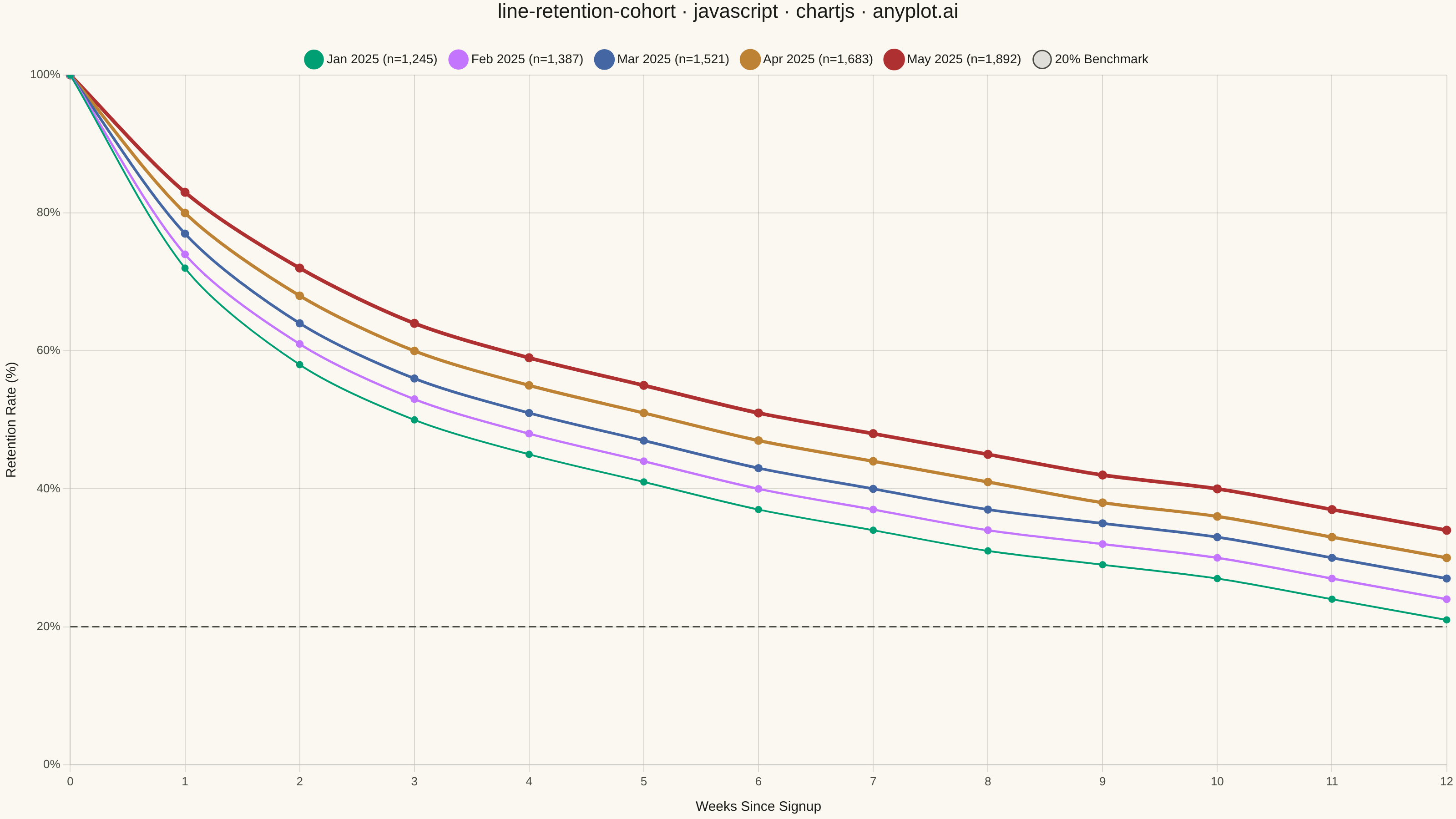
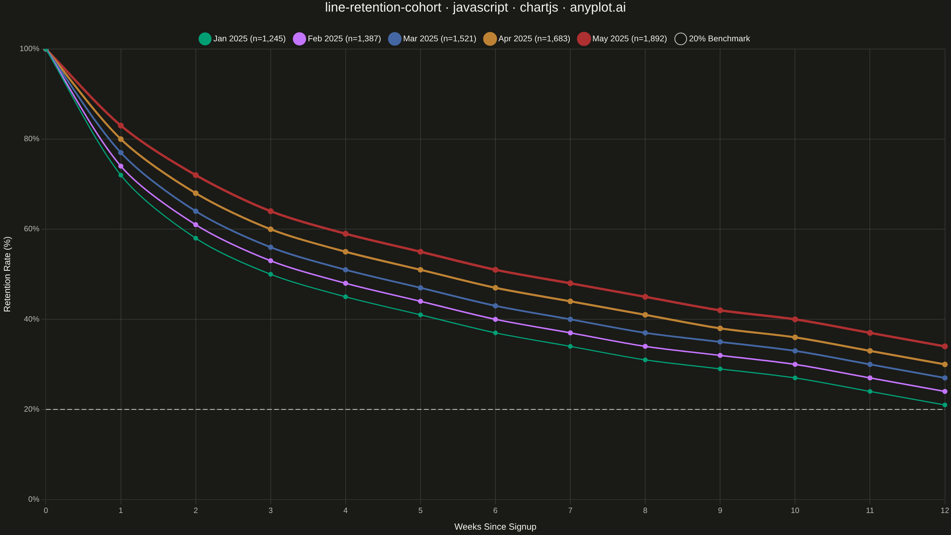
A line chart showing the percentage of retained users over time since signup, with separate curves for different cohorts. All curves start at 100% at time zero and typically exhibit exponential decay, revealing how well a product retains users over their lifecycle. By overlaying multiple cohorts, teams can visually compare whether retention is improving or degrading across signup periods.
// anyplot.ai
// line-retention-cohort: User Retention Curve by Cohort
// Library: chartjs 4.4.7 | JavaScript 22.22.3
// Quality: 90/100 | Created: 2026-06-20

const t = window.ANYPLOT_TOKENS;

// Data — weekly retention for 5 monthly signup cohorts (deterministic)
const weeks = [0, 1, 2, 3, 4, 5, 6, 7, 8, 9, 10, 11, 12];

const cohorts = [
  { label: "Jan 2025", size: 1245, data: [100, 72, 58, 50, 45, 41, 37, 34, 31, 29, 27, 24, 21] },
  { label: "Feb 2025", size: 1387, data: [100, 74, 61, 53, 48, 44, 40, 37, 34, 32, 30, 27, 24] },
  { label: "Mar 2025", size: 1521, data: [100, 77, 64, 56, 51, 47, 43, 40, 37, 35, 33, 30, 27] },
  { label: "Apr 2025", size: 1683, data: [100, 80, 68, 60, 55, 51, 47, 44, 41, 38, 36, 33, 30] },
  { label: "May 2025", size: 1892, data: [100, 83, 72, 64, 59, 55, 51, 48, 45, 42, 40, 37, 34] },
];

// Thicker lines for newer cohorts to emphasize recent improvements
const lineWidths = [2, 2.5, 3, 3.5, 4];

const datasets = [
  ...cohorts.map((cohort, i) => ({
    label: `${cohort.label} (n=${cohort.size.toLocaleString()})`,
    data: cohort.data,
    borderColor: t.palette[i],
    borderWidth: lineWidths[i],
    pointRadius: 3,
    pointBackgroundColor: t.palette[i],
    fill: false,
    tension: 0.3,
  })),
  // 20% retention benchmark reference line
  {
    label: "20% Benchmark",
    data: weeks.map(() => 20),
    borderColor: t.inkSoft,
    borderWidth: 1.5,
    borderDash: [8, 4],
    pointRadius: 0,
    fill: false,
    tension: 0,
  },
];

// Mount
const canvas = document.createElement("canvas");
document.getElementById("container").appendChild(canvas);

// Chart
new Chart(canvas, {
  type: "line",
  data: {
    labels: weeks,
    datasets,
  },
  options: {
    responsive: true,
    maintainAspectRatio: false,
    animation: false,
    plugins: {
      title: {
        display: true,
        text: "line-retention-cohort · javascript · chartjs · anyplot.ai",
        color: t.ink,
        font: { size: 22, weight: "500" },
        padding: { bottom: 16 },
      },
      legend: {
        labels: {
          color: t.ink,
          font: { size: 14 },
          usePointStyle: true,
          padding: 16,
        },
      },
    },
    scales: {
      x: {
        ticks: { color: t.inkSoft, font: { size: 13 } },
        grid: { color: t.grid },
        title: {
          display: true,
          text: "Weeks Since Signup",
          color: t.ink,
          font: { size: 15 },
          padding: { top: 8 },
        },
      },
      y: {
        min: 0,
        max: 100,
        ticks: {
          color: t.inkSoft,
          font: { size: 13 },
          callback: (v) => v + "%",
          stepSize: 20,
        },
        grid: { color: t.grid },
        title: {
          display: true,
          text: "Retention Rate (%)",
          color: t.ink,
          font: { size: 15 },
          padding: { bottom: 8 },
        },
      },
    },
  },
});
Runnable source as JSON, for any HTTP client: https://api.anyplot.ai/specs/line-retention-cohort/chartjs/code. Any spec id and library id listed in llms-full.txt fit the same URL shape; every URL below is complete and callable.
{
  "spec_id": "line-retention-cohort",
  "language": "javascript",
  "library": "chartjs",
  "page": "https://anyplot.ai/line-retention-cohort/javascript/chartjs",
  "hub": "https://anyplot.ai/line-retention-cohort",
  "code_json": "https://api.anyplot.ai/specs/line-retention-cohort/chartjs/code",
  "spec_json": "https://api.anyplot.ai/specs/line-retention-cohort",
  "render_light_png": "https://storage.googleapis.com/anyplot-images/plots/line-retention-cohort/javascript/chartjs/plot-light.png",
  "render_dark_png": "https://storage.googleapis.com/anyplot-images/plots/line-retention-cohort/javascript/chartjs/plot-dark.png",
  "interactive_light_html": "https://storage.googleapis.com/anyplot-images/plots/line-retention-cohort/javascript/chartjs/plot-light.html",
  "interactive_dark_html": "https://storage.googleapis.com/anyplot-images/plots/line-retention-cohort/javascript/chartjs/plot-dark.html",
  "quality_score": 90.0,
  "license": "MIT",
  "guide": "https://anyplot.ai/llms.txt"
}
Part of User Retention Curve by Cohort on anyplot.ai.